Assets Library
The Mockitt Assets Library is a core tool for centrally managing, sharing, and reusing design elements. It helps individual designers and teams easily maintain design consistency and significantly improve work efficiency.
1. What is the Assets Library?
Your Design Asset Center: The library is a centralized storage for frequently used design elements, including Components, Colors, Text Styles, and Shadow Effects.
Reuse & Unify: Once added to the library, you and your team members can easily reuse these elements across different projects and design files.
Core Value: It ensures a unified interface style, avoids repetitive work, and makes design updates more efficient.
2. Core Value of the Library
🚀 Boost Efficiency: Drag and drop common elements (like buttons and navigation bars) directly from the library, eliminating the need to recreate them.
🎨 Design Consistency: Team members use the same standardized elements, ensuring unified visuals and user experience.
🤝 Seamless Collaboration: Teams share the library, making it easy to discover and use design assets created by each other, fostering knowledge sharing.
3. Supported Asset Types
The Assets Library manages several core design elements:
Components (Main Components): Reusable UI widgets, such as:
- Buttons, Input fields, Checkboxes, Radio buttons.
- Navigation bars, Tab bars, Cards.
- Common Icons, Image placeholders.
- Complex combined widgets (e.g., list items containing avatars, names, and actions).
Styles:
Color: Brand colors, Neutral colors, Status colors, etc.
Text: Font, Size, Weight, Line height, and other typographic styles (e.g., Headings, Body text, Captions).
Effect: Corner radius, Fill color, Stroke, Shadows, etc.
Variables:
- Used to define and reuse dynamic values in the design system, such as spacing and corner radius sizes.
4. Getting Started
Accessing the Library
You can easily find the library entry point in the design interface:
Left Toolbar: Click the
Assets(Component) icon > SelectManage Library(Book icon).Right Panel (When nothing is selected): When no element is selected on the canvas, find and click
Manage Libraryin theLocal Stylessection on the right.
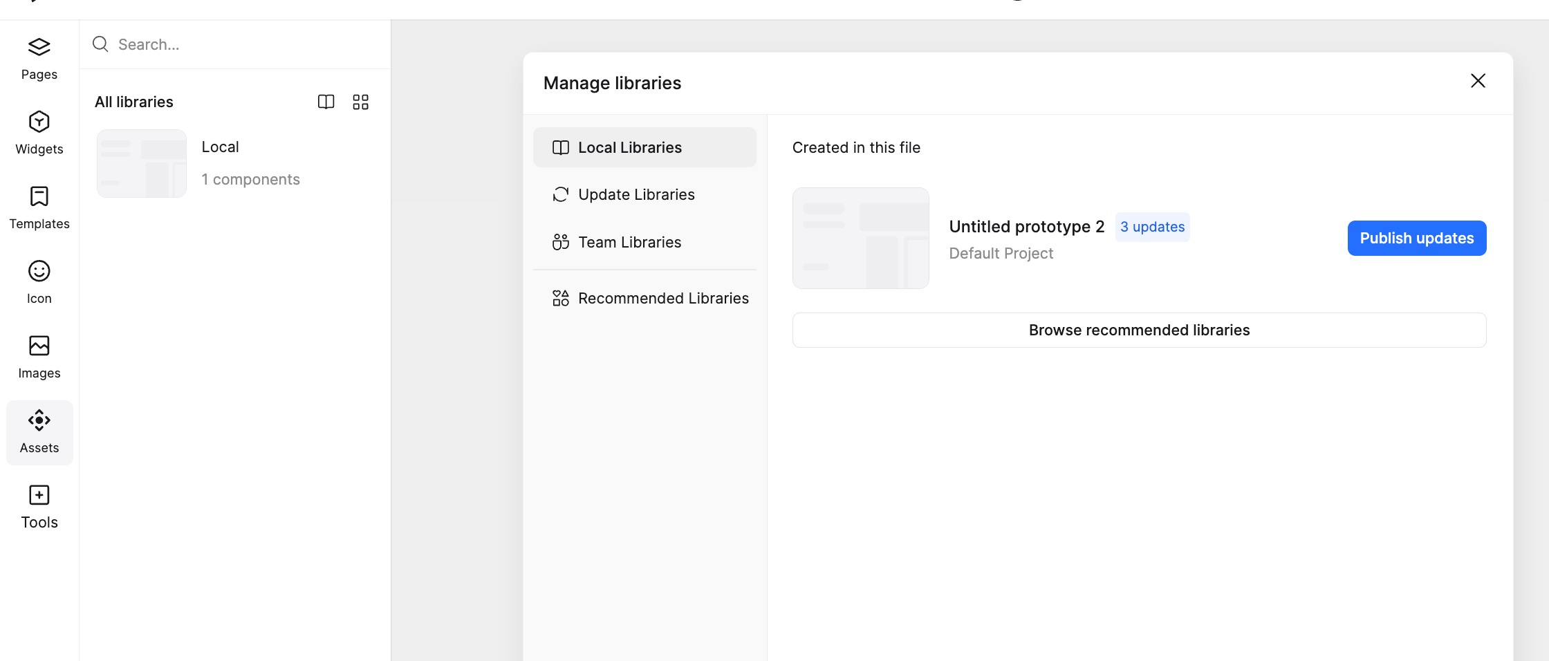
Understanding the Library Interface
Opening the Library Management panel reveals the following main areas:
Local Library: Assets created and used within the current file.
Team Library: Shared libraries available to your team (requires creation and publishing).
Updates: Displays assets in the Team Library that have available updates.
Featured (Community): High-quality resource templates provided by Mockitt official or the community.
5. Creating Your Team Library
Turn frequently used elements into shared team assets:
How to Add Assets to the Library?
Select on Canvas: Select the design element(s) you want to save as a shared resource.
Create Resource:
Create Component: Right-click the selected element > Choose
Create Component. The new component is saved to the Local Library by default.Publish (Key for Team Sharing): Go to the
Library Managementinterface > Under theLocal LibraryorUpdatestab, find the resources (or the file containing them) you want to share, and click thePublishbutton. Once published, these Styles, Components, and Variables enter the Team Library for member use.
6. Best Practices for High Efficiency
Maintenance Tips
Update Promptly: When the design system changes, prioritize updating the source assets in the library.
Keep it Lean: Remove unused or redundant resources.
Merge & Optimize: When similar resources are found, evaluate whether to merge them.
Refine Information: As resources evolve, update their categories, tags, and descriptions.
Collect Feedback: Encourage team members to provide feedback on the library experience for continuous improvement.
7. FAQ
Q: Will my design files change automatically when the Team Library is updated?
- A: No, your design files will not be modified automatically. When the assets you use have updates, Mockitt will send a notification (usually indicated in the Library panel or on the relevant component). You can choose to review the changes and manually confirm the update to your file.
Q: Can I import external icons or images into the library?
- A: Yes! You can drag
SVG,PNG,JPG, and other image formats directly onto the Mockitt canvas or Assets panel, and then add them as Components or manage them directly for team reuse.
- A: Yes! You can drag
Q: How do I manage too many resources?
- A: Components can be organized into folders using naming conventions. For example, to create a folder for a "Primary Button" component, rename the component to "Button/Primary". This will automatically place it inside a "Button" folder.