Overlay Widget
In App and Web prototyping, popups are frequently used to demonstrate interactive effects. To simplify the design process for complex pages, Mockitt introduces the Overlay Widget to help you quickly create popup effects and interactions.
Create Overlay
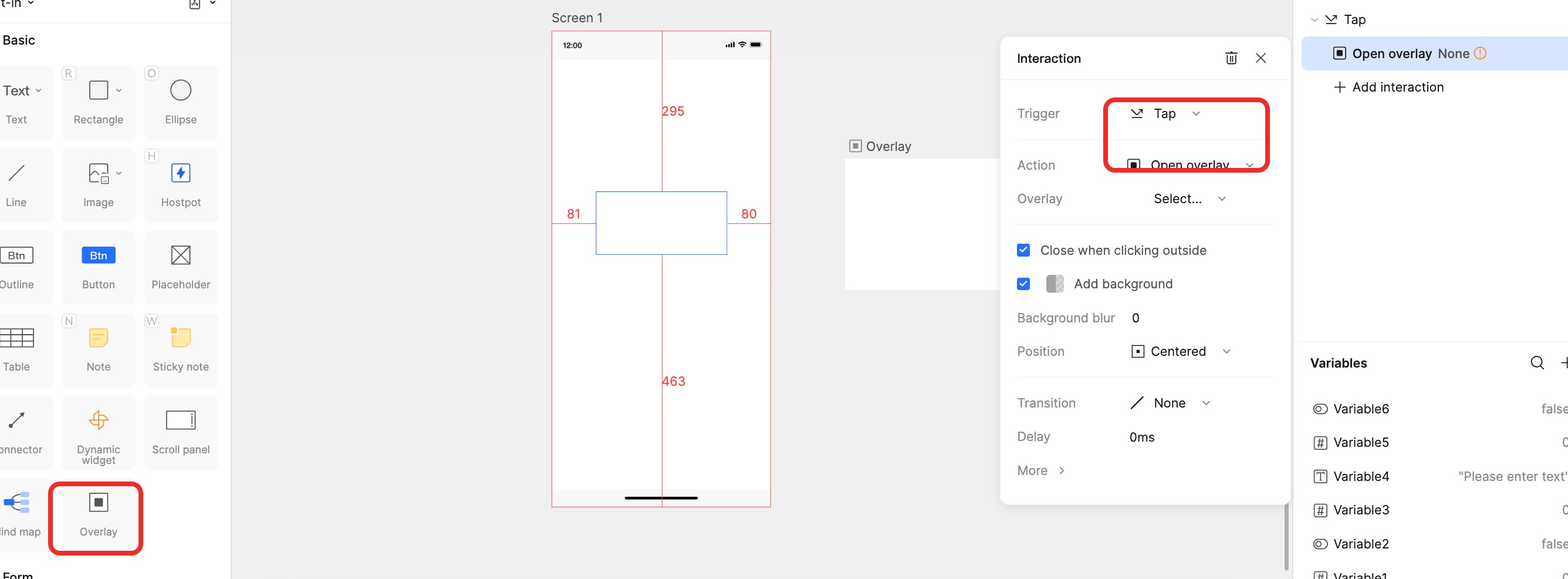
Open the Widgets panel, select Overlay Widget from the Built-in category, and drag or double-click to create it on the canvas.
Unlike other widgets, the Overlay does not need to belong to a specific page; simply ensure it is placed on the canvas.
Overlay Properties
The Overlay Widget acts like a mini-page where you can add text, widgets, icons, and other elements.
1. Modify Size
The default size of an Overlay is 300x240px. After selecting it, you can modify its width and height in the Appearance panel on the right.
2. Modify Appearance
You can customize the Corner Radius, Fill, Stroke, and Shadow of the Overlay in the right panel to match your design needs.
Note: Although editing an Overlay is similar to editing a page, it is not a standalone page. It will not appear in the Page List on the left sidebar, only in the Layers list. It does not support settings for device frames, layouts, or fixed regions.
Overlay Interaction Events
Overlays support interaction events similar to pages. Select an element and use the Interactions panel on the right to set up behaviors.
1. Set "Open Overlay"
You can set a page element to open an Overlay upon interaction (e.g., a click).
- Select the trigger component. Drag the Lightning icon to the target Overlay widget. Set the Action to Open Overlay.
- If you haven't created an Overlay widget on the canvas yet, the system will prompt you to create one when you select "Open Overlay" for another element.
Configuration Options:
- Close when clicking outside: If checked, clicking the area outside the Overlay will close the topmost Overlay.
- Mask: If checked, a background layer (scrim) will appear behind the Overlay. You can customize the background color and opacity.
- Position: Adjusts where the Overlay appears relative to the original page. Mockitt offers 7 presets (e.g., Center, Top-Left) and 1 Manual option. When Manual is selected, a virtual ghost element matching the Overlay's size appears on the page, allowing you to drag and position it precisely.
2. Set "Close Overlay"
The "Close Overlay" action is used for elements inside the Overlay, such as a "Close" button (X).
- Select the trigger element inside the Overlay (e.g., a button).
- In the right panel, click New Interaction.
- Set the Action to Close Overlay. This will close the current Overlay during presentation.
- Note: This event is invalid if there is no open Overlay context.
3. Set "Swap Overlay"
When your prototype involves navigating between multiple popups, use Swap Overlay to switch directly to another Overlay without closing the current one.
- Select the current Overlay (or an element inside it) and add an interaction.
- Set the Action to Swap Overlay and select the target Overlay.
- The new Overlay will inherit the configuration of the previous one (including Mask, Blur, Close settings, and Position). These options cannot be configured separately for the swapped overlay.