Adding Interaction Events
Mockitt supports adding interaction events to widgets or pages, simulating the real experience of user interaction with the product, making your prototype "move".
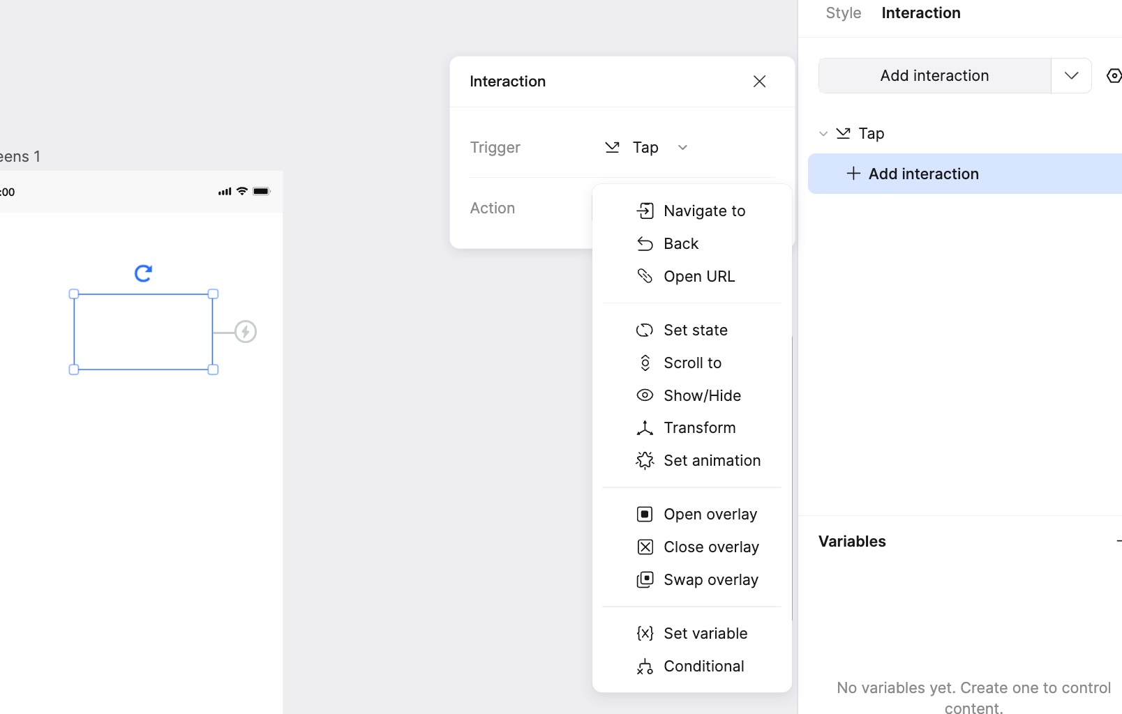
Create Interaction Events
To add an interaction event, you need to set the Trigger and the Action.
1. New Interaction
You can add interaction events to widgets or pages in two ways: via the Right Panel or via the Lightning icon next to the widget.
1.1 Adding via Right Panel Select the widget or page that will trigger the interaction. In the right sidebar, select Interactions → New Interaction to create a new event.
1.2 Adding via Lightning Icon Select the widget that will trigger the interaction, then drag the Lightning button appearing around it to the target element to quickly create a new event.
- Drag to a page in the left Page List: Automatically creates a Click to Go to Page event.
- Drag to a target widget: An action menu will pop up. Select the desired action to create the event; if the current state only supports one action, the event will be created directly.
2. Select Trigger
Choose a trigger to make the interaction event effective (e.g., Click, Double Click, Hover).
3. Select Action
Actions include Go to Page, Open Link, Switch State (Page/Component), Scroll to, and Show/Hide. The prototype will perform the corresponding interaction behavior after the event is triggered.
4. Select Target Element
When your selected event behavior is Scroll to or Show/Hide, you also need to select the target element for the jump/switch, as well as the specific transition method. You can also add transition animations.
This allows for a high-fidelity interactive experience during preview.
Please Note:
- The same element supports multiple actions for the same event type. For example, clicking one button can switch the states of multiple Dynamic Widgets.
- Some similar actions may conflict, causing the event to fail. Please check and reset if necessary.
Interaction Event Details
1. Go to Page / Back / Open Link
Go to Page: Select Go to Page in the Action menu and choose the corresponding page to jump to another page within the prototype file.
Back: Select Back in the Action menu. During the presentation, triggering this event will return the view to the previously visited page.
Open Link: This event allows jumping to an external website URL.
2. Switch Component State
If a widget (Dynamic Component) on the page has multiple states, the Switch State event can trigger the switching of that component's state.
Note: This only supports switching states of components within the current page.
3. Scroll To
After triggering the Scroll to event, the presented page will scroll to the location of the target element.
To use the Scroll to effect, the canvas height must be longer than the screen height set for the prototype to allow scrolling.
After adding the event, a scrolling guide line will be generated at the top of the target element. You can drag it up or down to adjust the specific position, or set the Offset value in the right panel for fine-tuning.
4. Show/Hide
Show/Hide can quickly toggle the visibility of a target element.
In the right event panel, you can choose from three types: Show, Hide, or Toggle (Toggle switches between show/hide states upon repeated triggers).
You can also use Dynamic Widgets to achieve show/hide effects.
5. On Load
Pages and elements can trigger interaction events via On Load, meaning the event fires immediately when the page or element finishes loading.
To set this up, select Interactions → New Interaction in the right sidebar, and choose On Load as the Trigger.
After selecting the event and target element, you can use Delay to set a time delay for the interaction to trigger after loading.
When adding a Timer to a Dynamic Component, you must first select a specific state before adding the timer event.
Interactions in Dynamic Widgets
Mockitt allows you to add interaction events to elements inside a Dynamic Component, such as switching page states or other component states. This enables rich dynamic effects.
Double-click the Dynamic Component to enter the state editing mode.
You can then add interaction events to specific elements within the Dynamic Component.
Deleting Interaction Events
There are two ways to delete an added interaction event.
Select the page/widget with the interaction, then click the Delete (trash can) button in the Events section of the right settings panel.
When the interaction link lines are visible, select the page/widget, click the Edit icon on the link line, and then delete the event.
Event Preferences
Open the Preferences window via the Menu (top-left) > Preferences, or the Settings icon in the Interactions panel.
Settings related to events include:
General - Links: You can set how interactions are identified on the canvas. Options include: Do not show, Show badges only, or Show wires and badges.
Animation: You can set the default animation for switching page/component states to No Animation or Smart Animate.