Shape Widgets
Mockitt features a variety of built-in shape widgets to help you build interface elements, organize page layouts, and create visual illustrations. The built-in shape widgets include Rectangle, Ellipse, Polygon, Star, and Triangle.
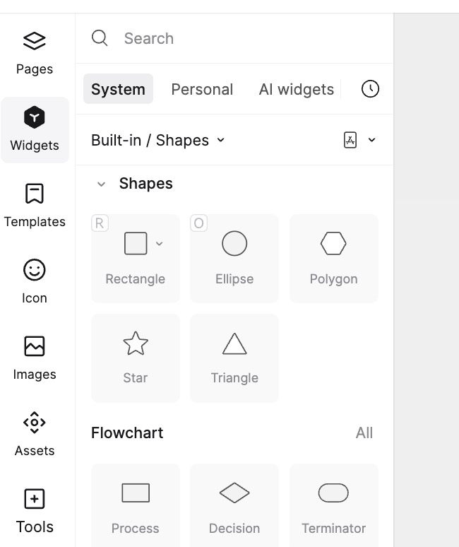
Rectangle Widget
- Create and Adjust: Drag the Rectangle widget to the canvas to adjust its size and position, and select different fill colors. You can also use the shortcut R to draw a rectangle.
1. Border Radius (Rounded Corners)
There are two ways to set rounded corners for a rectangle in Mockitt.
(1) Numeric Input: After selecting a rectangle, you can set the radius in the Appearance panel on the right (four corners can be set independently). The current version also supports Single-side Stroke settings.
(2) Quick Radius: This feature allows you to quickly modify the rectangle's corners directly on the canvas.
- Use the shortcut R or click the Rectangle tool in the top toolbar to create a rectangle.
- Hover over the rectangle, and four dots will appear inside the corners. Drag any dot to quickly adjust the radius.
(3) Independent Corners: To modify a specific corner individually, select the Independent Corners icon in the right property panel and type the value directly.
2. Border Settings
After creating a rectangle, you can customize its border style.
Select the widget, and in the Appearance section on the right, you can set the border color and shape.
You can also control whether specific borders of the rectangle are visible.
Ellipse Widget
- Create and Adjust: The Ellipse widget is used to create circles and ellipses. You can create one by dragging and dropping, then adjust its dimensions and proportions as needed.
- Add Path: You can add paths to an created ellipse or select path types (e.g., for pie charts) and set independent corner radii to create richer styles.
- Custom Style: The Ellipse widget supports styles such as Fill, Border, and Shadow, which can be personalized according to your needs.
Polygon Widget
- Create Polygon: The Polygon widget defaults to a hexagon. You can adjust the number of sides, with a minimum of 3 and a maximum of 20.
- Adjust Polygon: In the right property panel, you can set the polygon's color, border, etc. The Polygon widget supports rounded corners, but does not support independent corner radius settings for individual corners.
Star Widget
- Create Star: The Star widget defaults to a 5-point star. You can adjust the number of points, with a minimum of 3 and a maximum of 20. Additionally, you can adjust the star's radius (ratio); a larger radius creates shallower points, approaching a circle at the maximum.
- Star Settings: In the right property panel, you can choose the star's color, border, shadow, etc. The Star widget supports rounded corners but does not support independent corner radius settings.
Triangle Widget
- Create and Adjust: The Triangle widget is used to create various types of triangles. You can adjust its size, position, and orientation, as well as select different colors and borders.