Basic Widgets
Basic widgets are the most frequently used elements in prototyping. Click Widgets and select Built-in to access Mockitt's common widgets.
Text
1. Modify Text Appearance
After selecting a Text widget, you can set its font size, color, and font family in the Appearance panel on the right.
Select the Text widget and click the ellipsis icon in the Appearance panel to adjust the text alignment.
Note: Currently, you can only use the provided fonts; uploading custom fonts is not supported.
2. Batch Modify/Replace Text
You can use the Find and Replace function to batch modify text elements.
Rectangle
The Rectangle widget allows you to add a rectangle to the prototype, which can be stretched arbitrarily.
1. Border Radius (Rounded Corners)
There are two ways to set rounded corners for a rectangle in Mockitt.
(1) Numeric Input: Select the rectangle and enter values in the Radius field in the Appearance panel. You can set a unified radius or configure independent corners. Additionally, the current version supports setting Single-side Strokes (borders).
(2) Quick Radius: This feature helps you quickly modify the curvature of the rectangle's corners directly on the canvas.
- Use the shortcut
Ror select the Rectangle tool from the top toolbar to create a shape. - When hovering over the rectangle, dots will appear inside the corners. Drag any dot to adjust the radius.
(3) Independent Corners: To modify a specific corner individually, select the Independent Corners icon in the right property panel and type the value.
2. Border Settings
After creating a rectangle, you can customize its border style.
Select the widget, and in the Appearance section on the right, you can set the border color and style (solid, dashed, etc.).
You can also control the visibility of specific borders (Top, Bottom, Left, Right).
Ellipse
- Create and Adjust: The Ellipse widget is used to create circles and ellipses. You can create one by dragging and dropping, then adjust its dimensions and proportions as needed.
- Add Path: You can add paths to an created circle or select path types to set independent corner radii, allowing for more complex shapes.
- Custom Style: The Ellipse widget supports styles such as Fill, Border, and Shadow, which can be personalized according to your needs.
Line
- Create and Adjust: You can create a line and adjust its length and angle.
- Custom Style: The Line widget supports settings for Color, Line Style (Solid, Dashed, Dotted), and Thickness.
Image
The Image widget supports uploading images into the prototype. In the Mockitt prototyping tool, you can insert, split, crop, and export images.
1. Insert Image
Drag an Image widget from the Common Widgets panel, then use the Appearance panel on the right to upload an image file.
Note: Currently supported formats are PNG, GIF, JPG, and JPEG. File size limits per image: Free Plan < 2MB, Professional/Team Plan < 5MB, Enterprise Plan < 10MB.
2. Split Image
The tool supports Image Splitting, allowing you to conveniently slice images.
Steps:
- After inserting an image, click the Split Image button in the Appearance panel, or right-click the image and select Split.
- A split window will appear. Choose Cross, Horizontal, or Vertical splitting modes.
- Click on the desired position on the image to split it.
- Handles will appear between the split parts. Hover over the handle to drag and adjust the spacing between the image slices.
Note: Splitting works for single or multiple images. If multiple images are selected, the split line will cut through all of them.
3. Crop Image
- Double-click an image to activate cropping, or click the Crop button in the right panel. You can choose Rectangular or Circular cropping.
- Proportional Scaling: Click the "Lock Aspect Ratio" icon in the right panel or hold the
Shiftkey while resizing to scale the image proportionally. - Stretch/Fill: Select the image and choose between Stretch or Fill modes in the right panel settings.
4. Export Image
Mockitt allows exporting images from the prototype in PNG format.
(1) Export from Editor:
Select the image widget you want to export and click Export in the bottom right corner.
To batch export, hold Shift and select multiple images, then click Export.
If the image is a GIF, selecting it individually allows you to export it in GIF format.
(2) Export from Handoff/Preview Mode: In the Preview window or via a share link, switch to Overview mode in the top bar. Select the desired image and click Export to save it locally.
Hotspot (Link Region)
The Hotspot widget allows you to add a clickable area to a specific part of the canvas (e.g., a specific section of a flat image). The Hotspot appears yellow in the editor but is transparent during presentation.
1. Create Hotspot: Find the Hotspot widget in Widgets > Built-in. Drag it to the canvas and adjust its size.
Shortcut: H + Drag.
2. Edit Hotspot: Move the Hotspot to the target area and add an interaction event to it.
Button
Buttons are crucial interaction components in prototyping, used for triggering events, navigation, or submitting forms. Mockitt provides Button and Button 2 variants.
- Create Button: Drag the "Button" widget from the panel to the canvas. Adjust its size, position, and text.
- Modify Appearance: Customize the button's Fill Color, Stroke Style, Border Width, Shadow, and Corner Radius in the Appearance panel.
- Set Text: Double-click the button to edit the text. Adjust font, size, and color in the right panel.
- Add Interaction: Add events to the button to trigger navigation, popups, or other actions.
Placeholder
Placeholders are used to quickly build low-fidelity wireframes, helping to clarify layout ideas for designers and developers. As the name suggests, it occupies a specific space on the canvas where you can add text labels for communication.
Table
1. Create Table
The Table widget allows you to quickly generate a data table. After selecting the Table widget, you can change the table type and border color in the right panel.
2. Table Scrolling Effect
There are two ways to make a table scrollable:
Method 1:
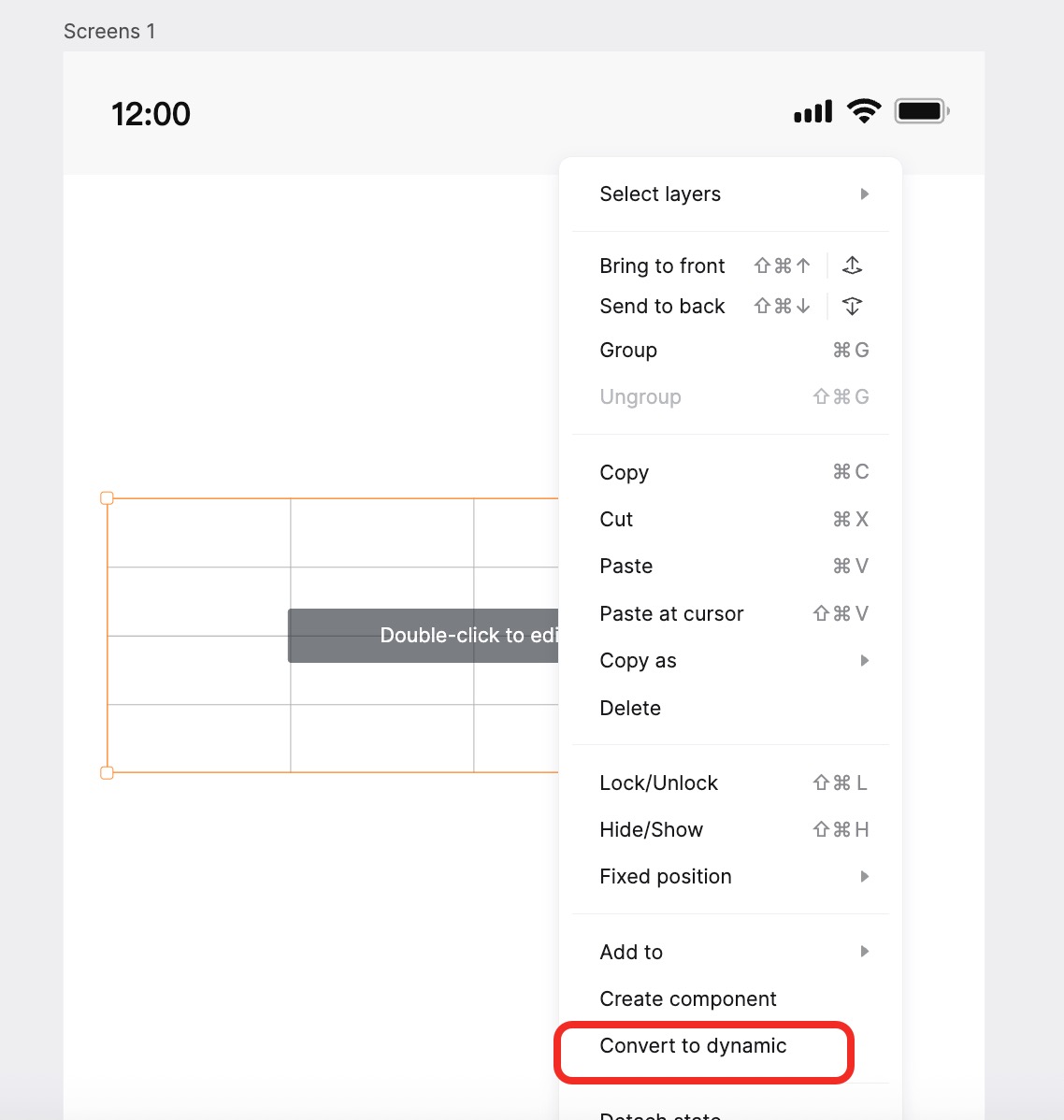
- Select the table, right-click, and choose Convert to Dynamic Widget.
- Click on the state title (e.g., State 1) to enter editing mode. Adjust the frame to the desired visible display area. Click Exit Editing.
- Select the Dynamic Widget. In the Appearance panel, set the Scroll property (Vertical or Horizontal).
Method 2:
- Select the table, right-click, and choose Convert to Dynamic Widget.
- Enter the Dynamic Widget editing mode. Resize the table content (State 1) so it is larger than the visible orange border frame.
Difference between the two methods:
- On PC Preview: Method 1 displays scrollbars (if enabled) and supports mouse wheel scrolling. Method 2 relies on click-and-drag scrolling (simulation).
- On Mobile Preview: Both methods support touch scrolling.
Note (Card Annotation)
The Note widget allows you to add detailed annotations to the prototype, displayed as a card.
1. Appearance
Create a Note widget or double-click it to reveal the editing bar above the component, where you can format the text and color.
2. Binding Objects
Drag the Note widget to the desired location. Drag the guide line endpoint (circle) to the specific object you want to annotate. When the small dot becomes solid, it means the Note is successfully bound to the object.
Sticky Note (Pin Annotation)
Sticky Notes function similarly to Card Annotations but without the guide line, appearing as a simple dot or icon on the prototype to mark specific spots.
1. Edit Sticky Note
Drag a Sticky Note widget to the canvas. A popup editing box will appear where you can enter the content.
2. View Sticky Note
During presentation, clicking the Sticky Note icon will reveal the annotation content in a popup.
Arrow
Drag the Arrow widget from the Common Widgets panel to the page. You can customize the arrow's start/end styles, thickness, and curvature in the Appearance panel.
Dynamic Widget
Dragging this widget to the canvas inserts a container for creating interactive states.
Scroll Panel
The Scroll Panel is a container used for long pages or sections where content exceeds the visible area.
When placed on the page, it defaults to a Dynamic Widget. The orange border indicates the Visible Area.
To adjust the content, Double-click to enter the Dynamic Widget editor. Inside, you will see a transparent border indicating the Actual Content Size. Ensure your content is inside this frame. You can resize the State to accommodate more content.
After exiting the editor, use the Appearance panel to configure scrollbar visibility. This enables local horizontal or vertical scrolling during preview.