Dynamic Widgets
Overview
Dynamic Widgets allow you to define multiple states for a single component and animate them through interaction events, achieving interactive animations within a page.
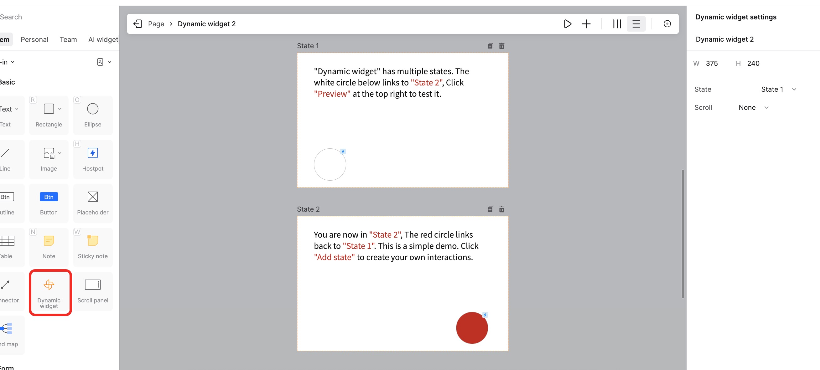
Creating and Converting Dynamic Widgets
Convert to Dynamic Widget
Select any element on the canvas. Right-click and choose Convert to Dynamic Widget.
Alternatively, click Add State in the right property panel to convert it.
Detach Dynamic Widget
To revert a Dynamic Widget back to a standard component, right-click it and select Detach Current State.
Editing Dynamic Widgets
Create and Edit Multiple States
There are two ways to enter the Dynamic Widget editing mode:
- Double-click: Double-click the Dynamic Widget to enter the editing view.
- Add State: In the Appearance panel on the right, click + Add State to enter the state editing mode.
Adjusting Component Scope
- Orange Frame (Visible Area): This represents the visible viewport of the Dynamic Widget. After exiting edit mode, you can resize this frame directly on the canvas to change what is visible.
- State Size (Actual Content): Click on the state name (e.g., State 1) inside the editor. A transparent border will appear, representing the actual size of the content for that state.
- Scroll Settings: If the content (State Size) exceeds the visible area (Orange Frame), you can set Vertical or Horizontal scrolling in the Appearance panel.
Interaction Events within States
Elements inside a Dynamic Widget state can have various interaction events, including:
- Gestures: Tap, Swipe Left/Right/Up/Down, Long Press, Double Tap.
- Mouse Actions: Click, Double Click, Hover, Mouse Out, Right Click.
- Timer: Trigger events automatically after a delay.
Actions
By adding interaction events, you can trigger the following actions:
- Go to Page
- Back to Previous Page
- Open Link
- Switch Component State
- Scroll to
- Show/Hide
Managing Component States
Upon entering the component state editing mode, the component automatically becomes a "Dynamic Widget" with a new state added.
The left panel allows you to select different states, while the right panel lets you edit appearance and add interactions.
1. Change Layout in Editor
In the middle of the editing toolbar, you can switch between Horizontal or Vertical distribution for viewing multiple states.
2. Add Component State
Click the + button in the state bar to add a new blank state.
Click the Duplicate icon above a specific state to quickly create a copy of that state.
3. Delete Component State
- Right-click the state in the Layers panel and select Delete.
- Click the Trash icon above the state in the editing view.
4. Move/Resize State Canvas
Click the resize tool in the toolbar to adjust the size and position of different states.
5. Add Interactions to States
In the right panel of the state editor, you can add events to elements within specific states.
6. Set Default State
To change which state is shown initially:
- Exit the Dynamic Widget editor.
- Select the Dynamic Widget on the canvas.
- In the right Appearance panel, change the Default State from the dropdown menu.
7. Preview Dynamic Widget
Click the Play icon in the toolbar to quickly preview the dynamic effect of the component.
8. Exit State Editing
Click the Exit button in the top left or click on the breadcrumb navigation to return to the main canvas.
Nested Dynamic Widgets
Dynamic Widgets can be nested inside other Dynamic Widgets, allowing for highly flexible and powerful prototype designs.