Chart Widgets
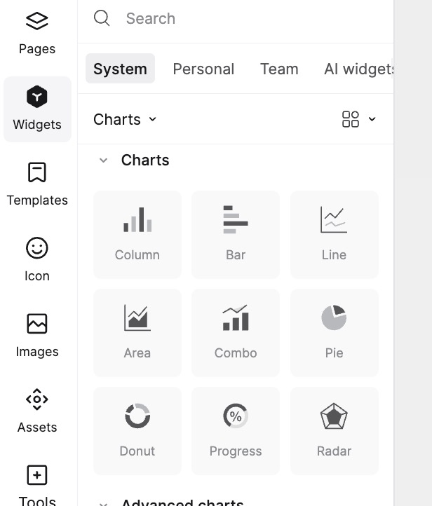
Mockitt offers a variety of chart widgets to help you visualize data intuitively in your prototypes. These include Column charts, Bar charts, Line charts, Area charts, Combo charts, Pie charts, Donut charts, Progress Rings, Radar charts, and more.
Editing Chart Data
You can modify chart data for any chart type using the property panel on the right.
To edit chart data:
- Select Chart Widget: Select the chart on the canvas and click the Edit Data button in the top-right corner of the selection.
- Double-click: Alternatively, double-click the chart on the canvas to open the data window.
- Modify Data: In the data window, you can directly edit values and text. You can add rows and columns, and enter positive or negative numbers.
- Click the + button on the right or bottom to add rows or columns. The system will automatically generate random data to simulate real-world scenarios.
- Click the color block at the far left of each row to change the color for that data series.
Chart Appearance Settings
You can customize the appearance and behavior of your charts in Mockitt.
- Chart Type: Once selected, you can easily switch between compatible chart types in the Appearance panel on the right.
- Theme Color: Choose a color theme for your chart to match your design style.
- Legend & Tooltip: Toggle the visibility of the Legend and Tooltip. If "Tooltip" is enabled, hovering over data points during presentation will display specific values.
- Data Labels: Enable Data Labels to show specific numerical values next to each data series for clarity.
- Prefix/Suffix Unit: Set units that will be applied to axes, data labels, and tooltips (e.g., "$", "%").
- Grid Format: Customize grid lines by selecting styles (solid, dashed, dotted), thickness, and color.
- Animation: Check "Load Animation" to display animation effects when the chart loads.
Axis Settings
- Min/Max Value: Set the minimum and maximum values for the coordinate axis in the right property panel.
- Interval: Define the spacing between numerical values on the axis to ensure data readability.
- Label Angle: Adjust the rotation angle of axis labels to prevent overlapping text and keep the chart tidy.
- Text Style: Customize the font size and color for axis text.
Chart Types
Column / Bar Chart
Used for comparing values over time or across categories. Column charts are vertical, while Bar charts are horizontal. You can toggle grid lines, axes, and adjust label angles in the property panel.
Line / Area Chart
Used to show trends over time. Line charts emphasize the trend of each data series, while Area charts visualize the magnitude of change over time. The "Smooth Curve" option in the property panel allows you to turn jagged lines into smooth curves.
Combo Chart
A combination of Column and Line charts, suitable for dual-axis data presentation.
- In the Appearance panel, you can toggle grid lines and axes.
- Prefix/Suffix units determine the values for the left and right Y-axes (default is unified).
- The Combo Chart must have more than 1 group of data series. The last series defaults to a Line chart (Right Y-axis), while others appear as Column charts (Left Y-axis).
Pie / Donut Chart
Used to show proportions of a whole. Donut charts are a variation that uses a ring shape.
- Switch between Pie, Donut, and Rose charts in the "Type" section of the property panel.
- Adjust the Corner Radius and Inner Radius (for Donut charts). Larger corner radius values make the edges of each sector smoother.
Progress Ring
Used to display progress or percentage completion. This chart does not support data entry via the data window. Instead, set the Inner Radius and Progress percentage directly in the property panel.
Radar Chart
Used to display multivariate data and the relationship between a specific series and other series. Each category has its own numerical axis radiating from the center, connected by lines.