Dynamic Widgets
Overview
A Dynamic Widget is a powerful container that allows you to define multiple States for a single component. It is primarily used to implement interactive animations within a single page without jumping to a new URL.
With Dynamic Widgets, you can change an element's position, size, color, or visibility across different states.
Common Use Cases:
- Popups & Modals: Dialog boxes that appear upon clicking.
- Dropdown Menus: Menus that expand and collapse.
- Tab Bars: Switching content between different tabs.
- Toggle Switches: ON/OFF states.
- Scrollable Areas: Lists or content that scroll within a fixed area.
Creating a Dynamic Widget
- Select Elements: Select one or more widgets on the canvas that you want to include in the dynamic behavior.
- Convert: Right-click the selection and choose Convert to Dynamic Widget.
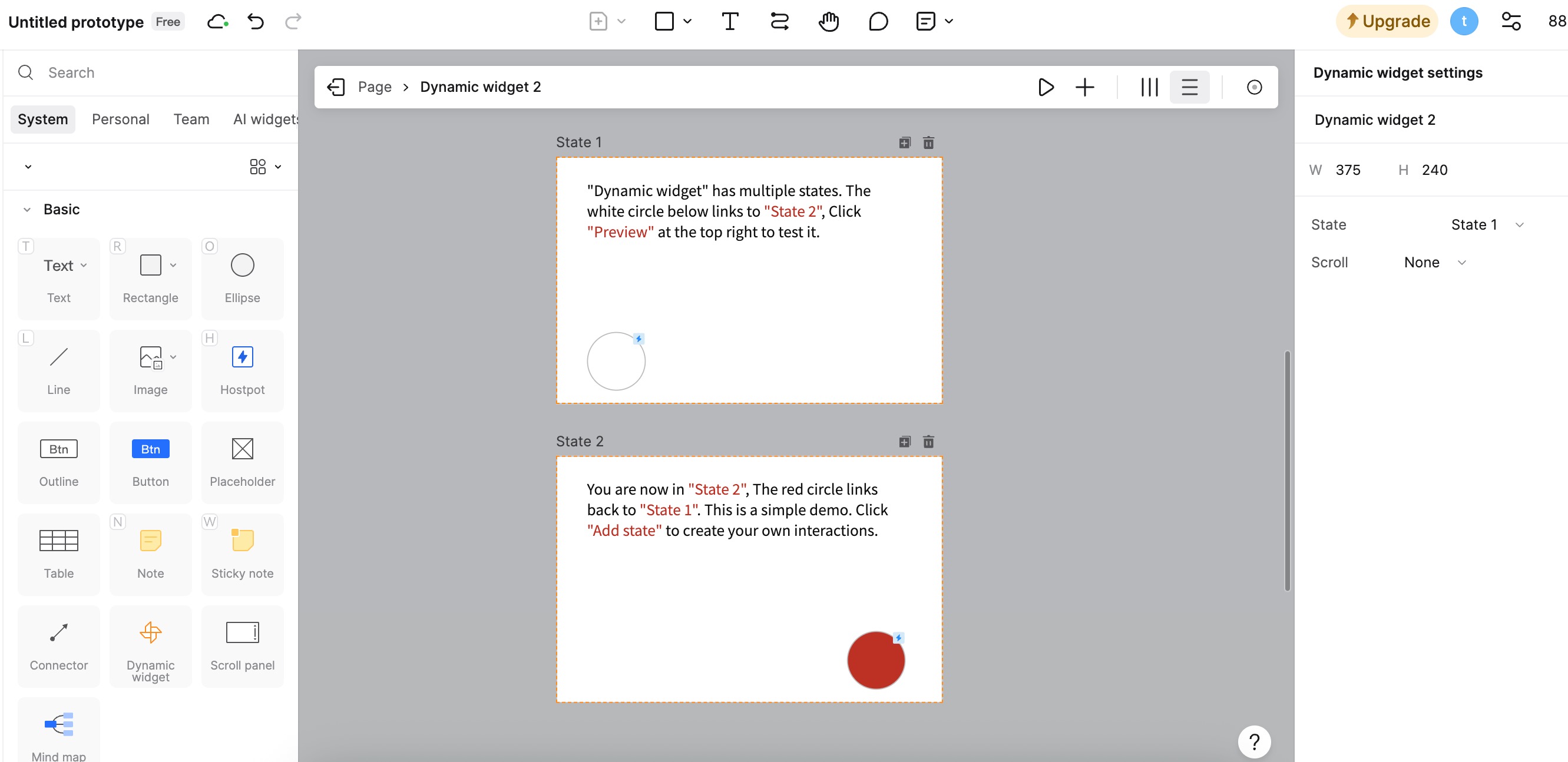
- Edit: Double-click the newly created Dynamic Widget to enter the State Editing Mode.
Managing States
Once inside the State Editing Mode, you will see a state bar at the top of the editor.
- Add State: Click the + icon to create a new state (e.g., State 2). You can duplicate an existing state to keep the layout consistent.
- Modify Content: In the new state, move, resize, or change the color of the elements to define how they should look in this specific state.
- Add Interaction: To switch between states (e.g., click a button to go from State 1 to State 2), you need to add an interaction event inside the Dynamic Widget or from the outside.
- Example: Select a button in State 1, add a Click trigger, and set the action to Switch State -> State 2.
Scroll Settings (Scrollable Containers)
Dynamic Widgets are also used to create local scrolling areas (e.g., a long map inside a phone screen).
- Enter Edit Mode: Double-click the Dynamic Widget.
- Adjust Content: Ensure the content inside the widget is larger/longer than the Dynamic Widget's boundary (the orange frame).
- Set Scroll: Click on the empty area of the state. In the right Appearance panel, set Scroll to Vertical or Horizontal.
- Exit: Click "Exit Editing". Now, that specific area will scroll during the presentation.
Tips
Default Animation: If you want to change the default transition effect (e.g., from "None" to "Smart Animate") for all state switches, go to Preferences (top-left menu) > Default Animation.
Default State: You can decide which state is shown initially when the page loads. Select the Dynamic Widget (without entering edit mode), and in the right Appearance panel, choose the Default State.
Interactions within Dynamic Widgets
Dynamic Widgets are isolated containers, but they can interact with the rest of the project.
To link a button inside a Dynamic Widget to a completely different page:
- Double-click to enter the Dynamic Widget.
- Select the button or element.
- Add an interaction event and set the action to Go to Page.