Navigation Widgets
Navigation widgets are key elements in applications or websites used to guide users through browsing and navigation. They help users access different pages, functions, or content in a structured way.
Navigation widgets are located in Widgets > Built-in. You can double-click or drag them onto the canvas to use them.
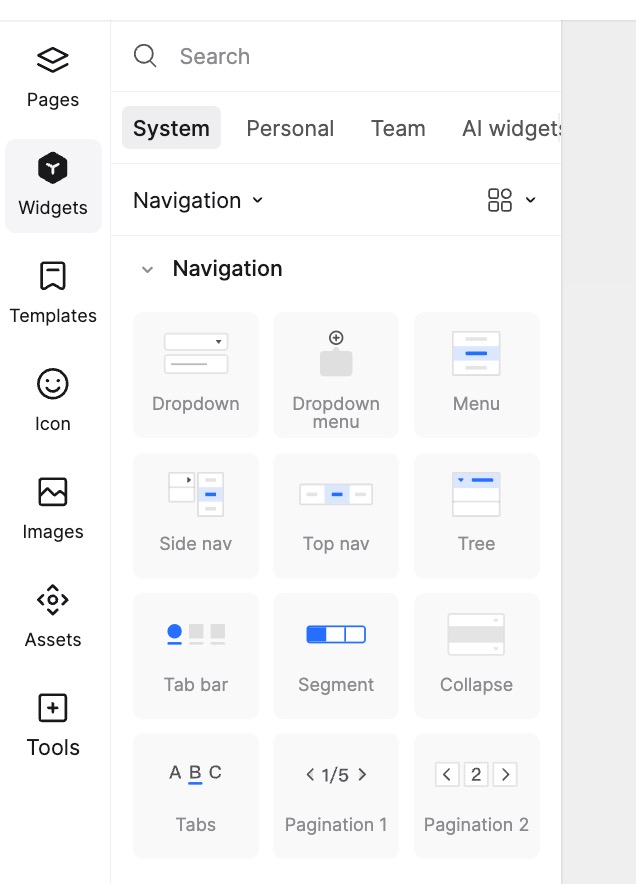
Dropdown Menu
Overview
A Dropdown Menu displays a list of options that users can select by clicking or hovering. When prototyping, dragging the Dropdown Menu widget onto the canvas allows you to implement click-to-jump interactions for dropdown items. By default, the widget has no border and only displays text when placed on the canvas.
Creation and Modification
Drag and Drop: Drag the Dropdown widget from the editor panel to the page.
Settings: In the Appearance panel on the right:
- Button Content: Modify the text displayed on the button.
- Multi-select: The dropdown is single-select by default. Click Support Multi-select to enable multiple selections.
- Display Selection: If enabled, the button text updates to show the selected option during operation.
- Interaction: Set to Click (options appear on click) or Hover (options appear on mouseover).
Add and Modify Options:
- Click the + button in the top right to Add Option.
- Edit the text within the option box.
- Reorder: Drag the handle on the left of an option to change its order.
- Add Event: Click the Lightning icon on the right to add a jump interaction.
- Default State: Click the Dot next to the lightning icon to toggle selected/unselected status.
- Delete: Click the - button to remove an option.
- Multi-select Preview: In multi-select mode, clicking the Circle on the right sets that option's text as the default preview text.
Popup Menu
Overview
When placed on a page, the Popup Menu exists as a Dynamic Widget with pre-configured state-switching interactions. Like other Dynamic Widgets, you can set the Default State and Scrollbar behavior in the Appearance panel.
Creation and Modification
Drag and Drop: Drag the Popup Menu to the desired page.
Add Menu Items: Double-click the component to enter the Dynamic Widget Editor and switch to State 2 to modify options and content.
Adjust Style and Layout:
- Double-click an option box to modify its appearance and text style.
- Add or delete text widgets to change options, adjusting the background height accordingly.
- To adjust the popup animation duration, click the blue lightning icon next to the trigger button and modify it in the right property panel.
Navigation Menu (Vertical & Horizontal)
Overview
We provide three styles: Standard Navigation Menu, Vertical Menu, and Horizontal Menu. They differ in the arrangement of Level 1 options and the expansion method of Level 2 options. Choose the one that fits your needs.
Creation and Modification
Drag and Drop:
- Select the desired menu style and drag it to the page.
- You can switch between styles in the Type settings on the right.
- Toggle Show Icons to display icons before options.
- Accordion Mode: If "Only expand current Level 1 menu" is checked, clicking a Level 1 item collapses others.
Modify Text and Icons:
- Click + to add a Level 1 Option.
- Click - to delete an option.
- Edit the text in the input box. Level 1 options support icon modification.
- Drag the handle on the left to reorder.
- Click the Lightning icon to add interactions.
- Click the Dot to set the default selected state.
- Click the + button next to an option to add a Sub-option (up to 5 levels supported).
Adjust Style: Configure background color, dividers, height, text size, and color for Main Menu, Sub-menu, and Selected Items.
Tree Widget
Overview
The Tree Widget is a powerful tool for displaying hierarchical data, helping you clearly present complex data relationships for easy browsing.
Creation and Modification
Create Tree:
- Drag the Tree Widget to the canvas.
- In the right property panel, toggle icons, checkboxes, and expand/collapse symbol types.
Modify Options:
- Select the Tree Widget and add nodes in the right property panel.
- Specify names, icons, links, or other information for each node.
Adjust Style:
- Customize node appearance, text style, and selection style as needed.
Mobile Navigation
Overview
The Mobile Navigation widget helps you quickly create a bottom tab bar, improving efficiency for mobile app prototyping. Drag Mobile Navigation from Widgets > Built-in to use it.
Creation and Modification
Create Navigation:
- Drag the Mobile Navigation widget to the canvas.
- Toggle icons or text visibility. Hiding one centers the other vertically.
Modify Options:
- Add or delete options (Min: 2, Max: 20).
- Drag to reorder options.
- Click the Lightning icon to add interaction events.
- Click the Dot to toggle the selected state.
Adjust Style:
- Configure the tab bar's fill color, stroke, text, and icons.
- Set specific colors for the Selected Item's text and icon.
Segment Control
Overview
Segment Control is used for Tab Switching and is widely used in mobile interfaces.
Creation and Modification
- Drag the Segment Control to the canvas.
- Use the + and - buttons in the Options section to add/remove segments (Min: 2, Max: 20). Click to edit text (max 50 chars).
- In the right property panel, set corner radius, independent corners, fill color, stroke, text style, and the background/text style for the Selected Item.
Accordion
Overview
The Accordion widget helps organize complex content by grouping and hiding sections.
Creation and Modification
- Drag the Accordion to the canvas.
- Modify Title and Content text in the right property panel.
- Click + to add more sections.
- Configure text style, alignment, independent corners, stroke, and colors for titles and content areas.
Tabs
Overview
The Tabs widget is similar to Segment Control but has slightly different settings. It applies to both Web and Mobile interfaces.
Creation and Modification
- In the right property panel, set text style and the color/style of the underline for the selected item.
- Add or delete options in the Options section. Add interactions to specific tabs using the lightning icon.
- Min: 2 options, Max: 50 options. Text limit: 100 chars.
Pagination
Overview
Pagination is a common UI element used to divide large amounts of content into multiple pages. Pagination 1 is better for Mobile, while Pagination 2 is suitable for PC/Web.
Creation and Modification
- Drag the Pagination widget to the area.
- Set appearance properties like corner radius, independent corners, background color, stroke, and text style in the right panel.
- Set the total number of pages.
- Selected Item Settings: Pagination 1 allows setting font size and color; Pagination 2 allows setting fill color, stroke, font size, and color.