Form Widgets
Form widgets are located in Widgets > Built-in. You can double-click or drag them onto the canvas to use them.
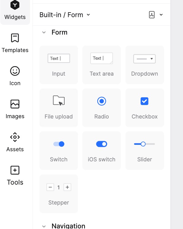
Input (Single/Multi-line)
Use the Single-line Input or Multi-line Input widget to add a text field where users can type during preview.
Difference between Single-line and Multi-line Input:
- Single-line Input: Regardless of the length of the input, it is always displayed on a single line and does not wrap. You can scroll horizontally to view the content.
- Multi-line Input: Text wraps automatically when it exceeds the width of the input box. You can scroll vertically to view all content.
Modify Placeholder Text: Select the widget. In the Appearance panel on the right, you can modify the default placeholder text and its color.
Keyboard Style Settings: For Single-line Input widgets, you can configure the virtual keyboard that appears when the input field is tapped (mobile simulation). Path: Right Appearance panel -> Keyboard Style.
Dropdown
The Dropdown widget reveals multiple options when the arrow is clicked. Users can select an option from the list.
By default, it has 3 options. You can modify the text of these options.
Add Option: Double-click the widget, place the cursor at the end of the last option, and press
Enterto type a new option.Delete Option: Double-click the widget and delete the unwanted option lines.
Set Default Option: The first option in the list is the default selection. To change the default, simply modify the text of the first option.
Note: The Dropdown is treated as a single component. Currently, adding interaction events to specific individual options within this component is not supported.
File Upload
This widget simulates a file upload button. When running the prototype, clicking the Choose File button opens a system file selection dialog. After selecting a file, its name will appear in the label area on the right.
Radio Button / Checkbox
- Radio Button: Allows selection of only one option from a set.
- Checkbox: Allows selection of multiple options.
You can configure these widgets in the Appearance panel on the right.
Set Type:
- Quickly switch between Single Select (Radio) and Multi-select (Checkbox). Round icons indicate single selection; square icons indicate multi-selection.
- Disabled: When enabled, the entire component turns gray and cannot be interacted with.
- Size: Adjust the font size and overall size of the options.
- Alignment: Supports Equal Spacing for Options and Equal Spacing for List. You can adjust the specific spacing value in the numeric box on the right.
Set Options:
- Click the + button in the top right to add an option.
- Click the - button to the right of an option to delete it.
- Click the text within the option box to modify the label.
- Hover over an option and drag the handle on the left to reorder.
- Click the Dot to the right of the lightning icon to toggle the default selected/unselected state.
- Click the Lightning icon to add interaction events (e.g., jump to another page when selected). Refer to Adding Interaction Events for details.
Style Settings:
- Modify the button color and text color for both Unselected and Selected states.
Switch
Drag the Switch widget from Widgets > Built-in > Form Widgets to the canvas. Two styles are available: Android Switch and iOS Switch.
- In the right property panel, you can set the Disabled state, as well as styles for On and Off states.
- If Disabled is checked, the component becomes unclickable and visually dimmed.
Slider
The Slider is used for selecting a value within a range, commonly for adjusting volume, brightness, or parameters.
Note: The Slider is different from a Scrollbar and cannot be used to scroll pages.
- In the right property panel, you can configure the Track (corner radius, thickness, fill color, shadow) and the Thumb (position, size, corner radius, fill color, stroke, shadow).
- Limits: Track width is limited to 2-20 (dropdown shows even numbers, but custom input is allowed). Thumb diameter is 8-80. Thumb stroke width max is 9.
Stepper
Use the Stepper component for making small adjustments to a value (e.g., changing quantity from 1 to 2).
- Modify Value: In the right property panel, you can set the text style, value range (min/max), and default value.
- There are no hard limits on the min/max values (negative numbers allowed). Default range is 0-10, default value is 1. If the current range changes and excludes the default value, it automatically updates to the nearest boundary value.
- Modify Appearance: You can set the corner radius, width, icon size/color, fill color, and stroke style.