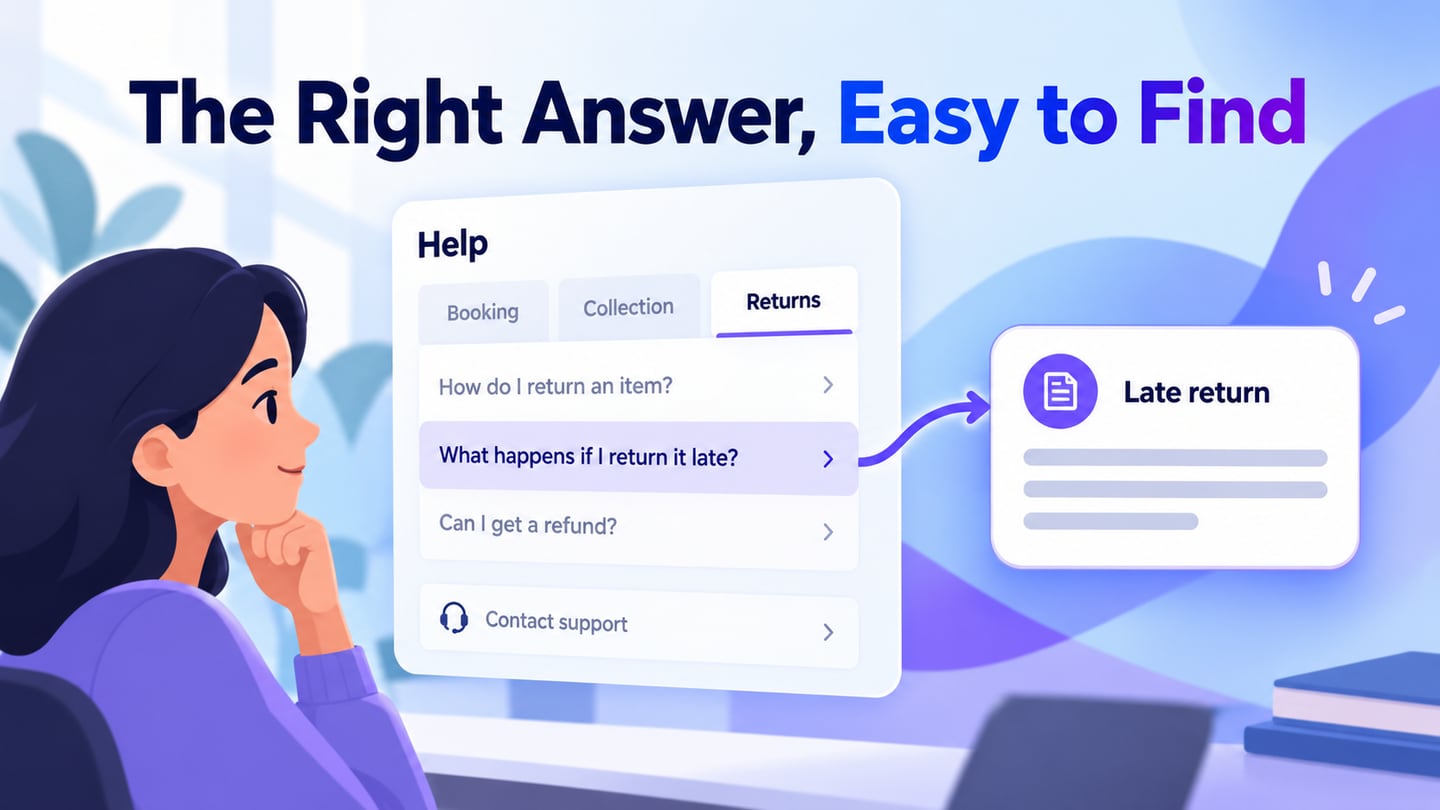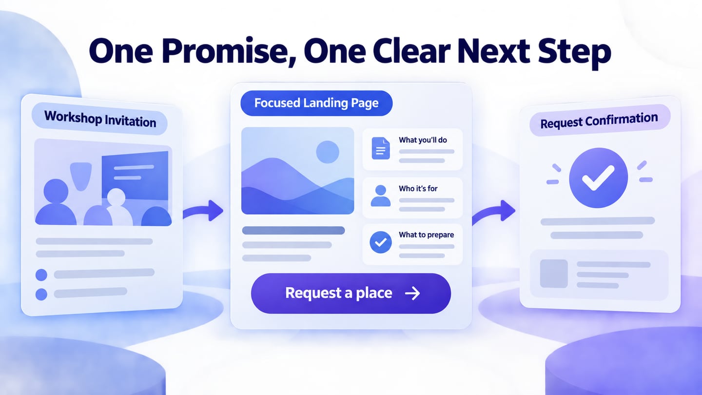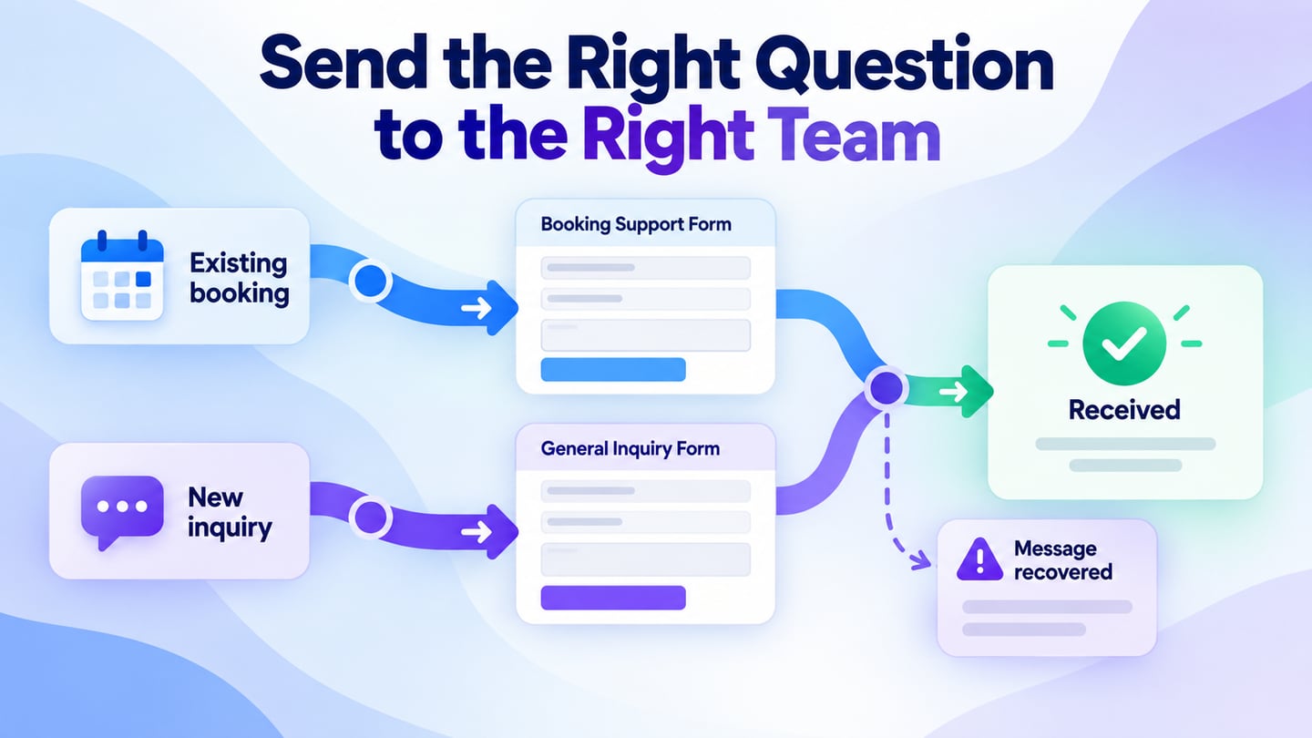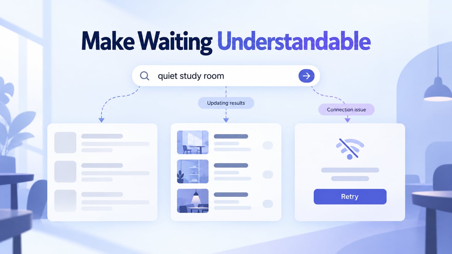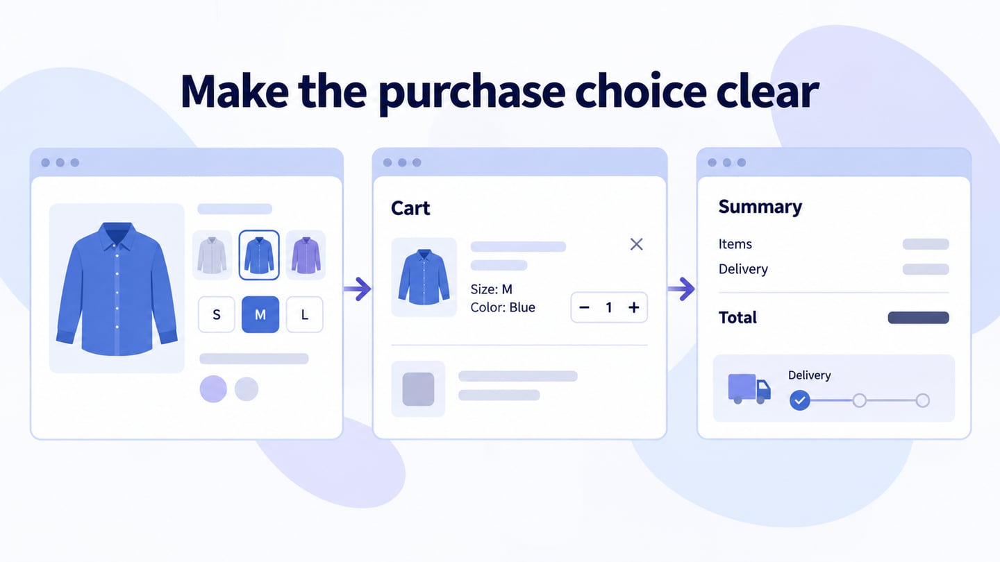
A search page helps a visitor find an item or answer using their own words. Prototype the query, results and recovery states in Mockitt’s online prototyping workspace before styling the search icon. A large field is useful only when the results and next steps support the task.
Design search page online
Start with the content being searched and the questions people bring to it. A product catalog, a news archive and a help center need different result details and filters. Define the scope in the field label or nearby text.
Parts of the search prototype
- A visible, understandable query control with a clear submit action.
- Optional suggestions with a defined selection and dismissal behavior.
- Results whose titles, summaries and metadata help the visitor choose.
- Loading, empty-query, no-result and failed-request states.
- A way to refine the query or filters without losing the current context.
If the search entry sits in a shared header, coordinate its behavior with the header navigation. Opening a search panel should not hide its close control or trap the visitor.
Build a search task in Mockitt
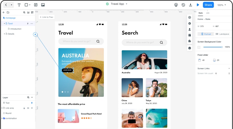
Step 1: Define the search scope
Choose what can appear in the results and what information distinguishes useful matches. For an equipment catalog, that might include item name, category, availability and relevant specifications. Use fictional or approved sample records for the review.
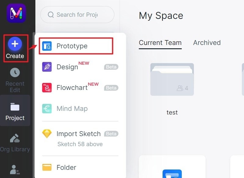
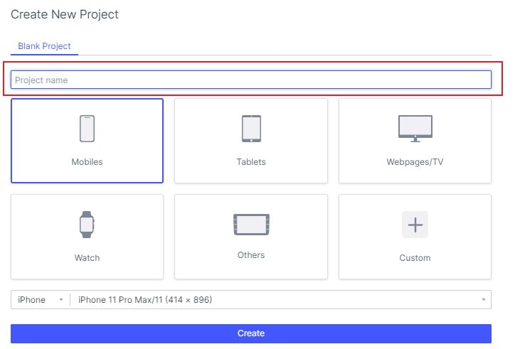
Step 2: Name the project
Create the main result view and the states needed to test it. Name the project for the search task and review both a wide layout and a narrow one. The retained screenshots show an earlier editor, so use them as workflow references rather than current toolbar instructions.
Step 3: Arrange the input and result area
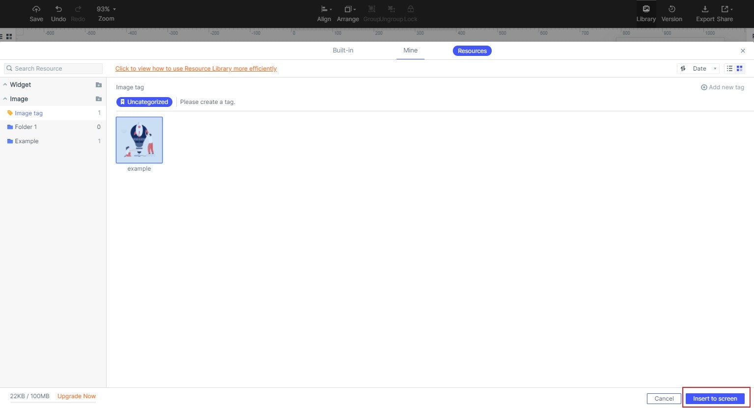
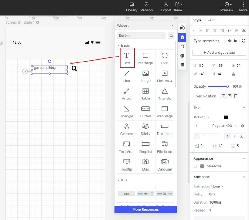
Place a clearly labeled field and submit control before the results. Add imagery only where it helps identify a match. The historical image-library screenshot demonstrates inserting an asset; it does not establish how a production search engine retrieves or ranks content.
Step 4: Connect the query, filters and outcome
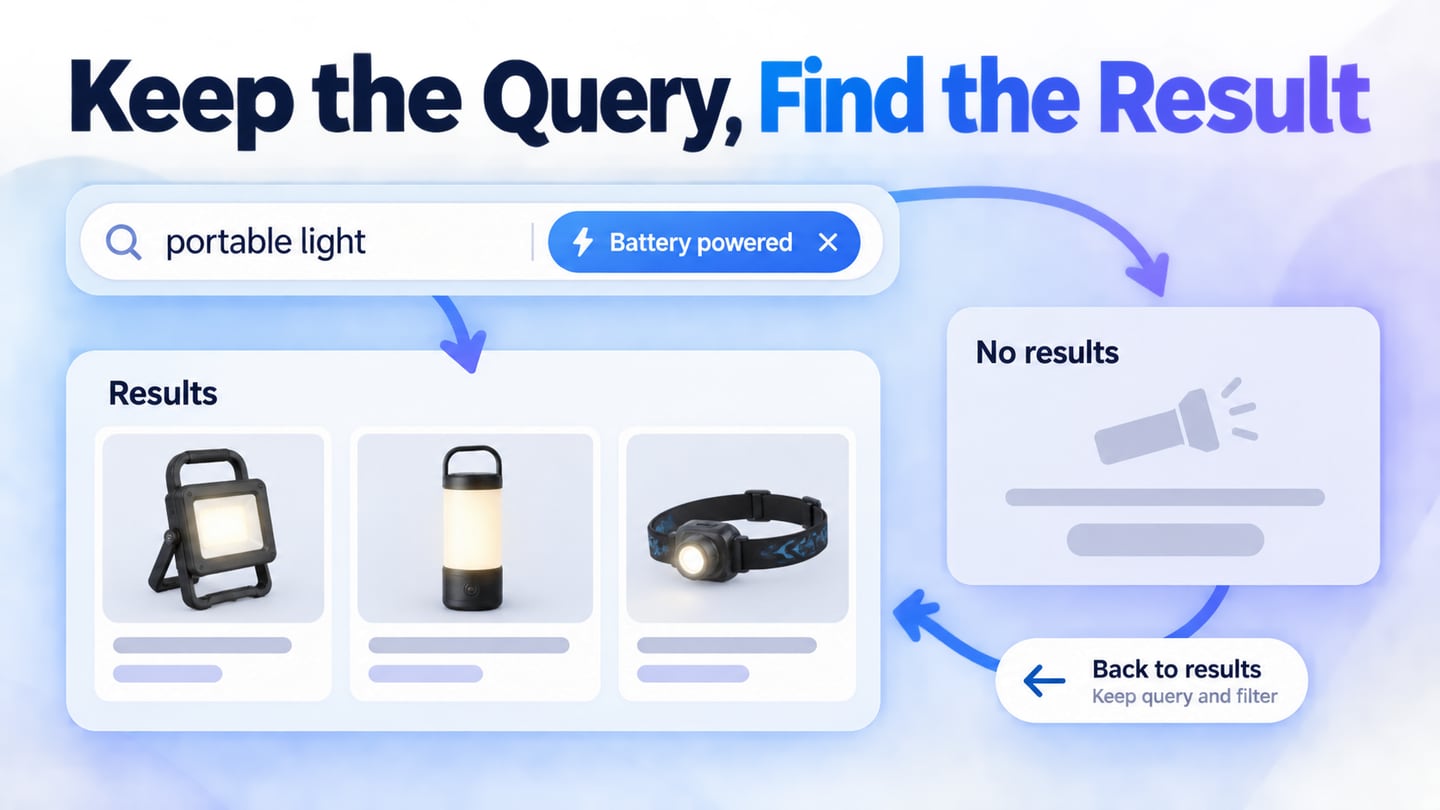
For an illustrative equipment catalog, a visitor searches for “portable light.” Results show item names, power source and availability, with a Battery powered filter. Selecting the filter narrows the list and displays it as an active choice. The query remains visible so the visitor can refine it without starting again.
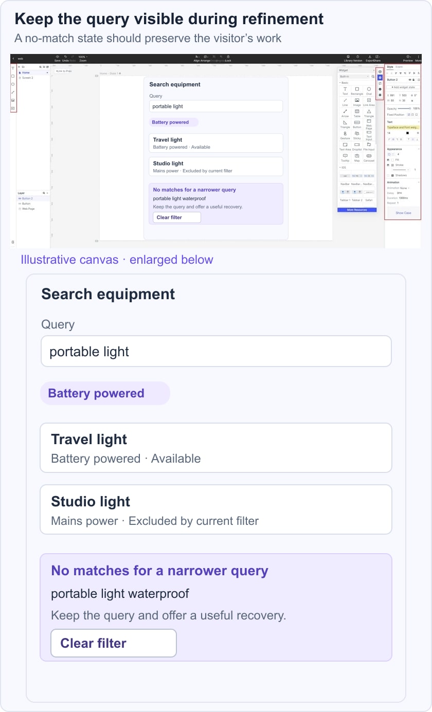
Now test “portable light waterproof” when there is no matching item. Explain that no results match the current query and filter, offer to clear the filter and keep the typed query available. Do not silently replace it with an unrelated popular product. If suggestions are offered, review the W3C combobox pattern for keyboard selection and dismissal behavior. For the interaction before results appear, use the search autocomplete behavior guide to define selection, Escape, and late suggestions.
Connect a result to its detail page and test returning to the list. The query, selected filters and useful position should be preserved where appropriate. Document this behavior for implementation instead of assuming that linked prototype screens provide it automatically.
A search with zero matches is different from a missing URL. Use the 404 recovery pattern for missing resources, while a valid search page explains the query outcome and offers refinement.
Five historical search references and their lessons
1: Bike Tours.com
The original BikeTours reference focuses on travel discovery. The durable design question is how to help someone who has a broad destination or trip type in mind without assuming they know the exact tour name. Use verified, current inventory data if your search interface displays destination or package counts.
What to inspect
- Keep the search entry discoverable near the browsing context.
- If suggestions are shown, distinguish a destination from a tour category so selecting one has a predictable meaning.
Apply the pattern
- Use filters that reflect meaningful differences in the available trips rather than presenting every field in the database.
- Do not automatically select a suggestion merely because it appeared. Test typed queries, keyboard selection and dismissing the suggestion list.
2: City of Boston
The City of Boston reference concerns a broad service website. A visitor may search for a task using everyday language rather than the name of a department. Search needs to connect those terms with an understandable destination.
What to inspect
- Make the search control recognizable in the shared navigation.
- When the field expands, preserve a clear close or return action and a sensible focus position.
Apply the pattern
- Large icons do not replace accessible names or a clear description of the search scope.
- Result summaries should explain the service or next step, not merely repeat a department title. Review common synonyms and unsuccessful queries with the content owners.
3: Techcrunch
The TechCrunch reference concerns a news archive. For editorial search, dates, article titles and concise summaries can help readers distinguish current reporting from an older piece on the same subject.
What to inspect
- Place the search entry consistently with the site’s other navigation.
- Keep the active query visible after submission so a reader understands why the results appeared.
Apply the pattern
- A compact search control still needs sufficient space for the entered query and a clear submit action.
- Suggestions are optional. If implemented, test them with long titles and the keyboard, and do not imply that a historical page has a current autocomplete feature without verification.
4: Harvard Law Review
The Harvard Law Review reference concerns a publication with specialized material. The search design should help readers identify relevant articles through accurate titles and metadata; it should not imply that every result provides personalized legal advice.
What to inspect
- Use a recognizable search label and a stable place to enter the query.
- Allow the visitor to revise the terms without losing the surrounding search context.
Apply the pattern
- Distinguish query suggestions from actual result titles and explain any available date or content-type filters.
- If a result count is shown, keep it consistent with the active query and filters. Avoid displaying a precise count that does not match what the reader can reach.
5: PetCareRx
The PetCareRx reference combines products and articles. Mixed results can be useful when a query expresses either a purchase task or an information need, but the result type must be clear.
What to inspect
- An expanding search field should remain usable on touch screens and with keyboard focus.
- A label such as “Search products and articles” can explain the scope before the visitor types.
Apply the pattern
- Use type filters or clear result labels when products and informational pages appear together.
- A product result may need price and availability, while an article needs a useful title and summary. Do not make them visually identical if that hides their different destinations.
Conclusion
Review search as a sequence: enter a query, inspect suggestions if present, choose or refine results, open a destination and return. Test misspellings, long queries, empty results and a failed request.
Use the W3C labeling guidance for the input and any filters. For an editorial archive, the blog listing guide helps coordinate search with topic browsing. A good search page makes the query and its consequences understandable, including when it cannot find a useful match.