A blog page helps readers choose what to read next. Its design should make topics, article promises and reading paths clear. Use Mockitt’s online prototyping workspace to review the index with realistic article cards instead of judging a grid filled with repeated placeholder titles.
Use these ten design themes as checks for a maintained blog. It focuses on the listing page: the place where readers browse, search and select articles, rather than the typography of a single article.
Prototype the blog index with real content
Begin with an article inventory: title, topic, useful summary, cover and any trustworthy date information. Identify the difference between an editorially featured story and the latest published material so the interface does not imply that both lists are ordered by recency.
Choose a small set of reader tasks, such as finding a beginner guide, returning to a known topic or searching for a specific problem. Each task should have a visible route through the page.
Include these elements in the first prototype:
- A page title that explains the collection and a short statement of its scope.
- Article cards whose title, image and summary describe the same intent.
- Topics or filters that reflect the actual content inventory rather than a long list of near-duplicate labels.
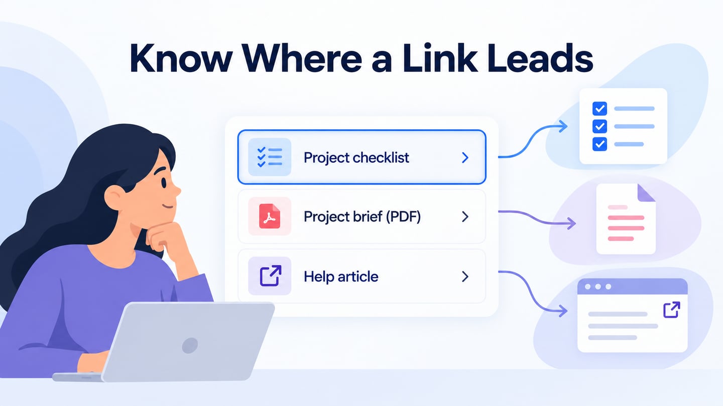
- A clear link target for each card, with an understandable article title rather than repeated “Read more” text alone.
- The loading, empty and no-result states needed for browsing or filtering.
- Pagination or another predictable way to reach older articles without losing the current position.
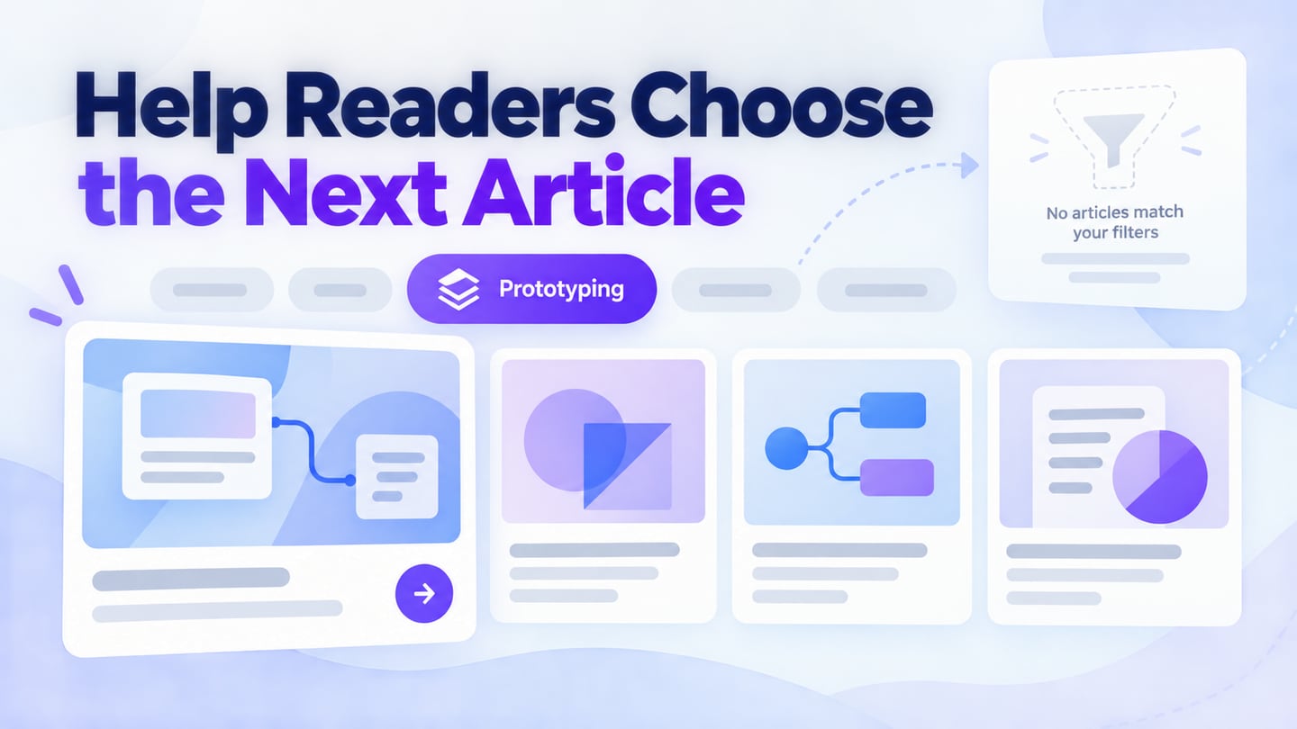
For an illustrative Product Practice blog, use three topics: Research, Prototyping and Delivery. Feature one onboarding-research guide, then show a latest-articles list with distinct titles and summaries. Selecting Prototyping narrows the list and leaves the active topic visible above the results.
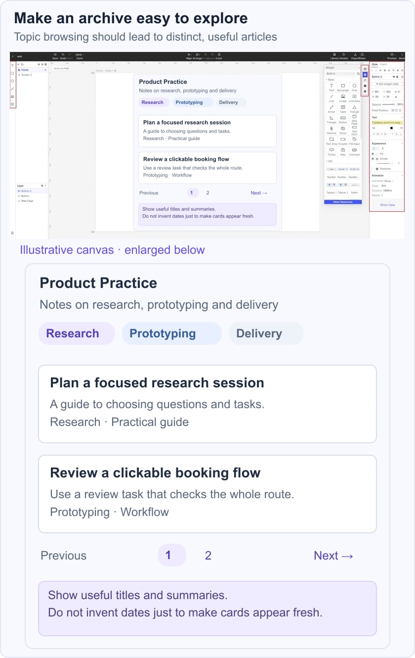
Test a reader looking for an error-state prototype tutorial. They should not have to interpret three nearly identical “Best design tips” cards. Give each card a specific promise, and keep its cover consistent with the article it opens. When a filter has no matching articles, offer a way to clear it rather than showing an unexplained blank grid.
- Create the listing, a filtered view and the empty-result state.
- Populate them with short, long and multi-line titles, not only ideal-length examples.
- Connect a card to an article and a search control to a realistic search-results layout. Test returning to the original list without losing the selected topic.
Ten historical blog references and the patterns they suggest
#1: Microsoft stories
The Microsoft Stories reference emphasizes an editorial grid and recognizable brand expression. A grid is useful when readers need to compare several story choices, but it should not make every item appear equally important. Identify whether an item is featured, recent or part of a series, and keep those signals consistent across the index.
#2: Pando
The Pando reference focuses on consistent visual treatment. Color and typography can help unify a collection, but the original unsupported brand-recognition percentage is not needed to justify a coherent system.
Use a limited set of card treatments and reserve stronger emphasis for a defined editorial purpose. If every card has a different font, badge and background, readers may spend more effort decoding the layout than choosing an article.
#3: Fubiz
The Fubiz reference suggests discovery by interest. Filters can be useful when they reflect meaningful differences in the content. Avoid describing a historical filtering interface as a current personalization feature without checking it. Start with a small, understandable set of choices and show the active filter and result count clearly. A visually attractive cover should still communicate the article’s subject.
#4: Brit + Co
The Brit + Co reference emphasizes colorful imagery and an orderly collection. Images can invite exploration, but the titles and summaries need to carry enough information for readers who cannot interpret the image.
Create a cover system that allows different subjects to remain distinct. Reusing the same finished image with a new title weakens the reader’s ability to recognize an article later.
If a Trending area exists, define how items enter it. Do not label a manually chosen list as popular unless there is a reliable basis. A social-sharing control is optional and should not compete with the article’s own link.
#5: Help Scout
The Help Scout reference highlights a restrained card system and generous space. The useful lesson is giving the article promise room to breathe rather than treating blank space as waste.
A lead story can be larger than the rest, while the remaining cards follow a predictable hierarchy. Test the image crop at both card and article sizes; a cover that explains the topic should not lose its important text or diagram when displayed as a thumbnail.
#6: Webdesigner Depot
The Webdesigner Depot reference includes sharing and navigation aids. Shared controls should remain secondary to the reading task. A long listing needs a clear position and a reliable route to more content, not a collection of competing floating icons.
Keep the shared header, card styles and page controls consistent, then check that long titles and missing images do not break the alignment. Consistency is a maintenance practice as much as a visual choice.
#7: Crew
The Crew Backstage reference uses one prominent story before the rest of the collection. This can work for a deliberately curated publication, provided returning visitors can still locate new or previously seen articles.
A large featured story should not imply that every other article is less useful. Show why it is featured through its topic or editorial context, and provide a clear route into the broader collection. A particular blue shade alone does not prove trust.
#8: 500px
The 500px reference puts photography at the center of discovery. This is appropriate when the images themselves are part of the editorial value. Optimize the files for their rendered sizes, preserve their aspect ratios and keep titles readable without the image. Do not use an unsupported sharing multiplier to justify oversized media.
#9: Pixelgrade
The Pixelgrade reference connects the blog’s presentation with the wider brand. Align navigation and type hierarchy with the main site while allowing article covers to express different subjects. A brief, accurate excerpt helps readers choose; a clipped generic introduction may tell them very little. Check that the visible title matches the title of the destination article.
#10: Charity: water
The charity: water reference uses photography and impact stories. The important distinction is between the story being told and the action the organization wants readers to take.
The original anniversary reference is historical, not a current campaign. If an index highlights an old milestone, label its context accurately. A donation or other conversion action can remain available without interrupting every card or obscuring the archive.
Before release, verify the titles, covers, dates and destinations together. A useful missing-page design is a fallback, not a reason to leave broken article cards in the index.
Maintain the listing after publication
Keep original publication dates and meaningful revision dates distinct. Do not refresh the visible date merely because a card style or internal link changed. When an article moves into a different topic, update filters, pagination and related recommendations together.
Test keyboard traversal through cards and page controls, meaningful heading order, narrow-screen reading and the empty state. Use the W3C heading guidance to keep the collection understandable beyond its visual grid. Coordinate the shared site navigation so the blog feels like part of the same website.