Online UI Design for Apps and Websites
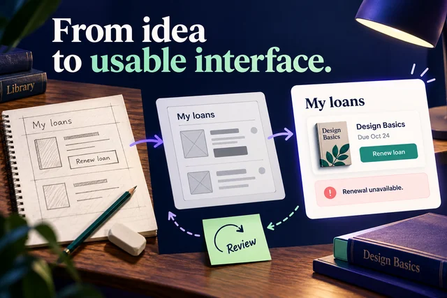
Arrange interface components, connect screens into interactive flows, and review app and website prototypes with your team.
 Try for Free


Why Prototype Interfaces with Mockitt?
Build the interface from reusable parts

Components for common UI patterns
Arrange navigation, buttons, inputs and dialogs around the task. Reuse a pattern across screens so the team can review it consistently.

Adapt a useful starting layout
Start with an existing layout when it fits the task, then replace its content, controls and states with the needs of your product.


Show what happens when someone acts

Connect the user flow
Link screens and actions so a reviewer can attempt the task from its starting point to the result. Include a route back to change a choice.

Choose the right trigger
Use triggers such as click or hover to demonstrate the intended response. Explain important states that are not obvious from the default screen.

Use motion with a purpose
Adjust transitions and animation settings to show a change of state, a relationship or feedback. Keep the task understandable without decorative motion.
Review the interface in the same context

Edit together
Work on the shared prototype with teammates and discuss the changes as they appear. Agree which flow and version the review will cover.

Keep feedback beside the screen
Share a prototype link and use comments to record specific questions. Ask reviewers to explain what they expected and what the interface actually communicated.


Keep the interface connected to its requirements

Map the task first
Use a flowchart or mind map to outline the task and its decisions before expanding the interface. Refer back to that structure when a screen or state changes.

Explain the rules behind the screen
Keep the relevant requirements with the prototype so reviewers can understand the scope, constraints and unresolved questions. A clear screen still needs clear business rules.
Review an interface around a complete task
 App interfaces
 Dashboard interfaces
 Website interfaces

Make the app task clear on a small screen

Group the content around the main action

Keep controls and labels consistent across the flow

Review the default, error and completed states

Design the work behind the dashboard

Choose table columns that support the decision

Show how filters, selection and details work together

Explain empty results and unavailable actions

Connect a website visit to a useful outcome

Make the page hierarchy and navigation clear

Use meaningful labels for links and calls to action

Review the route from entry page to completion
Keep team work connected
Shared product context
Keep requirements, prototypes and design material available to the people reviewing the work.
Team access and organization
Organize shared projects and agree who can access and edit the work. Review team access as responsibilities change.
Bring existing work into the review
Import supported design files, then inspect the result and adjust the elements that need attention.
Reusable team resources
Share approved design assets so the team can reuse the same patterns across projects.
Shared product context
Keep requirements, prototypes and design material available to the people reviewing the work.
Team access and organization
Organize shared projects and agree who can access and edit the work. Review team access as responsibilities change.
Bring existing work into the review
Import supported design files, then inspect the result and adjust the elements that need attention.
Reusable team resources
Share approved design assets so the team can reuse the same patterns across projects.