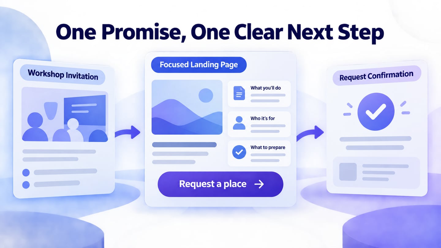
A landing page should connect the promise that brought someone there with a useful next action. Start with the visitor’s task, then use Mockitt’s online prototyping tool to test the message, evidence and action together. An attractive layout alone does not establish that the offer is relevant or that the next step works.
Define what you need to learn before collecting analytics. Track an appropriate task outcome, such as a completed request, without assuming that every visit permits unrestricted collection of personal data.
Use the web and app references to distinguish a focused campaign page from a broader homepage or an app-store promotional image. The examples are historical visual references, not current pricing or performance claims.
Wireframe the offer before decorating the page
Write one sentence describing the intended visitor, the problem and the next step. If those are unclear, a more expensive design tool or a more elaborate template will not resolve the brief.
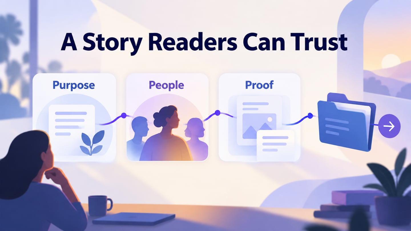
Gather the material needed to support the promise: a product view, an example deliverable, a clear explanation or approved evidence. Remove claims that cannot be substantiated before the visual layout makes them look authoritative.
Arrange the first screen around a headline, a short explanation and the main action. Secondary information should help a reader decide, not introduce an unrelated conversion goal.
Mockitt can help you arrange and connect the proposed screens. Use realistic copy and show where the main action leads. A prototype demonstrates the flow; it does not itself publish a campaign, process a signup or measure conversion.

Review these parts of the prototype as a connected experience.
From wireframe to a testable landing page
Keep the first pass simple enough that reviewers focus on the meaning and order of the content.
Assets
Use reusable text, image and button elements for consistency. A shared style should not make every section equally prominent; the hierarchy needs to distinguish the promise, its supporting evidence and the action.
Design | Presentation
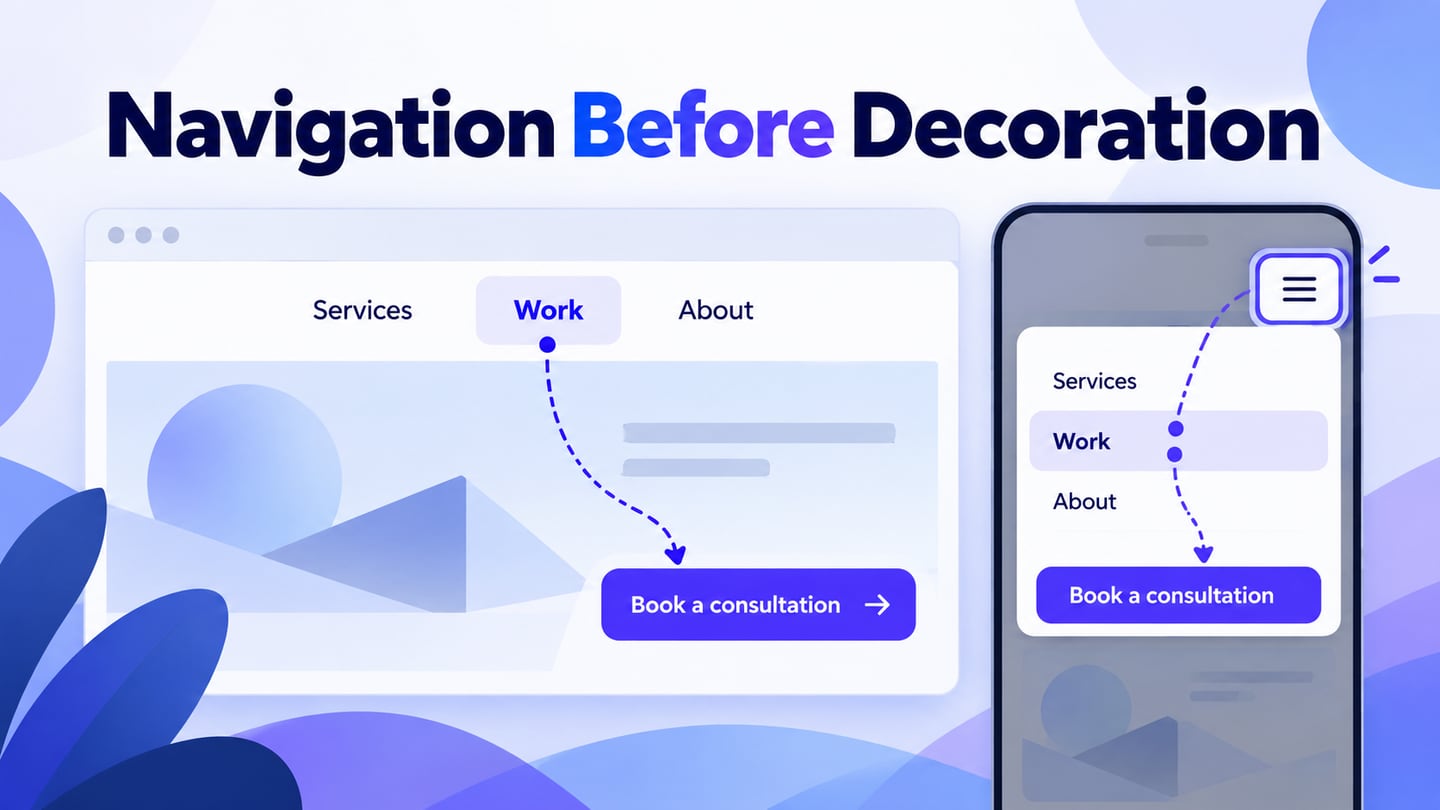
Connect the main button to the actual kind of next step: a request form, a product workspace, an app store or a download explanation. The button label should set that expectation before the reader selects it.
Cloud | Collaboration
Share the flow with someone who understands the audience and someone unfamiliar with the offer. Ask what they expect to happen next, then compare that expectation with the destination.
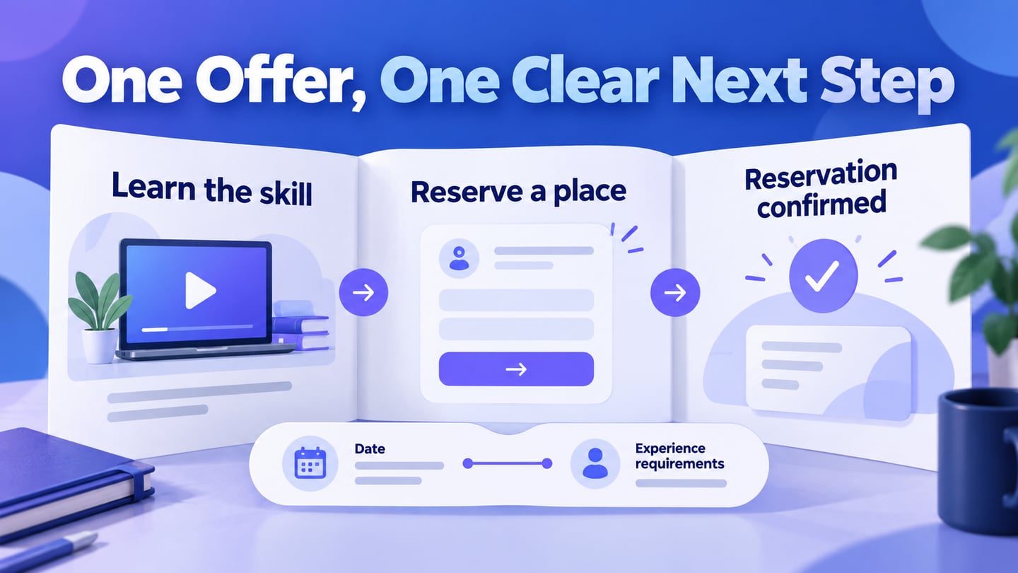
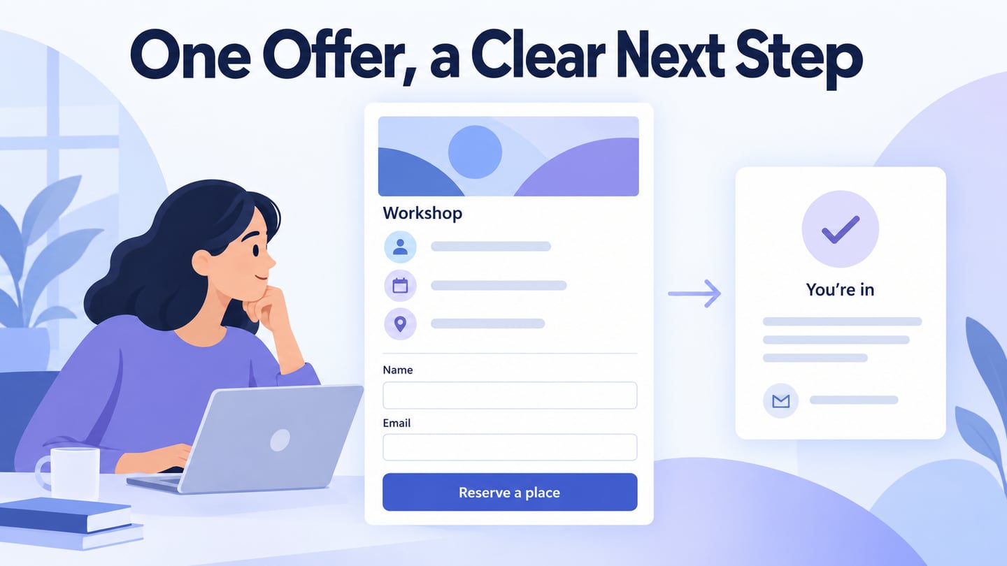
For an illustrative workshop landing page, the visitor arrives from an invitation to a remote research-planning session. The headline explains the task, the page states the session format and prerequisites, and “Request a place” opens a short request form. The confirmation explains the next step rather than pretending a place is confirmed before availability is checked.
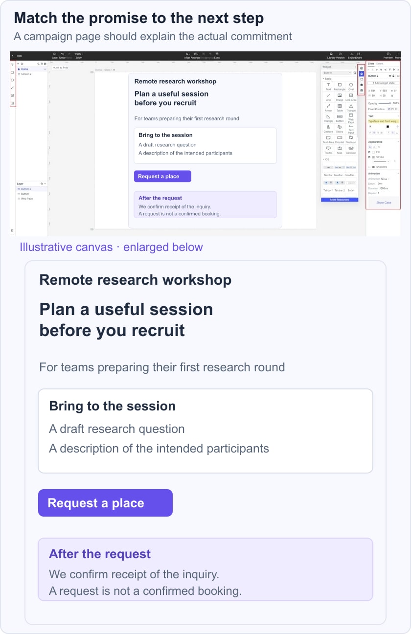
Test message match from the invitation through the confirmation. If the invitation says “workshop” but the page promotes a general newsletter, the flow has broken its promise. Keep necessary terms close to the action and show an unavailable-session state so the review covers more than the ideal path.
Ten historical web and app-promotion references
Use these references to study a specific design choice. Their original screenshots may show an older homepage, feature page or app-store image rather than a dedicated campaign landing page.
Landing Pages for Web:
1. Landing Page Design Example-Trello
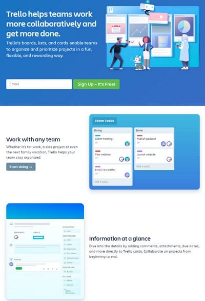
The Trello capture puts a collaboration message, a signup field and product views near the beginning. The useful idea is connecting the stated outcome with a visible product context. For your own page, check whether the visitor can tell what they will create or accomplish after the first action.
Describe free access or a trial accurately according to the current offer. Do not characterize every free signup as a trick, and do not imply that a historical screenshot establishes today’s plan limits.
2. Landing Page Design Example-Moz
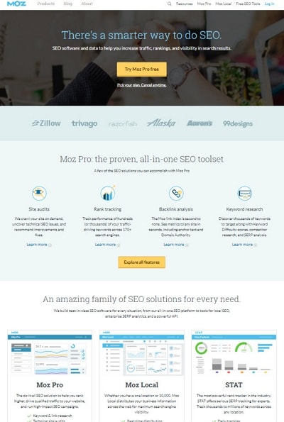
The Moz capture introduces an SEO toolset and then expands into several product areas. It illustrates how a broader product page can support exploration, but that is different from a single-purpose campaign page.
If the campaign asks for one specific action, remove unrelated destinations only where that helps the task and does not hide necessary information. A clear offer and honest conditions matter more than whether the design resembles another tool’s page.
3. Landing Page Design Example-Marketo Engage
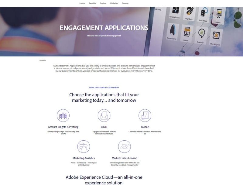
The Marketo capture shown here is an engagement-applications overview, not the ebook signup page described in the old text. Its visible structure moves from a broad statement to application categories.
The lesson is to make the scope understandable before asking for a commitment. If your own offer is an ebook, show what it covers and explain the form requirements; do not use a product overview as evidence of that download flow.
Choose the layout according to the actual offer, and make the action label match the promised result.
4. Landing Page Design Example-Microsoft
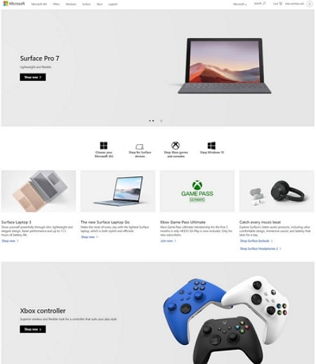
The Microsoft capture is a historical retail homepage with several product and shopping routes. It is not evidence of a gated ebook campaign. This is useful as a contrast: a homepage supports multiple tasks, while a focused landing page needs a deliberate primary path.
For a specific product campaign, carry the visitor to the relevant product details or action rather than sending them into an unrelated general directory.
5. Landing Page Design Example-Hootsuite
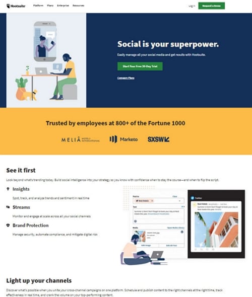
The Hootsuite capture combines a product promise, a trial action and feature sections. Treat visible logos and statistics as claims belonging to that historical capture, not evidence available for reuse in your own campaign.
If a trial is the action, explain what starts, what access is included and what happens later. Keep those terms consistent with the signup destination and the maintained pricing information.
Landing Page Design for Apps
The following images show app promotion and store-style panels. They illustrate how a product task can be introduced visually; they do not demonstrate the complete web landing-page flow.
1. Landing Page Design Example-Cash App
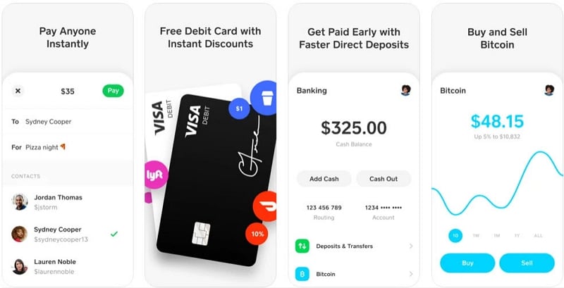
The Cash App panels pair short benefit statements with interface views. This approach can help visitors understand different tasks, but a landing page should select the views relevant to the campaign instead of presenting every feature at once.
When an action opens an app store, identify the destination and supported platform. Financial features and eligibility require their own current documentation; do not infer them from an old promotional image.
2. Landing Page Design Example-BrightLock
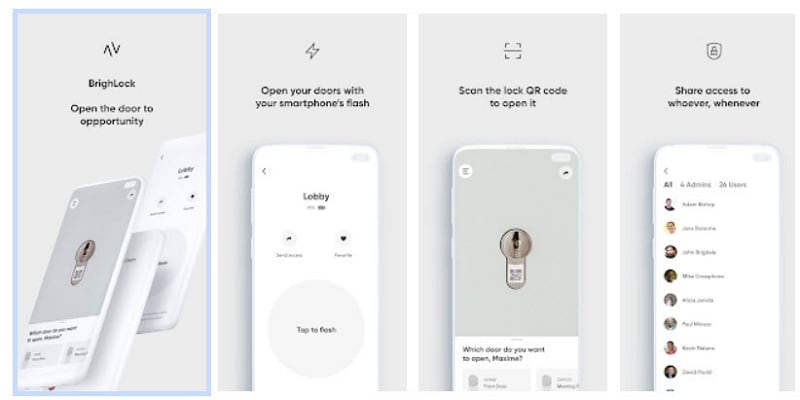
The BrightLock panels explain a physical-product interaction through a short visual sequence. The useful pattern is showing the steps that make an unfamiliar product understandable. Verify hardware requirements and current availability separately before repeating a capability claim or inviting a purchase.
3. Landing Page Design Example-Ibotta
The original Ibotta reference focuses on a simple entry into a cashback-related app. For any reward offer, explain eligibility and conditions clearly; avoid unsupported claims that a product dominates the market or that every visitor will receive a benefit.
A concise page can still need an example of how the task works. Use the few details required to set expectations, then send the reader to an appropriately labeled next step.
4. Landing Page Design Example-Carly
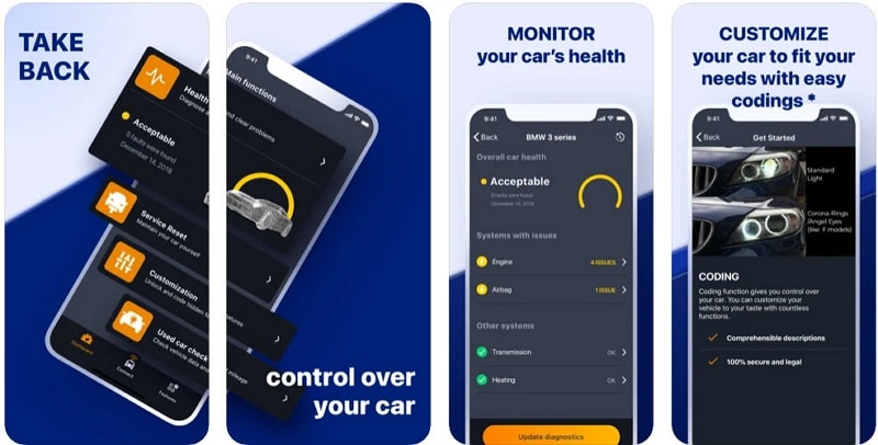
The Carly panels show automotive tasks using product screens. That is useful for connecting a technical feature to a recognizable purpose. If your campaign includes a savings estimate, state its source, assumptions and applicability rather than treating the number as universal.
5. Landing Page Design Example-Aaptiv
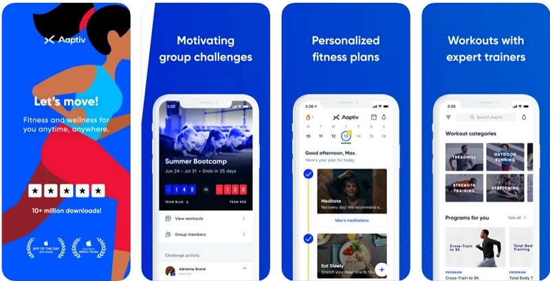
The Aaptiv panels show different activities through app views. Their historical download and award statements are not current evidence. The design lesson is the relationship between a short task label and the relevant screen, not the alphabetical position of a brand name or an assumed marketing result.
Review the entire promise-to-action flow on desktop and mobile. Check the signup step if one is involved, including errors and confirmation, rather than stopping the review at the main button.
Keep one clear primary task, use evidence you can support and make essential conditions visible. A longer sales page may need more explanation, but it still needs a coherent next step. For forms, apply the W3C guidance on labels so the requested information remains understandable.