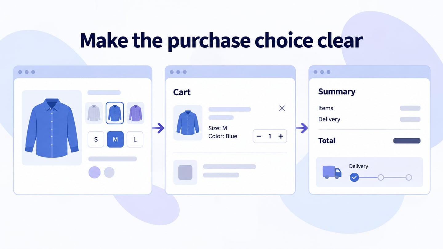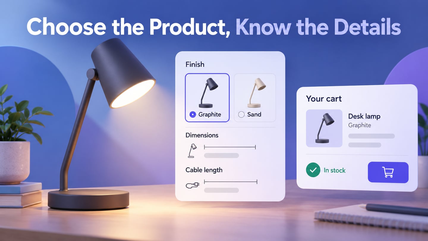
A product page should help someone decide whether a particular item fits their needs and what they are selecting. Use Mockitt’s online prototyping workspace to test the relationship between images, details, variants and the cart action. A polished page cannot substitute for accurate product information.
Start with the questions a customer must answer: What is it? Will it fit? What is included? Which option is selected? What does it cost, and when can it be obtained? Give those questions a deliberate place in the layout.
The original eight references are retained as design themes, not a current ranking or a claim about the stores’ present interfaces. Use each theme to examine a specific decision in your own page.
A product detail page differs from a campaign landing page: it must support evaluating an item and its available options, even when the visitor enters through a search result.
Prototype the selection task
Gather approved product descriptions, images, specifications, variant names and availability rules. Identify which information changes with the selected option and which remains constant.
Use a realistic item and several states rather than filling the page with an idealized placeholder. Include an unavailable option and a longer product name so layout problems emerge early.
Mockitt
Mockitt can help arrange the page and connect selection states. Use the prototype to discuss how the choice affects images, price and the next action. The prototype does not provide live inventory, order processing or a verified product review system.

Keep the task clear while you build the screens.
Elements to review
Choose the elements needed for this product rather than adding every common ecommerce feature.
- Product evidence: include images or diagrams that answer questions about scale, material, use or what is included. Decorative photography alone may leave important details unclear.
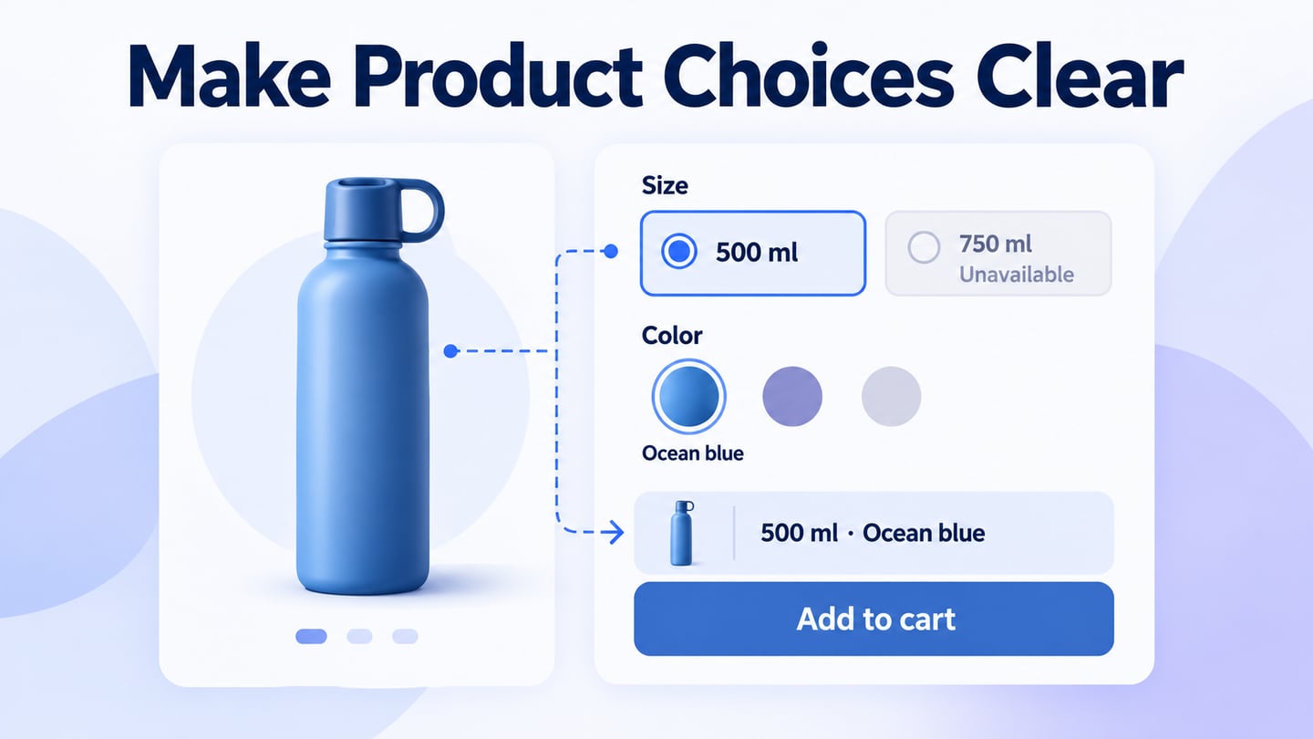
- Selection states: show which variant and quantity are selected, which choices are unavailable and how the price changes. Labels should remain understandable without relying only on color.
- Shared review: ask product, support and implementation owners to check accuracy and behavior. Record any unconfirmed specification instead of presenting it as established.
For an illustrative desk lamp, show the selected finish as “Graphite,” the cable length as 1.8 m and the price as $48. Selecting “Sand” changes the image and label. If that finish is unavailable, replace the purchase action with an accurate availability message; do not let the page add a different finish without the customer’s choice.
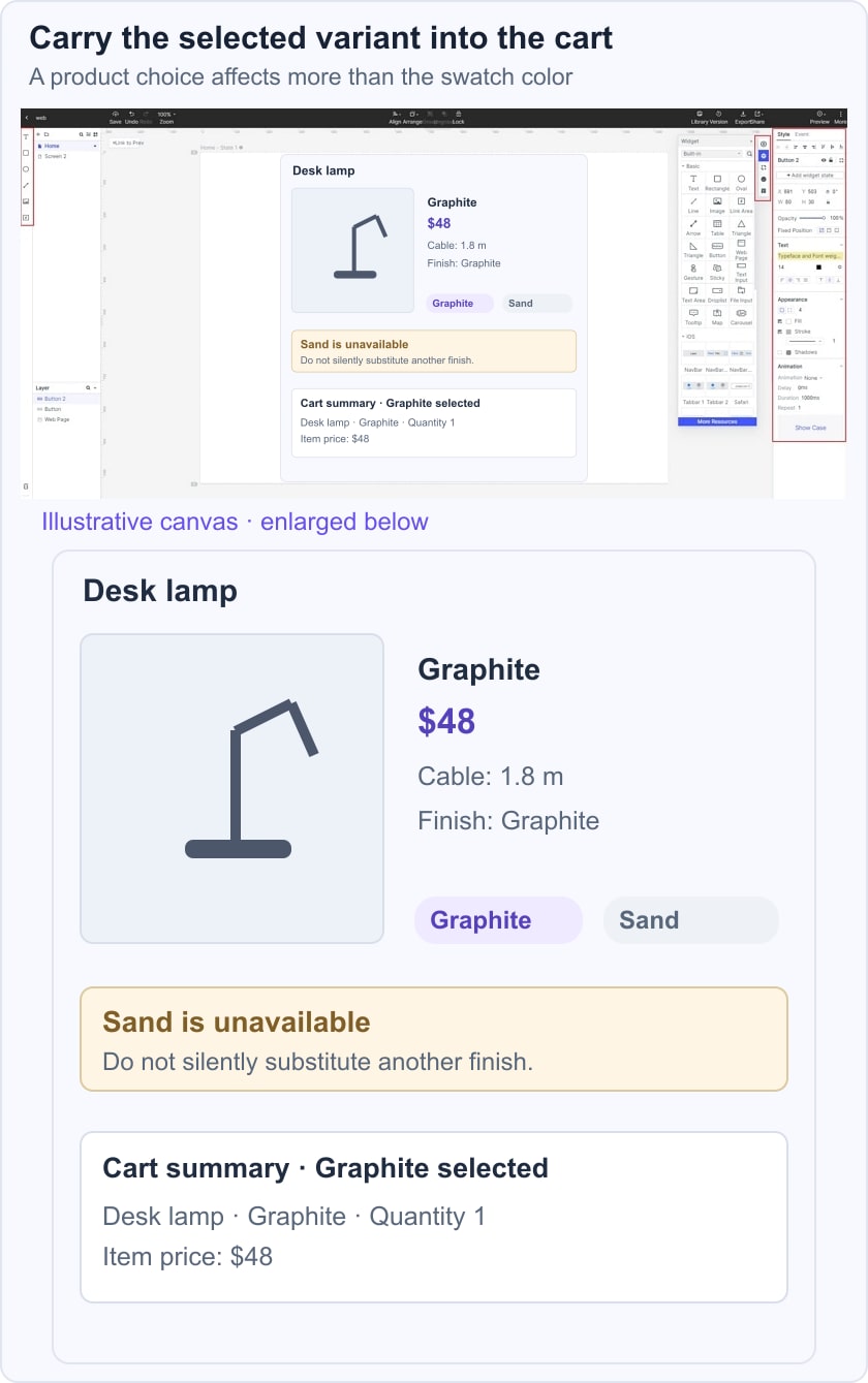
Test a customer choosing the lamp for a small desk. They need dimensions and cable information near the details, not hidden behind promotional copy. Then test changing the finish and quantity before opening the cart. The cart summary should preserve the selected item, finish, quantity and price.
Eight historical references and product-page decisions
These references suggest useful questions, but they do not establish that one layout produces more traffic or sales. Evaluate the task and evidence rather than copying a brand’s appearance.
1. Bellroy
The Bellroy reference emphasizes demonstrating a product rather than showing only a static hero image. A short video or a sequence of images can explain capacity, scale or use when those details matter. Provide useful still images as well and keep essential specifications in text. A video should not be required to discover the basic product choice or price.
2. Sun of a Beach
The Sun of a Beach reference focuses on readable details and a straightforward selection area. Put the information needed for a decision within reach of the choice it affects. Reviews can offer additional context when they are genuine and maintained, but a product page should not invent reviews or treat their presence as mandatory proof of quality.
3. Forever 21
The Forever 21 reference brings price, size and product details together. The transferable idea is to associate the decision controls with the item they change. A size guide needs a clear label and a return path to the same selected item.
Test unavailable sizes, long option names and an error after the cart action. A compact interface is not necessarily a fast or usable one; observe whether the customer can complete the choice without guessing.
4. Johnny Cupcakes
The Johnny Cupcakes reference connects a distinctive visual identity with practical purchase details. Personality can remain visible while product name, price, quantity and action stay easy to find.
Keep loading motion secondary and reserve space for imagery so controls do not move while a customer is selecting them. A subjective preference for a design is not evidence that it outperforms alternatives.
5. Insta360 Store
The Insta360 reference raises the need for detailed product explanation and a support route. Technical products may need compatibility, included accessories and setup requirements in addition to a short benefit statement.
A floating chat control is optional, not a universal requirement. If one is provided, verify its availability and ensure it does not cover options, details or the cart action on mobile. Keep essential compatibility information on the page rather than forcing a conversation.
6. MADE: communicate scale and materials
The historical MADE reference concerns furniture, where dimensions, materials and context often affect the decision. Use labeled measurements and meaningful images to explain scale instead of assuming a lifestyle photograph is enough.
A product video can supplement those details, but its content should agree with the selected variant. Distinguish included items from props shown in the scene, and make relevant delivery or assembly information discoverable.
7. A photography-led retail reference
The original BRATLEBORO reference emphasizes large product photographs. The name and current site details are not established by the available material, so the useful lesson is the image task rather than an unsupported company recommendation.
Show different views when they answer different questions. Keep images proportionate and avoid stretching them to fill a fixed box. Add descriptive alternatives and captions where the image conveys a detail that affects the purchase decision.
8. 69 | Sixty-Nine: use a restrained information hierarchy
The final original reference favors a limited set of product details and expressive imagery. Restraint can help when it removes clutter, but it becomes a problem when essential specifications or conditions disappear.
Ask what the customer would need to contact support about before ordering. Bring the common decision-critical details onto the page and leave optional storytelling in a lower section.
Test the complete selection and checkout path, including an unavailable variant, a changed quantity and a failed cart update. Keep a relevant product-support route available without making it the only way to obtain basic information.
Before release, check image proportions, selected-state labels, the currency and total, readable specifications, and the consistency of the cart summary. Apply the W3C form-label guidance to selectors and inputs. A product page is ready when its information and behavior support an informed choice, not merely when the hero image looks finished.