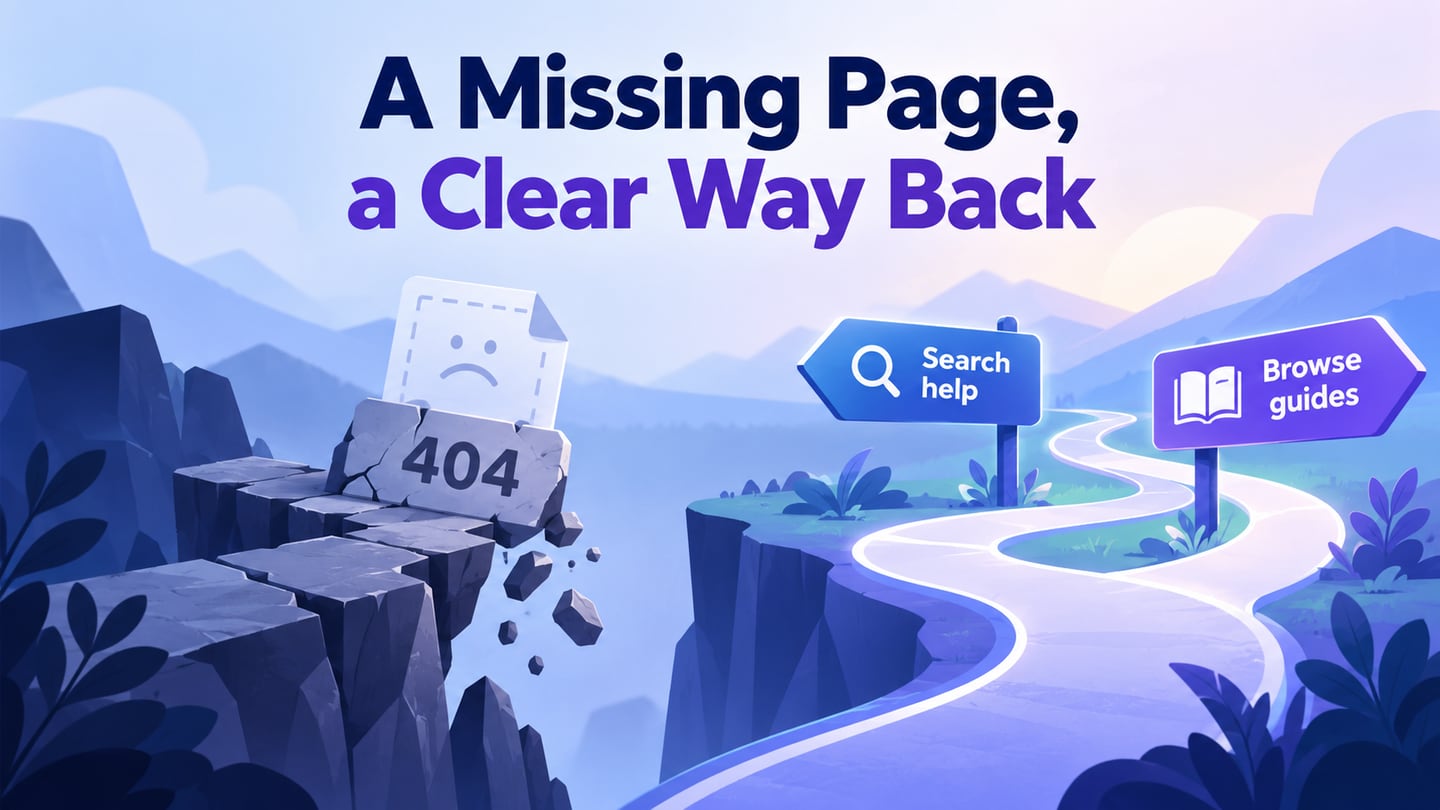
A 404 page appears when the requested resource cannot be found. A useful design explains the problem and helps the visitor recover without pretending that the requested content is still available. Use Mockitt’s online prototyping tool to test the recovery paths before implementing the error page.
The visual design and the HTTP response are separate concerns. Google’s HTTP status guidance explains that a page returning a 4xx status is not indexed as normal content. Returning a success status for an error page can create a soft 404. A clever illustration does not correct an incorrect response.
If a page has a genuine replacement, an appropriate redirect may be the right solution. If it is gone and has no equivalent, provide a real not-found response with useful navigation. Do not redirect every missing URL to the homepage and call the problem solved.
Start by distinguishing a missing resource from an empty search-results page. The visitor’s next task and the appropriate response differ.
Prototype the recovery task
A 404 prototype needs more than one attractive screen. Include the page that caused the broken path, the error state and at least one working destination. That lets a reviewer experience the interruption rather than judging a poster in isolation.
Choose a small set of helpful actions: search the site, visit the relevant category, return home or report a broken link. The right set depends on what the visitor was likely trying to find.
Build the states in Mockitt
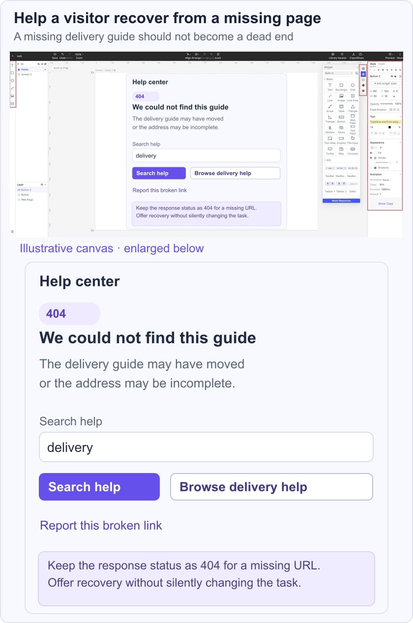
Arrange a plain-language heading, a short explanation and clearly labeled recovery controls. The historical editor image illustrates screen composition; it is not a completed 404 page, and the current editor’s controls may differ.
Use actual destination names during the review. “Browse delivery guides” communicates more than “Continue” when a visitor was looking for a delivery article.

Include these parts:
- A clear message: state that the page cannot be found without blaming the visitor or exposing internal server details.
- A useful next step: place the most relevant recovery action before secondary options, with readable labels and visible keyboard focus.
- A reviewable route
For an illustrative support site, a visitor opens an old link to a delivery guide. The 404 screen says “We can’t find this guide,” offers a search field labeled “Search help articles,” and provides “Browse delivery help” as the main recovery route. A smaller “Report this link” option preserves the original address for the support team.
Test three paths: a mistyped address, a deleted guide and a broken link from another article. The same error screen may work for all three, but the maintenance action differs. Fix the internal broken link, consider a replacement only where it is equivalent, and retain the missing-page response when no replacement exists.
Ask a reviewer to recover without using the browser’s address bar. Check the search result, the contact or reporting route and the return to normal navigation. Avoid automatic countdowns that move the person before they can read or choose.
Ten historical 404 references and their tradeoffs
Archived 404-page examples illustrate different recovery patterns. They do not establish each website’s current error page or demonstrate measured conversion results.
For each pattern, separate the memorable element from the recovery mechanism. If the visitor cannot find a way forward without understanding the joke, revise the hierarchy.
1. Lego
The Lego reference uses a playful explanation suited to its brand. The useful principle is plain language paired with a recognizable tone: the page can be friendly without making the visitor decode a technical error.
A home link gives a route back, but a relevant category or search option may better preserve the original task. A visible link is a choice; it should not be described as an automatic redirect or as proof of a sale.
2. List25
The List25 reference combines several recovery options. This can suit a content-heavy site where the missing URL does not reveal one obvious replacement.
Keep search, problem reporting and the homepage distinct. Explain what reporting does, and do not make a visitor complete a support form simply to continue reading.
The original example also mentioned an advertisement. Treat advertising on an error page cautiously: a paid promotion can compete with the very navigation needed to recover. First verify that the page solves the missing-content task.
3. BrettTerpstra
The Brett Terpstra reference highlights other content. Related articles can be useful if they are genuinely relevant, but an error page should not force readers into unrelated promotion. Label recommendations separately from the main recovery action and make the site navigation available.
4. Steve Madden
The Steve Madden reference presents product discovery on a retail error page. Category links or search can help a shopper continue, while generic trending products may be irrelevant to the item they sought. Avoid implying that an unavailable product is still purchasable; clearly distinguish a missing page from an out-of-stock product page.
5. 9GAG
The 9GAG reference emphasizes an app download. This illustrates a tradeoff rather than a universal recommendation: a download may be relevant to some visitors, but it does not necessarily help someone find missing web content.
Offer a web recovery route as well. A visitor should not have to install an app to escape the error screen or understand what happened.
6. OptinMonster
The OptinMonster reference includes a promotional download. A lead offer can be secondary content, but it should not replace navigation or imply that submitting personal details is required to recover. Keep the error explanation and practical next step ahead of the marketing offer.
7. Marvel
The Marvel reference uses a story-themed explanation. A recognizable brand voice can make an interruption less abrupt, provided the literal problem remains understandable.
Pair any fictional explanation with plain wording such as “This page could not be found.” Readers unfamiliar with the story should still know whether to search, go back or choose another section.
8. Mantra Labs
The Mantra Labs reference uses a space-themed visual. Illustration can establish tone, but the recovery controls must remain readable while the media loads and when motion is reduced.
The original description included a timed redirect. That behavior can move a reader before they finish reading or make a selection. Prefer an explicit destination link; if an equivalent resource has moved, handle the redirect at the URL level rather than adding a theatrical countdown.
9. Carwow
The Carwow reference turns the error screen into a small game. This can be memorable, but interaction is optional entertainment, not recovery. Keep navigation available without playing, avoid trapping keyboard focus and check the page on a device where the game cannot load.
10. Pixar
The Pixar reference uses an expressive character image to acknowledge disappointment. The design lesson is emotional tone alongside a clear message, not a requirement for a large branded illustration. A lightweight page with useful navigation can work without artwork.
Choose the pattern that supports the visitor’s next task. Keep humor, promotion and games subordinate to a clear explanation and working routes.
Release checks for a real 404 page
Request a deliberately nonexistent URL and inspect the response status. Test search, category navigation, keyboard focus and narrow-screen layout. Verify that shared header navigation still works, and keep the error page out of the normal sitemap. Finally, review the broken-link source: improving the error screen should accompany fixing the paths that send readers there.