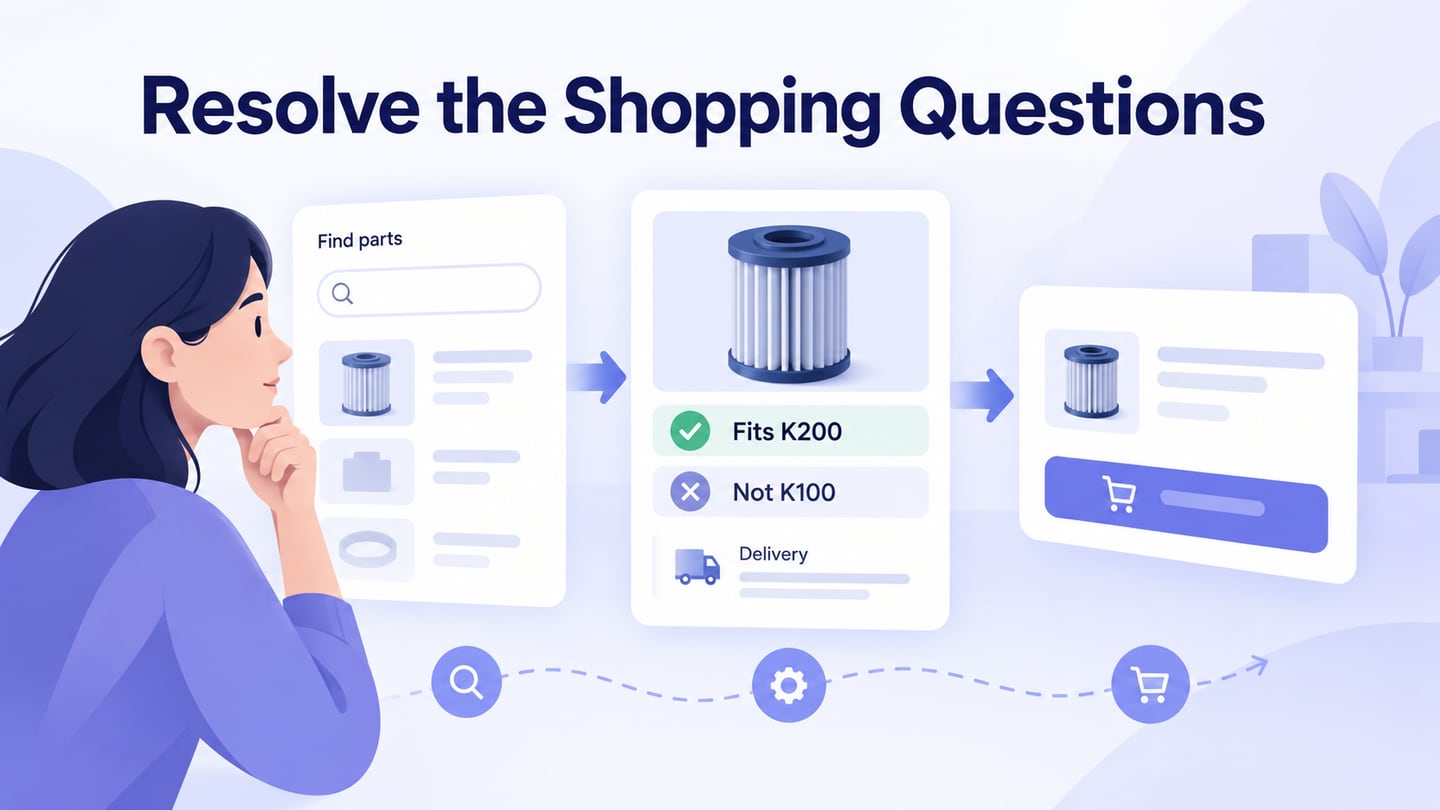
E-commerce web design helps a customer find a suitable product, understand its terms, and complete a purchase with clear feedback. Start in a UI design workspace with the shopping task and the information needed to make that decision.
A store’s appearance matters, but so do product details, availability, costs, and recovery from mistakes. A clear design can support the buying process; it does not guarantee a sale or repeat purchase.
Review four connected areas: trust, interface organization, product discovery, and checkout. Use those areas to plan a prototype with realistic content before implementing the store.
Define which product, customer task, and device context the review will cover.
Elements For A Good eCommerce Web Design
Trust and Security
Make the seller, offer, and purchase terms understandable. Visual reassurance must match the actual operation of the business and the technical controls protecting customer information.
- Provide accurate business and contact information. Use authentic reviews and testimonials only with an appropriate basis and permission.
- Explain shipping and returns clearly, including relevant costs, conditions, and the process customers should follow.
- Link to an accurate privacy notice explaining actual data practices. Do not use a generic promise that all information is always confidential.
- Present relevant product reviews honestly, with enough context to understand what they describe. Do not fabricate reviews to make an empty store look established.
- Implement HTTPS with appropriate TLS configuration. A domain-validated certificate protects the connection but does not establish the seller’s reputation or guarantee transaction safety; Let’s Encrypt explains this distinction.
- Show a certification or trust mark only when it genuinely applies and can be verified. A decorative badge is not a security control or evidence of legitimacy.
- Write concrete product and service information. Explain what the customer receives and any limitations before asking for a decision.
User Interface and Experience
Give the customer a clear starting point and a visible route from discovery to purchase. Avoid treating an old first-impression statistic as a universal design threshold.
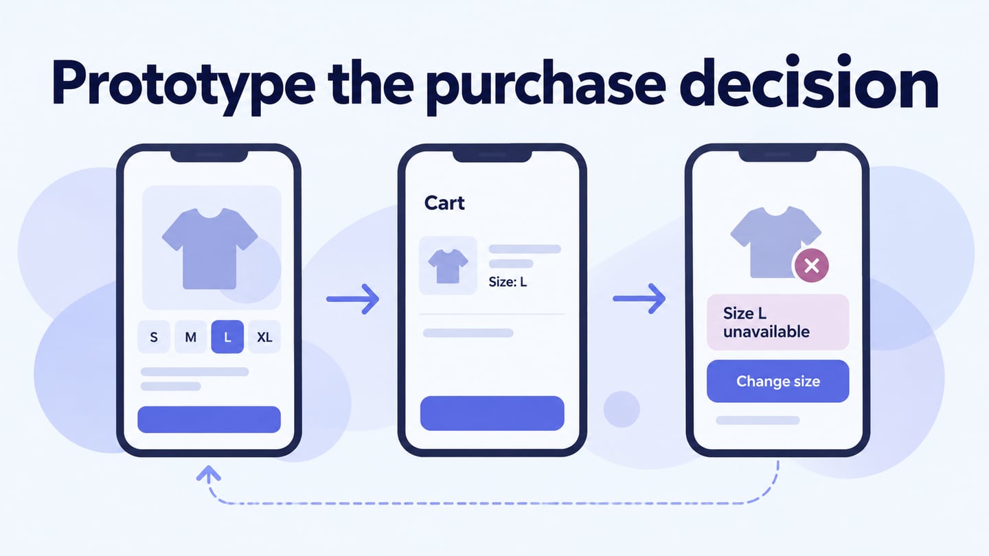
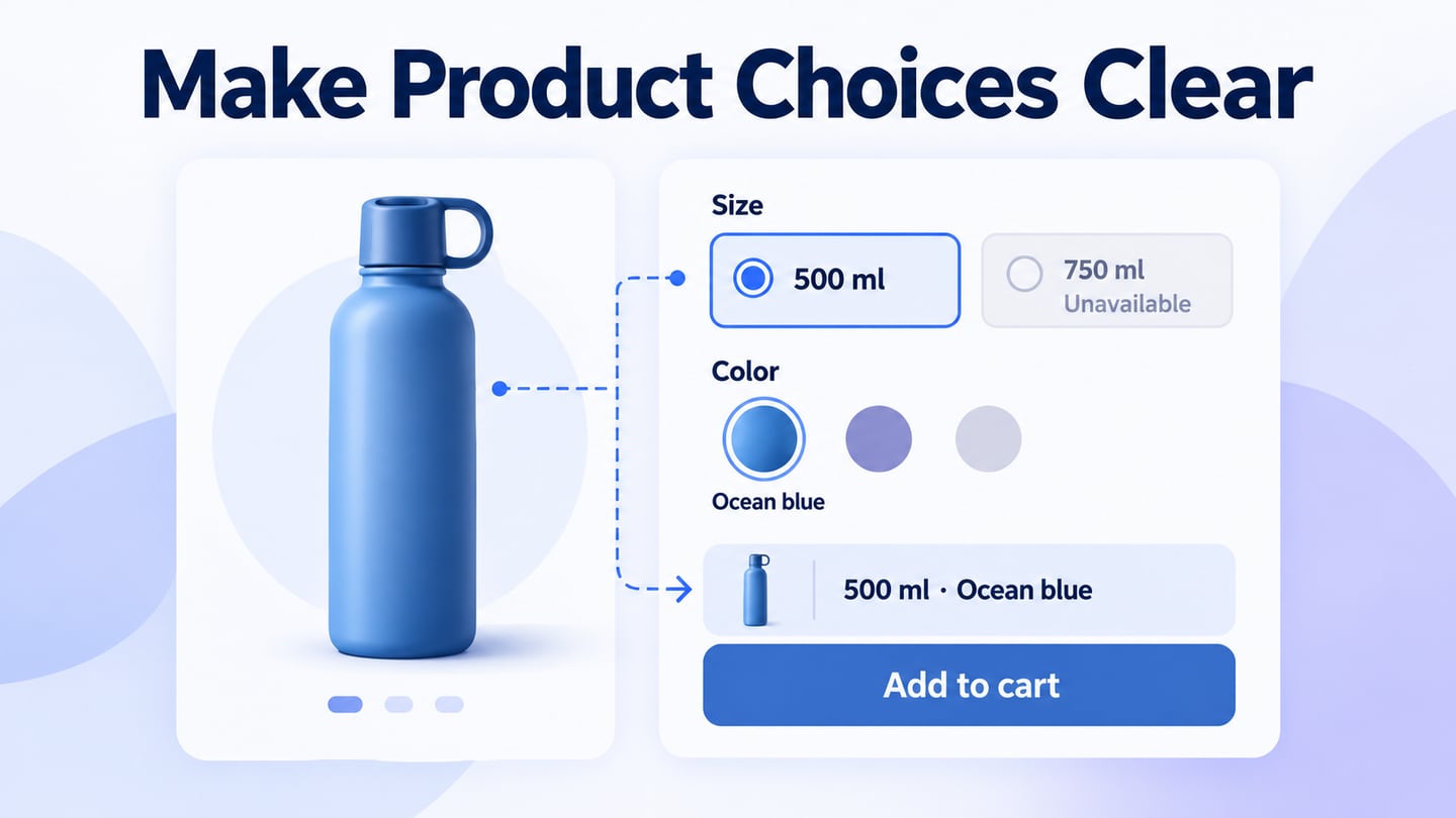
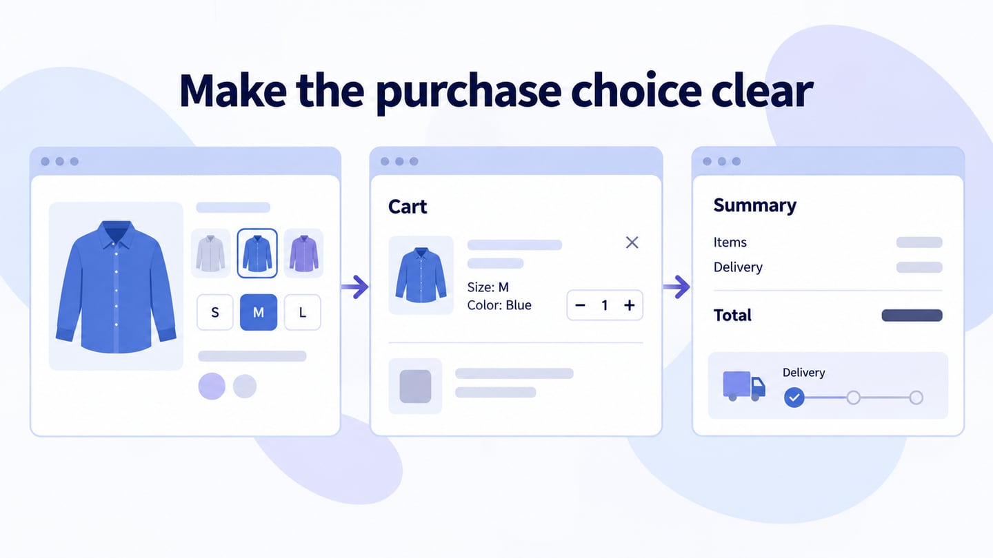
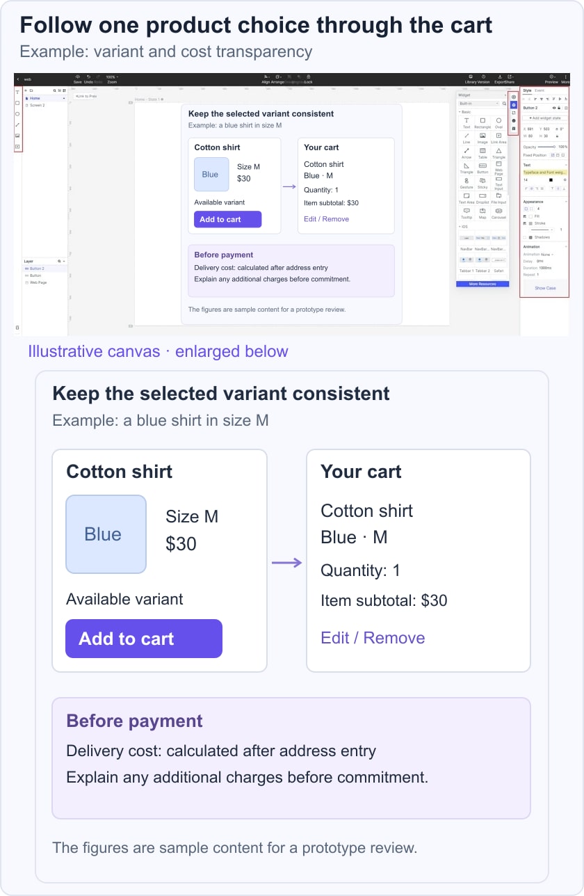
For example, prototype buying a blue shirt in size M. On the product page, show the selected variant and its availability. After Add to cart, confirm that the cart contains the same color, size, quantity, and price. Let the customer change quantity, return to product details, and see when delivery cost becomes available before committing to payment.
- Use consistent controls, typography, and status language across the store so the same action behaves predictably.
- Place the information needed for the current decision prominently. Preserve enough spacing to separate groups rather than forcing every detail above the fold.
- Limit unnecessary visual variation. Make headings, labels, body text, prices, and secondary information distinguishable.
- Use text labels for unfamiliar icons and clear accessible names for controls.
- Avoid overlays that interrupt shopping without a useful purpose. Essential dialogs should have clear actions and a way to cancel where appropriate.
- Keep navigation understandable and preserve context when users move between categories, results, and product details.
- Name product categories and subcategories in language customers recognize.
- Make search easy to find when the catalog and shopping behavior justify it. Test its location at desktop and mobile widths.
- Offer filters and sorting that reflect meaningful product differences. Show active filters and an obvious way to clear them.
- Use autocomplete when the suggestions are helpful and can be selected accessibly. It should not prevent entering an unsupported query.
- Support the terms customers actually use, including relevant product names and attributes. Explain no-results states and offer a useful next step.
- Show a concise product summary and a clear route to full details.
- Make genuine promotions understandable, including conditions and end dates where relevant.
- Use clear product photographs with useful angles and a suitable background. Do not stretch images to fill a card.
- Use video when it explains a feature or use case that still images cannot. Provide controls and consider its loading cost; do not assume it automatically increases sales.
- Show decision-relevant details such as dimensions, materials, variants, availability, price, and applicable warranty information.
- Display stock or time limits only when accurate. Avoid fabricated scarcity, endlessly resetting timers, or urgency that hides the actual terms.
- Recommend related products when they help the shopping task, without obscuring the selected item or cart.
- Give the checkout action a clear label and a visible place in the cart.
- After adding an item, provide feedback and a route to review the cart.
- Link the cart item back to the relevant product information while preserving the current selection.
- Allow appropriate edits to quantity, variants, and item removal, and show the effect on the order summary.
- Disclose charges clearly before commitment. If delivery or tax depends on information not yet entered, explain that instead of showing an unexplained final-looking total.
- Offer the payment and account options supported by the real store. Keep the form focused and explain whether an account is required.
- Show the actual support channels and hours. Do not promise round-the-clock live assistance when it is unavailable.
Use Mockitt to arrange the storefront screens and connect the product-to-cart task for review.

Build the product page, variant states, cart, and review screen needed for the chosen example.
A visual prototype helps explain the experience. Store operations, payment processing, inventory, and account security still require implementation and appropriate review.
Replace template content with realistic product details so layout problems and missing information become visible.
Review the browser flow at relevant viewport widths and verify that the selected variant remains understandable.
Share with the people responsible for design, content, and implementation. Record which observation leads to which revision.
Before implementation, test an available variant, an unavailable variant, a cart edit, and a cost that cannot yet be calculated. Those states reveal more than reviewing only the ideal purchase path.