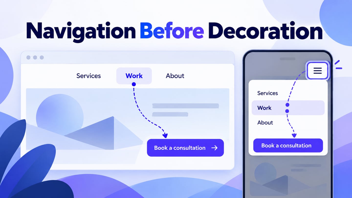
A website header helps visitors understand where they are, find the next page and start a useful action. Use Mockitt’s online prototyping tool to review those tasks before implementing the shared header. A polished header supports usability; it does not guarantee search rankings or sales.
Start with the audience’s main tasks and the site’s information structure. The logo, navigation and primary action should have clear roles, while a search control or account route belongs only where the site actually needs it.
Use the design workflow and ten layout ideas below to evaluate a header for your own task. Treat the examples as layout patterns; a still image cannot establish a website’s automated behavior or business results.
How to Create a Website Header Design?
Write a short header brief before drawing. State which destinations must be visible, what the main action does and which content can sit in a secondary menu. Use actual page names instead of placeholders that hide long-label problems.
Open a prototype workspace and create the page states needed for the task. The retained screenshot illustrates an earlier Mockitt editor; current controls may differ, but the purpose remains arranging elements and reviewing their interactions.
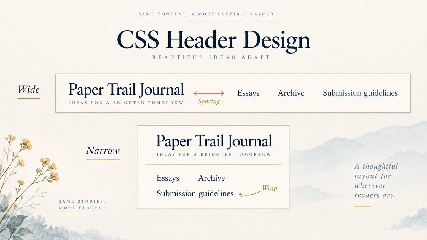
Make a desktop layout and a narrow-screen layout. Decide explicitly what becomes a menu, what remains visible and where the main action goes. An image that looks responsive is not evidence that the final HTML will respond correctly to every viewport.
For an illustrative Fieldwork Studio site, use Services, Work and About as desktop navigation, with “Book a consultation” as the primary action. On a 390-pixel review screen, keep the brand and a Menu button visible. The opened panel contains the same three destinations and the consultation action in a deliberate reading order.
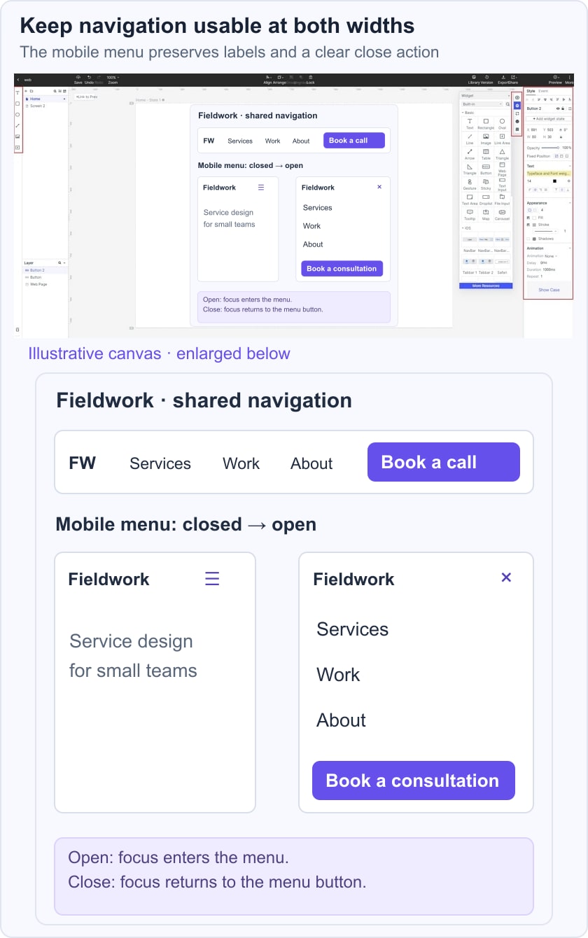
Test a visitor who wants to inspect work before contacting the studio. They should reach Work without opening an unrelated account flow. Then test Menu, a destination, return to the page, and Menu again. Record the expected focus destination when the panel opens and closes, rather than documenting only its visual position.

Use the W3C disclosure pattern for the behavior of a simple expandable navigation control. The implementation should expose its expanded state and support keyboard operation. A website navigation panel is not automatically an application-style menu requiring a complex menu widget.
Ten header patterns to evaluate
Choose a pattern for the job it performs, then test its limitations. The patterns cover navigation, imagery, service content, motion and retail discovery; each needs to be tested against the intended user task.
1. Brand-led navigation
A clear brand mark and a short row of destinations suit sites with a compact information structure. Keep the logo’s home destination predictable and make the active section understandable without relying only on color. If the labels need to be shortened until they become ambiguous, reconsider the grouping instead of making every item smaller.
2. An image-led first screen
A large image can communicate the subject of a page, but it should not compete with the navigation. Keep text readable over changing image areas, provide an appropriate alternative for informative imagery and avoid placing essential controls where cropping may hide them. The hero and header can share a composition without becoming one inaccessible image.
3. A service or product header
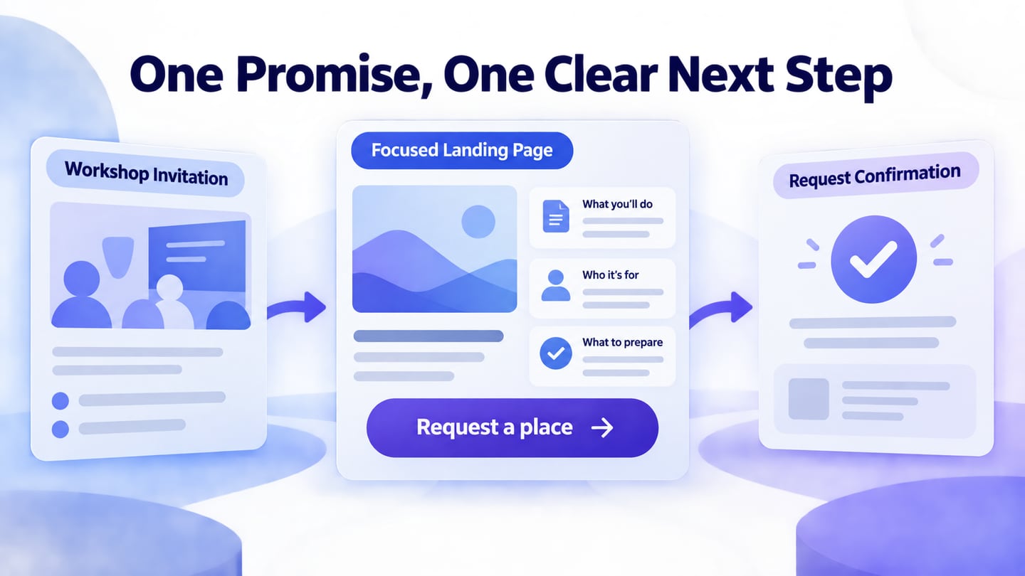
A service site may need to explain both what it offers and how to begin. Keep the primary navigation separate from the page’s introductory statement. A descriptive action such as “Request a consultation” sets a clearer expectation than a vague “Start.” Verify that the destination matches the promise instead of sending every visitor to the same generic form.
4. A restrained motion header
Motion should not cause navigation to appear and disappear unpredictably. If a header changes after scrolling, preserve access to the same tasks and avoid moving a control while the user is aiming at it. Provide a stable experience for reduced-motion preferences and test keyboard use through the transition. The simplest useful version may be a static header.
5. Portfolio-first navigation
A portfolio can prioritize Work and About while leaving detailed project categories to the next page. The header should remain recognizable when a visitor enters through a deep project URL. Test a long project title below it and make sure the shared navigation does not cover the first heading. Visual novelty should not erase the route back to the project list.
6. A promotional announcement
An announcement can sit above the main header when it communicates a relevant, time-limited message. Keep it separate from permanent navigation so that removing the campaign does not change the meaning of the menu.
If the announcement is dismissible, label the close control and test focus after dismissal. Avoid late insertion that pushes the page down after it has rendered. A rotating promotion should not make an important destination temporarily unavailable.
7. A category and locale header
A store or international service may need category navigation and a region or language selector. Use explicit labels for the available choices, preserve the reader’s task where possible and explain when changing region affects the available content. Do not infer a person’s preferences from demographic assumptions. Test long translated labels before treating the layout as complete.
8. A photography or event header
For a visually led service, images can introduce the work while the header provides stable routes to portfolios, services and contact. Do not place all essential information inside a background photo or video. Make the inquiry action understandable, and distinguish an existing-client support route if the business requires one. The visitor should not need animation to discover how to contact the team.
9. A video-led introduction
Video can support the page’s message, but the navigation must work while it is loading, paused or unavailable. Reserve the media area to avoid a sudden layout change, provide suitable controls and do not rely on audio to explain the primary task. Test on a constrained connection; a large video should not prevent someone from using the header.
10. A retail header with search and cart
A retail header often has to balance category browsing, product search and the cart. Give each a distinct role, keep the cart label or count understandable, and test empty as well as populated states. On mobile, decide what remains visible when the menu opens rather than stacking overlays that conceal one another.
Review the header as an interaction
Follow the complete path: enter through a deep page, identify the current section, open navigation, choose a destination and return. Test narrow width, increased text size, visible focus and long labels. The W3C page-region guidance helps distinguish shared navigation from the main content.
For a sticky header, check that it does not obscure keyboard focus or anchored section headings. The focus-not-obscured guidance addresses this important failure mode. In-page links need an appropriate offset so readers can see the section they selected.
Finally, coordinate the names with the website footer and use the mobile navigation examples to review small-screen details. A successful handoff describes states, destinations and behavior as well as colors and spacing.