To design a website, start with the task your visitor needs to complete. Organize the content around that task, sketch the key pages, build a clickable prototype, and test the route on a narrow screen as well as a desktop. Visual styling comes after the page structure and navigation make sense.
This guide uses a fictional bike repair service: a visitor chooses a service, reviews what to expect, and requests an appointment. You can build and connect the screens in the Mockitt prototype maker before implementing the website in your chosen website platform or codebase.
1. Decide what the website needs to help people do
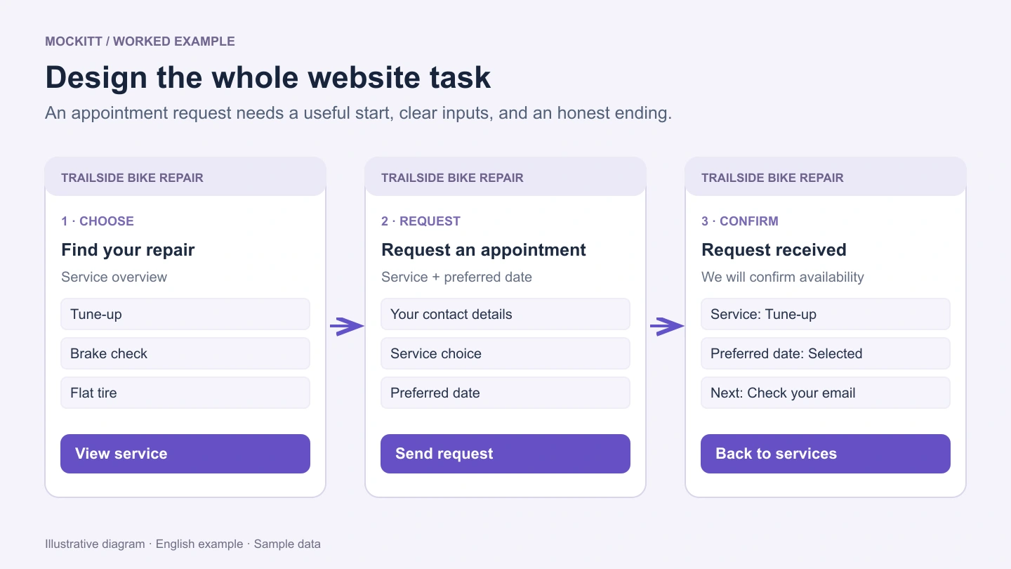
Write one sentence describing the main task: “A rider can find a suitable repair service and request an appointment.” Then identify the information needed to complete it. For this example, that includes service descriptions, location, opening hours, what to bring, and what happens after a request.
Separate the main action from secondary choices. A visitor comparing services needs a clear path to the details; a returning customer may want contact information immediately. Both can be easy to find without giving every link the same visual weight.
| Page | Visitor's question | Useful content and action |
|---|---|---|
| Home or service overview | Can this business help me? | Service categories, location, and a link to service details |
| Service detail | Is this the right service? | Scope, preparation, and a request-appointment button |
| Appointment request | What do I need to provide? | Contact details, service choice, preferred date, and clear field labels |
| Confirmation | Did the request go through? | Request summary and an explanation of how the business will respond |
Use draft copy with realistic length. A layout that only works with “Lorem ipsum” may break when a service name wraps, an address is longer, or the form needs a helpful error message.
2. Sketch the hierarchy before styling the page
Use simple blocks to decide where the heading, navigation, main content, and primary action belong. For the service page, put the service name and purpose before the appointment button. Place preparation details close to the action so visitors do not have to search another page before deciding.
Begin with a wireframe when the structure is still uncertain. Test the content order with plain shapes first. Fonts, gradients, and illustrations should support a clear hierarchy, not compensate for an unclear one.
For inspiration, study how a site supports its visitors' tasks. The SFMOMA website, for example, gives visitors routes to exhibitions, visiting information, events, and tickets. The useful lesson is to organize navigation around recognizable needs; a museum's exact layout is not a template for every business.
3. Create the screens and reusable elements in Mockitt
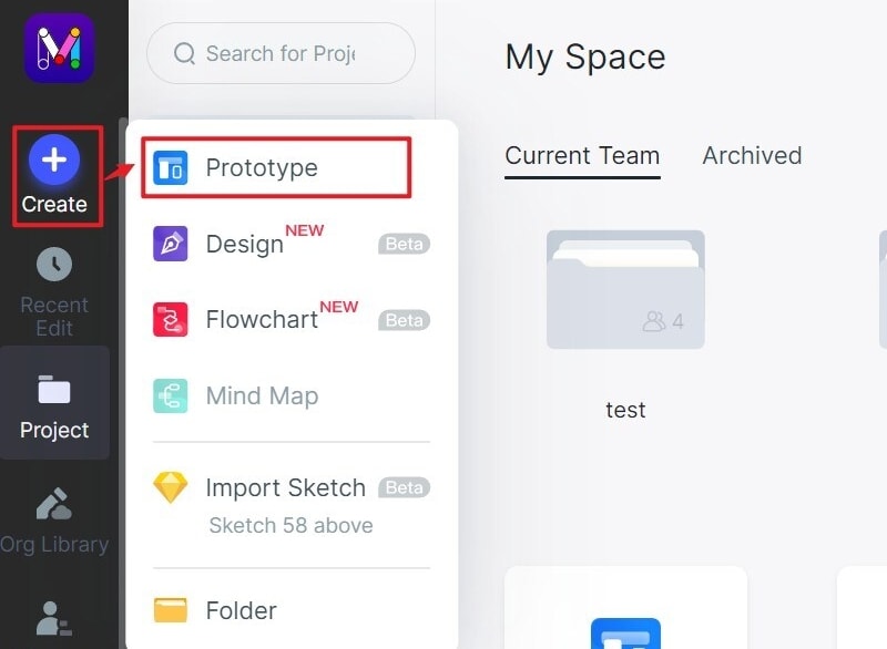
Create a project and choose a screen size
Create a prototype project for the website, name it after the task, and add the pages you need. A blank project gives you room to explore the structure; a suitable template can be a starting point if its content and navigation match your brief.
Choose the web screen preset or set a size appropriate for the layout you are exploring. Make a separate narrow-screen version of the important pages. A desktop mockup alone will not show whether navigation, forms, and content work on a phone.
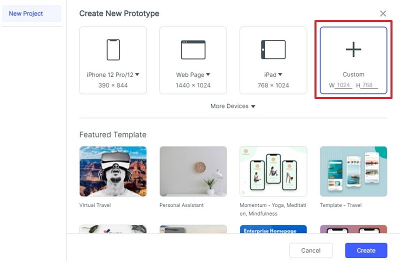
Use the project's screen settings when you need to adjust the dimensions. Keep a short note about which viewport each design represents so reviewers do not mistake a fixed-size prototype for a fully responsive implementation.
Add widgets, text, and consistent styles
Add the elements your layout needs: headings, body text, buttons, images, and form fields. In the illustrated editor, widgets can be placed on the canvas from the library. Start with real labels such as “Request an appointment” and “Preferred date” rather than generic labels that hide the task.
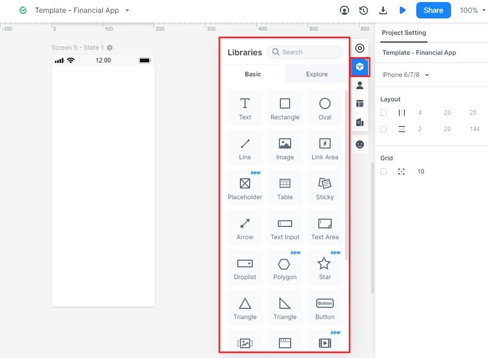
Select an element to adjust its properties in the inspector. Establish a small set of text sizes, spacing values, and button styles, then use them consistently. A secondary link should not look more prominent than the action the page is designed to support.
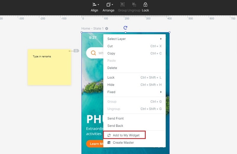
Save useful widgets for reuse. Reusing a service card or appointment button helps keep repeated elements consistent while you work through the rest of the site. Check labels and states after reuse; the same visual component may need different content on another page.
4. Connect the route and its recovery states
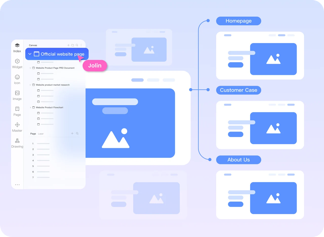
Link the service card to its detail screen and the appointment button to the request form. In Mockitt, select the relevant element and configure its link or drag its connection to the destination screen. Preview the route from its actual starting page.
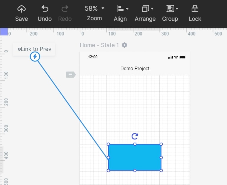
Include the states that change what a visitor can do: an empty required field, an unavailable date, a submission in progress, and a confirmed request. Make a clear distinction between “We received your request” and “Your appointment is booked.” The interface must reflect the service's real scheduling process.
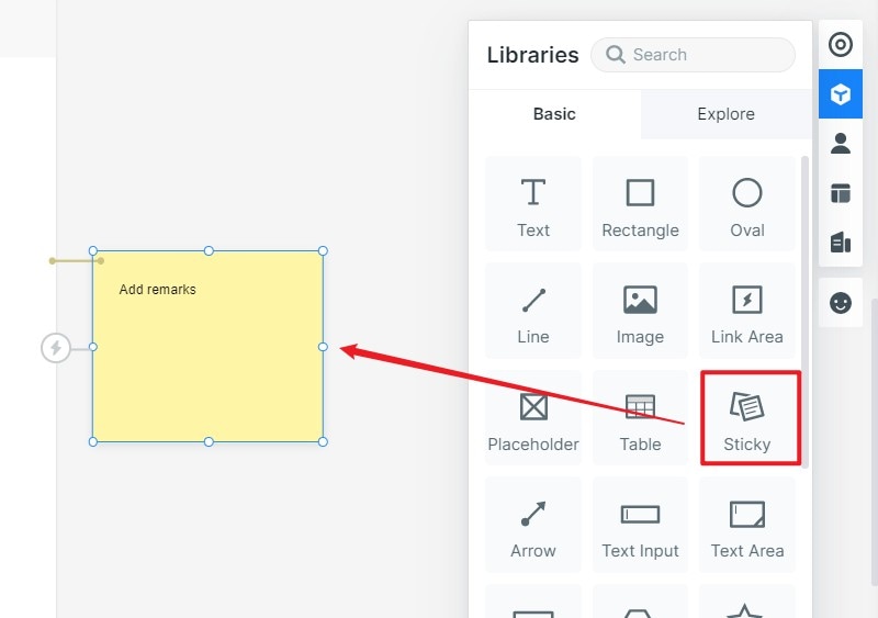
Add notes where behavior cannot be demonstrated fully in the prototype. For example, explain who confirms an appointment and what the production system should do after a failed submission. Use the notes to support the design, not to conceal missing screens or dead-end navigation.
5. Review the design on a narrow screen
Reorganize the content for the available width instead of shrinking the entire desktop design. Stack service cards, keep field labels close to their controls, and make the navigation understandable when fewer links fit on one line. Avoid cutting off the primary action with a fixed-height section.
- Can a visitor identify the service and find the next action without guessing?
- Do long headings, addresses, and error messages fit without hiding content?
- Can someone move back from the form and keep the context of their service choice?
- Are links distinguishable, controls clearly labeled, and important states explained in text?
A prototype helps you discuss these choices. Test responsive behavior, keyboard access, form validation, and loading states again in the implemented website; they depend on the actual markup, code, and content.
6. Test one complete task before handing off
Ask a reviewer to find a tune-up service and request a suitable appointment without showing them where to click. Observe where they hesitate, which information they seek, and whether they understand the confirmation. Revise the page or label that caused the problem, then try the same task again.
Share the agreed screens, interaction notes, and outstanding questions with the person building the website. Include the intended desktop and mobile layouts, the required form states, and the content that is still missing. Choose a website builder or development workflow that can implement those requirements. A clickable prototype communicates the design; it is not a deployed website.