01Event registration
Make signing up straightforward.
Explain the event, schedule, location, and eligibility. Ask only for the details you need, then tell visitors whether their registration succeeded.
Event → Signup form → Confirmation
Mobile landing page design · H5
Build the page, connect the signup flow, and show what happens next. Use Mockitt to prototype mobile landing pages your team can explore before development.
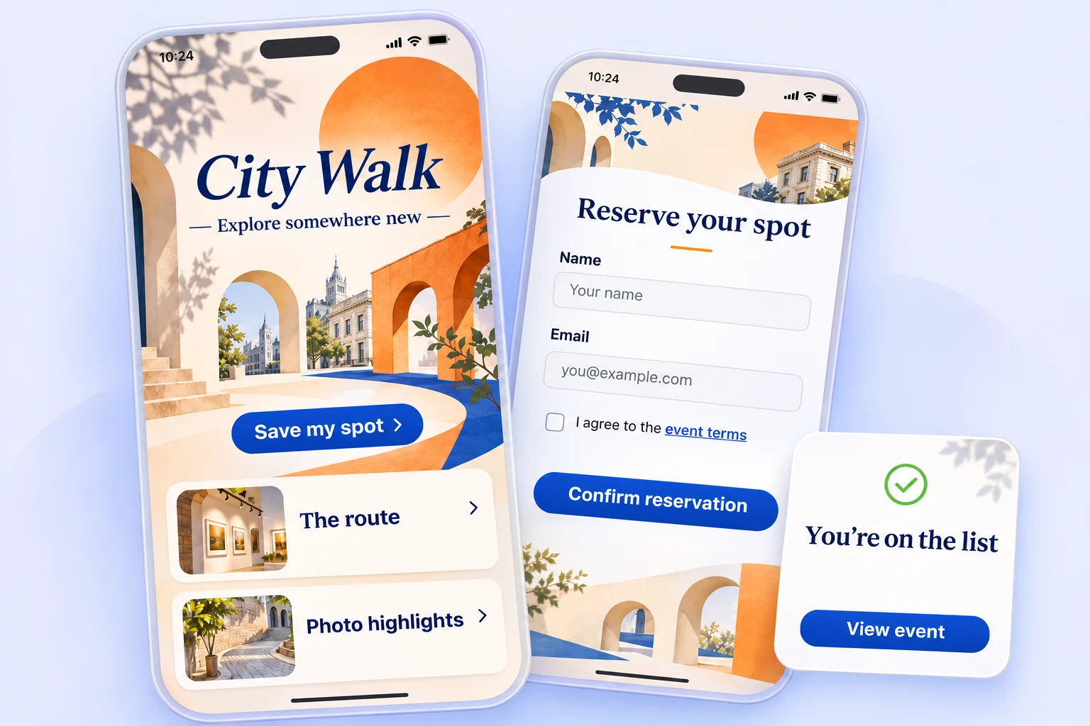
Start with the visitor's task
A mobile landing page, sometimes called an H5 page, opens in a phone's browser. Start with why someone arrived and what they need to do. That decision shapes the message, page length, and primary button.
Explain the event, schedule, location, and eligibility. Ask only for the details you need, then tell visitors whether their registration succeeded.
Introduce the product, show what makes it useful, and answer the questions that come before a demo request or waitlist signup.
Make the benefit easy to understand. Include eligibility, availability, and the next step so a compelling campaign also makes sense in use.
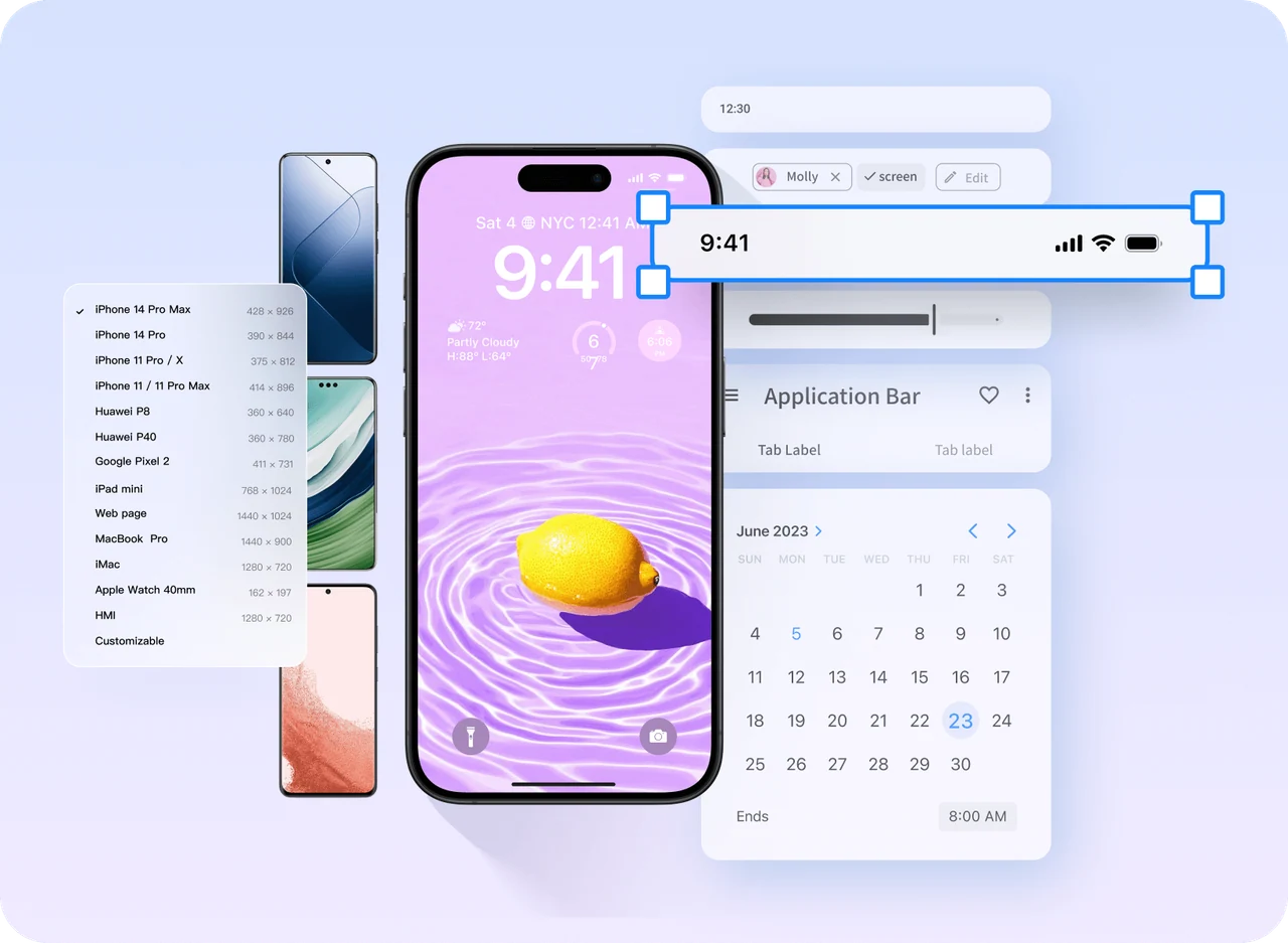
01 / Build the page
Arrange text, images, buttons, and cards on the canvas. Start with a blank page or reuse a suitable layout, then bring the campaign together with consistent spacing, colors, and components.
Give the event name, main benefit, date, and signup button a clear order. Keep detailed terms accessible without making them the opening message.
Group the introduction, agenda, and registration details. Use images to explain the experience instead of pushing the action farther down.
Carry the same form fields, buttons, and feedback styles through the landing, signup, and result screens.
02 / Connect the interaction
Take a city walking tour signup. The visitor chooses an event, enters their information, and sees the result. Use page links, overlays, and component states to make each part of that journey reviewable.
Two hours. A new side of the city.
Your details are ready. Please wait while the request is sent.
Saturday, 10:00 AM
Meet at the visitor center.
Example signup flow: identify the error, show the pending state, and confirm the next step.
Keep the error beside the field and explain how to fix it.
Show feedback and prevent repeated submissions in the planned behavior.
Keep the entered details and provide a clear retry path.
Replace the signup action with a useful event or waitlist message.
03 / Review it on a phone
Design at the intended phone width, then preview the flow with real content. Review scrolling, overlays, and return paths together so the layout supports the interaction.
Use the actual event name, a longer description, and realistic form labels. Check line breaks and image cropping before approving the layout.
Show how the active field, sticky button, and page content should behave while someone types.
Closing an overlay should return the visitor to a recognizable place. Changing a selection should preserve information they do not need to reenter.
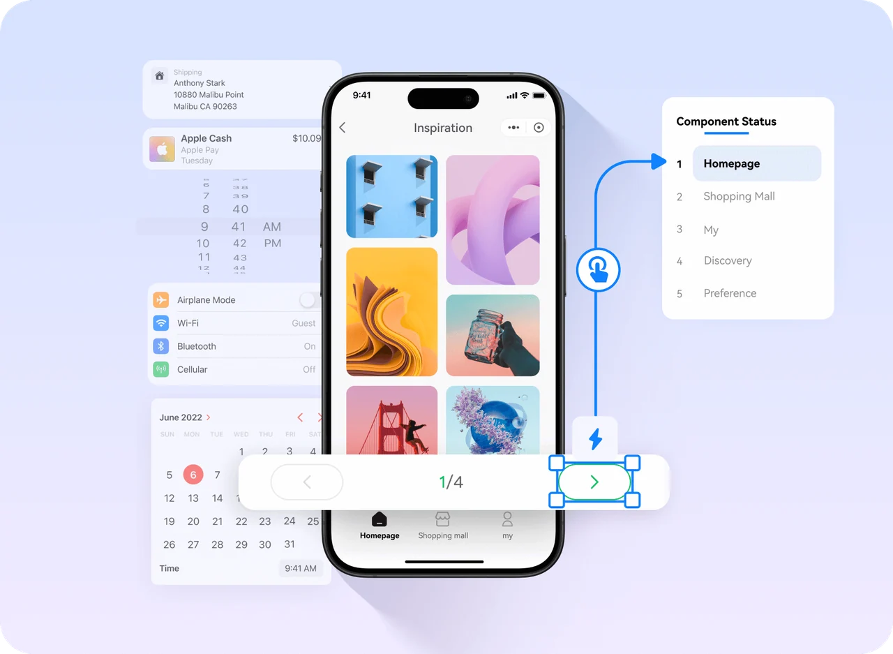
04 / Explore an AI first draft
Choose a task and name your project. Copy the brief into Mockitt AI, then refine the generated pages, content, and interactions around your campaign.
Already have a page in HTML? Bring an existing starting point into your design workflow.
Explore HTML import →
05 / Review and hand off
Share the prototype with marketing, design, and engineering. Review the same flow, add comments in context, and connect decisions to specific screens.
Questions before you start
Yes. Use Mockitt's components and interaction settings to build a clickable prototype. You can review the page and its behavior before a developer implements the live campaign.
No. A shared prototype is for demonstrations and review. A production page needs hosting, real form processing, consent handling, and any payment or analytics integrations required by the campaign.
Start with the phone viewport your audience is most likely to use. Test narrow layouts and longer content, then document how the design should adapt. A single prototype canvas does not automatically define responsive behavior for every browser.
An H5 or mobile landing page is a browser-based experience, often reached from a campaign link. A mini-app is a focused journey inside a larger product or host platform, so its entry, navigation, and return behavior need to fit that environment.
You can explore a first draft with Mockitt AI or use the HTML import workflow as a starting point. Review the resulting layout and interactions, then adjust the design to match the campaign's content and business rules.
From the first screen to the final confirmation
Build the page. Connect the action. Review the whole experience.