An FAQ page should help people find a specific answer without opening a support conversation. Begin with questions that customers actually ask, then use Mockitt’s prototyping workspace to review the categories, answer states and fallback route. Not every site needs a large FAQ; a few clear answers near the relevant task may work better.
Write questions in the reader’s language and answer them directly. Do not use the format as a disguise for repeated sales claims or questions that no customer has asked.
The examples illustrate jump links, search, categories, expandable groups and longer help articles. Evaluate each pattern by the questions visitors need answered.
Design Your FAQ page online
Collect recurring questions from support and product teams. For each one, record the approved answer, the source of any policy and who will maintain it. Remove duplicates before designing categories.
Choose the structure according to the collection. A short list can show answers directly; a larger set may need topics, search or links to detailed articles. An accordion saves initial space but adds interaction that must be implemented and tested.
Do not claim that a design has been user-tested unless it has. Use a prototype to conduct a focused review: give someone a question and observe whether they can find the answer and understand its limits.
Build and test the FAQ prototype
Arrange the main topics and questions in Mockitt, using complete answer text. Short placeholders can conceal the real problem: answers that become difficult to scan or require several related policy links.

Include a direct-answer state, a no-result state and a route to contact when the answer does not resolve the issue. The historical editor image below illustrates composing screens, not an automatic FAQ-generation or production-coding service.
Parts to include in the review
- Question inventory: use recognizable labels, avoid duplicates and distinguish topics with enough content to justify a category.
- Answer presentation: show the answer in readable text, with a relevant next step only when one is needed.
- Shared review: ask the policy owner to check accuracy and someone unfamiliar with the content to check findability.
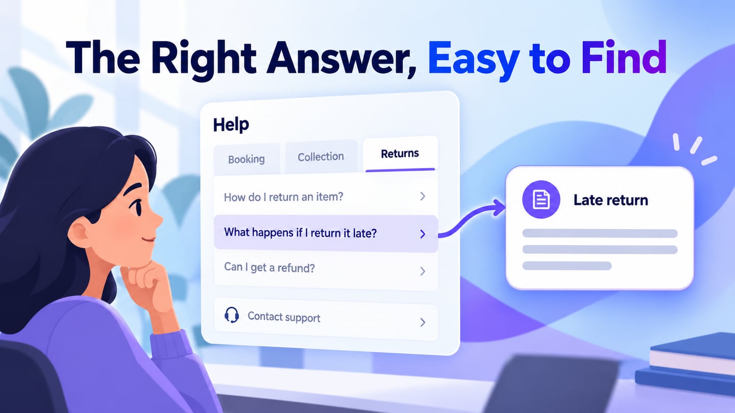
For an illustrative equipment-rental FAQ, use Booking, Collection and Returns as topics. A reader asks, “Can I return equipment after closing?” The answer explains the agreed return process and points to contact only when an exception requires help. Do not hide the actual rule behind “Contact us for details” if the service has a standard policy.
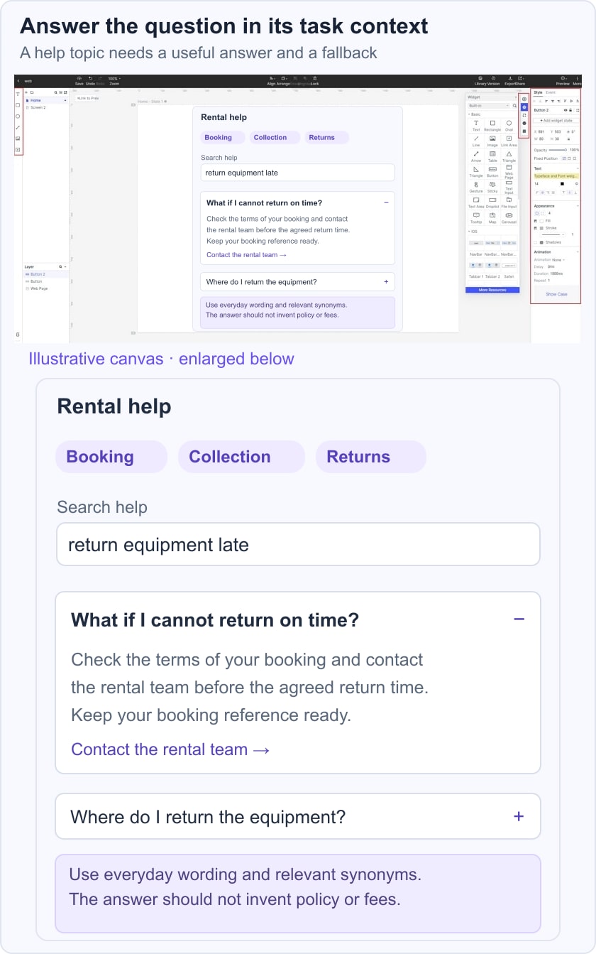
Prototype the question collapsed and expanded, then test a search for “late return.” The W3C accordion pattern describes heading buttons, expanded states and keyboard operation. If the answer spans several steps or exceptions, link to a dedicated guide instead of burying an entire manual in the accordion.
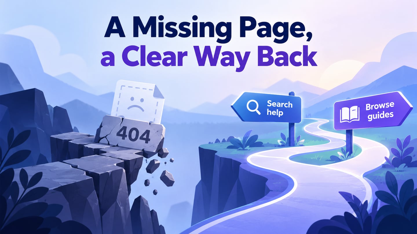
Also test a query with no answer. Keep the query visible, offer a way to change it and provide a relevant contact route. A blank result panel does not tell the reader what to do next.
Ten historical FAQ references and their design lessons
The retained screenshots show earlier versions of these sites. They are useful layout references, not current policy sources or a ranked usability study. Judge the visible structure and validate any interaction in your own implementation.
1. FAQ page design-Zappos
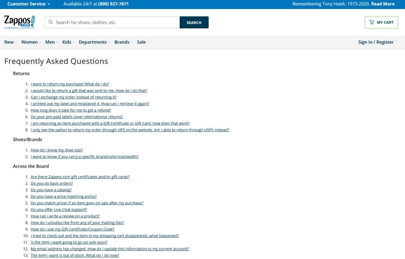
The historical Zappos capture groups linked questions under categories such as returns. This supports scanning when the labels are recognizable. The shared header also contains search. For a jump-link list, ensure the destination answer is visible below any fixed header and that returning to the question list is easy.
2. FAQ page design-Nintendo
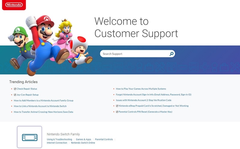
The Nintendo capture is a support landing page with search, trending articles and product-related groups. It does not show every answer hidden in an accordion. This is a useful distinction: a help-center entrance organizes routes to answers, while a short FAQ may contain the answers itself. Choose the model that fits the depth of the material.
3. FAQ page design-Microsoft
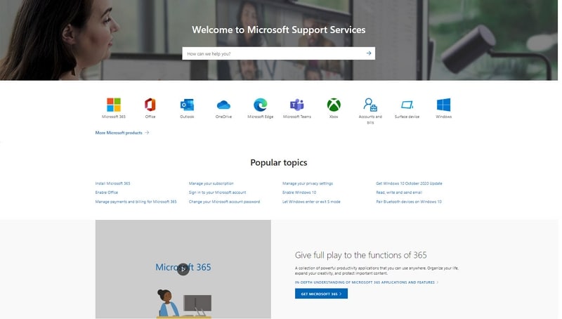
The Microsoft support capture combines search, product icons and popular topics. Its structure helps a reader narrow the subject before entering a detailed support flow.
The relevant lesson is product context, not the size or reputation of the company. A visitor who has not yet identified their product needs a different starting point from someone with a precise error message.
Use clear product names and maintain the topics as products change. Do not copy old product groupings into a current guide or assume that a screenshot proves a particular expansion behavior.
4. FAQ page design-Adobe Creative Cloud
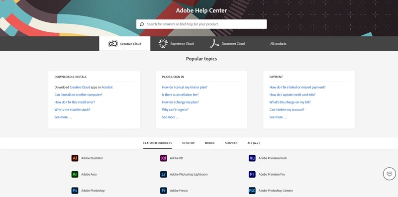
The Adobe Help Center capture divides popular topics into areas such as installation, plans and payment, with products listed separately. This separates a task-based route from a product-based route.
Offer both routes only when they help readers. If every category contains the same questions, simplify the structure and keep one maintained answer for each policy rather than creating conflicting copies.
5. FAQ page design-WhatsApp
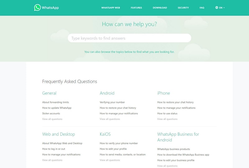
The WhatsApp capture uses general and platform-related groups beside a search entry. Platform differences can matter when the steps genuinely differ. Avoid forcing readers to choose a device before they can read an answer that applies to everyone, and keep the platform names current.
6. FAQ page design-YouTube
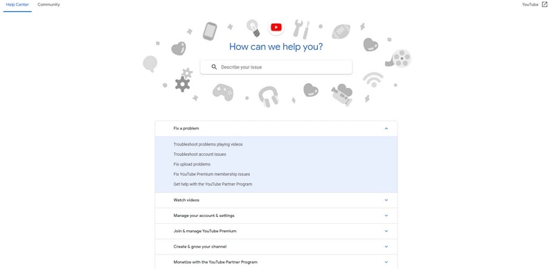
The YouTube capture shows search and expandable topic groups. A group label should describe what lies inside, and the expanded state should remain clear. Test keyboard operation and long labels at a narrow width. A compact visual arrangement is useful only if the reader can reach the required answer without guessing.
7. FAQ page design-SoundCloud
The original SoundCloud reference raised the idea of a help article rather than a two-line answer. That is appropriate when a task needs steps, prerequisites or troubleshooting.
Use a concise FAQ answer to establish the main point, then link to a detailed guide where needed. Avoid unsupported explanations about device storage or platform popularity; they do not help readers evaluate the answer structure.
8. FAQ page design-Kraft Heinz
The Kraft Heinz reference combines search with links to detailed answers. Search can help when visitors use different words for the same task. Review actual query language, add useful synonyms where appropriate and inspect no-result searches rather than assuming that a search box solves findability on its own.
9. FAQ page design-Charmin
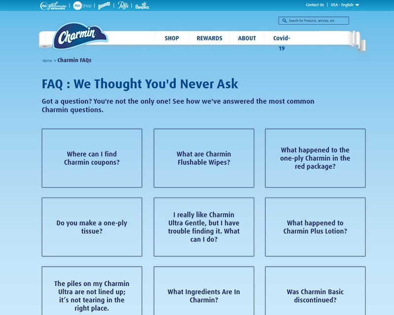
The historical Charmin capture presents questions as cards. This can work for a modest, well-defined set, but long questions must remain readable and the whole card’s destination should be clear. Do not use images or playful wording that obscure a sensitive or practical question. Test whether the cards remain easy to scan on mobile.
10. FAQ page design-Spirit Airlines
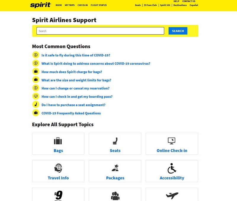
The Spirit Airlines capture separates common questions from broader support topics. That hierarchy can help readers begin with a frequent task while preserving access to less common ones. The old screenshot includes time-specific travel notices; those are historical context, not current advice. Give temporary answers an owner and review date so they do not remain in the permanent FAQ after the underlying situation changes.
A good FAQ is a maintained answer system. Use real questions, make the answer easy to locate and offer a fallback when the situation falls outside the standard rule.
Keep answers accurate after launch
Assign an owner to policy-sensitive answers and review them when the product or service changes. Test question links after moving content, and make the search experience useful for the vocabulary readers use. Do not promise special search-result treatment simply because the page has an FAQ heading or structured data.
Place the FAQ in a consistent footer or help navigation location. Measure whether people can resolve the intended task, not just whether they open an accordion.