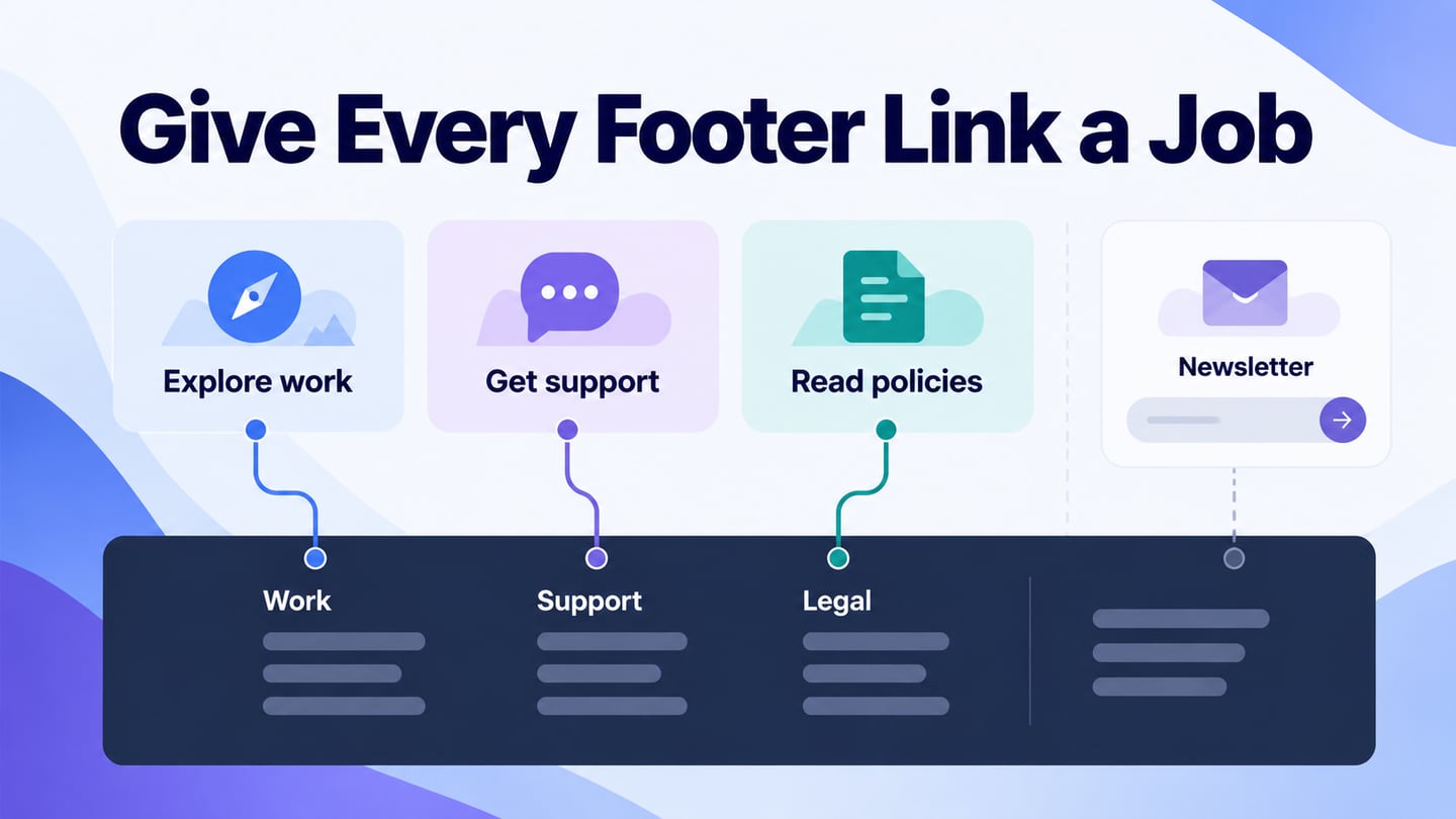
A useful website footer answers the questions visitors still have after reading a page. Start by listing those questions, then use Mockitt’s prototyping workspace to test the content groups and destinations before turning the footer into a shared site component.
The footer is a secondary route through the site, not a place to guarantee traffic or repeat every promotional message. Its value is practical: readers can locate help, identify the organization or reach a relevant next page.
Use the workflow and ten design observations below to distinguish useful footer patterns from decorative choices. A company name or a colorful screenshot cannot establish conversion performance, security or automated personalization.
How to Create a Website Footer Design?
Begin with a content inventory. Collect the actual support, contact, company and policy pages that the footer could link to. Remove duplicates and label each destination by the task it helps a visitor complete.
Choose the few groups needed for this website. A studio and an online store will have different requirements. Check the current workspace plan for collaboration or export features rather than assuming that every feature is free for every organization.

Invite reviewers who understand both the content and the users’ questions. Share the prototype with a concrete task, such as finding help with an existing order, and observe which label they choose without coaching.
Create separate desktop and mobile views. A wide row of columns may become a stack or a set of accessible disclosures, but a design tool does not automatically decide the correct reading order or interaction for the implemented website.
For an illustrative Fieldwork Studio footer, the first group is Studio: Work, Services and About. The second is Help: Project support and Contact. A final row contains Privacy and Terms. Keep the service inquiry distinct from an optional newsletter so a client is not asked to subscribe just to request help.
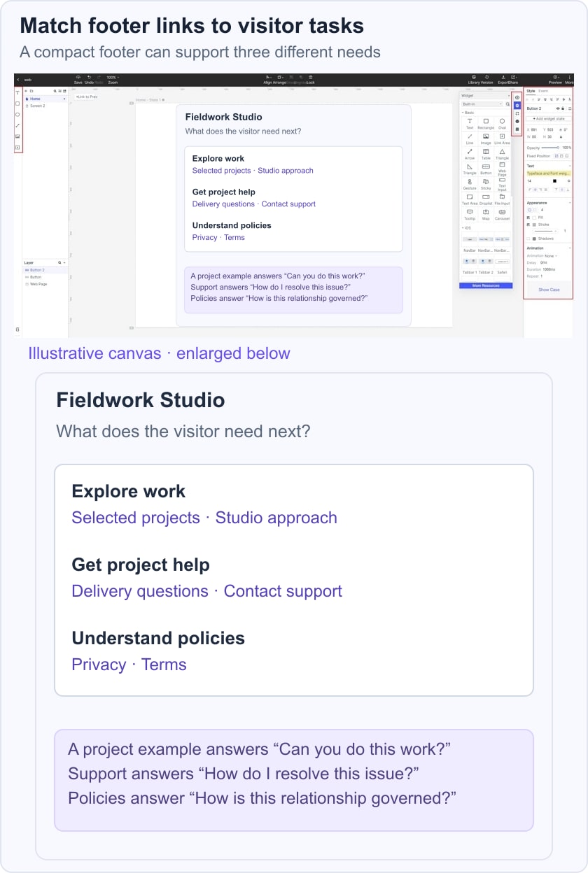
Review three tasks: find a past project, ask about ongoing work, and read the privacy policy. If two reviewers interpret a group differently, revise its label or move the destination. Keep a simple decision log that states which link moved and which task became clearer.
Preview the footer with real labels, longer text and a narrow viewport. Check its relationship with the website header and make shared destination names consistent. Then record the behavior that development must implement, including keyboard focus and expanded states.
Ten footer patterns and references to evaluate
These are design choices to test, not a ranking of the most successful footers. Official references were reviewed for the visible information they provide; older or ambiguous references are retained as general design lessons without unverifiable claims.
1. Organizational information: Henning Larsen
The current Henning Larsen website identifies an architecture and design practice and offers routes such as Contact, Press, Privacy and cookies, and Careers. The useful principle is separating organizational tasks. A journalist, prospective employee and client should not have to guess which generic “More” link applies to them. Avoid assuming that a global organization needs identical contact information on every page.
2. Contact-led footer
The original Envoy reference focused on email, phone and social contact. That idea remains useful without inferring prices or business credibility from a dark background. Put the primary service contact where readers can find it, label specialist routes clearly and distinguish an inquiry form from a newsletter subscription. A short footer can be complete if the site has a small information structure.
3. Multiple offices: TUX
The official TUX site provides contact information and addresses for Los Angeles and Montréal. When a business has multiple offices, keep each address grouped with the relevant location label. Do not force a visitor to infer which office a phone number belongs to. Test the directions and email links on the devices your audience uses.
4. Retail support: Sézane
The current Sézane site separates Help, social channels, About Us and legal information. Its help links include tasks such as returns and order tracking. These are useful retail categories because they reflect questions that continue after a purchase. The lesson is the task grouping, not an unsupported claim that animation or a particular color increases sales.
For a store, ask someone to find the return process from a product page and then from an order-confirmation page. Keep the label consistent even if the surrounding footer content differs by region.
5. Brand continuity: BASIC/DEPT®
The official BASIC/DEPT® website describes a branding and digital design agency. A footer can maintain the site’s voice through typography and concise wording, but brand expression should not obscure contact and policy routes. Judge continuity by whether the end of the page still feels understandable and navigable.
6. Publication footer
The original magazine example raised a useful question: what does a reader need after finishing an article? Consider the publication’s sections, contact information, subscription management and relevant policies. Distinguish editorial contact from billing help. Avoid claiming that colors automatically change by location unless the actual implementation has been checked. A publication footer should support continued reading without becoming a second, unstructured homepage.
7. A small studio footer
For a small design practice, a concise statement of work, a contact route and a few relevant destinations may be enough. The original studio reference does not establish current prices or capabilities, so do not copy those claims. Use recognizable labels, keep the contact details maintained and resist filling empty space with unrelated social channels.
8. Subscription as an optional task
The original retail example included newsletter signup. Keep that task separate from support and explain what a subscriber can expect. A visible label, validation message and confirmation state matter more than a decorative input. If the form is unavailable, help and policy links should still work. Do not describe newsletter signup as a unique feature or as evidence of trust.
9. Portfolio navigation
For a creative portfolio, the footer can reconnect a visitor with Work, About and Contact after a long project story. Use the same project and service names as the rest of the site. If the footer includes a next-project link, make it distinct from the shared navigation so readers understand whether they are exploring a sequence or leaving it.
10. A large resource directory: Awwwards
The Awwwards website contains a broad collection of design-related categories and resources. For any large directory, the footer should summarize a useful subset, not duplicate every menu entry. Group by reader task, check the destination labels and remove obsolete categories instead of allowing the footer to grow indefinitely.
Check the footer before release
Read its groups in document order without relying on columns. Follow every destination, inspect long labels, test visible keyboard focus and verify that optional forms do not block navigation. The W3C region guidance explains the semantic role of the page footer; the implemented site still needs its own accessibility review.
Use the mobile footer guide for small-screen interactions and the HTML/CSS footer example for implementation structure. Revisit the shared footer when the site’s services or support routes change, rather than treating it as a permanently finished graphic.