Part 1: Introduction
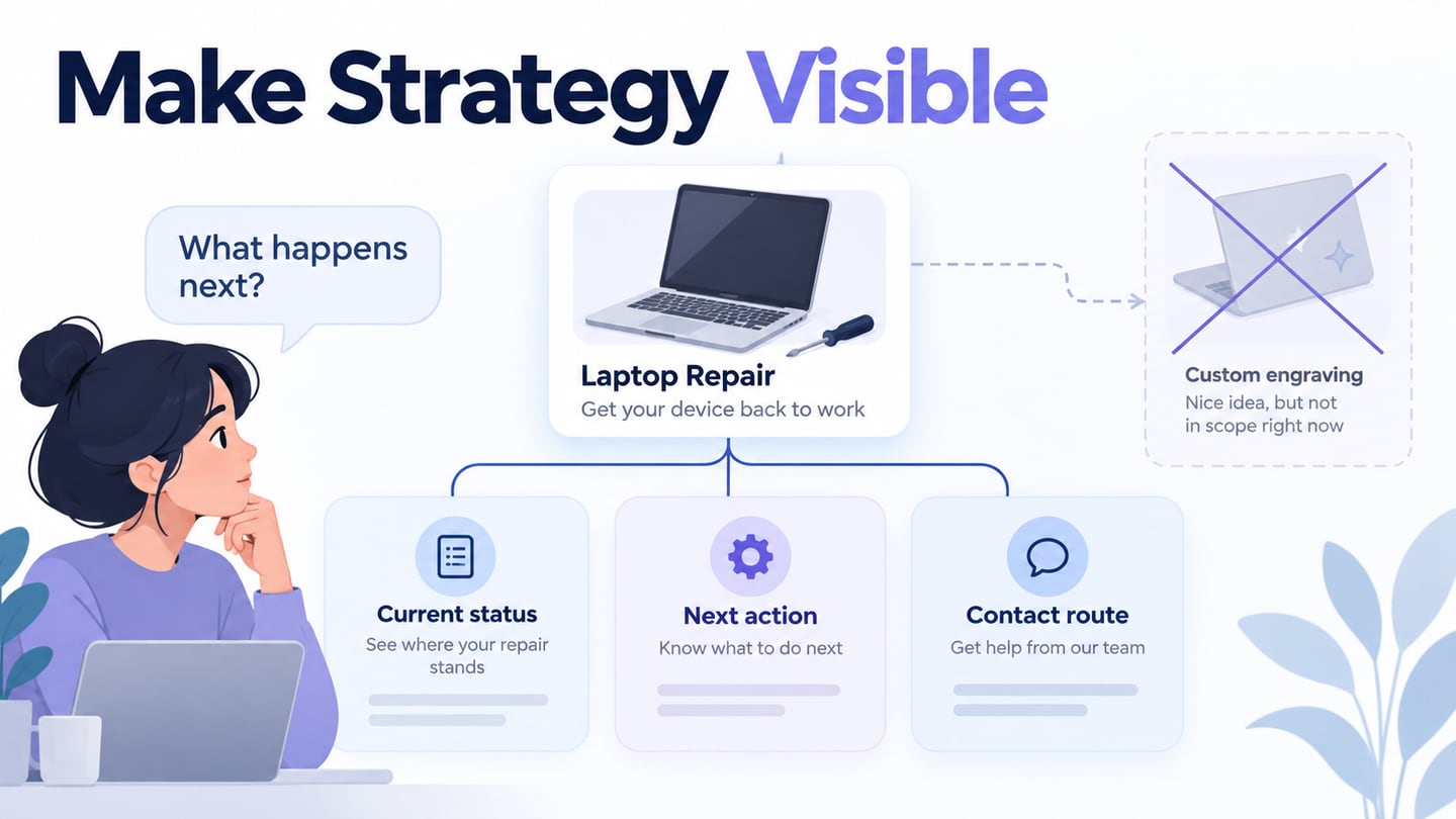
Content strategy decides what information people need, how it should be organized, and how it will remain reliable. It contributes to the wider UX strategy by connecting user tasks with the organization’s purpose and capabilities. Typography and layout affect presentation, but they cannot compensate for missing, inaccurate, or outdated information. Use the ten practical considerations below to plan content that serves a real task.
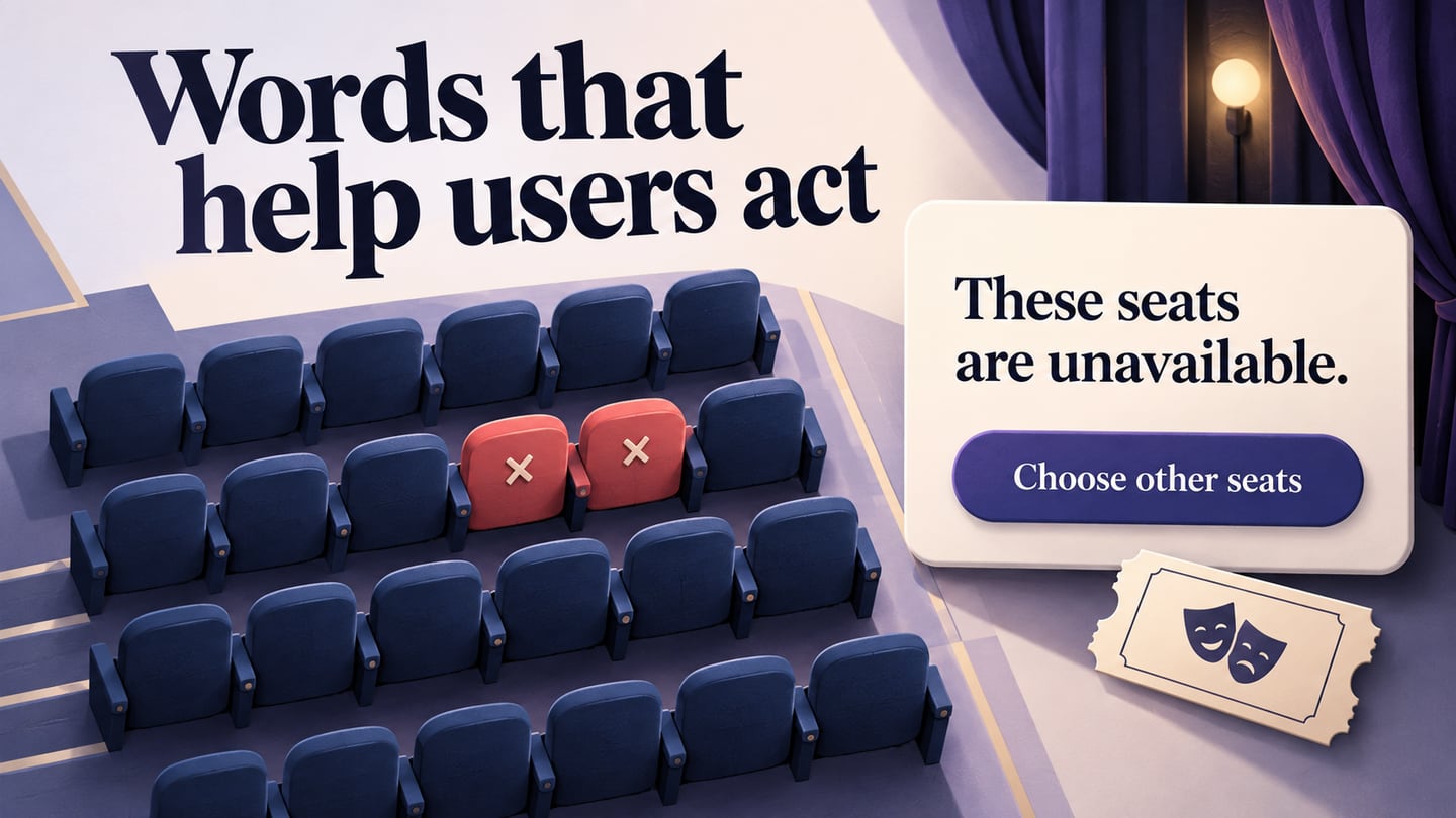
A practical content strategy keeps interface copy connected to the task it supports.
Part 2: What is Content Strategy?
Content strategy is the set of choices that guides creating, delivering, organizing, and maintaining useful content. It considers the audience, the task, the message, the format, and the people responsible for the information. A business page may support a purchase, while a service page may help someone complete an existing task. Neither should push a transaction at the expense of an accurate answer.
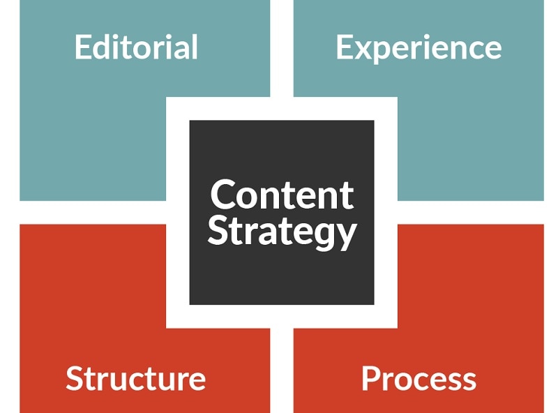
The Brain Traffic content strategy quad offers four connected areas: editorial approach, experience, structure, and process. Editorial choices include audience and voice. Experience concerns the context and format in which information is used. Structure concerns organization and reuse. Process concerns how content is created and maintained. The model is a way to discuss responsibilities and gaps, not a guarantee that a website will succeed.
Part 3: Relation between Content Strategy and UX.
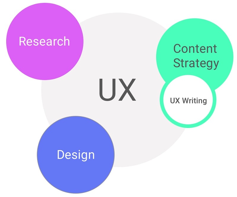
Content strategy and UX meet where a person needs information to make a decision or complete an action. A clear label can help someone recognize the right route; an explanation can make the consequences of an action understandable. The work is broader than bringing more visitors to a page. Sometimes the best outcome is that someone finds a short answer and leaves because the task is complete.
UX design organizes the interaction and the surrounding information. Content strategy helps establish what information should be present, where it comes from, and how it stays dependable. Design and content should be reviewed together with realistic text, especially for long labels, exceptions, and error states.
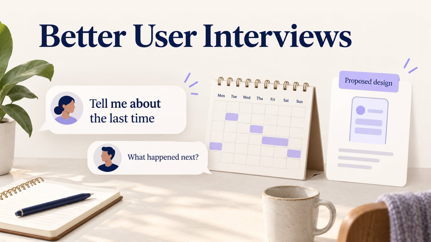
Research the actual audience and situation. An evidence-based persona or task summary can help the team remember needs, but it should not replace direct evidence. Separate a user’s question from the organization’s preferred message, then identify where both can be served honestly.
Agree on the content’s purpose before selecting a format. A policy, a short status message, an onboarding step, and a comparison guide need different levels of detail. Keep the source and ownership of important claims available so the design does not turn an uncertain statement into a confident promise.
Turn the strategy into a content model
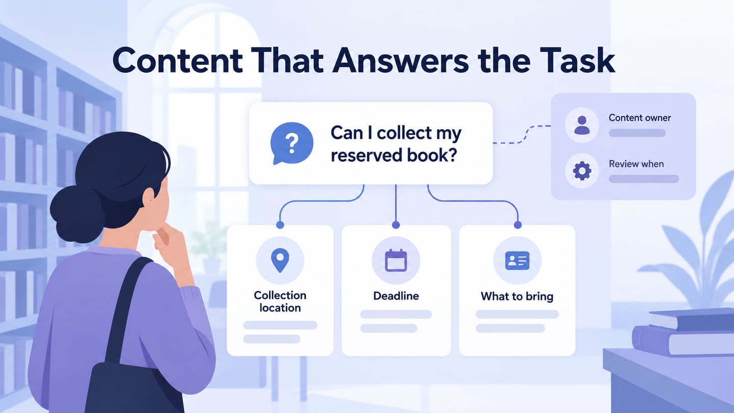
For an illustrative library service, the question is not simply what to publish but what a reader needs after a reserved book becomes available. The collection message needs the location, deadline, required library card, and a route to current opening hours. “Your book is ready” alone leaves the next action incomplete.
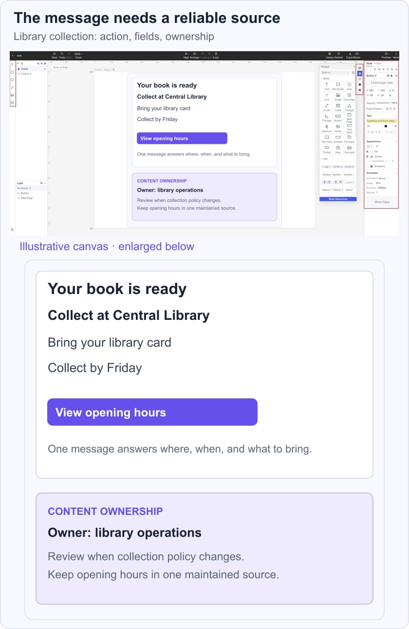
Define those as separate content fields, identify library operations as the policy owner, and record a review trigger when the collection policy changes. If opening hours vary, link to the maintained hours information rather than copying the schedule into several messages. The reader sees a concise instruction while the team has a clear source for each field.
Place the message in a prototype of the collection journey and ask someone to explain where they will go, what they will bring, and when collection is due. If an answer is missing, revise the content model or the presentation. Keep this observation separate from traffic or business outcomes: an understandable screen is one piece of evidence, not proof that the whole service has improved. Use UX content testing to separate finding the information, explaining its meaning, and deciding what to do next.

Part 4: Best practices for meaningful content.
The following ten practices help turn a content plan into reliable information. Use them to review an existing page as well as to prepare a new one.
- Identify organization goals and user's requirements
Research the user’s task and the organization’s role in meeting it. Use relevant interviews, support questions, analytics, and subject-matter input, while recording the limits of each source. Define the page’s intended outcome in concrete terms, such as helping someone understand collection instructions. Do not equate publishing more content with increasing sales or improving the service.
- Think from the User's Perspective
Look at the product or service from the reader’s situation. What do they already know, what are they trying to decide, and what might prevent them from acting? Use language they recognize and answer the important question before describing the organization. Search terms can suggest questions, but they do not justify adding unrelated keywords or creating several pages for the same intent.
- Simple Communication
Use direct sentences and familiar words where they communicate the meaning accurately. Explain necessary specialist terms in context. Plain language is not the same as removing important conditions: a short sentence that hides an eligibility rule can be less useful than a longer, well-structured explanation. Read the text alongside the action it supports.
- Useful content
Include the information needed for the decision, and remove material that only fills space. Check facts with their responsible source. An example, image, or table earns its place when it makes the task easier to understand; entertainment is not required for every service message. Keep assumptions visible in the working brief until they can be verified.
- Update Regularly
Give important content an owner and a reason to review it. A plan, price, policy, interface change, or repeated support question may trigger an update. A calendar reminder can help, but changing a displayed date without changing the information does not make the content current. Correct or retire obsolete material and check any pages that reuse it.
- Make accessible
Plan accessibility as part of the content rather than a final decoration. Use meaningful headings, descriptive links, appropriate text alternatives, and understandable instructions. The W3C image-alt decision tree distinguishes informative, functional, and decorative images. Review the content with the implemented interface and relevant assistive technology; a readable draft alone cannot establish full accessibility.
- Consistent Format
Use a style guide for terminology, dates, units, tone, and recurring content patterns. The same action should not be called “Reserve,” “Order,” and “Request” without a meaningful distinction. Consistency should help recognition, not force every page into an identical outline. Allow different formats when the task requires them.
- Effective availability of content
Make the content findable through the routes people actually use. Site navigation and categories support browsing; internal search helps people look for specific information; external search can bring them directly to a page. Use accurate titles and useful contextual links. Check whether a direct arrival provides enough context without requiring a visit to the homepage first.
- Create Engaging Content
Choose the format that communicates the information well. A screenshot may explain a control, a table may compare options, and a short paragraph may be enough for a policy condition. Add media when it serves the task and provide an accessible equivalent. Long reading time is not automatically a sign of success; it may indicate confusion.
- Persuasive Headlines
Write a heading that accurately describes the question or action. Specific wording helps people judge whether the page contains the answer they need. Avoid curiosity-driven promises that the body does not fulfill. Review headings as a sequence: a person scanning them should understand the topic and the available next steps.
Part 5: Conclusion
Content strategy connects user needs, useful information, structure, and maintenance. The practical output is a set of decisions the team can keep using: what the content is for, where its facts come from, how it is presented, who owns it, and when it needs review. Apply the ten practices to one important journey, check the result with realistic tasks, and expand the approach as the evidence supports it.