An About Us page explains who is behind a website, whom they serve and why their work matters. It can support credibility when its claims are specific and supported. Prototype the story in Mockitt’s online prototyping workspace so reviewers can check the message, evidence and next step before the page is built.
Design the About Us Page Online
A prototype helps organize text, images and navigation without treating visual polish as proof of credibility. Begin with a content outline and real source material: approved company history, team information, examples of work and any evidence needed for claims.
Useful parts of the design workflow
- A clear first section that states what the organization does and for whom.
- Reusable text and image elements that keep spacing and hierarchy consistent.
- A layout that allows real copy to be reviewed before it is reduced to fit a template.
- An evidence area for relevant work, people or documented milestones.
- A shared review route for the people responsible for the accuracy of the story.

Work through the page in this order.
Step 1: Define the reader and purpose
Decide whether the page serves prospective customers, partners, applicants or another audience. They may share some questions, but a single paragraph cannot answer every task equally well. Keep the primary purpose visible in the brief.
Step 2: Create a new project
Create desktop and mobile screens for the page. Name the prototype after the task, such as “About the studio,” and use a layout that can accommodate realistic headings and paragraphs rather than a device-specific decorative template.
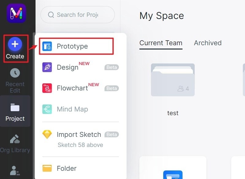
Step 3: Insert widgets and Icons
For an illustrative Fieldwork Studio page, begin with “We design service experiences for small teams,” then explain the type of work and the people responsible. Follow with one approved project example and a short account of the working process. End with a relevant next step, such as viewing the work or contacting the studio.
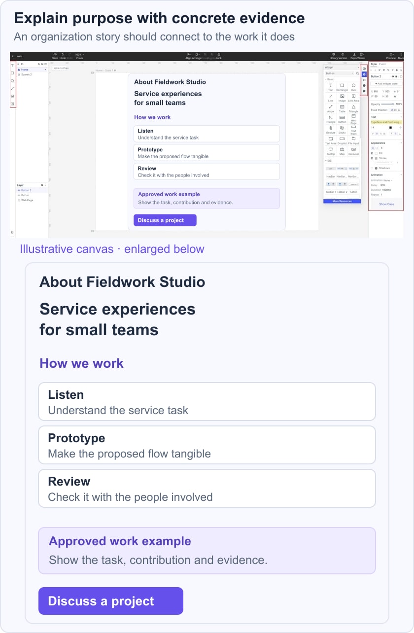
Check each statement against evidence. “We listen carefully” is difficult to evaluate on its own; a short explanation of how a project brief is reviewed tells the reader more. Do not invent client counts, awards or testimonials to fill a credibility section. If a claim cannot be supported, narrow it or remove it.
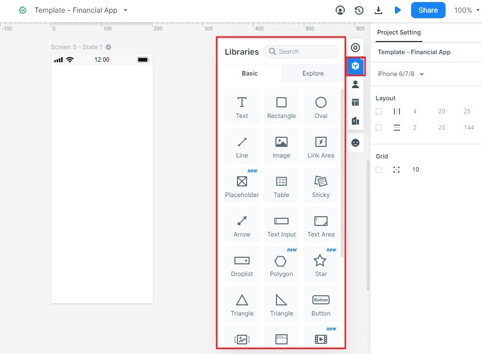
Step 4: Use media to explain the work
A short video or real photograph can show the people and process, but it should complement the text rather than replace the essential explanation. The retained historical widget images show an earlier embedding workflow; current controls and third-party embedding permissions may differ. Provide captions or an equivalent text explanation and keep the page understandable when the video is unavailable.
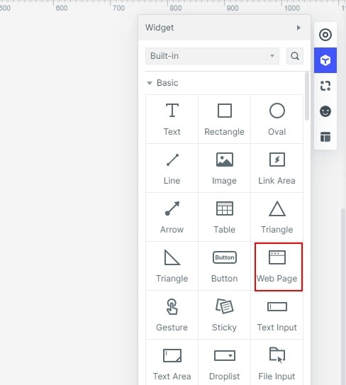
Ten historical approaches to an About Us page
These historical site references illustrate different ways to explain an organization. Current pages may have changed; a particular color or animation does not guarantee trust.
1: Cupcakes and Cashmere
The Cupcakes and Cashmere reference centers on a named creator and personal interests. This is a useful approach when the person’s perspective is part of the reason readers visit. Avoid assuming that a topic or visual style belongs to one gender; explain the actual audience and editorial purpose.
What to inspect
- A real portrait can identify the person behind the work when it has a clear purpose and appropriate permission.
- A specific account of interests and experience can help readers understand the perspective, without exposing irrelevant personal information.
- Keep routes to the main content and search recognizable so the biography does not become a dead end.
Apply the idea
- Separate an optional newsletter invitation from the core biography.
- If a shop is relevant, label it as a shop rather than hiding a commercial destination behind a vague personal link.
2: Nowness
The Nowness reference uses a video-led cultural story. The transferable idea is letting the medium demonstrate the editorial focus while still explaining what the organization does in readable text.
What to inspect
- Give media a deliberate place in the hierarchy rather than placing a large player above all context.
- Social links can lead to published work, but the presence of icons alone does not establish reputation.
- Use concise descriptions and clear headings to explain the scope of the work.
Apply the idea
- Make account creation optional unless it is required for the next task.
- Label search and playback controls and keep the essential story available without playing a video.
3: Mailchimp
The Mailchimp reference uses a company origin story. A chronological account can explain a product’s purpose, provided the events and dates are checked against approved source material rather than recreated from memory.
What to inspect
- Select milestones that explain meaningful changes instead of listing every year.
- Keep company history distinguishable from the shared navigation and promotional banners.
- Use a next step that matches the reader’s interest, such as exploring the product or reading a relevant case.
Apply the idea
- Use concrete language to explain what changed and why it mattered to customers.
- Link supporting work where it helps verify or extend the story, without turning every phrase into a promotional link.
4: Toy Fight
The ToyFight reference uses a distinctive agency voice and playful visual treatment. This can communicate personality, but the reader still needs to understand the services, team and contact route.
What to inspect
- Motion and illustration should support the story without preventing reading or navigation.
- A creative label such as “Who” needs enough context to communicate that it leads to company information.
- Keep the tone consistent while making important facts easy to locate.
Apply the idea
- Choose colors for readability and brand continuity rather than assuming that brightness persuades everyone.
- Provide a clearly named contact route for readers who are ready to discuss work.
5: Pierro Caron
The Pierro Caron reference focuses on an artist’s practice. The useful pattern is connecting a biography with visible work, explaining the methods or interests that give the portfolio context.
What to inspect
- Maintain a clear route from the biography to the work and back.
- Explain the practice in the creator’s own accurate terms, avoiding unsupported claims about recognition or sales.
- Use expressive headings only when the following text makes their meaning clear.
Apply the idea
- Show relevant work with accurate captions and appropriate image alternatives.
- An external profile can offer more context, but the main page should not require a social account to understand the artist.
6: Doom Tree
The Doomtree reference introduces a collective rather than a single founder. That calls for explaining both the shared purpose and the roles of the people involved.
What to inspect
- A group photograph can establish who is being discussed, but it does not replace names or descriptions.
- Keep member biographies proportionate to the page’s purpose.
- Separate current releases or events from durable background information so the About page does not become stale whenever a date changes.
Apply the idea
- Link to maintained work or event pages instead of copying an entire temporary schedule into the biography.
- Assign an owner to factual details such as membership and contact information.
7: Lonely Planet
The Lonely Planet reference connects a travel purpose with its resources. The principle is explaining what readers can use the organization’s work for, rather than simply saying that it is inspiring.
What to inspect
- An explanatory video should have a text alternative and a clear relationship to the page’s message.
- If an app or guidebook is relevant, identify the destination accurately and avoid obsolete download instructions.
- Keep search and account controls understandable as shared site functions.
Apply the idea
- Distinguish editorial background from a purchase action.
- Support statements about responsibilities or commitments with specific, maintained information.
8: Gummisig
The Gummisig reference is a freelancer’s introduction. A focused page can explain the type of work accepted, the working approach and the route for an inquiry without imitating a large company’s history.
What to inspect
- State the scope of the service in language a prospective client can understand.
- A friendly voice is useful when it remains precise about responsibilities and limits.
- Use relevant work examples to demonstrate the practice instead of asking the reader to infer expertise from color alone.
Apply the idea
- Publish testimonials only with a reliable source and permission; do not manufacture praise to fill a template.
- Keep professional profiles optional supporting evidence, not the only means of contact.
9: Bull Dog skincare for men
The Bulldog skincare reference connects an origin story with a product category. Product and health-related claims need their own evidence; an About page should not imply universal suitability merely because its story is engaging.
What to inspect
- Use brand imagery to support recognition, while the text explains the organization’s purpose.
- Separate the company story from detailed product claims and instructions.
- Keep headings, contrast and reading order consistent across sections.
Apply the idea
- Send readers to a relevant product page when they need product-specific information.
- Keep the shopping and account destinations clear rather than mixing them into the story without context.
10: Mixd
The Mixd reference emphasizes the people doing the work. This is useful when customers need to understand responsibilities and the organization’s approach, rather than just see a gallery of portraits.
What to inspect
- Let the hierarchy show the purpose of each section before relying on decorative styling.
- A dedicated team page can hold detailed roles when the About page needs to remain focused.
- Only include professional links that are relevant and approved by the people involved.
Apply the idea
- Use real, current portraits where appropriate; generic stock faces should not be presented as staff.
- Explain responsibilities in specific terms and keep them maintained as the team changes.
Conclusion
An effective About page makes a supported story easy to understand. Preserve the organization’s voice, verify its facts and give readers a sensible next step.
Before release, ask someone unfamiliar with the organization to explain what it does, for whom and how to continue. Check headings against the W3C guidance on meaningful heading structure, review the mobile layout and verify every biographical claim. A page that answers these questions is more useful than one that merely looks impressive.