8 UI Design Principles with Practical Interface Checks
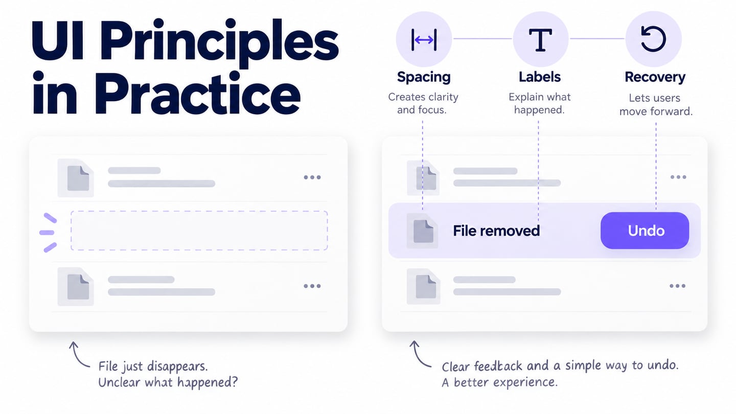
UI design principles help a team reason about an interface when several visual solutions seem possible. They are starting points for review, not guarantees that a design will work. This guide keeps eight useful principles from the original article and connects each to a concrete decision, a common failure, and a way to check the result.
Good UI Design Principles
Apply these principles to a real user task and review them together. A visually consistent interface can still hide its status; a prominent action can still be difficult to operate. Nielsen Norman Group’s usability heuristics provide a useful broad reference for feedback, consistency, user control, and error recovery. The examples below show how to turn those ideas into review questions.
1. Understand the task and audience
Research what the person is trying to accomplish, their context, and the information they need. For a shared document workspace, distinguish someone browsing files from an administrator managing access. A frequent mistake is adding every available action to every screen. Ask: can the intended person identify the next action without knowing the team’s internal terminology? Validate the answer with representative users rather than assuming that a competitor’s layout will work.
2. Make action outcomes visible
After an action, communicate what happened and what remains in progress. When a file is deleted, remove it from the relevant list and show an understandable result; while a save is pending, do not imply completion. A color change alone may be missed or misunderstood. Ask a reviewer to explain the current state without your narration. Ensure the implementation communicates important status to people using assistive technology as well.
3. Make controls understandable
An interface feels understandable when labels, grouping, and behavior fit the task. Use a visible label for an unfamiliar action rather than expecting an icon to explain it. In a file list, a generic trash icon beside several rows can create uncertainty about which item will be removed. Check that the action’s target is clear, that controls look operable, and that labels remain meaningful out of context.
4. Organize information by importance
Give the main task an appropriate visual priority while keeping related information available. In a deletion decision, the file name and consequence deserve more attention than unrelated promotions or secondary actions. Avoid making every button equally prominent. Ask the reviewer what they notice first and whether that matches the decision you need them to make. Use hierarchy to clarify choices, not to hide cancellation or pressure someone into an action.
5. Prevent mistakes and support recovery
People make slips, change their minds, and misunderstand labels. Choose a proportionate safeguard for the action: an undo opportunity may suit a reversible deletion, while an irreversible action may need a clear confirmation. State the affected item and the consequence. Do not add a confirmation to every minor action by default; repetitive dialogs can become noise. Test both the intended action and the recovery path, and confirm the actual retention policy before promising that a file can be restored.
6. Make the interface operable and accessible
Easy access is more than adding tabs or shortcuts. Consider keyboard operation, visible focus, readable contrast, zoom, target size, labels, and error identification. The relevant WCAG requirements give specific criteria to check. For the file example, a keyboard user must be able to reach the row action, understand its target, and return to a useful place after the result. A screenshot or clickable mockup cannot prove those implementation details.
7. Be Consistent
Use the same name and behavior for the same action across the product. If “Remove” revokes access in one place and deletes the file in another, matching button colors will not fix the confusion. Define the distinction and choose labels that reflect it. Reusable components help keep spacing, states, and typography aligned, but review exceptional cases rather than forcing unlike actions into one pattern.
8. Appropriate Language
Write labels and messages in language the intended reader understands. “Delete file” describes an action more clearly than “Execute object removal.” An error should say what the person can do next without blaming them or exposing unnecessary technical detail. Review text with real names, long titles, plural forms, and relevant languages so the layout does not depend on a convenient placeholder.
Apply the principles in a prototype
Use Mockitt to compare the interface states involved in a task. A prototype makes it easier to discuss the location of an action, the information shown before committing, and the feedback afterward. It does not replace research or the accessibility and behavior checks required in the implemented product.
Create a file list, a deletion decision, and a recovery state. Use realistic sample file names, preserve the distinction between removing access and deleting a file, and keep the recovery policy explicit. Reuse equivalent controls so reviewers can focus on the decision rather than inconsistent styling. If a template supplies an inappropriate action or promise, change it before the review.
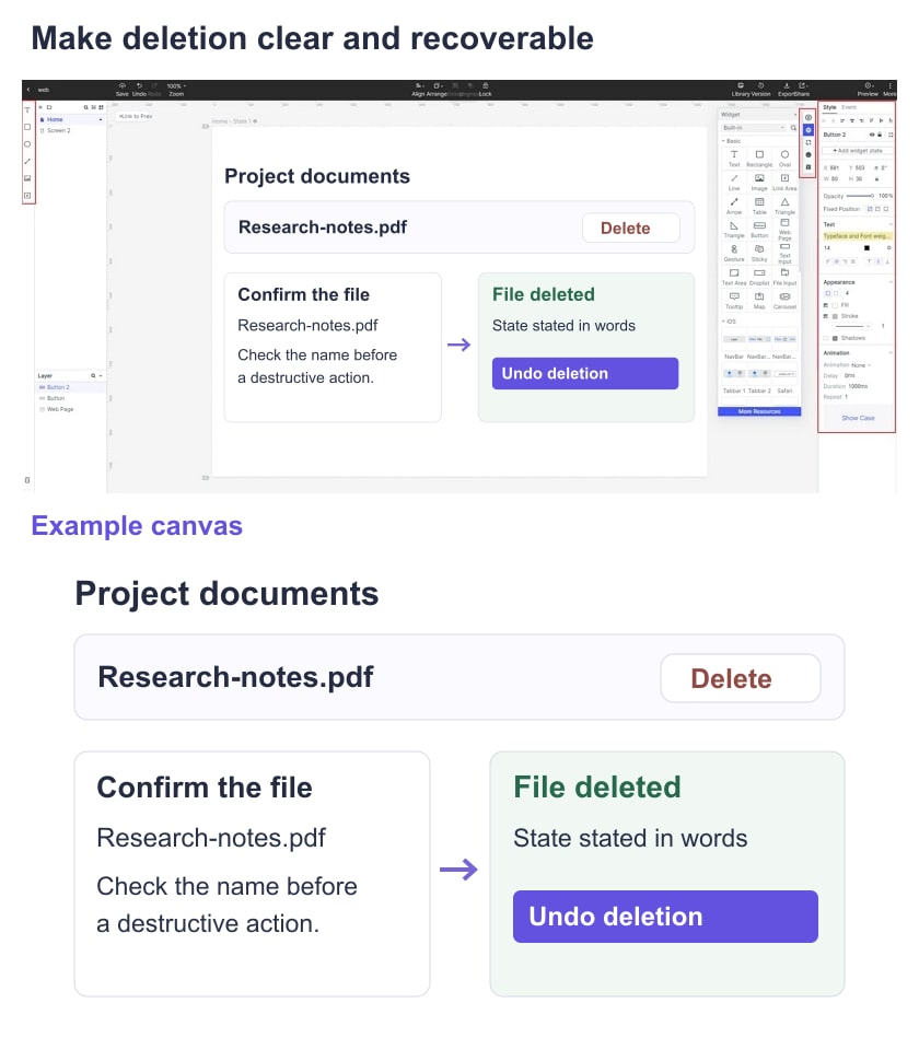
Ask a reviewer to delete a named sample file and then recover from a mistaken selection. Observe whether they identify the correct target and understand what happened. Record where they hesitate and why you think it happened, keeping observation separate from interpretation. Revise the affected state and check the path again; do not turn one informal review into a claimed usability result.
What to carry into implementation
- The reviewed user task, screens, and key alternate states, with unresolved issues assigned to an owner.
- Reusable component definitions and the circumstances in which a different pattern is intentional.
- Responsive behavior, realistic content limits, and the priority of information at narrow widths.
- Accessible labels, focus expectations, and non-color ways of identifying errors and status.
- Feedback and recovery behavior, including the approved timing and limits of any undo action.
- A record of review observations and decisions so the next team understands why a change was made.
- Implementation checks for keyboard use, assistive technology, persistence, and actual permission behavior. A prototype is the reference for intent, not evidence that these checks have passed.