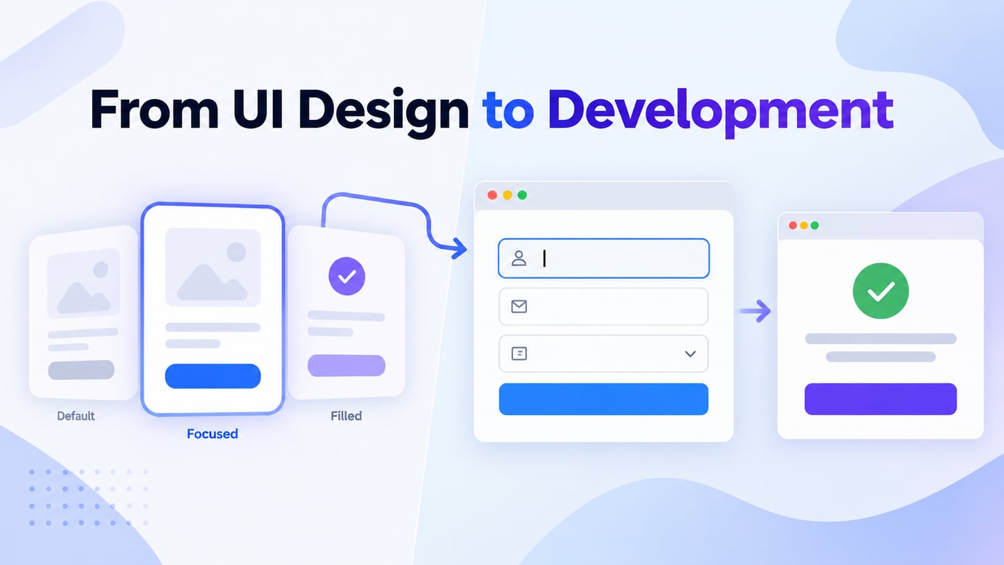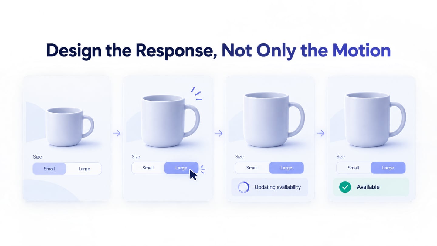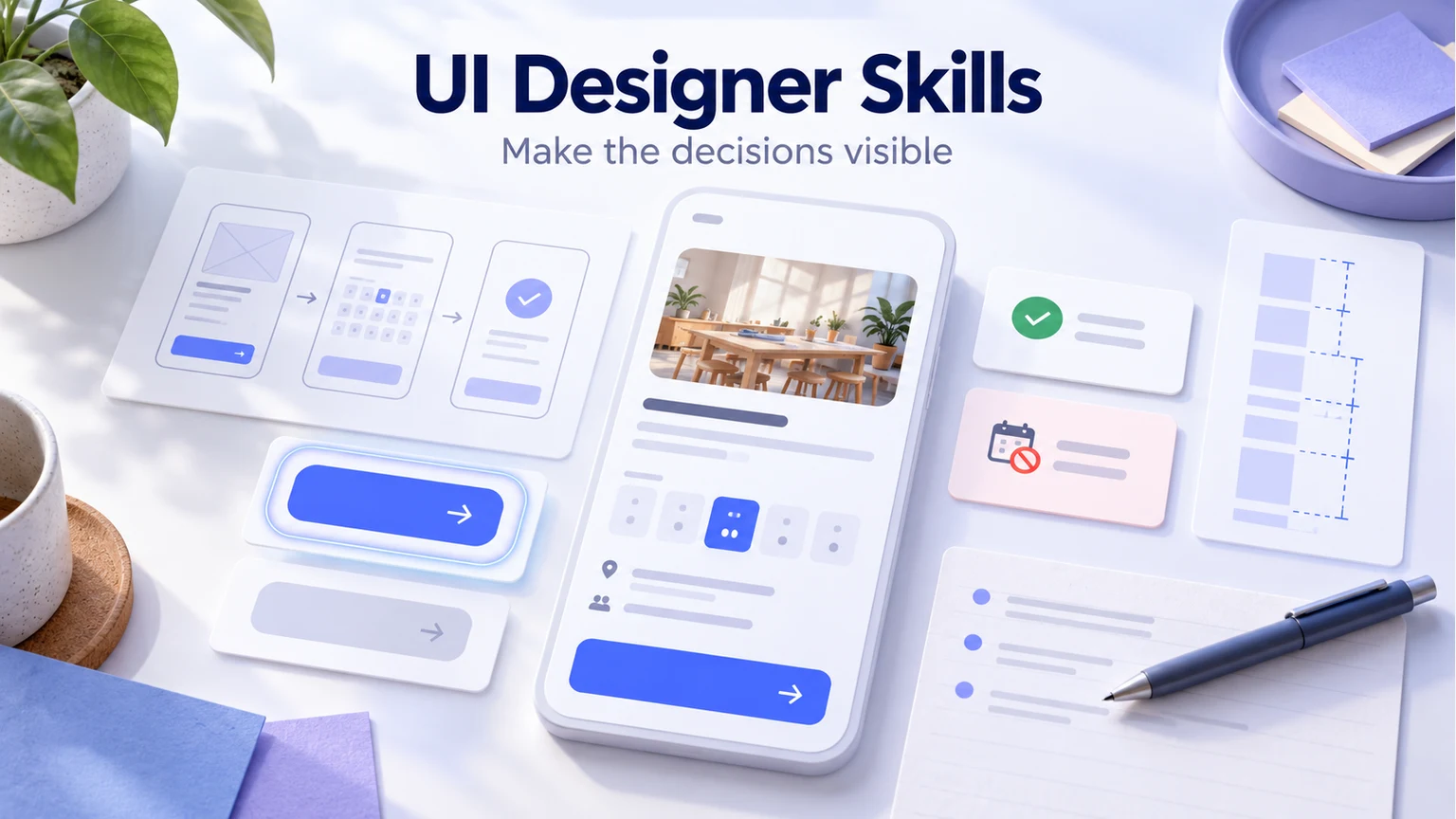
Useful UI designer skills combine interface craft with the ability to explain and evaluate a design. Wireframing and prototyping, tool fluency, analytics, collaboration, and research literacy all matter. The practical test is whether you can turn a user task into clear screens and explain the decisions behind them.
You can practice these skills with a small project in Mockitt's interface design workspace. Use a fictional community workshop booking page: show the workshop details, let someone reserve a place, and make the confirmation or unavailable result understandable. A focused example gives you more to discuss than a gallery of unrelated screens.
5 important skills for a UI designer
1. Interactive wireframing and prototyping
Wireframing and prototyping are foundational UI skills. A wireframe helps you decide what information belongs on a screen and how to prioritize it. A prototype makes the proposed interaction easier to inspect before developers implement it.
Get familiar with different levels of detail instead of making every exercise look finished immediately. For the workshop page, start with the name, date, location, availability, and primary action. Check whether a reader can understand the offer before choosing decorative imagery or animation.
Then connect the main route and a relevant exception. Reserve a place should lead to a clearly identified reservation result. No places available should explain what the person can do next, such as choosing another workshop, rather than leaving an inactive button with no explanation.
UX writing supports this work. Use specific labels and feedback: “Reservation confirmed” communicates more than “Success.” Explain what the user has reserved and what happens next. The UX writing guide explores how small pieces of interface text help people complete a task.
Keep an annotated flow or a short prototype walkthrough as evidence of this skill. Explain which question needed interaction and which details were intentionally left out. A clickable prototype demonstrates proposed behavior; it does not prove that a reservation service works.
2. Tool fluency and visual consistency
Tools help you express design decisions, but learning every new application is not the same as improving your craft. Become comfortable arranging elements, editing typography and spacing, reusing components, connecting screens, and preparing a design another person can understand.
Mockitt provides a browser-based environment for creating interfaces and prototypes. Use it to keep repeated elements consistent across your workshop screens. When you change a label, review its appearances in the details, confirmation, and unavailable states rather than treating each screen as a separate poster.
Practice the visual basics deliberately. Establish a readable hierarchy for the workshop title, schedule, supporting details, and primary action. Use alignment and spacing to show related information. Test a long workshop name so the layout is not dependent on unusually short sample content.
Design the button states the implementation needs, including a visible keyboard focus state. A disabled action should have a reason that people can understand. For text readability, WCAG's contrast guidance specifies a minimum of 4.5:1 for ordinary text and 3:1 for qualifying large text, with defined exceptions. Check actual colors and sizes rather than judging contrast by eye.
Build and preview the workshop route, then inspect it at a narrow screen width. Confirm that important information remains visible, text wraps naturally, and the next action is clear. A screenshot of a focus state documents an intention; keyboard operation and accessibility still need checking in the implemented product.
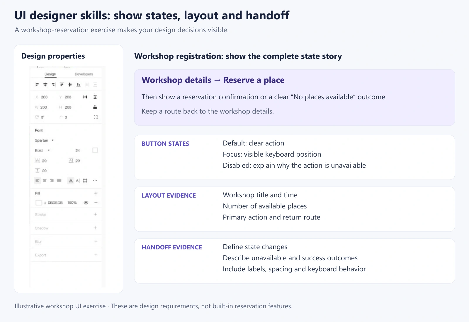
The evidence to keep is a small, consistent set of screens and states, plus a note explaining how the layout handles longer content. That demonstrates more tool competence than a list of software names on a resume.
3. Understand analytics without guessing the cause
Alongside wireframing knowledge, learn to read counts, percentages, and ratios. They can help you see where people struggle, but a number does not explain its own cause. Define the event, audience, time period, and denominator before comparing results.
For a live workshop service, a drop between viewing details and starting a reservation could have several explanations: unsuitable dates, lack of places, unclear pricing, or a technical problem. It would not automatically prove that the button color is wrong. Check instrumentation and relevant context before proposing a redesign.
Combine a pattern in the data with research or a targeted review. A design hypothesis makes the proposed explanation explicit so the next test can challenge it. For example, making the date and location visible near the action might help people decide whether the workshop fits their plans; that remains a hypothesis until examined.
When practicing with invented data, label it as sample data and show how you would interpret it. Do not present a prototype's clicks as production conversion or add an unsupported improvement percentage to your portfolio. A clear analysis question is more credible than a dramatic number without a source.
4. Explain decisions and prepare useful handoff
UI work involves designers, researchers, developers, product managers, and other colleagues. Collaboration helps you combine their knowledge and identify constraints a screen alone cannot show. Communication is therefore part of designing the interface, not only presenting it afterward.
In a review, explain the task, the current proposal, and the decision you need. “Can someone tell that the workshop is full before starting a reservation?” gives colleagues something specific to inspect. “What do you think of the design?” often produces unrelated preferences.
Record useful feedback with its reason. A developer may explain that availability can change during the flow; a researcher may point out that people need accessibility information before booking. Those observations can change the states and content required, rather than simply adding more decoration.
For handoff, identify the agreed version and annotate behavior that is not obvious visually. Explain what Reserve a place does, which information appears in the confirmation, what happens when availability changes, and where the person can go after an unavailable result. Keep unresolved rules visible for the team to decide.
A review note and a concise state specification are useful work samples. They show how you respond to constraints and help another person continue the work.
5. Research literacy and attention to user needs
UI decisions should be informed by the people who will use the interface. Learn to ask useful questions, read research findings, and distinguish observed behavior from assumptions. Research literacy does not mean that every UI designer must independently run every kind of study.
For the workshop example, learn what someone needs to know before reserving: timing, travel, cost, accessibility, or what to bring. Do not assume those priorities from your own preferences. Research can also reveal different needs within the audience rather than one universal “typical user.”
Evidence-based user personas can keep relevant goals and constraints visible during design. Use them to ask concrete questions about the interface, not to invent a biography or decide that a demographic group behaves in one fixed way.
When reviewing a prototype, ask someone to attempt a realistic task and explain the result. Pay attention to the route, hesitation, misunderstanding, and assistance needed. Empathy helps you listen; evidence helps you decide what to change.
Finish the exercise with the revised screen, the reason for the revision, and the next thing you would investigate. Across these five skills, the strongest evidence is a coherent design process that another person can follow.