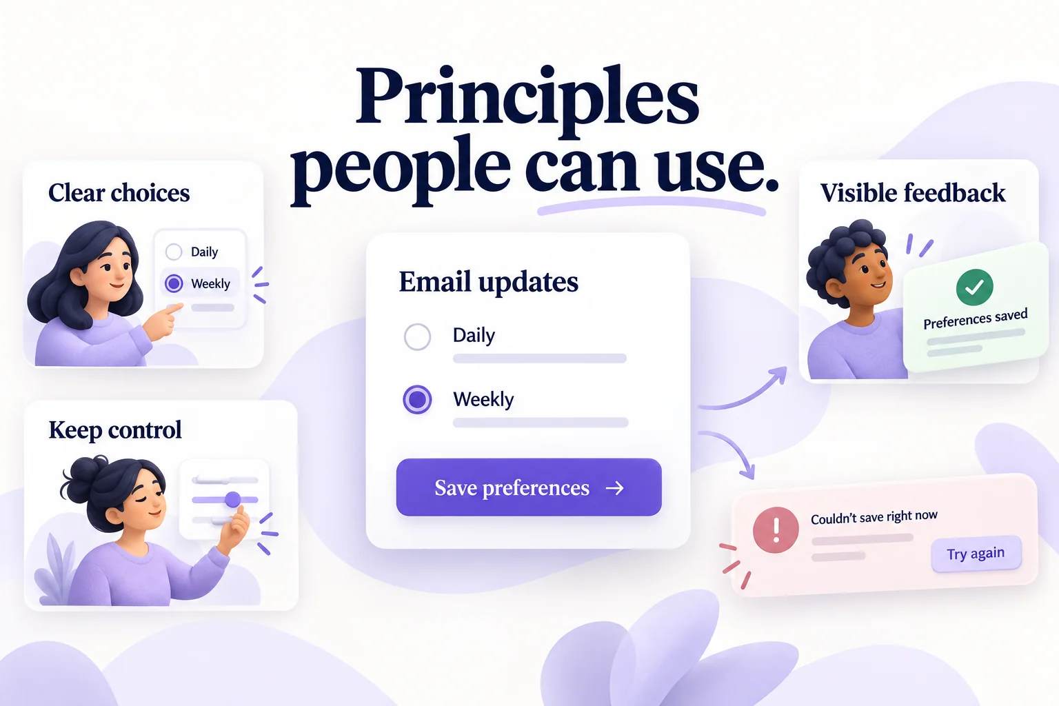
Good UX design principles help people understand an interface, complete a task, and recover when something goes wrong. For beginners, ten useful starting points are user needs, consistency, clarity, hierarchy, feedback, simplicity, familiar standards, user control, usability, and error prevention. Apply them to the task in front of you rather than treating them as a formula for guaranteed product success.
Use these principles while sketching and while you test an interactive prototype in Mockitt. They are easier to discuss when the team can follow a real sequence, such as changing notification preferences, than when everyone is reviewing an isolated attractive screen.

10 Important UX Design Principles
User experience includes how people understand and use a product, as well as whether it meets their needs in context. Visual design matters, but a polished interface can still have confusing navigation, misleading feedback, or a difficult recovery path. The principles below show where each one changes a design decision.
1. Meet User Needs
The primary aim of a design is to help users accomplish something that matters to them. Remember that you are not automatically representative of the audience. Learn about their tasks, constraints, and current ways of working before deciding which features or controls they need.
Interviews, observation, support questions, and task-based testing can reveal different parts of the problem. Choose the method for the question, not because it is the cheapest or most familiar. For example, seeing someone struggle to change a setting can reveal a navigation problem; asking whether they like the screen may not.
A control that looks unusual can still work, and a familiar control can still be inappropriate. Rather than assuming users prefer a slider or button, identify the decision they must make and test whether the chosen control makes it understandable. An eye-catching design is not sufficient if it does not support the task.
2. Consistency
Consistency includes fonts, colors, spacing, image treatment, terminology, and interaction behavior. Use the same patterns for the same meanings. People should not have to relearn how to save, cancel, or find a setting on each screen.
Take a form: related labels and instructions should have a consistent visual treatment, while errors must be distinguishable from ordinary guidance. Making every field identical is not the goal. Required, optional, disabled, and invalid fields communicate different things and may need different states.
A shared component can help maintain those decisions across screens. Record the meaning behind the style, not just its color or size. If one save button takes effect immediately and another opens a review step, make that behavioral difference clear rather than disguising it with identical labels.
3. Clarity
People should be able to understand what an action will do and where they are in a process. This matters especially when the action changes important information or commits them to a transaction. Use concrete labels and explain unfamiliar terms in the place where they are needed.
In an online purchase, distinguish the product, billing, review, and confirmation stages. A multi-step flow can make those stages visible, but it is not automatically better than a single page. Choose the structure around the amount of information and the task. In either format, show what remains and whether the purchase has been completed.
For a notification setting, “Save preferences” is clearer than “Continue” if the next action saves a choice. If it only advances to another screen, do not imply that the preference is already stored.
4. Have a Hierarchy
Information hierarchy organizes content and destinations. Visual hierarchy helps people notice what is important on the current screen. Both matter: a prominent button cannot fix an unclear navigation structure, and a sensible structure can still be difficult to scan.
An online store, for example, may group products into categories and subcategories while keeping search available. On a product page, the title, price, availability, and purchase action should have a clear relationship. A promotional banner should not compete with the information needed to choose the product.
Use headings, position, size, weight, and spacing to establish priority. Do not rely on color alone. On a settings page, group notification frequency with its explanation and keep unrelated account controls in a separate section. Review the hierarchy when the content wraps on a narrow screen.
5. Feedback
Feedback communicates what the system is doing and the result of an action. After submitting a job application, a person needs to know whether it was received, is still being processed, or failed. The message should explain the state and, when necessary, what to do next.
Do not show success merely because a button was clicked. The implemented product should confirm the actual outcome. If saving fails, preserve the person's work where possible and explain how to retry. A progress indicator can help during a wait, but it should not imply a precise completion percentage when none is known.
The W3C guidance on form notifications explains communicating success and errors accessibly. Include the intended message and focus behavior in the design specification, not only a colored toast in the mockup.
6. Simplicity
The aim is to help people find what they need, not to demonstrate how many features fit on one screen. Remove unnecessary decoration and competing actions, but keep the information required to make a sound decision. A minimalist interface that hides essential controls is not necessarily simple to use.
For a PDF tool, upload, convert, and edit may be the primary tasks. More specific editing actions, such as cropping pages or adding page numbers, can appear when the person is editing a document. This reduces initial complexity without making the secondary actions impossible to find.
For notification preferences, ask only for choices that affect the notifications. A frequency selector does not need unrelated profile fields. If an advanced option is hidden, give it an understandable label and keep the current setting visible when that matters.
7. Follow Standards
Familiar patterns can reduce the effort needed to understand an interface. Respect the conventions of the platform and the meaning people already associate with common controls. New behavior should solve a real problem, not create novelty for its own sake.
Icons such as a house or magnifying glass can be familiar, but recognition depends on context and the audience. Add visible text when the meaning is not clear. Do not assume that an unlabeled custom icon becomes understandable because it looks elegant.
Use a control according to its expected behavior. A checkbox normally supports an independent on/off choice. A group of radio buttons supports one choice from a set. If a control has unusual consequences, explain them before the person commits.
8. Keep Users Free and in Control
People should be able to make informed choices and leave a flow when appropriate. Provide understandable ways to go back, cancel, or change a decision. Avoid forcing a commitment through an unexpected action or hiding the route out.
During checkout, a person may need to edit an address or review an item without losing unrelated information. In a document editor, undo can help recover from a reversible change. The right recovery method depends on the action; not every system can undo an already completed external transaction.
On a preferences page, explain whether changes save immediately or require a save action. If there is a Cancel button, define what it restores. Leaving the screen and returning should not create uncertainty about which preference is active.
9. Usability
Every control should support a purpose people can understand. An appealing screen is still difficult to use if labels are ambiguous, targets are awkward to select, or keyboard users cannot complete the task. Consider the complete path, including errors and interrupted work.
Conduct usability testing with representative tasks. Observe whether people can complete the intended action, what they misunderstand, and what assistance they need. A preference for one color scheme is different from evidence that a flow is easier to use.
Accessibility also requires evaluation beyond a visual prototype. A prototype can communicate labels, order, and states, but implementation must support the appropriate semantics, keyboard behavior, and assistive technologies.
10. Confirm Before Committing When the Risk Justifies It
People can choose the wrong item or trigger an unintended action. Protect them from serious consequences with an appropriate opportunity to review, correct, or reverse the decision. A confirmation dialog is one option, not a requirement for every click.
For an irreversible deletion, explain what will be removed and identify the item. For a financial commitment, give the person a clear review of the relevant details. For a low-risk reversible change, undo or straightforward editing may work better than repeatedly interrupting the task.
WCAG's error-prevention guidance describes safeguards for important submissions, including reversal, input checking with an opportunity to correct, or review and confirmation. It does not call for a confirmation dialog for every ordinary save. Match the safeguard to the consequence.
Apply the Principles to Notification Settings
Imagine a service with a single preference: receive email updates daily or weekly. The goal is to help a person choose the frequency and know that it has been saved. This small example makes several principles visible together without adding unnecessary features.
- Start with the decision. Label the section “Email updates” and explain what kind of updates it controls. Use “Daily” and “Weekly” as mutually exclusive choices.
- Make the action explicit. Use “Save preferences” when the choice needs to be submitted. Keep the selected option visible while saving.
- Show the result. After a successful save, show “Preferences saved” and leave the active choice identifiable. Do not require the person to infer success from a disappearing spinner.
- Design the failure path. If saving fails, show “Could not save. Try again.” Preserve the Weekly selection so the person does not have to choose it again.
- Check control and clarity. Ask a reviewer to change the frequency, explain what is currently saved, and recover from the failure state. Their interpretation is more useful than asking whether they like the layout.
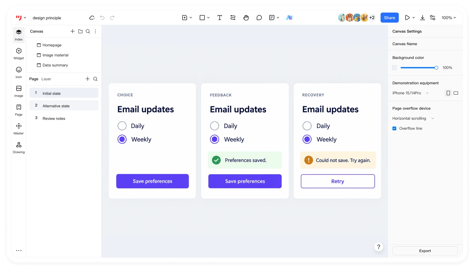
The example is a designed demonstration of states, not evidence of a live notification service. In the implemented product, the saved preference and the success message must reflect the actual result. Use the same controls and wording across the normal and error screens so the recovery path feels like part of one coherent interface.
Conclusion
These ten UX design principles are a practical starting point for evaluating a task flow. Use them to explain specific choices: why a label is clearer, why a state needs feedback, or why an action needs a recovery path. Then check those decisions with users and the implemented product. Good principles guide the work; evidence shows where the design still needs improvement.