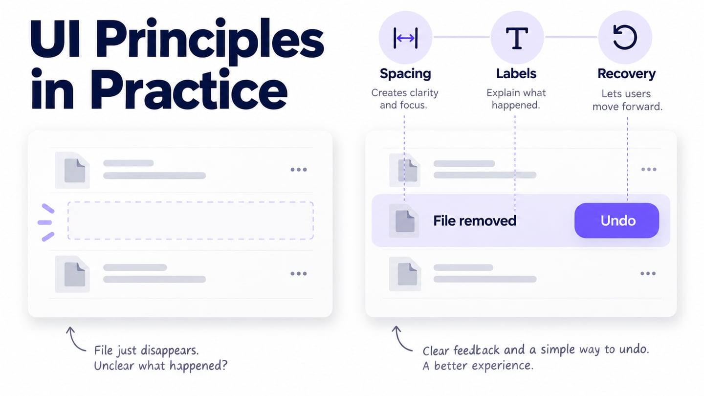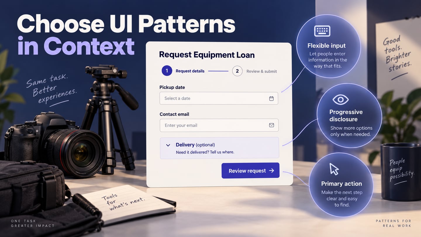
UI design patterns are reusable approaches to recurring interaction problems: helping someone complete a form, find their place or choose the next action. They are useful when the context fits. This guide explains ten patterns, the mistakes to avoid and how to combine selected patterns in an equipment-request form.
Prototype the Pattern Before Adopting It
Use the Mockitt design workspace to explore the layout and the prototype workflow to review a sequence of states. Begin with the person’s task rather than a favorite component. A visually familiar pattern can still be confusing when its labels or behavior do not fit the situation.
Prepare a Useful Pattern Review
- Scope: choose a small task, such as requesting a piece of equipment, and define what the person needs to know before continuing. Confirm current workspace requirements separately rather than relying on historical prices.
- Reusable elements: use consistent fields, labels and buttons so differences between states remain meaningful. Reuse the same pattern where its behavior is the same.
- Layout: arrange the controls in the order people need them, and check long labels and a narrow viewport before adding decoration.
- Interaction: connect the normal route and a relevant exception, such as a missing required field. Make clear which actions are simulated rather than connected to a live service.
- Review: ask someone to attempt the task and explain what they expect to happen. Record confusion at a specific label, control or state rather than collecting only general opinions.
- Version: retain the version used in the review and the decisions that followed. A cloud workspace does not justify a promise that work can never be lost.
- Handoff: explain validation rules, focus behavior and unresolved conditions to the implementer. A prototype can show the intended experience but cannot certify the final code’s accessibility or reliability.
What Are UI Design Patterns?
A UI pattern describes a recurring problem and a way to address it in context. It may involve one component, such as a required-field label, or a sequence, such as a multistep form. A component is the interface element; the pattern explains when and how to use it. Copying the appearance without understanding the task can reproduce the wrong behavior.
Describe a pattern with three questions:
- Goal: what does the person need to accomplish, and what would a successful outcome mean?
- Context: what information, device, permissions or prior steps affect the task?
- Approach and limits: how does the pattern help, and when would a different approach be more appropriate?
Ten UI Design Patterns and Their Trade-Offs
These patterns are options, not a ranking or a requirement to use all ten on every screen. Choose the smallest set that supports the task and check the states the person may encounter.
1. Deferred Registration
Deferred, sometimes called lazy, registration lets someone explore or begin a task before creating an account. A shopping cart can be one example, but not every service should defer identity checks. Decide which actions genuinely need an account and explain that requirement before the person invests substantial effort. Preserve work when registration interrupts a task.
2. Progressive Disclosure
Progressive disclosure keeps the immediate choices visible while revealing secondary or advanced options when needed; a mobile bottom sheet is one option for a short secondary choice. In an equipment-request form, delivery details can appear when someone chooses delivery instead of pickup. Keep the control that reveals them clear, and do not hide information needed to make the initial choice.
3. Forgiving Input Formats
A forgiving format accepts reasonable variations in input and makes the interpretation clear. It is not simply a search field with many results. For a pickup date, define the accepted formats and display an unambiguous confirmation such as “12 Nov 2026.” Do not silently guess whether “03/04” means March 4 or April 3; provide clear guidance or ask for clarification. Validation is still needed.
4. A Clear Primary Action
Give the current task an identifiable next action, such as “Review request.” Secondary actions such as “Save draft” or “Cancel” should remain understandable without competing equally for attention. “One primary action” is a useful focus for a task area, not a rule that every complex page can contain only one meaningful action. Label the actual outcome and show loading or failure feedback when needed.
5. Breadcrumb Navigation
Breadcrumbs usually show a page’s place in a hierarchy, not the user’s complete browsing history or progress through a form. For example, “Equipment / Cameras / Camera kit” describes location. A form-step indicator serves a different purpose. Use breadcrumb navigation when the hierarchy helps people orient themselves and reach higher-level pages.
6. Focused Account Registration
When an account is necessary, explain why and collect the information needed for that step. Keep labels and validation understandable, preserve entries after an error and provide an existing-user route where appropriate. Registration should follow the service’s actual access requirements; not every website needs to demand an account at the beginning.
7. Clear Required and Optional Fields
Mark required and optional fields consistently, using text or a clearly explained marker. Avoid relying on color alone. The W3C form-instructions guidance explains how labels and instructions help people provide the expected information. Keep a useful optional field when it serves a real task, rather than removing every optional field by rule.
8. A Progress Indicator for Multi-Step Tasks
Show the current stage and the remaining stages when the sequence is known. In a two-step equipment request, “Details” and “Review” communicate more than unexplained dots. If choices change the route, update the indicator accordingly. Allow people to revisit earlier entries without losing their work, and distinguish reviewing a request from actually submitting it.
9. Comparable Subscription Plans
Plan comparisons help people understand a commercial choice. Keep the comparison dimensions consistent and explain the billing period, meaningful limits and what the next action commits them to. Use this pattern only when a subscription decision belongs to the service; it is not needed in the equipment-request exercise below.
- A recognizable plan name and the intended use or audience.
- The price, billing period and relevant renewal or trial conditions, verified against the current offer.
- Comparable included features and material limits, rather than an uneven list of attractive claims.
- An action label that distinguishes starting a trial, choosing a plan and completing a purchase.
10. Supplemental Hover and Focus Content
A tooltip or additional detail can reduce clutter, but essential actions and instructions must also work for keyboard and touch users. Content triggered by hover or focus needs appropriate dismissal and persistence behavior; see W3C’s hover and focus guidance. Do not hide the only explanation of a required field behind a mouse-only interaction.
Combine the Patterns in an Equipment Request
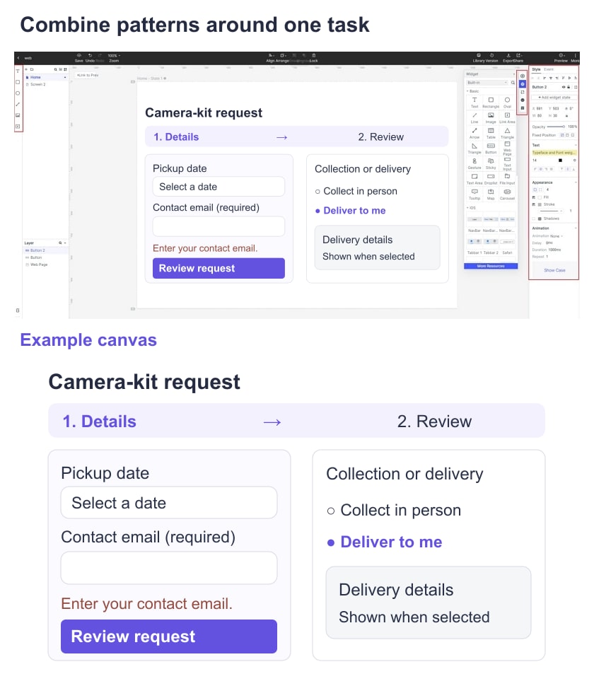
Imagine a community workshop lending a camera kit. The requester chooses equipment, a pickup date and a contact email, then reviews the details before submitting. Build this as an illustrative form; it does not reserve real equipment.
Show the Required Path First
On the first screen, use the labels “Equipment,” “Pickup date” and “Contact email (required).” Explain the expected date input beside the field. Show “Step 1 of 2: Details” and use “Review request” as the primary action. Keep “Cancel” visually secondary and explain whether leaving discards an unfinished request.
Reveal Only the Relevant Extra Fields
Offer pickup and delivery as explicit choices. Reveal “Delivery address” only when delivery is selected, while keeping any availability or cost information needed for that choice visible in advance. The optional delivery section should not make the basic pickup route look incomplete.
Design the Exception and the Review State
Create a missing-email state with a message next to the field and an ambiguous-date state that requests clarification. Preserve the other entries. On the review screen, show the interpreted date in words, the selected equipment and the collection method, with an edit action that returns to the existing values.
Ask a reviewer to request the camera kit for a stated date, change pickup to delivery, correct the missing email and explain what “Submit request” will do. Record where they hesitate and whether they notice the changed fields. Test the implemented form separately for keyboard focus, screen-reader labels, real validation and availability; a connected prototype demonstrates the intended route, not those runtime behaviors.