Modern UI Design: A Practical Workflow Beyond Visual Trends
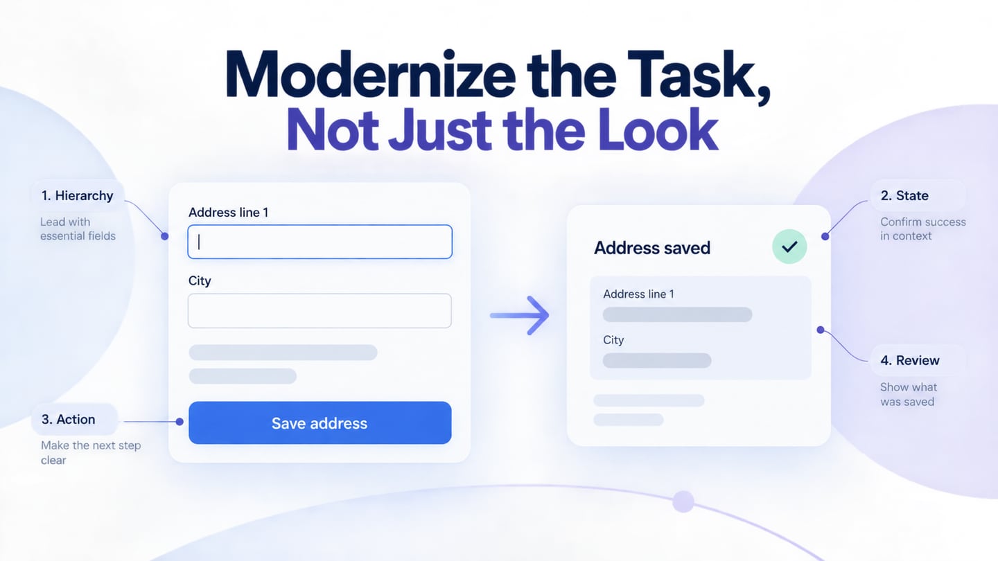
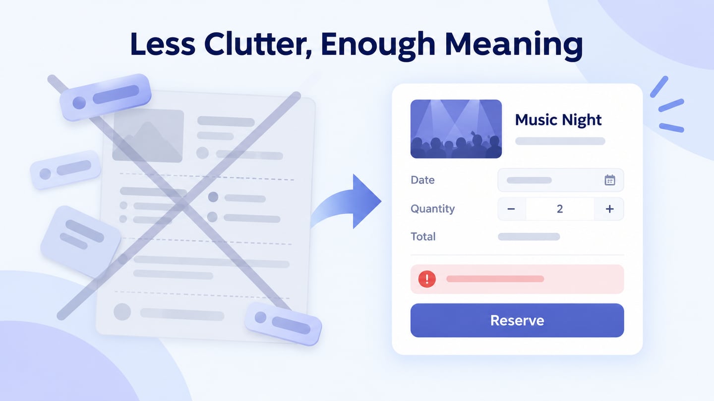
Modern UI design should make the current task clear, work with changing content and screen space, and communicate what happens after an action. Visual trends can influence appearance, but they do not establish quality. Use Mockitt’s UI design tools to explore hierarchy and reusable patterns alongside the workflow they serve.
Use a Shared Workspace for UI Decisions
Mockitt provides a browser-based workflow for arranging interface elements and reviewing designs. Start with realistic content and the decisions the person needs to make. Reusable components help keep repeated patterns consistent; they still need suitable labels and states.
Share the relevant design with reviewers and keep access settings appropriate to the project. Use animation only when it clarifies a transition. Current screen and collaboration limits depend on the plan, so do not assume that a workspace offers unlimited screens or access to everyone.
How to Make Modern UI Design Step-by-Step
The original five-stage workflow remains useful when it includes validation and handoff, rather than treating an attractive prototype as a released product. The screenshots below show earlier Mockitt controls; retain their conceptual steps while checking the current workspace.
Step 1: Create a new project
Create a project and choose the initial device or viewport. Give the project a task-specific name and include the important content conditions, such as long labels or an empty list.
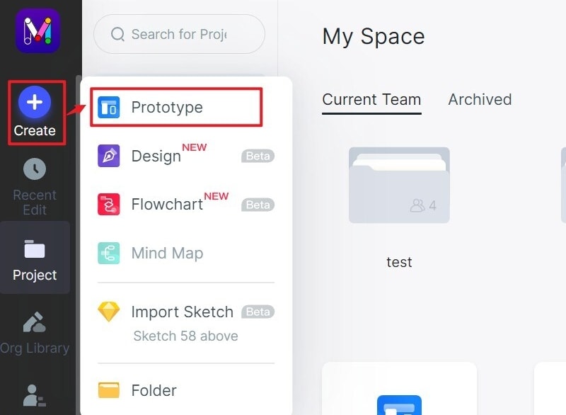
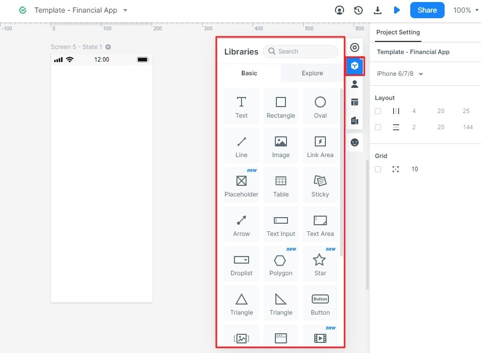
Step 2: Design the app with Modern UI
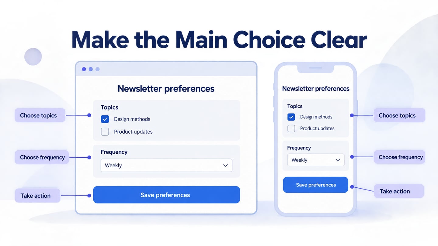
Add the components, text, and icons required for the task. Establish a visual hierarchy and consistent spacing before adding decoration. A component library supplies a starting point, not the meaning of the interface.
Connect the important screens and states. Document the action that triggers each transition and the outcome the person should see. Keep unexpected branches visible in the review.
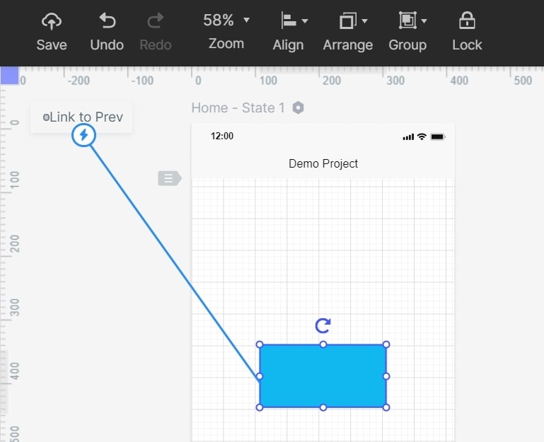
Add notes for requirements that a visual mockup cannot demonstrate, such as validation rules, permissions, and the source of displayed data.
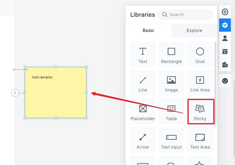
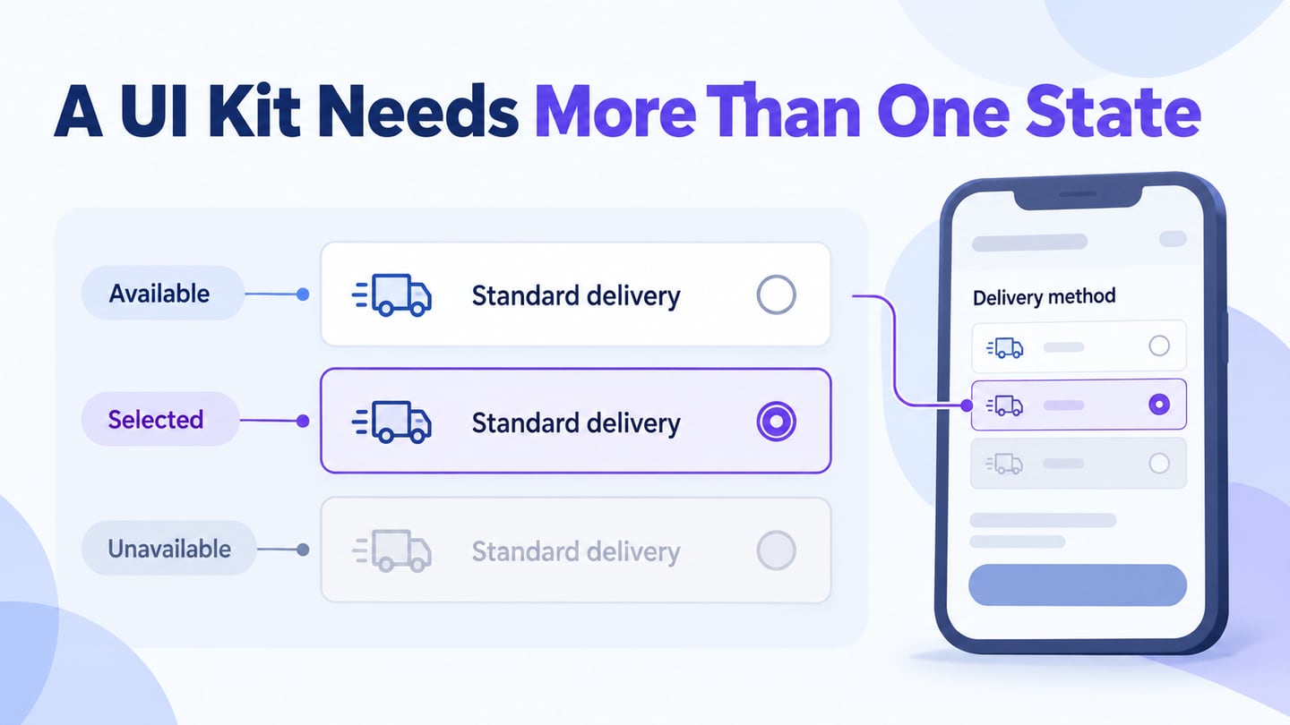
Use interactive states to explain selection, pending work, and confirmation. Check that the interface remains understandable when nonessential motion is absent.
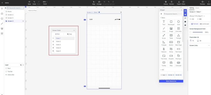
Step 3: Preview the Modern UI Design
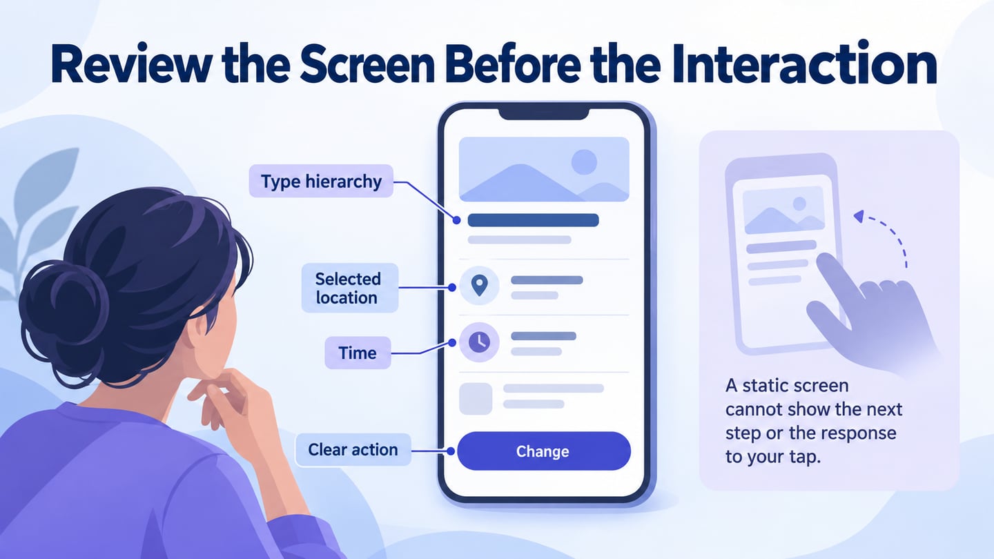
Preview the prototype on the intended screen sizes. Check both the default state and exceptions: larger text, long content, unavailable data, and invalid input. A desktop preview alone does not validate mobile behaviour.
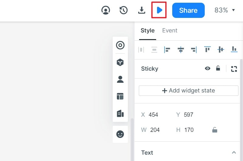
Step 4: Share the app prototype
Share the prototype with a clear task and specific questions. Ask reviewers to explain the outcome they expect before they activate a control; mismatches reveal ambiguity in labels or hierarchy.
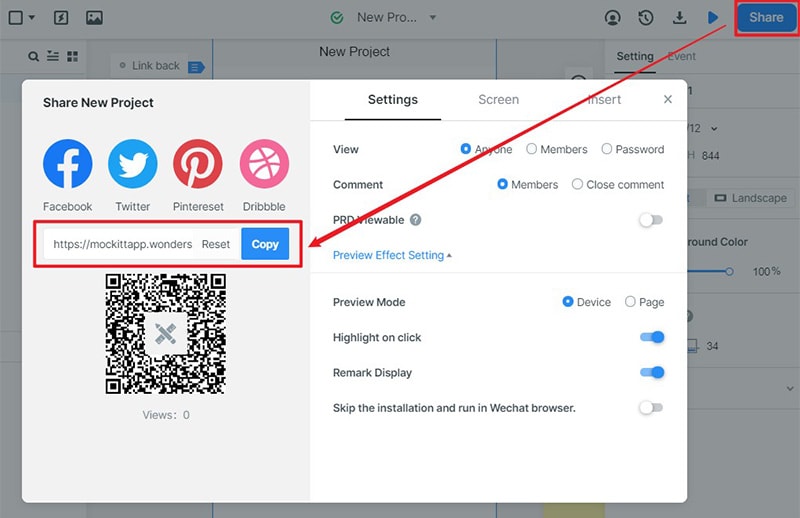
Step 5: Prepare for Implementation and Validation
After design review, hand over the states, rules, and unresolved questions. Developers still need to implement and test the interface, data handling, accessibility, and performance. Publishing a prototype is not the same as launching the finished application.
Modernize one address-editing task
For an illustrative address editor, use Address line 1 and City labels, sample values 18 Willow Lane and Bristol, and a Save address action. Keep the edited values visible if validation fails. After a confirmed save, show Address saved beside the resulting summary rather than changing the button color and expecting the person to infer success.
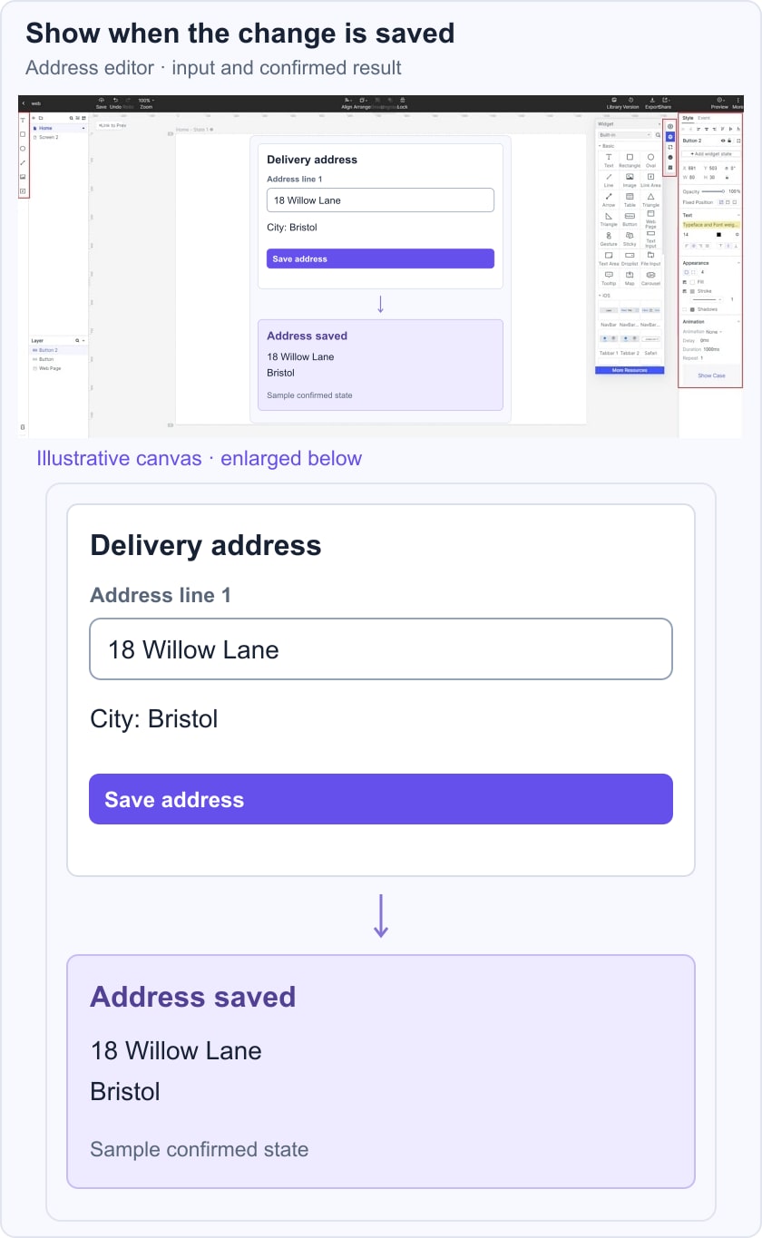
Review the default, invalid, pending, and saved states in an address-editing prototype. Follow accessible validation guidance for clear error explanation and correction. This example tests whether the modernized layout helps the task; it does not claim a real address has been stored.
Five UI References: What to Learn and What to Verify
1. Medium
Medium is a useful reference for content hierarchy and the separation of writing from publication. Its writing and publishing guidance gives a concrete workflow to inspect. Evaluate how your own editor distinguishes draft, preview, and public content rather than assuming that every reader sees the same current toolbar.
2. Virgin America: A Historical Booking Reference
Virgin America is a historical flight-booking reference, not a current booking service recommendation. The transferable question is whether a traveler can review and change itinerary choices before commitment. A modern booking design should make dates, passengers, price conditions, and the selected route understandable.
3. Airbnb
Airbnb was included for its accommodation-browsing and booking context. The useful design question is how a listing summary connects to the details required for a decision. Do not rely on an old description of where filters or prices appear. Check the current interface and preserve the information your own task requires across the transition.
4. Boosted Boards: A Historical Product-Presentation Reference
The earlier Boosted Boards example emphasized product motion and progressive detail. Treat that as a historical design lesson, not a claim about a current store or service. Product animation can explain form and construction, but buying information must remain usable without it. Keep relevant conditions and the main action available when media is slow or motion is reduced.
5. Dropbox
Dropbox provides a reference for organizing files and communicating item status. The useful lesson is to distinguish the item, its current state, and the action available to the person. Do not infer usability from illustration style alone; review the labels, permissions, and recovery paths with a concrete file task.
Bring these references back to one review question: does the interface make the person’s next decision clearer? Keep the visual system coherent, verify the difficult states, and use implementation testing to confirm what the prototype can only describe.