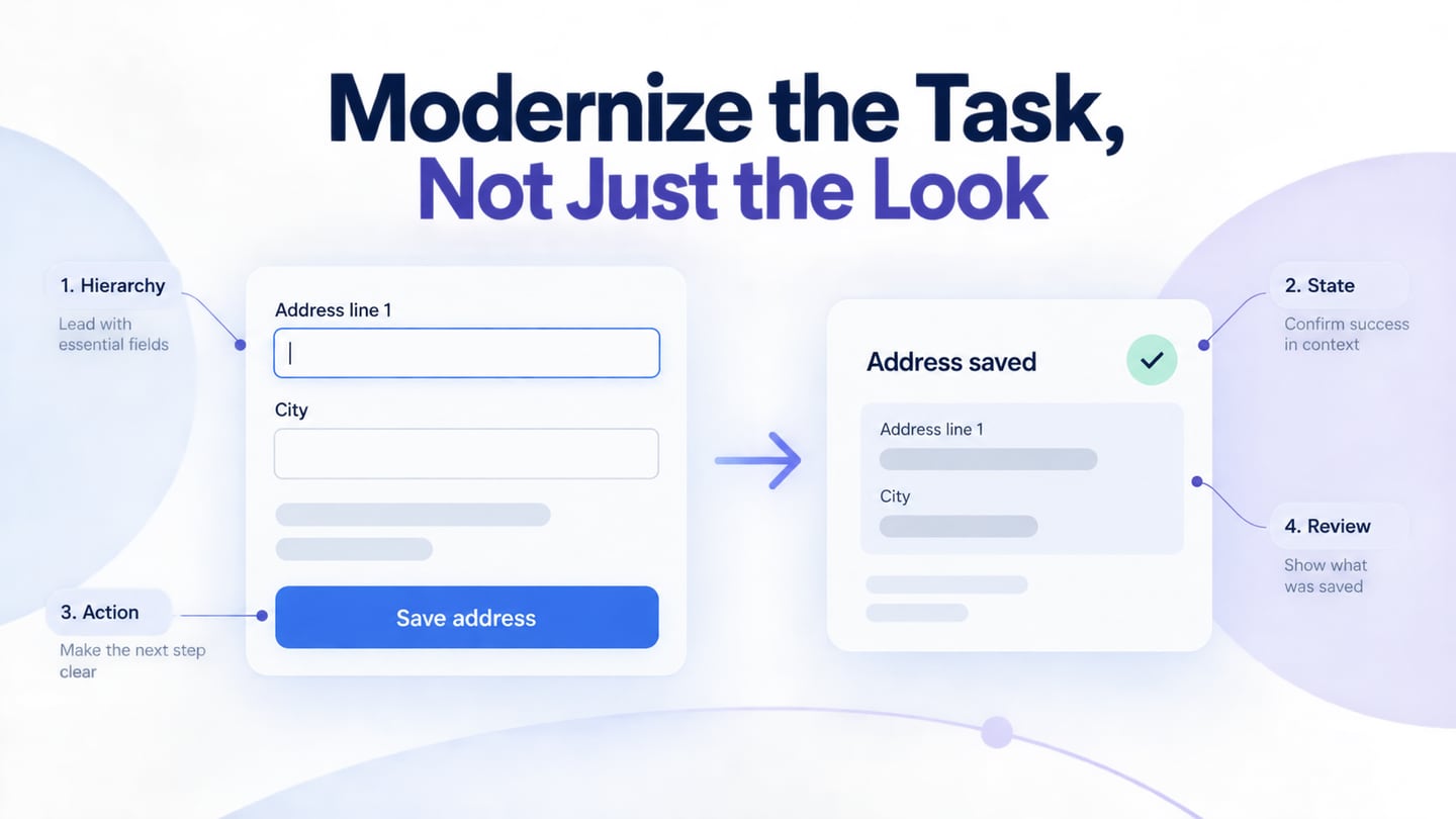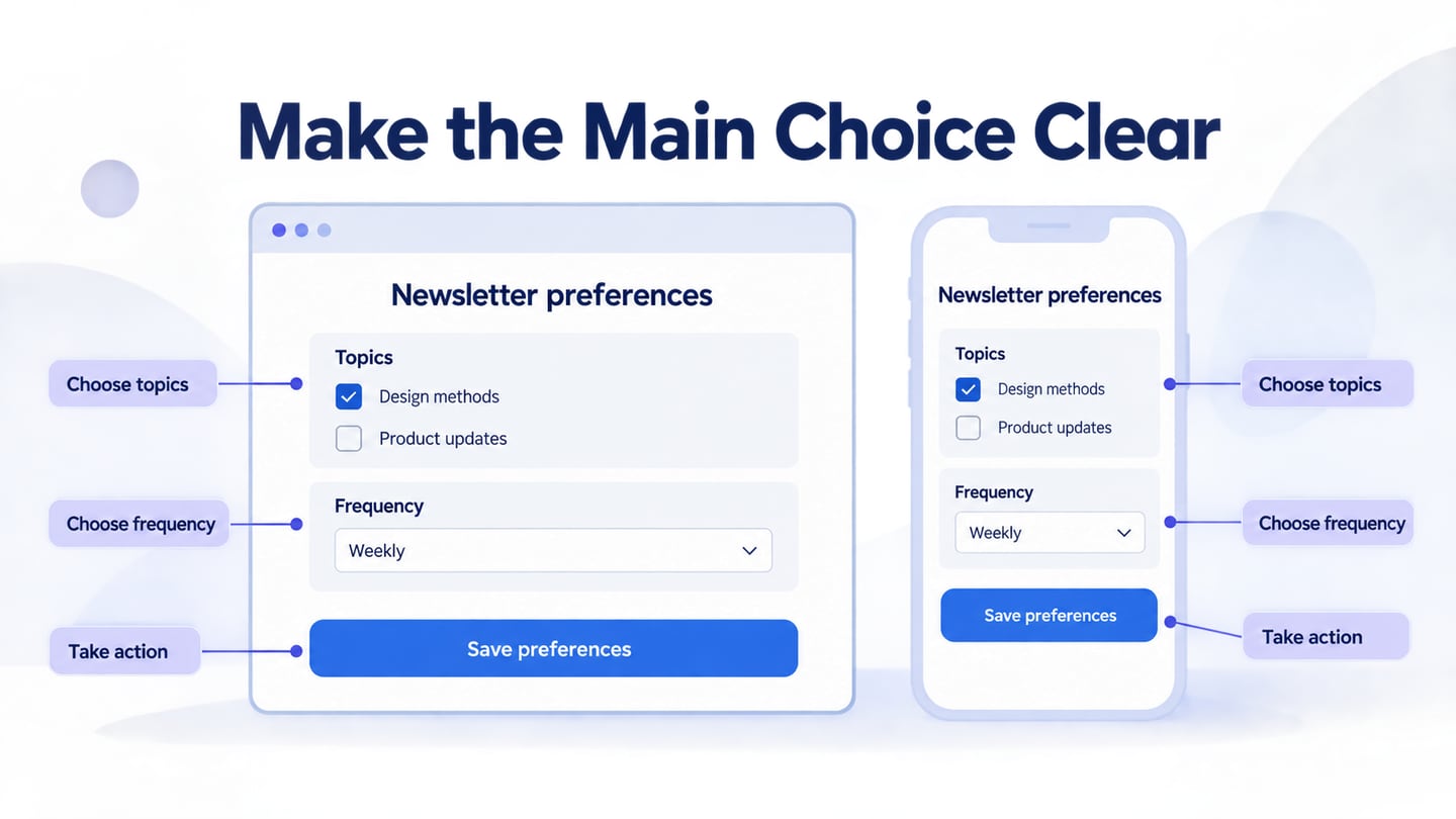

Web UI design organizes the content and controls people use to accomplish a task. A clear interface should make the next step understandable, preserve relevant context, and explain what happens when something goes wrong. Visual polish supports those goals; it does not replace them.
Use these ten rules as review questions rather than guarantees. In a web UI design workspace, make the relevant screens and states concrete before implementation. Then check the design with realistic content and the intended audience, and verify the actual website separately.
10 Rules of Good Web UI Design
Image Source: Shutterstock
1. Be consistent
Use the same labels and patterns for the same purpose across the site. Consistency does not require every page to have an identical layout: a search result and a payment review serve different tasks. Keep shared navigation, type roles and repeated actions recognizable, and document exceptions that have a clear reason.
2. Simple and clear UI design
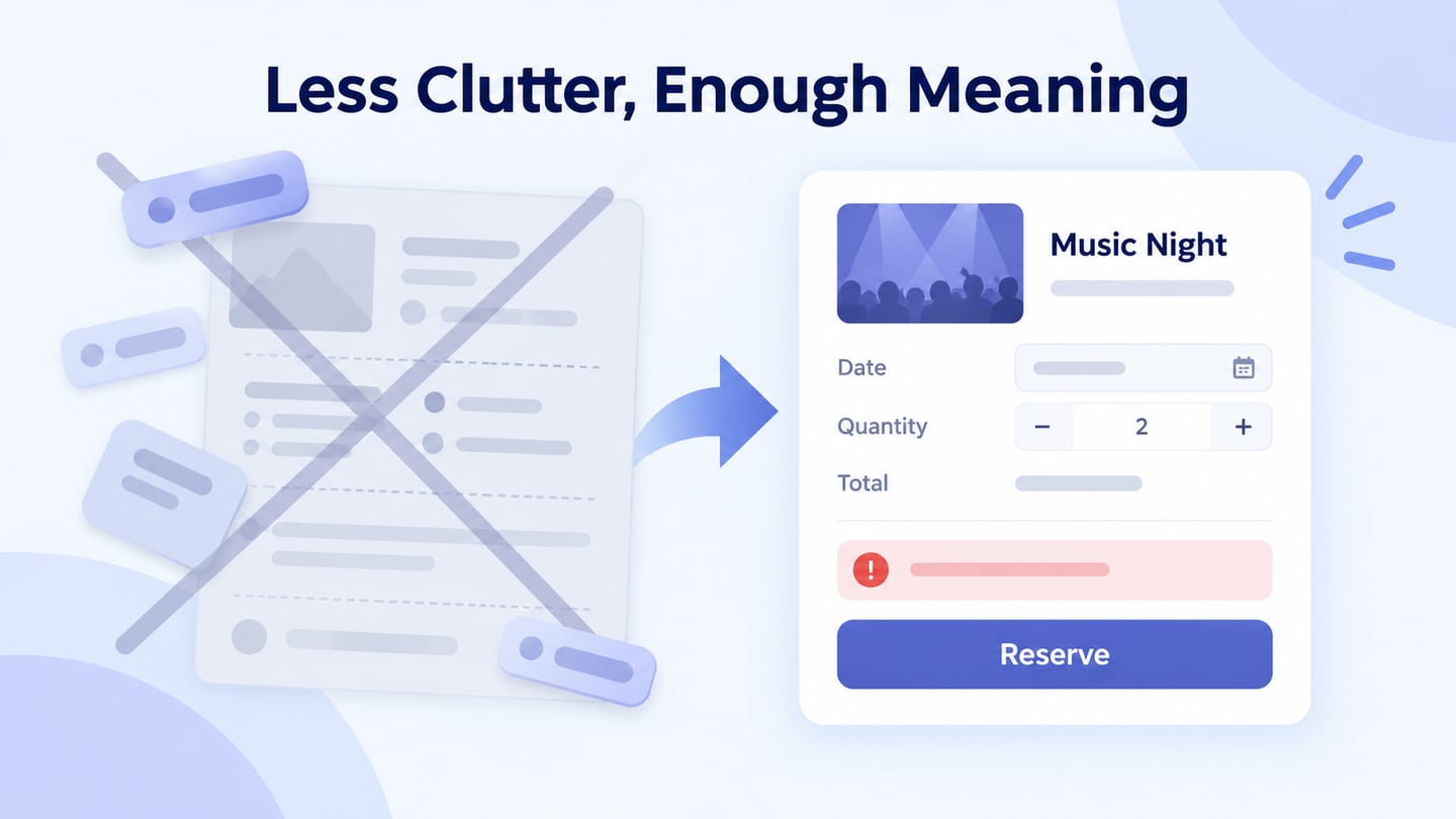
Make the task and choices understandable without removing information people need. Break a long process into steps when that helps orientation, but avoid adding pages merely to make each screen look sparse. Keep the next action, necessary conditions and a route back clear. Do not assume a simpler appearance automatically improves bounce rate or viewing time.
3. Focus on one action at a time
Give the current task a clear priority. Secondary actions can remain available, but should not compete with a consequential next step. A preference page, for example, can group several choices while giving Save preferences a distinct role. “One action” is a hierarchy principle, not a literal ban on more than one control.
4. Use typography correctly
Use a readable type scale and meaningful heading structure. Review line length, wrapping, contrast and enlarged text with real content. A heading can be prominent without becoming so large that it obscures the page’s purpose. Visual size and semantic heading level should both reflect the organization of the content.
5. Simplify forms to fill out
Ask only for information the task needs, explain unfamiliar requirements, and keep labels available while people enter data. Do not force account creation without a task-related reason. The W3C form-label guidance explains the relationship between understandable labels and the implemented controls; placeholder text alone is not a reliable substitute.
6. Design for Changing Screen Conditions
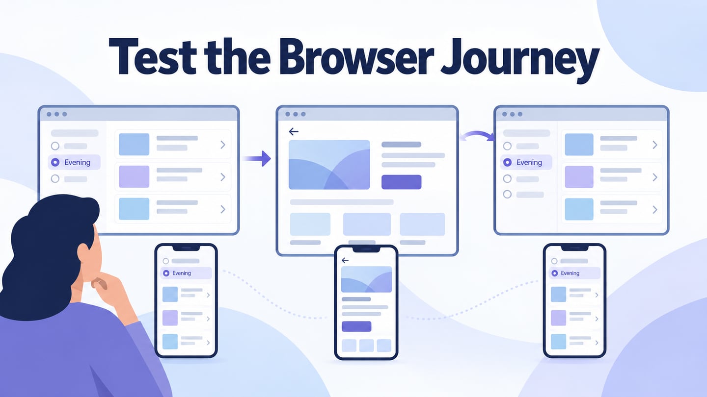
Review the layout as width, text size and input conditions change. Columns may need to stack, navigation may need a different presentation, and long labels may wrap. Responsive-design guidance from web.dev covers these broader concerns. Choosing a few device presets does not guarantee that every intermediate size works.
7. Sketch the Structure Before Polishing
Use paper or a suitable digital tool to compare layout ideas before committing to visual detail. Photoshop is one option, not a prerequisite. Look at references to understand their decisions, then create a structure for your own task instead of copying an unrelated page.
8. Define the Goal Before the Screen
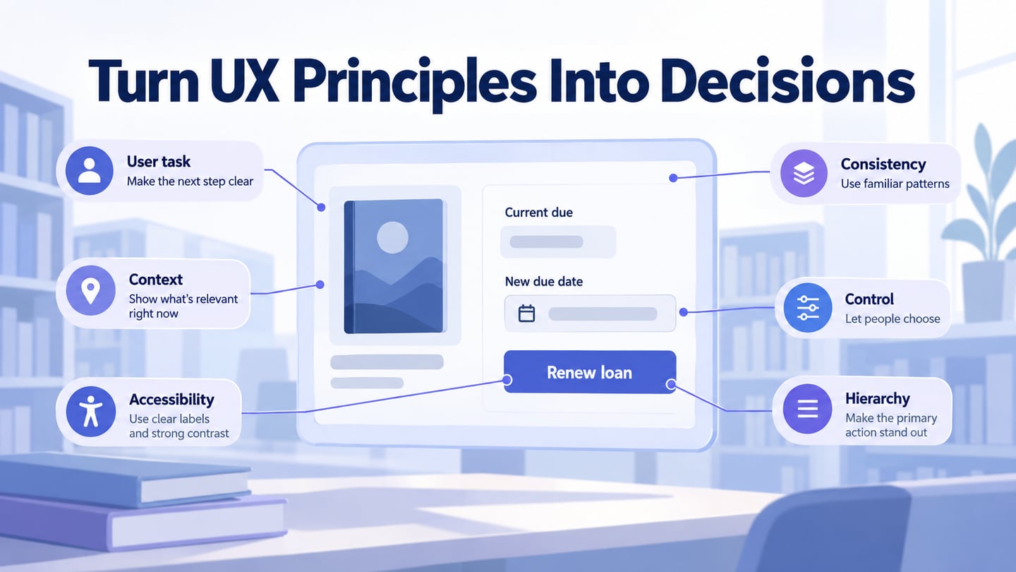
Name what the person should be able to accomplish and what the interface must explain. Link each important component to that goal. If nobody can explain why a field or promotional panel belongs on the page, investigate its purpose before making it more visually prominent.
9. Implement visual site hierarchy
Use grouping, spacing and emphasis to show relationships. Keep information needed for a decision near its control, and avoid relying on size or unexpected decoration alone. Review whether someone can scan the page and identify the task without first reading every line.
Apply the rules to a preference page
For a fictional newsletter, design a preference page with two topics: Design methods and Product updates. Show Design methods selected, Product updates unselected, and Frequency set to Weekly. Group topics separately from frequency and use Save preferences as the primary action.
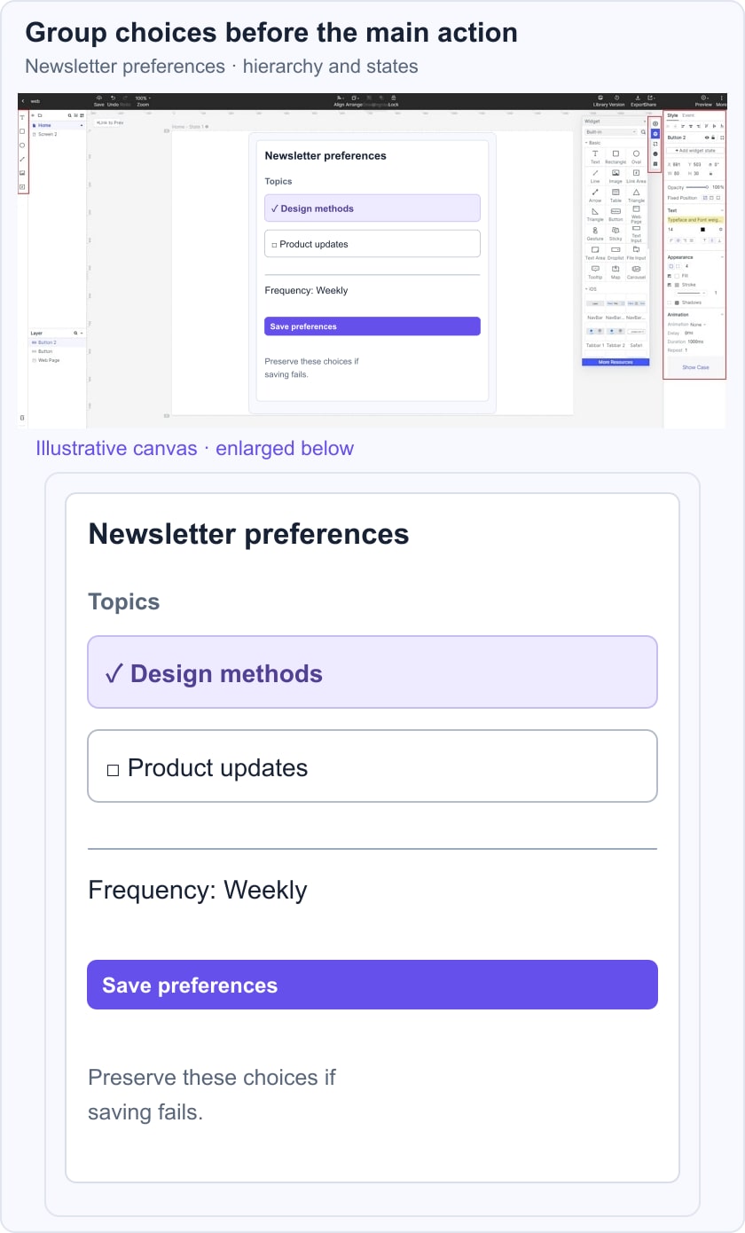
At a narrow width, keep the control labels visible and let the groups stack without changing their meaning. Include a saved confirmation and a failure state that preserves the choices. Ask a reviewer what will change when they save and whether the current selections are clear. These are illustrative design conditions, not a live subscription.
The implemented page must associate labels with controls, support keyboard focus and announce appropriate feedback. A mockup establishes the intended organization; UI testing verifies whether the actual behaviour matches it.
10. Choose Software That Supports the Work
Evaluate editing, reuse, collaboration, export and handoff against the project’s needs. A tool’s reputation does not establish the quality of the design. Test a representative screen and confirm current plan limits before moving a team’s workflow.
Use Mockitt to Build and Review the Web UI
Mockitt can support visual interface design and shared review. Start with the task, arrange the relevant content, and create the states needed to discuss the behaviour. The design remains separate from the production website and its implementation requirements.
Use interaction prototyping when a static screen cannot explain the sequence. Verify the current controls needed by your scenario instead of assuming that every conditional or responsive capability mentioned in an older tutorial exists in the same form.
Workspace and Review
Create a project and orient yourself in the current workspace. Earlier screenshots can illustrate an operation, but fixed claims about toolbar placement are not a durable guide. Keep the design accessible to collaborators with the appropriate permissions and a clearly identified version.
Reusable Components
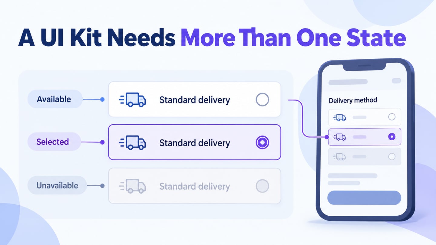
Reuse appropriate buttons, fields, navigation and content patterns. Name their roles and variants clearly, and check how a change affects the relevant screens. A component library is useful when the team also understands its content and behaviour rules.
Before adopting the workflow, verify these practical details:
- Current access and plan limits for the people who need to work on the design.
- How layouts are created, previewed and shared for the intended review.
- Whether available templates and assets fit the task and their licensing conditions.
- Supported browser and device requirements for editing and previewing.
- The version-history and recovery options included in the relevant plan.
- The learning and support needs of the people using the workspace.
- How interface assets and specifications reach the implementation team.
- How grids, spacing and constraints support the intended layout.
- Which export formats and handoff details are available, and what must be rebuilt in code.
Review the Task, Then the Polish
A usable web interface is not defined by being invisible, dull or fashionable. It is defined in relation to the people and tasks it serves. Keep useful information visible and provide a clear way to understand and recover from mistakes.
Apply these rules to specific decisions, review realistic content at relevant sizes, and carry the agreed behaviour into implementation. Recheck the page when content or functionality changes. Consistency and clarity are ongoing responsibilities, not properties guaranteed by a finished mockup.