A UX mockup is a detailed representation of an interface used to discuss content, layout and visual decisions. It can help a team move beyond a rough structure without yet implementing every interaction. Use a UI design workspace to make those decisions explicit, then identify which questions still require a prototype or a real implementation.
What is UX Mockup?
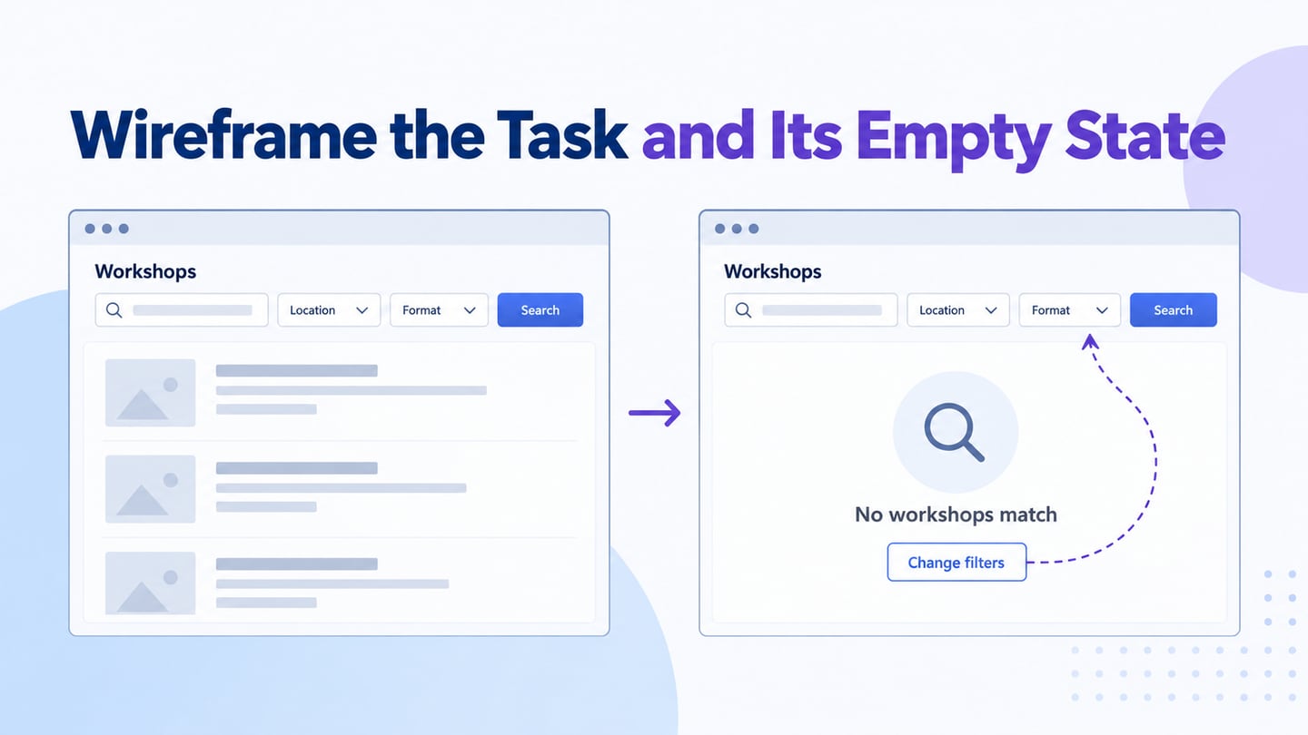
A mockup usually shows a static screen with more visual detail than an early wireframe: typography, color, spacing, images and realistic content. A wireframe emphasizes structure; a prototype represents selected behaviour. Teams may combine these artifacts, so agree what the deliverable is intended to demonstrate instead of treating the labels as a rigid sequence.
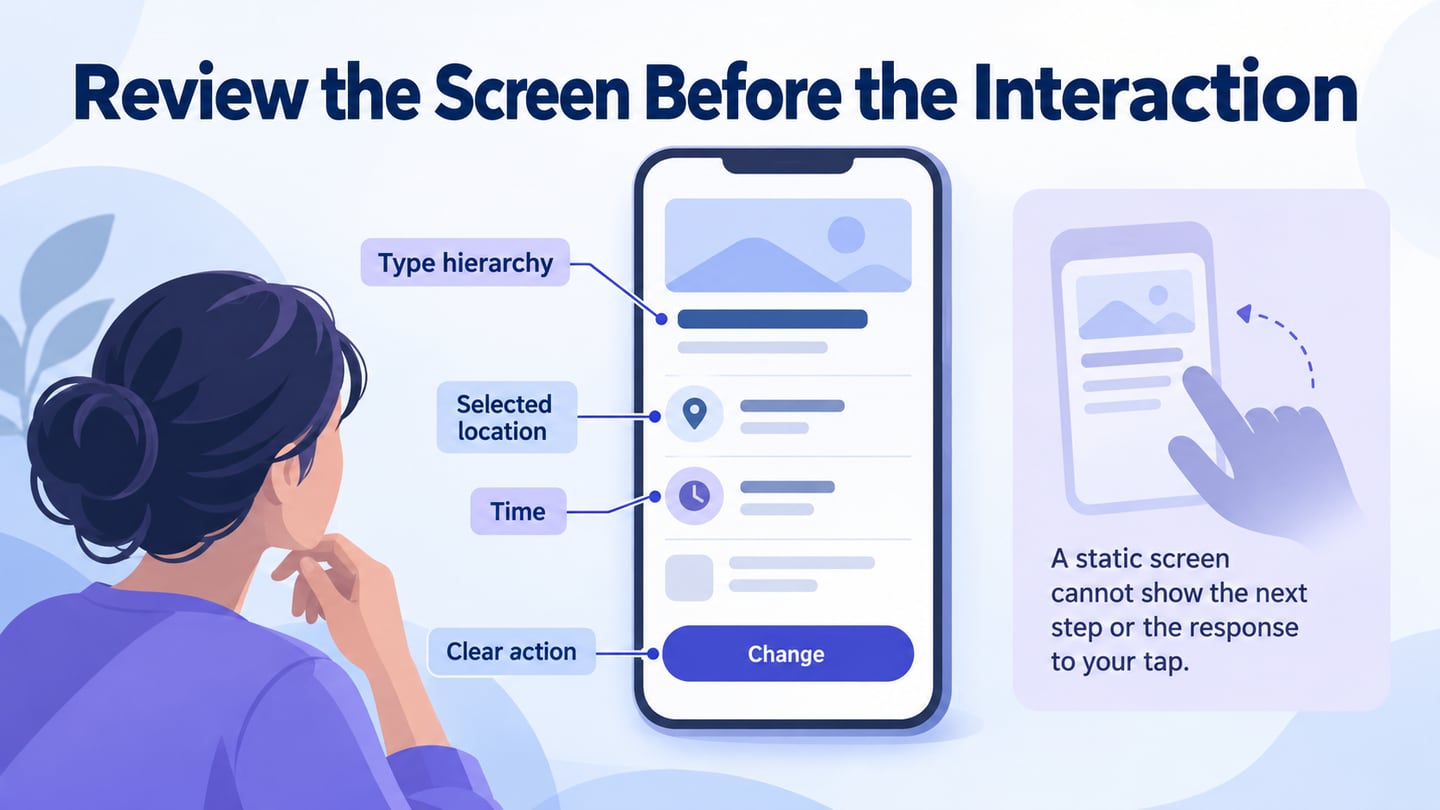
Use the mockup to compare visual hierarchy and content choices. A reviewer can assess whether the appointment time is easy to distinguish from a supporting note, for example. Feedback can reveal a design problem earlier, but a static screen cannot prove that the complete workflow is usable or prevent every later change.
You can begin with a sketch, then add the detail needed for the review in a suitable tool. Choose the format according to the decision, sharing needs and available assets. A free plan or a polished template is not enough to establish that the tool fits the project.
Use Mockitt for a Reviewable Mockup
Mockitt can support arranging editable interface elements, reusing components and sharing a design for feedback. Confirm current workspace capabilities and permissions before planning the workflow. A mockup is a design artifact, not a working website or a promise that every device supports the same editing experience.
Use realistic text and images when assessing visual hierarchy. Share the relevant version and ask reviewers to comment on specific decisions rather than whether they generally like the screen. When behaviour becomes the question, extend the design into an interactive prototype and make the simulated parts clear.
How to Make a UX Mockup
The following three-stage workflow covers setup, detailed design and review. Earlier screenshots illustrate the editing operations; the current workspace may arrange controls differently.
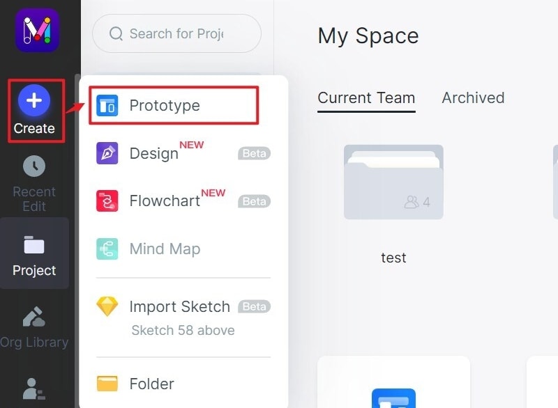
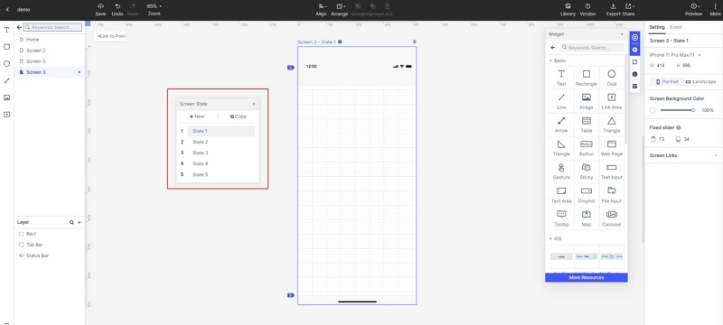
Step 1: Create a new project
- Create a project for the task, choose an initial viewport, and give it a meaningful name. A template can provide a starting structure, but remove elements unrelated to the intended screen.
- Confirm the frame size and test realistic content lengths. Keep an additional narrow layout when it matters to the audience. A device preset does not automatically define responsive behaviour.
Step 2: Design the Screen and Its Content
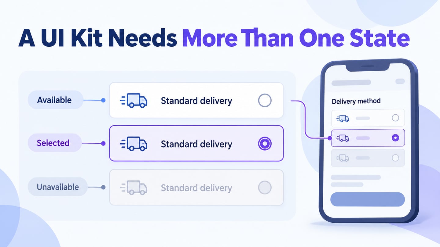
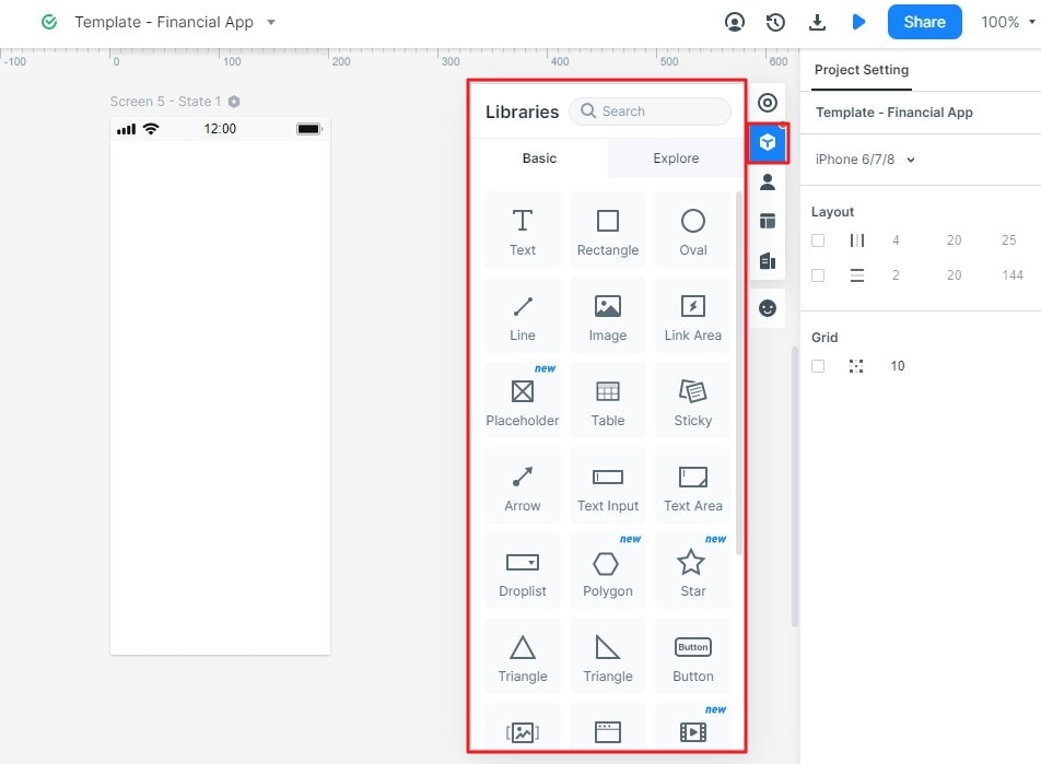
- Add the required controls, typography, imagery and spacing. Reuse suitable components and adapt their properties consistently. Make the selected information and primary action distinguishable without making all supporting text too faint to read.
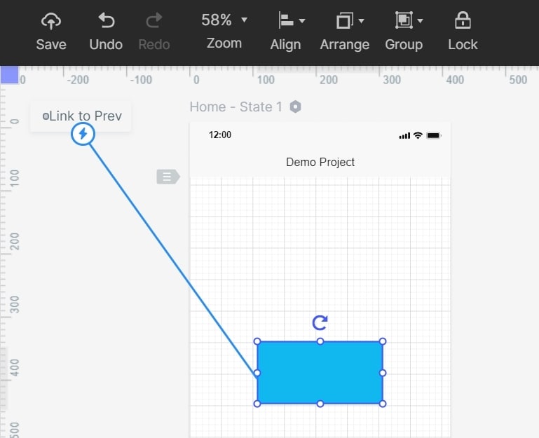
- Treat screen links as an optional transition from mockup to prototype. For a static review, record the intended destination without implying that the screen already performs the action.
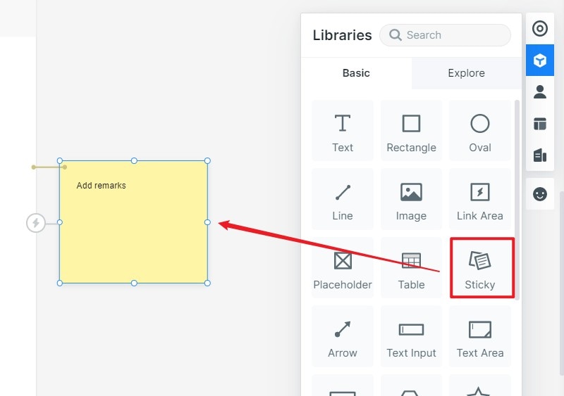
- Add separate notes for decisions that cannot be inferred from the image: data source, permissions, error handling and how content changes. Do not mix those notes into the public-facing copy.
- Use animation only when reviewing behaviour. It is not a requirement for a detailed static mockup, and it should not conceal unresolved layout or content decisions.
Step 3: Review and Share the Mockup
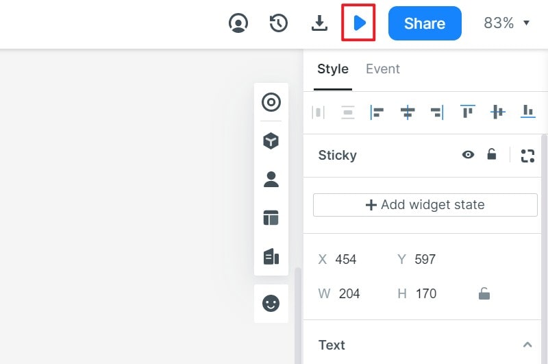
- Preview the design at the intended size and a relevant narrow width. Review hierarchy, content, contrast and image proportions, then share the version with people who can assess the task and implementation. Record decisions and unresolved questions. A static review does not establish that keyboard navigation, screen-reader output or data saving works.
Document the specific visual decisions the mockup settles and the behaviours that remain open.
Review a mockup with realistic content
For a fictional appointment service, mock up an Eye test at Riverside branch on Tuesday at 10:30. Place the service, location and time together, with Bring your current glasses as supporting information. A Change appointment action should be visually distinct without competing with the appointment facts.
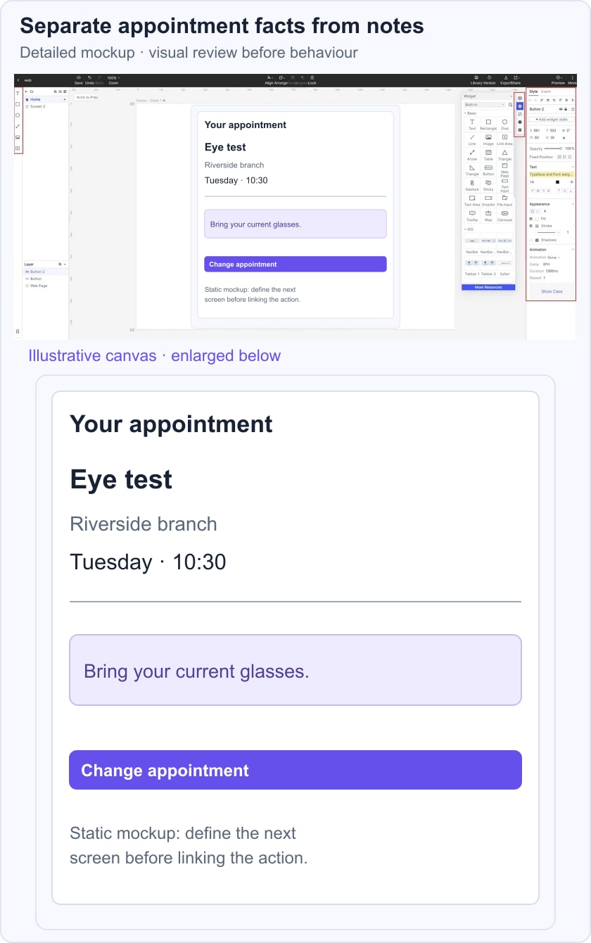
Try a longer branch name and a larger text setting. Check that the time does not appear to belong to the wrong line and that the note remains readable. Ask a reviewer to identify where and when they should attend before discussing colors. This is a design exercise, not a real appointment record.
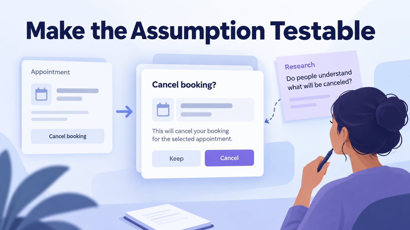
List the unresolved behaviour: where Change appointment leads, whether the existing booking stays active while choosing another time, and what happens if no alternative is available. A prototype can investigate that sequence. In implementation, controls also need appropriate labels and semantic relationships; a visually clear mockup is only one part of the evidence.