What is Glassmorphism UI Design?
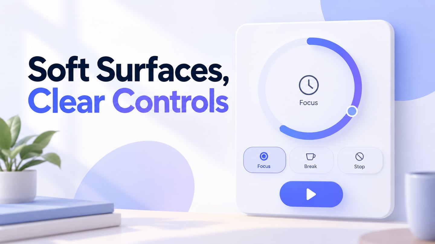
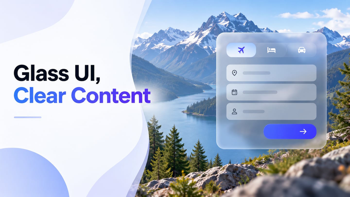
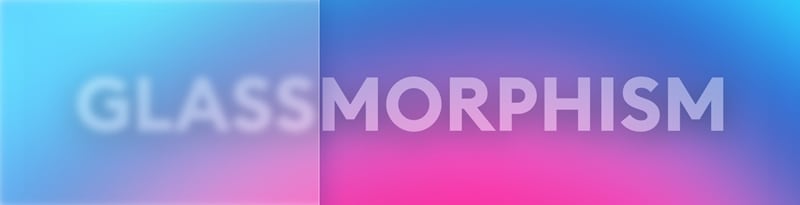
Glassmorphism is an interface style that uses translucent surfaces, background blur, light borders, and shadows to suggest frosted glass. It can separate a floating panel from the scene behind it without hiding that scene completely. In Mockitt UI design, you can compare a glass-inspired composition with an opaque alternative before deciding whether the effect helps the task.
Despite the popularity of the trend, it is important not to copy it blindly. Test the readability of the actual content: a decorative card and a form that collects payment details have different demands. Use contrast to keep important buttons visible, and check the design with low vision, changing backgrounds, and reduced-transparency preferences in mind.
Characteristic features of glassmorphism:
- Transparency - the overlay of layers creates the effect of frosted glass with a blurred background;
- Layering;
- Objects freely "floating in space" without support;
- Bright or muted colors that leave enough contrast for text and controls;
- Colorful backgrounds and photographs, the overlay of "glass" on which looks the most impressive;
- A very thin semi-transparent white stroke on objects to simulate a glass edge.
3 Useful Tips to Design Glassmorphism
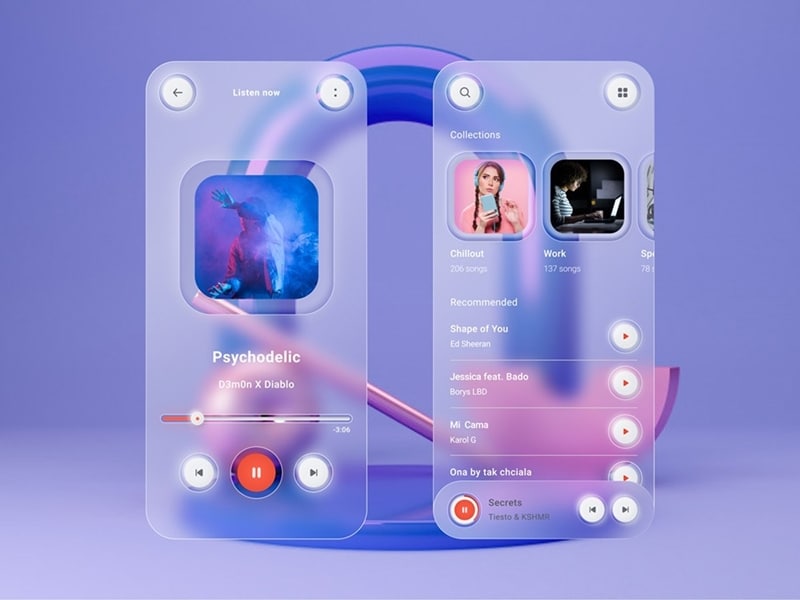
Glassmorphism gained attention as a UI trend around 2020, but translucent interfaces appeared earlier, including in Windows Vista. Apple and Microsoft have both used translucent surfaces in their operating systems. The useful lesson is how a surface separates foreground content from the background, rather than whether the style looks new.
macOS Big Sur is a historical example of floating, partially transparent interface elements. It should not be treated as the latest release or as a prescription for every website. A navigation panel that moves over different content needs more careful testing than a static illustration.
Microsoft’s Acrylic guidance describes a translucent material and recommends careful use on temporary surfaces such as flyouts. It also describes opaque fallbacks. That is a useful practical boundary: preserve a clear reading surface when transparency, device performance, or user settings make the effect unsuitable.
1. Make the effect
The effect combines background blur, a translucent fill, an edge, and a shadow. Adjust them separately. A panel does not need to become more transparent just because it appears nearer to the viewer. Start with one foreground surface; stacking several translucent panels can muddy the text and make the depth harder to understand. Compare the panel over both the lightest and darkest areas of its intended background.
2. Choose the right background
The background plays a vital role in making this effect visible. Large tonal differences can show through the blur, while fine detail can become visual noise. A quiet photograph or broad gradient often gives you a more predictable result than a busy image. Use the same background while comparing alternatives so that a more attractive photo does not hide a weaker panel treatment.
3. Set the correct transparency
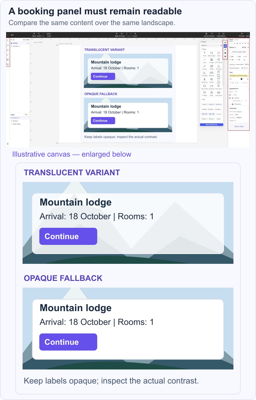
Adjust the panel fill independently from its text and controls. Lowering the opacity of a whole group can also fade the labels, which is usually undesirable. Keep essential content opaque and test the composite result; a blur value alone does not guarantee contrast. WCAG text-contrast guidance specifies at least 4.5:1 for ordinary text and 3:1 for qualifying large text. Check the background immediately behind each label, not a convenient empty corner of the panel.
For a mountain-lodge booking card, keep the arrival date, room count, and Continue button readable over a bright sky and a dark hillside. Compare the translucent card with a solid fallback. If the booking details become difficult to scan, use the opaque version even if the decorative version looks more striking. The example below illustrates this review; it does not claim that a blur control was used in the editor.
5 Glassmorphism UI Design Examples
The following historical design concepts show different uses of translucent surfaces. Keep them as visual references, not proof that a design is accessible or that a live product still uses the same interface. Unlike raised, soft-edged neumorphic controls, glass-inspired layers rely on the relationship between the foreground surface and the background.
Elements to the Glassmorphism Aesthetic:
Transparency
The frosted-glass effect is achieved with a blurred background seen through a translucent surface. This can suggest depth, but the visual effect should not be the only signal that an item is interactive.
Multi-layered approach
With objects floating above the background, a layered interface can separate content groups. Limit overlapping layers and keep the reading order clear. More layers do not automatically make the interface easier to use.
Vivid colors
The background color plays an essential role. Broad color changes make translucency visible; excessive detail can compete with the content. Check both light and dark areas, and avoid choosing a low-contrast label just to preserve the aesthetic.
1. Banking Fintech Web Design
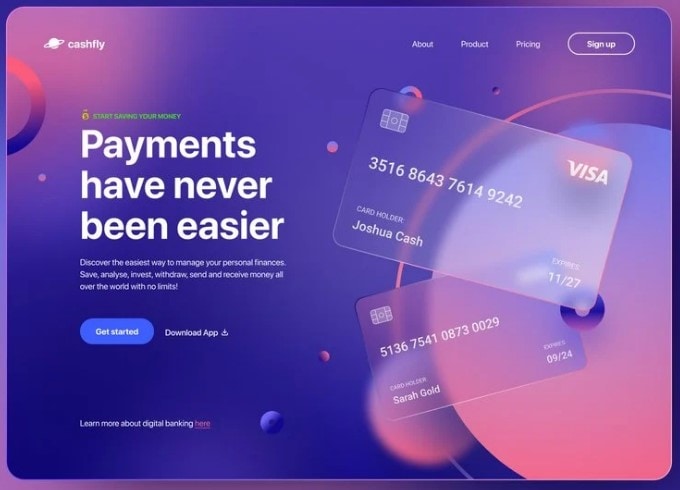
This historical banking website concept by Bogusław Podhalicz uses translucent credit-card illustrations against a purple background. The overlapping cards communicate depth while the main headline remains outside them. A useful lesson is to keep important reading content on a predictable surface rather than place all text inside the decorative glass.
2. Music Player Exploration
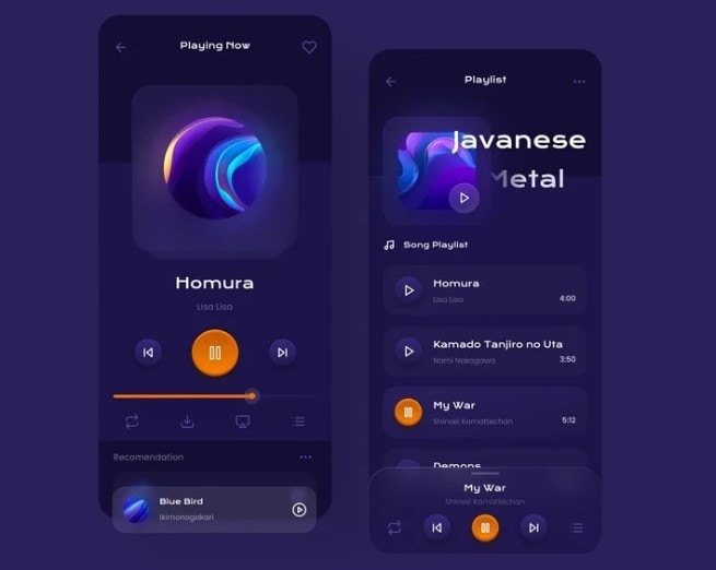
This music-player concept by Rudi Hartono for Plainthing Studio combines translucent panels with raised controls. Notice the separation between the current track and the playlist. A real implementation would still need clear focus states and sufficient contrast for small playback labels.
3. Glassmorphism Header Concept
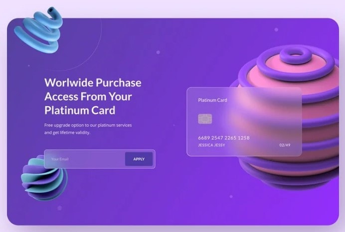
This historical website-header concept applies a frosted-glass effect to a credit-card illustration and the email-entry area. Compare the prominent action with the quieter field boundary. Before borrowing the treatment, check whether a visitor can distinguish the input, its label, and the submit button without relying on color alone.
4. Glassmorphism App
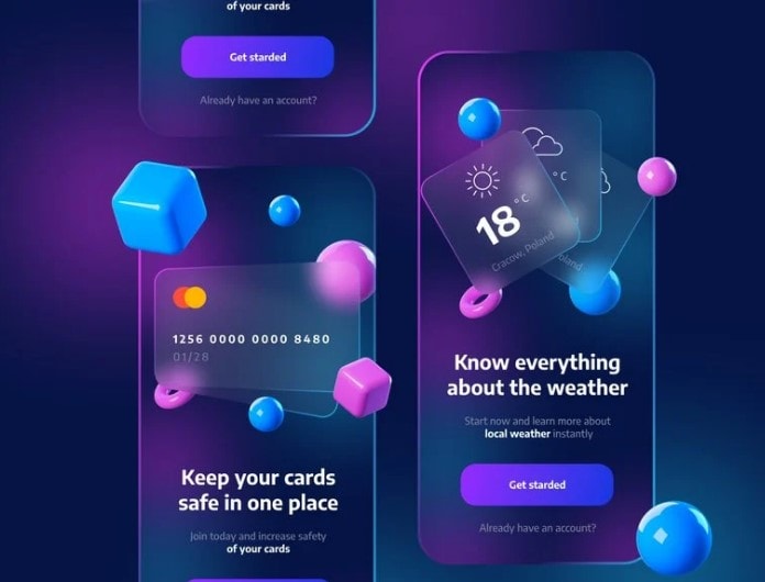
This archived app concept combines colorful 3D shapes with translucent weather and finance panels. The large temperature and card illustration establish a visual hierarchy. For a working app, use explicit labels for the next action and check that the decorative shapes never cover essential content.
5. Sign Up/Login UI Design by Stefan Brown
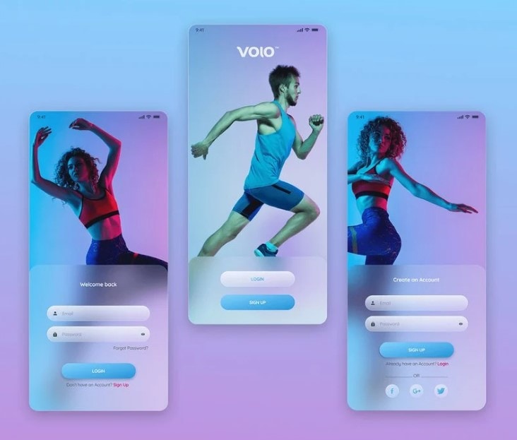
UI/UX designer Stefan Brown’s historical sign-up and login concept places translucent form surfaces over photographic imagery. This makes a useful contrast test: inspect the fields over both pale and dark parts of the photo, and provide visible error and focus states before using the pattern.
Review a Glass-Inspired UI in Mockitt
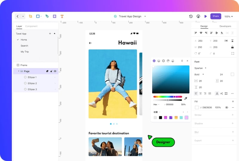
Prototyping tools help a team compare alternatives and explain a design decision. The right choice depends on the work and the people reviewing it. Apply UI design principles to establish the visual hierarchy and reading order, then introduce translucent surfaces where they clarify grouping. A style should support that hierarchy rather than replace it.
Mockitt lets you arrange screens and components, connect a flow, and share a prototype for review. Start with one complete task, such as choosing a room and confirming the booking details. Keep a solid-surface variant alongside the glass-inspired variant, then use a usability testing session to see whether people can find the information and action they need. A prototype review does not replace implementation-level accessibility checks.
Mockitt Key features and benefits
- A cloud-hosted environment, collaborative by design. Multiple designers can co-edit a project with the Enterprise Space feature, seeing changes in real-time.
- A visual editor for arranging elements and comparing alternatives; learn the controls needed for the task before preparing the review.
- Reusable components and templates provide a starting point. Replace example labels with realistic content so the design is tested at the lengths it will actually contain.
- Seamless linking method to add interactions, gestures, transitions, animations, and other effects to create high-fidelity prototypes.
- Bring relevant design assets into the project using the supported import options, then inspect spacing, fonts, and images before presenting the result.
- Use the available project history and team permissions to manage revisions, and check the options provided by your workspace and plan.
- Easily manage team libraries to implement design standards and styles for multiple members across different locations.
- Real-time preview and smooth developer handoff to streamline the transition.
Conclusion
Design styles change, but the reader’s task remains the useful test. Keep the five historical examples as inspiration, then compare a glass-inspired design with a readable fallback using your own content. If you need a calmer background, a controlled gradient can help you explore the effect without adding photographic detail. Choose the version that makes the content and next action clearest.