A UI kit is a collection of reusable interface elements and styles, such as buttons, form controls, cards, icons and type settings. In a UI design tool, it gives you a starting vocabulary for screens. A kit may contain editable design components, coded components, or both; check what the package actually includes.
A UI kit is not automatically a complete design system. A design system also needs usage guidance, behaviour, accessibility requirements, maintenance and ownership. Here, “UI kit” means a reusable design resource, not Apple’s UIKit software framework. Templates can suggest a layout, but your task and content determine whether that layout is appropriate.
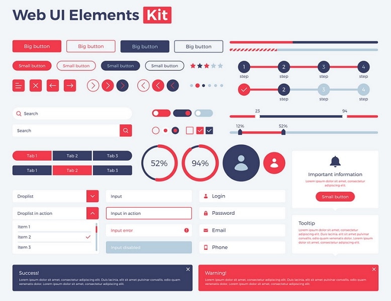
Advantages and Limitations of UI Kits
A useful kit reduces repeated drawing and makes consistent choices easier. Shared spacing, type and component variants can help the team compare screens without unrelated visual differences. A template can also reveal common elements of a page. The benefit depends on adapting the resource carefully rather than placing components wherever space is available.
A kit may omit the state your task needs, use unsuitable interaction conventions, or contain assets you cannot redistribute. Missing error, loading, focus and long-text states are common review questions. The limitation is not that experts cannot use kits; it is that a convenient visual resource can hide design and implementation work still required.
Before adopting a kit, check license, supported file format, editing access, component structure and maintenance status. Inspect several important controls at realistic sizes. The USWDS component reference demonstrates how reusable components can be paired with usage guidance; copying their appearance alone does not transfer that guidance or establish accessibility.
How to Use a UI Kit
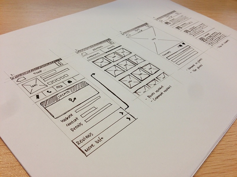
Start with the task and rough structure, then choose the components that support it. This keeps the kit from dictating a solution before the problem is understood.
- Sketch the screen and name the information and actions it needs. For a checkout, that might include delivery choices, their costs, and the selected address—not every component available in the kit.
- Inspect the relevant kit components and their variants. Confirm how labels, helper text, long content, selection and unavailable states are represented.
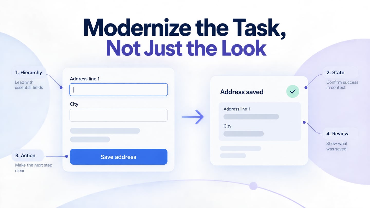
- Place the chosen components in the rough structure, then adapt content and spacing together. Keep related controls grouped and preserve a clear reading order.
- Review the task in context and revise the component or pattern where needed. Document any new variant so that the next screen does not invent a conflicting version.
A prototype helps the team inspect the sequence and meaning of the interface. It does not validate the production code, accessibility tree, or data rules. Review those with the implementation team rather than assuming a polished kit has solved them.
Check a component in a real task
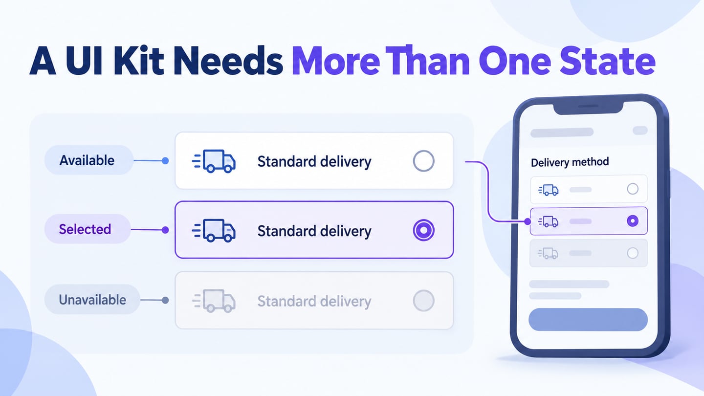
For a fictional checkout, test a delivery-option component with Standard delivery selected and Express delivery unavailable for the current address. Explain the restriction beside the unavailable choice, rather than relying only on pale text. The standard option states 3–5 working days; these are example conditions, not a real delivery promise.
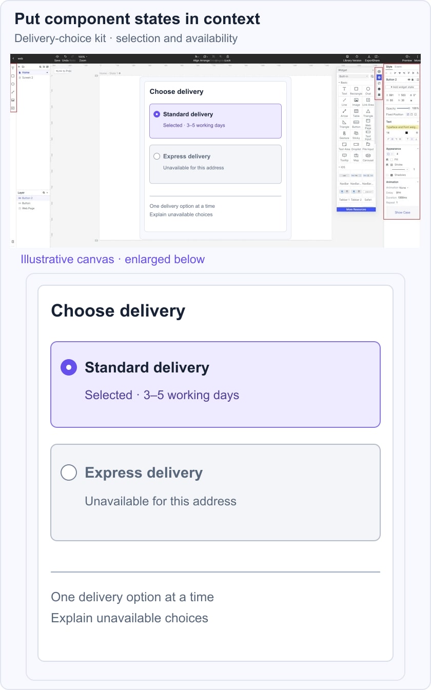
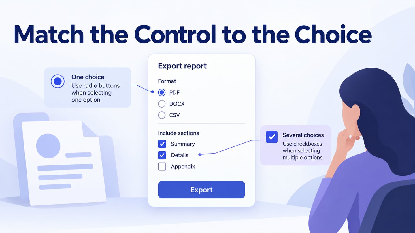
A radio group makes sense when exactly one option can be selected. Check what happens with long labels, keyboard navigation, visible focus and a changed address. The USWDS radio-button guidance provides an implementation reference; the visual prototype is a place to agree on the state and wording, not to claim the control already behaves accessibly.
Record the acceptance question: can someone tell which option is selected and why the other cannot be used? Also specify whether a change of address resets the choice. This turns a component specimen into a usable design decision.
Use Mockitt to Adapt and Review Components
Mockitt can support arranging editable interface components and sharing a visual flow for feedback. Use the kit as a starting point, then check that its content and states match the task. Earlier guide images illustrate the design process, not a guarantee that every imported component remains identical.
Capabilities to Check in Your Workflow
Reusable Assets
Use available widgets, icons and reusable components where they fit. Customize the properties needed by the task, and establish which version the team should reuse. Verify the current library contents rather than assuming a screenshot represents every available asset.
Sharing and Review
Share the relevant screens with collaborators and developers. Explain component states and interaction rules alongside the visual design. Check permissions and plan limits; sharing a design does not guarantee lossless transfer to every implementation platform.
Import Compatibility
If a kit comes from another tool, verify the currently supported import route and test a sample before moving the project. Compare fonts, constraints, icons and component relationships after import. Do not assume every layer or interaction transfers as an editable equivalent.
Interaction States
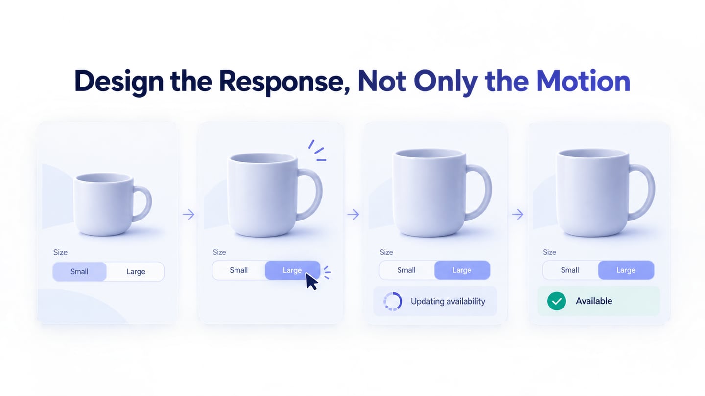
Represent the actions and feedback that matter to the task. For the delivery example, selected and unavailable choices are more important than a decorative transition. Use notes for behaviour the prototype cannot reproduce.
Different Screen Sizes
Review the component at narrow and wide widths with realistic content. Choosing a frame size is only the beginning: labels can wrap, controls can overflow, and groups can lose their meaning. The implemented layout needs its own responsive and accessibility checks.
Task-Based Learning
Use official guides for the operation you need, then apply the step to your own component. If an older screenshot differs from the editor, follow the current control labels rather than trying to reproduce an obsolete panel position.
A Reusable Review Checklist
Before approving the kit, inspect normal, selected, focus, error, loading and unavailable states where relevant. Check content length, contrast, naming, licensing and developer handoff. Assign an owner for future changes so reusable assets do not gradually diverge.
Choose a Kit That Fits the Task
A UI kit can make consistent design easier, but it cannot decide the user’s task or supply every missing state. Choose suitable components, adapt them with realistic content, and document the behaviour that the visual design leaves open. A smaller well-understood kit is more useful than a large collection whose rules nobody can explain.