A modern UI helps people understand where they are, what matters, and what they can do next. Clear hierarchy, consistent controls, readable text, responsive layouts, and useful feedback are stronger foundations than adopting a particular visual trend. The interface should fit the audience and the task.
The purpose of a contemporary website or application is to build both credibility and utility. Start with the user journey, then use a UI design tool such as Mockitt to explore the layout, components, and states. A polished screen still needs to work when content is long, a request fails, or someone uses a small screen or keyboard.
The five practical tips and five design principles below retain that focus on users. The examples illustrate different design choices; their visual style alone is not proof that an interface is usable or accessible.
5 tips and examples of modern UI design
1. Consistency

Consistency makes an interface easier to understand and use. People should not have to relearn a button, label, or navigation pattern on every page. Apply the same meaning to repeated colors, icons, spacing, and control styles, while leaving room for different content needs.
For example, if a filled button means the primary action, avoid using the same treatment for every secondary option. Keep a “Save changes” action recognizable across related forms. A consistent visual system should also cover focus, error, disabled, and loading states, not just the default appearance.
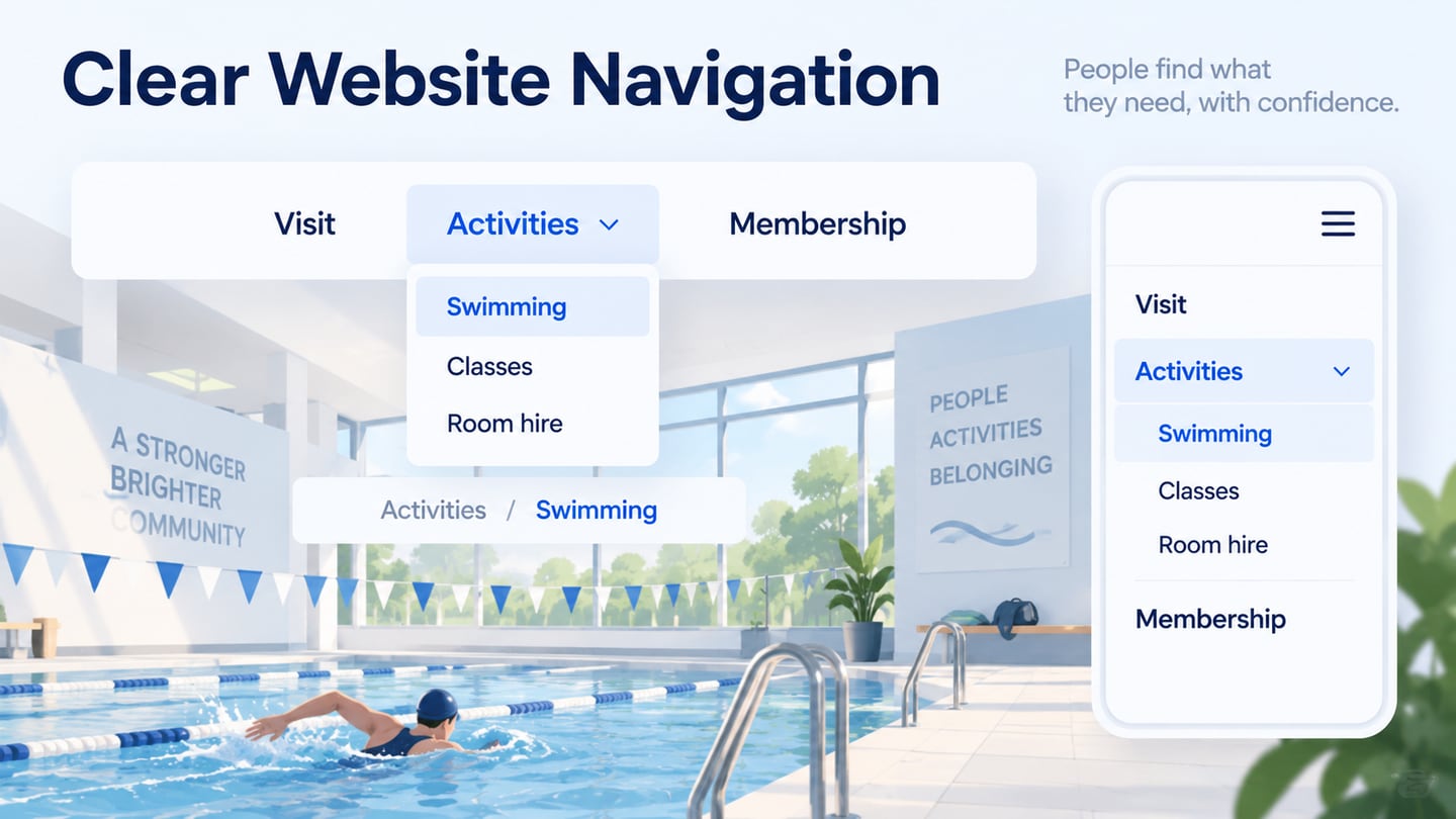
The fitness page above shows how a small set of text styles and a clear focal point can create a coherent composition. When applying a similar approach, check that the text remains readable over the background and that navigation is usable at smaller widths.
2. A customizable interface with a useful personal touch
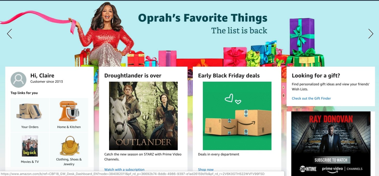
A greeting such as “Hi, Adam” can make an interface feel familiar, but useful personalization goes further. It might restore a recent task, show a saved preference, or help someone find a relevant item. Choose personalization that reduces work rather than adding decorative text.
Make the behavior understandable and allow people to change a preference when appropriate. A recommendation should not hide the normal navigation or prevent someone from exploring other options. The retail example combines personalized content with a wider catalog; the design question is whether users can still find what they came for.
3. Make interactions predictable

A modern UI supports movement between pages and states without making people guess what happened. Place navigation where users can find it, use labels that describe the destination, and give feedback after an action. Familiar patterns help, but their meaning still needs to be clear in context.
The downward cue in this portfolio example suggests more content below. Similar cues should have an accessible label when implemented as controls and should lead somewhere meaningful. Test whether a person can return to the previous step, keep their input, and recover after an error.
For a booking flow, “Continue” should lead to the promised next step, while the confirmation should make the selected date and status clear. A smooth animation cannot repair an ambiguous action label or a missing recovery path.
4. Use voice when the task benefits from it
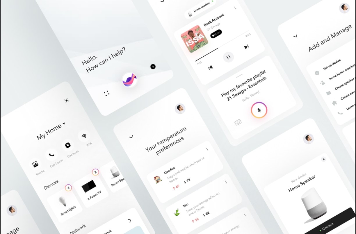
Voice input can be useful when hands are occupied or speaking is easier than typing. It is an interaction option, not a requirement for every modern interface. Consider where the product will be used, how much privacy the task needs, and whether speech is practical in that setting.
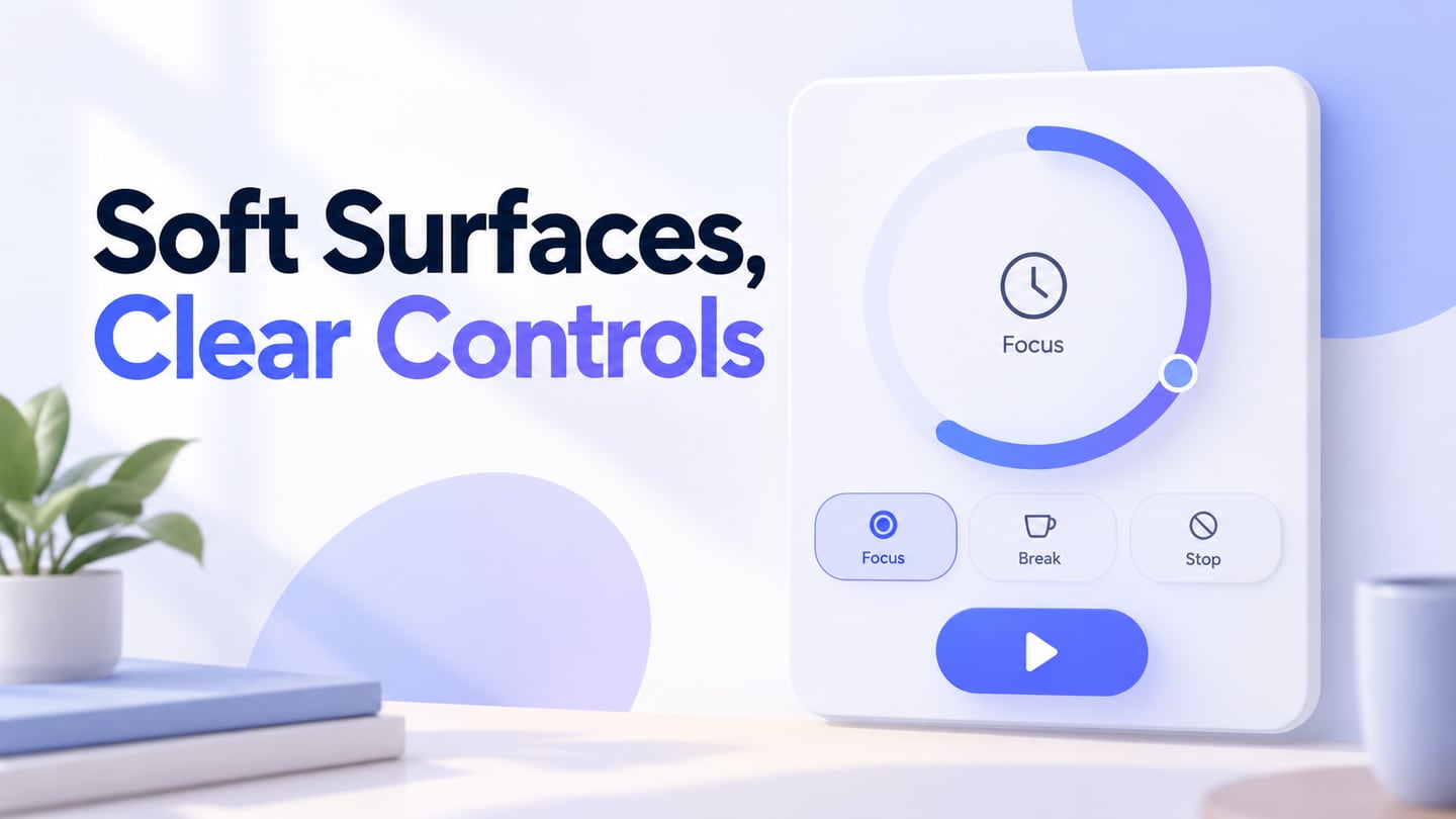
If voice is appropriate, show when the system is listening, what it understood, and what action will follow. Let the person correct a misunderstanding and provide another way to complete the task. Important or irreversible actions may need an explicit confirmation. The smart-home image is a visual example of this interaction category, not evidence that every shown control has been implemented.
5. Give animation a purpose
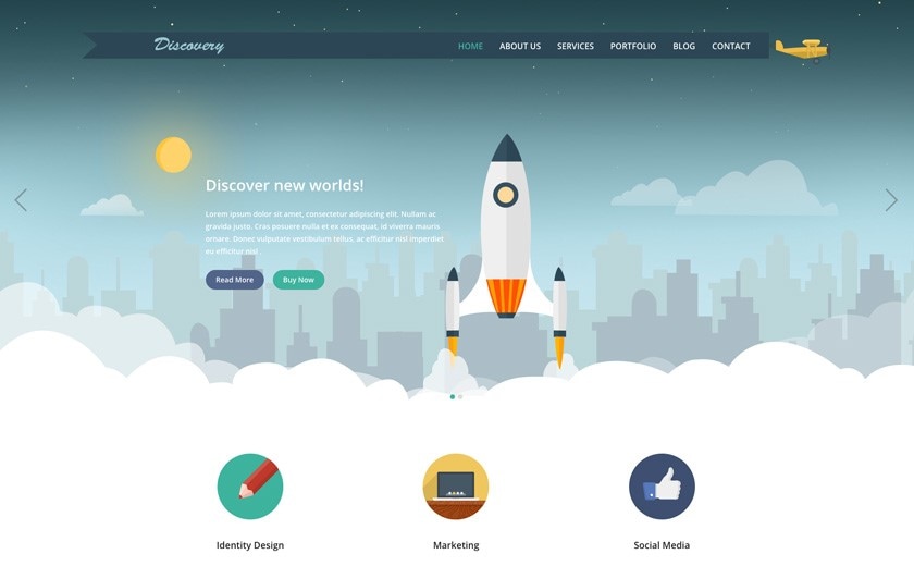
Animation can show a state change, explain where an item moved, or connect two steps. It is not essential to every interface. Animate the parts that communicate useful information, and avoid movement that competes with reading or delays the next action.
A static screenshot can suggest a visual direction but cannot demonstrate how motion behaves. Review the actual transition, including a reduced-motion experience. The interface should remain understandable when decorative animation is removed, and important feedback should not depend on motion alone.
5 core principles of modern UI design
Here, “modern UI” describes a practical design approach rather than a particular development framework. Windows Presentation Foundation (WPF) is a Windows desktop UI framework with vector-based rendering and other application features. It is one technology for building interfaces, not the origin or definition of modern UI design in general.
1. Understand your users and their tasks
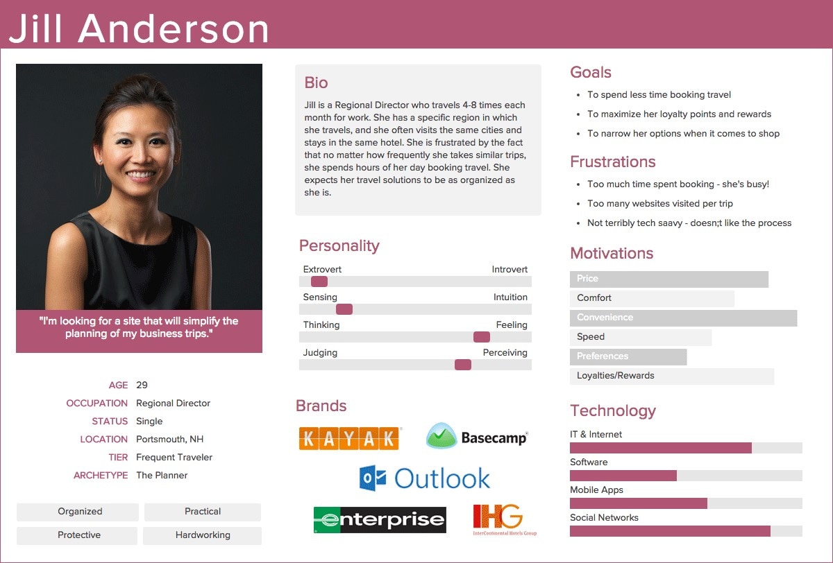
Every aspect of a design should serve the people who use it. Understand what they are trying to accomplish, what interrupts them, what information they need, and the conditions in which they use the product. A persona can organize relevant findings, but a portrait and demographic details alone do not explain a task.
The example persona illustrates a way to arrange goals and frustrations. Treat its fields as prompts for evidence, not facts to invent. A person's device, available time, familiarity with the task, or access needs may explain a design requirement more clearly than an assumed age group.
2. Design for a task, not only a look
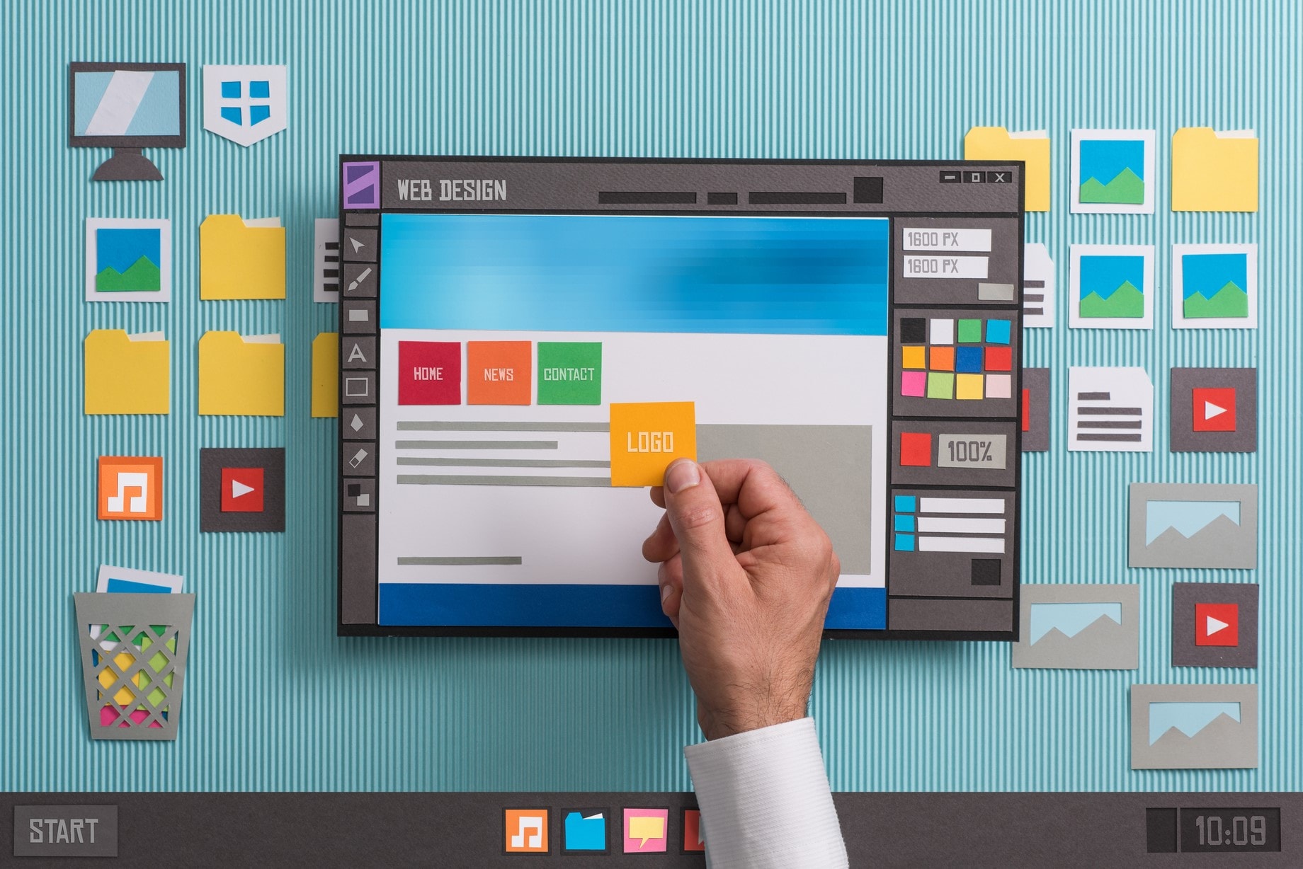
Creating an interface is more than composing an attractive page. After understanding the task, decide what information and controls are necessary. Every addition should have a purpose, and visual decisions should help users complete the work.
Consider a settings page. A decorative hero may look impressive, but clear section labels, readable current values, a recognizable save action, and feedback about unsaved changes do more to support that task. Use visual style to reinforce that structure rather than obscuring it.
3. Make content easy to scan and read
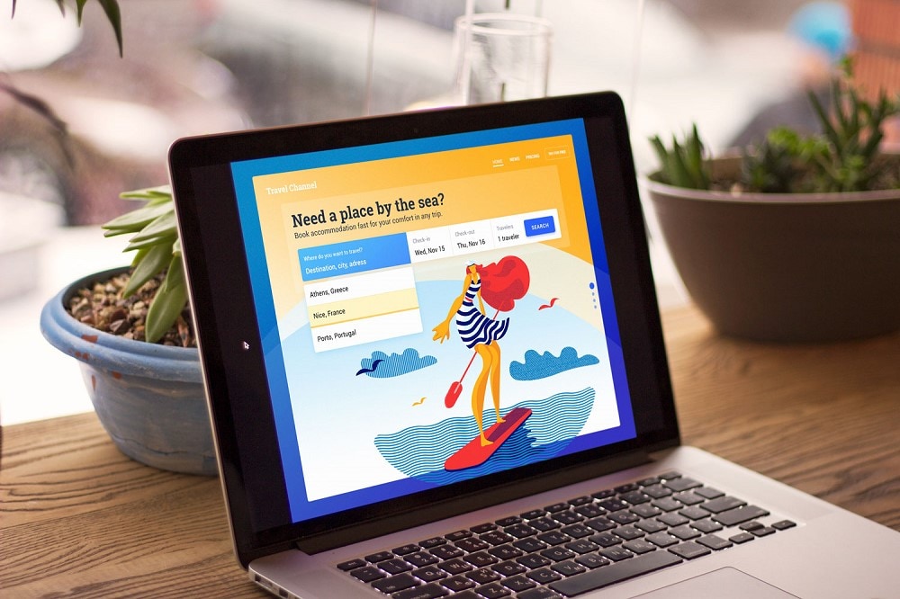
People should be able to identify a page's purpose without reading every word. Use descriptive headings, short labels, meaningful grouping, and enough space between unrelated elements. Put the information needed for a decision close to the relevant action instead of relying on an assumed eye-scanning pattern.
In the booking example, the form and main action should remain distinguishable from the illustration. Check actual text contrast as well as visual hierarchy. WCAG's minimum text contrast criterion generally requires 4.5:1 for normal text and 3:1 for large text, with defined exceptions. These thresholds are a starting check, not proof that the whole interface is accessible.
Also give controls persistent, meaningful labels. A placeholder that disappears when someone types is not a useful substitute for a visible label. Communicate errors with explanatory text and a recovery action rather than color alone.
4. Design for different screens and zoom levels
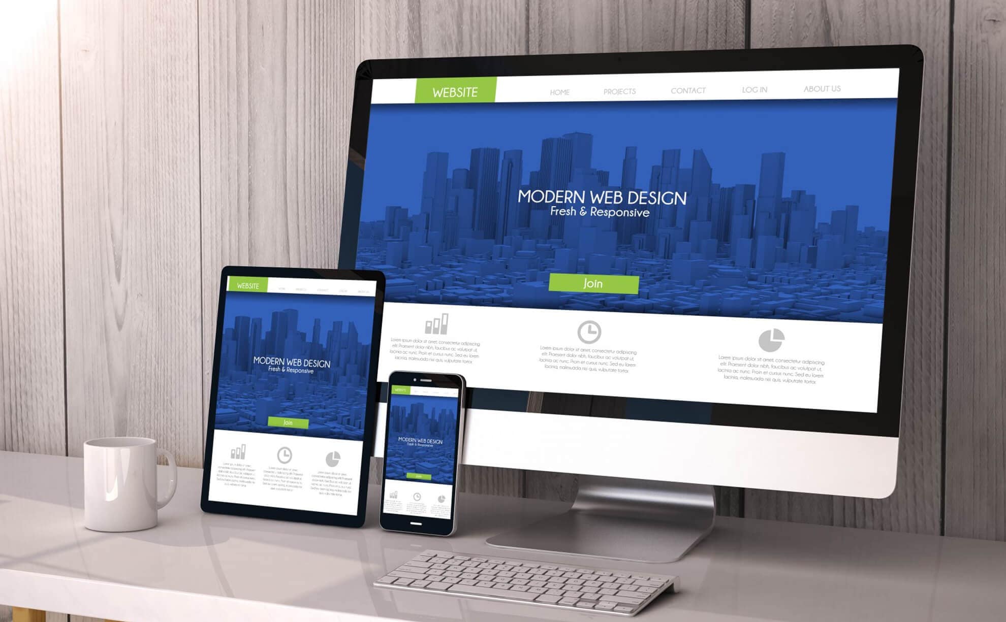
Users may access the same product on a desktop, laptop, tablet, or phone. Keep the task and essential information available as the space changes. A mobile layout often needs a different arrangement; shrinking the entire desktop screen is rarely enough.
Try long labels, enlarged text, keyboard navigation, and narrow viewports. Check that an error message or sticky control does not cover the next action. WCAG's reflow criterion addresses presentation without loss of content or functionality at a width equivalent to 320 CSS pixels for vertically scrolling content, apart from content that requires a two-dimensional layout.
For a dashboard, this may mean rearranging summary cards while giving a genuinely wide data table its own scrollable region. Preserve the relationship between a label and its value, and test the real responsive implementation as well as the design frames.
5. Evolve the design from evidence

As user needs and product constraints change, the interface should evolve. There is no universal schedule requiring a redesign every few years. Change the parts that evidence shows are confusing, inaccessible, inconsistent, or unable to support a new task.
Keep a record of the problem a revision is intended to solve and what you will observe afterward. A small improvement to a form or a shared component may be more useful than a complete visual replacement. Preserve familiar behavior when it continues to work.
Develop and review a modern UI with Mockitt
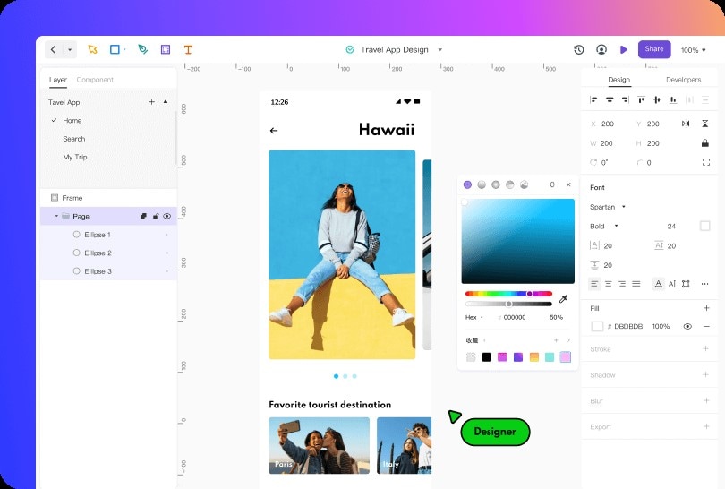
Mockitt Design provides a browser-based space for creating interface layouts and reusable components. The existing travel-page example shows how the canvas, layers, and properties relate to a design. Use such artifacts to discuss concrete choices rather than judging a tool or interface only by its appearance.
Features that support the design process
- Components and variables: reuse interface elements and shared values to keep related designs consistent.
- Layout and visual editing: arrange content and adjust its presentation while exploring different screen sizes.
- Team review: use collaboration and comments to discuss a specific element or design decision.
- Handoff: share design details and assets with developers. A design or code draft is not a working backend or a tested production application.
To review behavior as well as appearance, build a clickable prototype of the important route. Keep the example small enough that a reviewer can understand the task and the choices you want to discuss.
Review one screen and its states
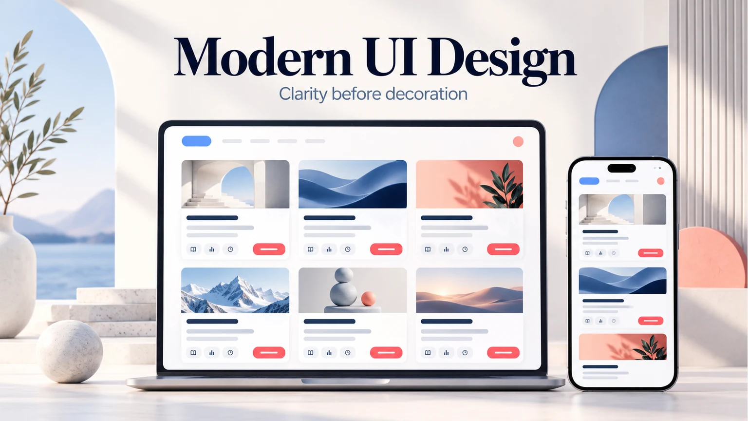
For a course catalog, make each course's title, level, duration, and description easy to distinguish. Give “Preview course” a clear role, keep supporting details grouped with the correct course, and show what a learner can expect next. Review a long course title and an unavailable course as well as the default card.
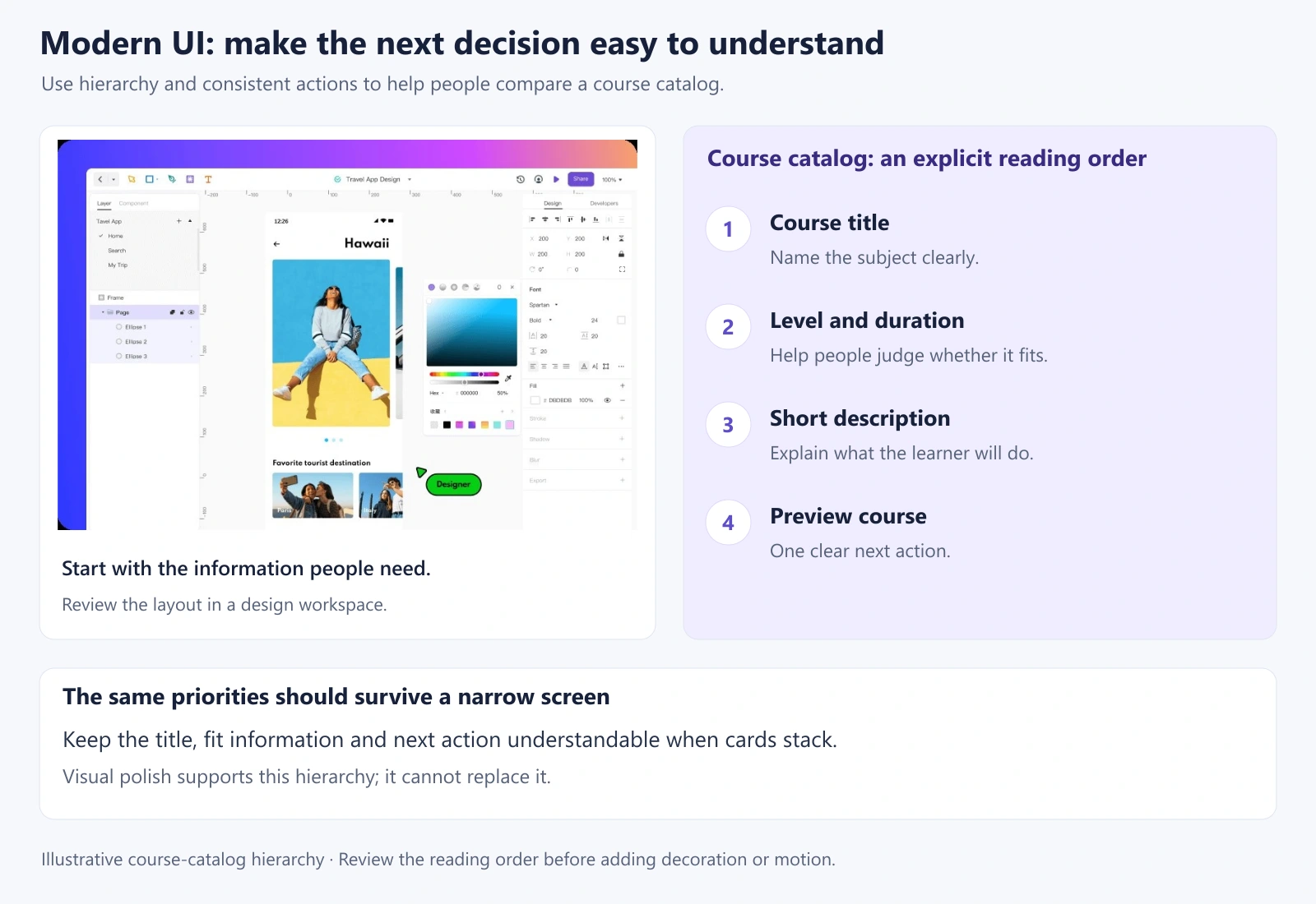
Compare the same task at a wide and narrow viewport. Read the labels aloud, follow the controls in order, and inspect the error and confirmation content. Take the unresolved questions into implementation and usability testing; a static design review cannot establish keyboard behavior or screen-reader compatibility by itself.
Build clarity before adding decoration
A modern UI should remain useful as content, devices, and user needs change. Understand the task, use consistent patterns, make information readable, and provide clear feedback. Choose visual treatments because they support those goals, then revise the design when evidence reveals a better way to help people complete their work.