A sales page explains an offer in enough detail for the intended reader to make a decision. Use Mockitt’s online prototyping tool to review the claim, supporting evidence, conditions and next action as one flow. Persuasion should come from a clear, relevant offer rather than invented testimonials or guaranteed outcomes.
Design a sales page with Mockitt
Begin with an approved offer brief: who it is for, what is included, what is not included and what the customer must do next. Mockitt can help organize and review those sections; it does not verify the business claims or provide a functioning sales system.
Useful parts of the prototyping workflow
- Reusable sections for the promise, deliverables, evidence and conditions.
- Readable headings and content blocks that let reviewers inspect the argument.
- Consistent actions whose labels match the next step.
- A shared review route for content, business and implementation owners.
- Separate desktop and mobile states, including the destination of the main action.

Work through these steps before adding decorative polish.
Step 1: Define the offer and its limits
Collect the facts that can be supported. Identify claims that need evidence, such as a result, testimonial or comparison. Remove unsupported figures rather than designing a badge around them.
Step 2: Give a project title
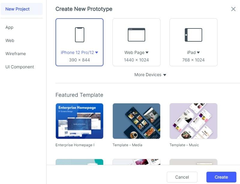
Name the prototype for the actual offer and create the views needed to review it. Use real-length copy and identify which sections change for different audience segments, if any.
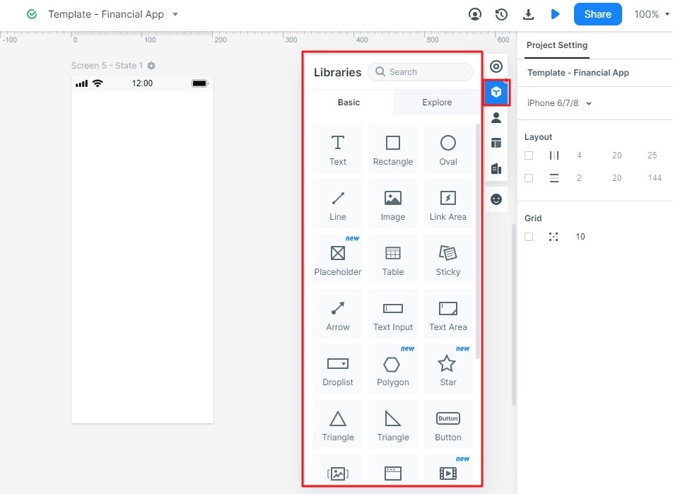
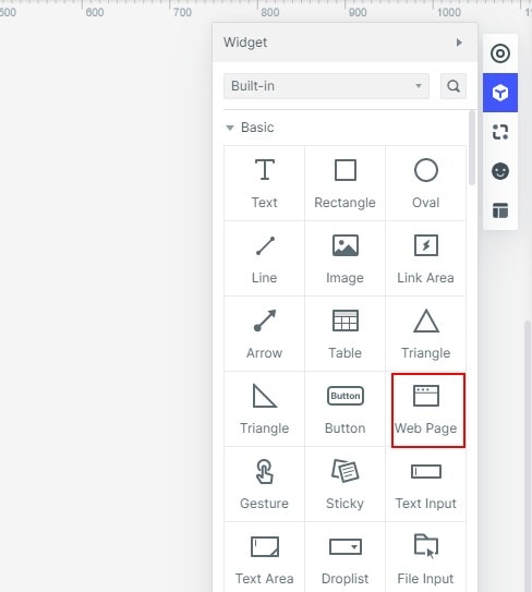
Step 3: Add desired widgets and icons
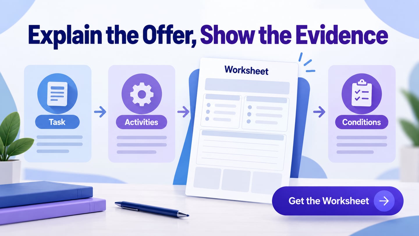
For an illustrative research-planning workshop, the offer includes a live session, a reusable planning worksheet and feedback on one draft plan. It does not promise a job, income increase or a successful product launch. The page explains prerequisites, the session format, what participants receive and how to request a place.
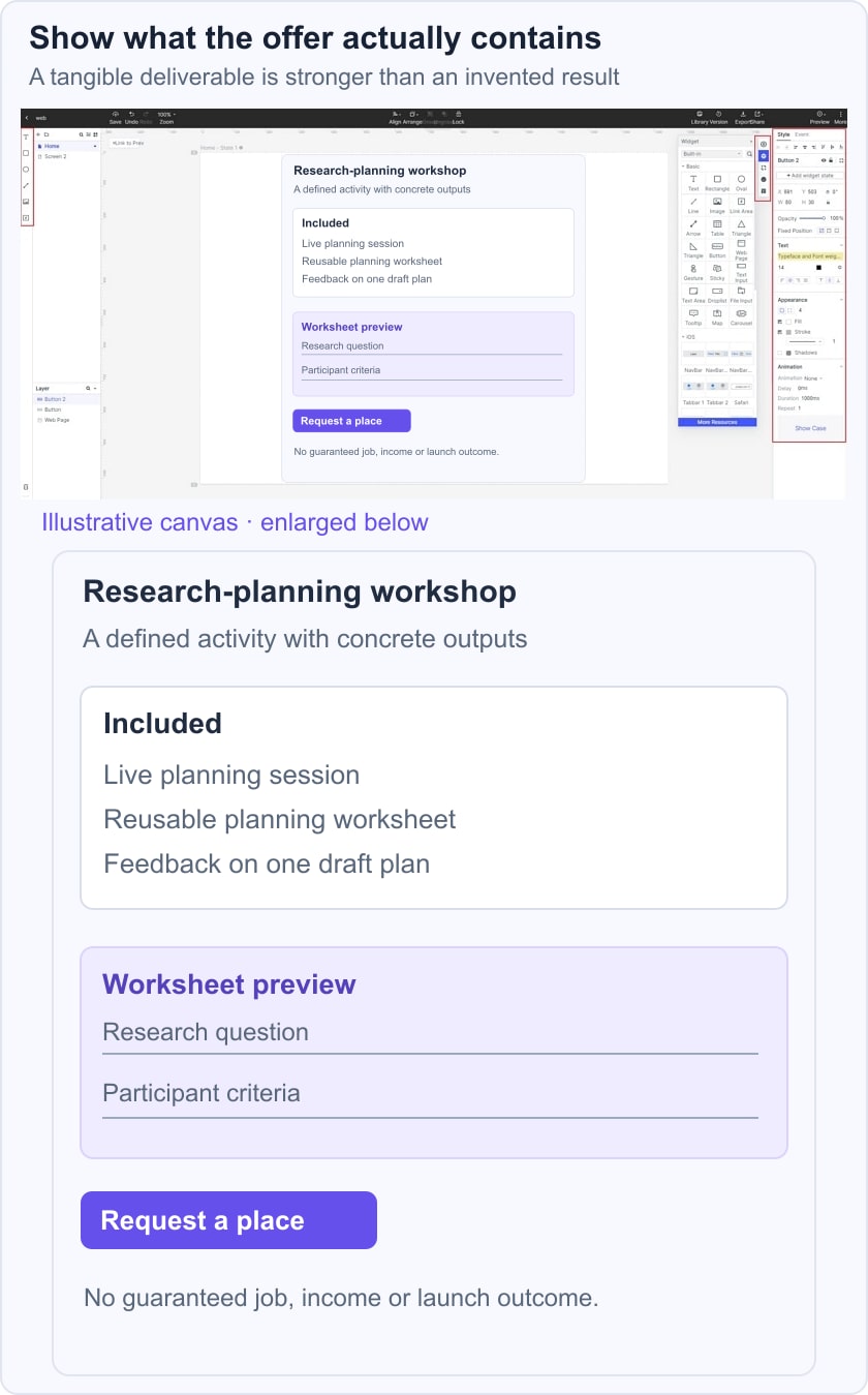
Build the argument in that order: the task participants need help with, the concrete activities, an example worksheet, the facilitator information and the conditions. If a testimonial is available, use an approved, accurately attributed statement; if it is not, show the actual deliverable instead of inventing social proof.
Step 4: Use a demonstration where it helps
A short demonstration can show the worksheet or process more clearly than a broad promise. Keep the essential explanation in text, provide an appropriate alternative for the media and verify that the embedded content is available. The retained screenshots show an earlier editor workflow; current controls and third-party permissions may differ.
Eight historical sales-page patterns and their limits
1: AWAI
The original AWAI reference concerns a writing-related offer. The useful design question is how the page explains the audience, curriculum and next step. Income claims require evidence and context; they should not be treated as an expected outcome merely because they appear in persuasive copy.
What to inspect
- Headings should explain the offer and its sequence, not make increasingly extravagant promises.
- Keep necessary navigation and a way to leave the flow. A focused page need not trap the reader.
- Use a clear action label that tells the visitor whether they are buying, applying or requesting information.
Apply the pattern
- Use testimonials only when their source, permission and relevance are established.
- Remove repetitive persuasion that adds no information about the offer or the decision.
2:Tai Lopez
The Tai Lopez reference illustrates a personality-led sales presentation. A named presenter and an energetic tone do not verify a product’s results. Keep the evaluation focused on what is offered, the evidence behind its claims and the terms of the decision.
What to inspect
- A strong headline still needs to state a supportable promise.
- Videos and badges should explain or substantiate the offer, not imply authority without a source.
- If a refund policy exists, describe its actual conditions rather than using a vague guarantee as a substitute for them.
Apply the pattern
- Make a maintained contact route easy to find before a purchase.
- Do not imply that selected success stories represent every customer’s likely result.
3: DigitalMarketer
The DigitalMarketer reference uses a structured explanation of a marketing offer. The useful approach is to connect each included activity with the problem it addresses, while avoiding claims about secret methods that guarantee success.
What to inspect
- Explain the process in concrete terms, including the work expected of the customer.
- Keep the main action consistent across the page and its destination.
- List deliverables and prerequisites separately from hoped-for outcomes.
Apply the pattern
- Use a clear section order that allows readers to answer a question without rereading the whole page.
- An image or subheading should add information about the offer rather than repeat an unsupported benefit.
4: Dr Hyman’s Eat fat, get thin
The original Dr. Hyman reference included health and weight-related promises. This design guide does not establish those outcomes and does not recommend the program. The transferable design issue is how a page distinguishes the contents of an offer from the results someone might hope to achieve.
What to inspect
- Avoid presenting a challenge or before-and-after claim as a result every customer can expect.
- A testimonial is not a substitute for evidence supporting a health-related claim.
- Use headings that explain content and conditions without exaggerating the consequence of purchase.
Apply the pattern
- Identify precisely what the customer receives, such as materials or sessions, if those details are verified.
- Do not use a “Results” section to hide assumptions, limitations or the source of a claim. Remove unsupported outcome statements rather than merely making their font smaller.
5: Live off your passion
The Live Off Your Passion reference presents a personal-development offer. A page can help readers recognize a relevant problem without promising that a purchase will produce a particular lifestyle or income.
What to inspect
- A video should explain the method or deliverable, not replace the essential terms.
- Problem statements should reflect actual audience needs rather than broad assumptions about every reader’s life.
- The action should offer a clear next step without implying that hesitation is a personal failure.
- Keep endorsements accurate and relevant to the specific offer.
- Use case studies with enough context to understand what happened and what contributed to it.
Apply the pattern
- A time-limited income promise needs reliable evidence and context. Any refund policy belongs in clear, maintained terms.
- A concise FAQ section can address practical questions that remain after the offer is explained.
6: Beach body 21-day fix
The original Beachbody reference included a specific weight-loss promise. That claim is not a suitable design recommendation without evidence and context. For layout analysis, focus on the sequence of included activities, the practical requirements and the clarity of the next step.
What to inspect
- Use relevant, accurately represented imagery rather than implying that a pictured person’s appearance is a promised outcome.
- Headings should state the program content without guaranteeing an individual result.
- Demonstrations should show the actual task or material and remain understandable without autoplay.
- Case studies and testimonials need reliable attribution and appropriate context.
- Social links provide another destination; they do not by themselves constitute proof of effectiveness.
Apply the pattern
- State only refund terms that have been checked against the current offer.
- Keep a clear way to navigate or leave the page. Removing every exit is not a usability benefit.
7: Food Babe Sugar Detox
The Food Babe Sugar Detox reference also contains health-related claims that this article cannot establish. Its reusable design lesson is organizing an offer into readable sections, not endorsing the program or promising a lifelong outcome.
What to inspect
- A question-style heading should lead to a useful answer rather than a fear-based assertion.
- Do not equate sharing buttons with evidence for a product or service.
- Use a list to explain verified contents and requirements.
- Avoid presenting an unsupported claim as educational fact simply because it is written in a confident voice.
- Diagrams and images should clarify the material without implying results they cannot demonstrate.
Apply the pattern
- A money-back statement must match actual maintained terms; do not use an unqualified percentage as decoration.
- A focused layout can preserve access to contact, policies and normal browser navigation.
8: Intentional blog
The Intentional Blog reference uses an educational offer for bloggers. The relevant design task is to explain what participants will learn or produce, while avoiding a promise of inevitable audience growth or financial success.
What to inspect
- Replace claims about secret success with specific topics and deliverables.
- Use a brief preview to demonstrate the teaching style or material.
- Make the sequence and requirements easy to scan.
- Use accurately sourced testimonials only where they help evaluate the offer.
- State whether the next action starts a purchase, an application or a request.
Apply the pattern
- A reader should never need to exit the browser simply to leave a sales page. Keep predictable navigation and a clear route to the wider site.
- Repeated buttons can help on a long page when they support the same task and appear after meaningful information. Avoid adding a call to action after every paragraph.
Conclusion
A useful sales page lets the reader explain the offer, its evidence and its conditions before committing. Coordinate the amount and billing details with the pricing page and test the destination of every action.
For a focused campaign, the landing-page workflow helps align the entry promise with the next step. Where the flow requests information, use the W3C form-label guidance and keep the form proportional to the task. A transparent page can be persuasive without inventing outcomes or obstructing the reader’s choice.