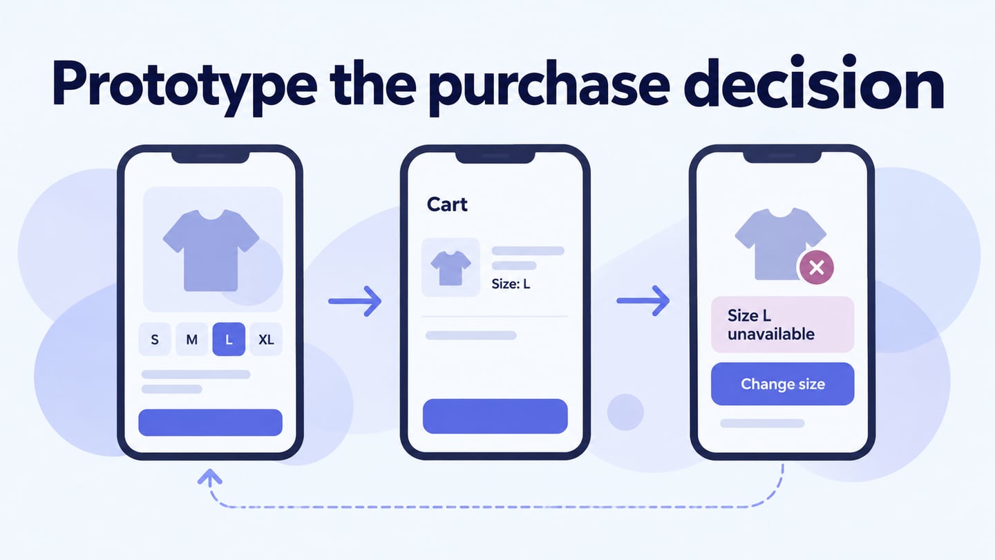
Ecommerce UI design shapes how people inspect products, choose options, and act on the information they see. Good presentation alone does not guarantee sales: availability, price, delivery, and product suitability also affect the decision. Use reusable UI components for product pages to keep labels, selected states, and actions consistent. This guide uses five design themes as practical interface checks rather than predicting which visual trend will win.
Five Ecommerce UI Design Practices
Choose a design approach because it helps a specific shopping task. The following practices apply to a small catalog as well as a larger store, but each needs realistic product content and testing at relevant screen sizes.
1. Design Around the Shopper’s Decision
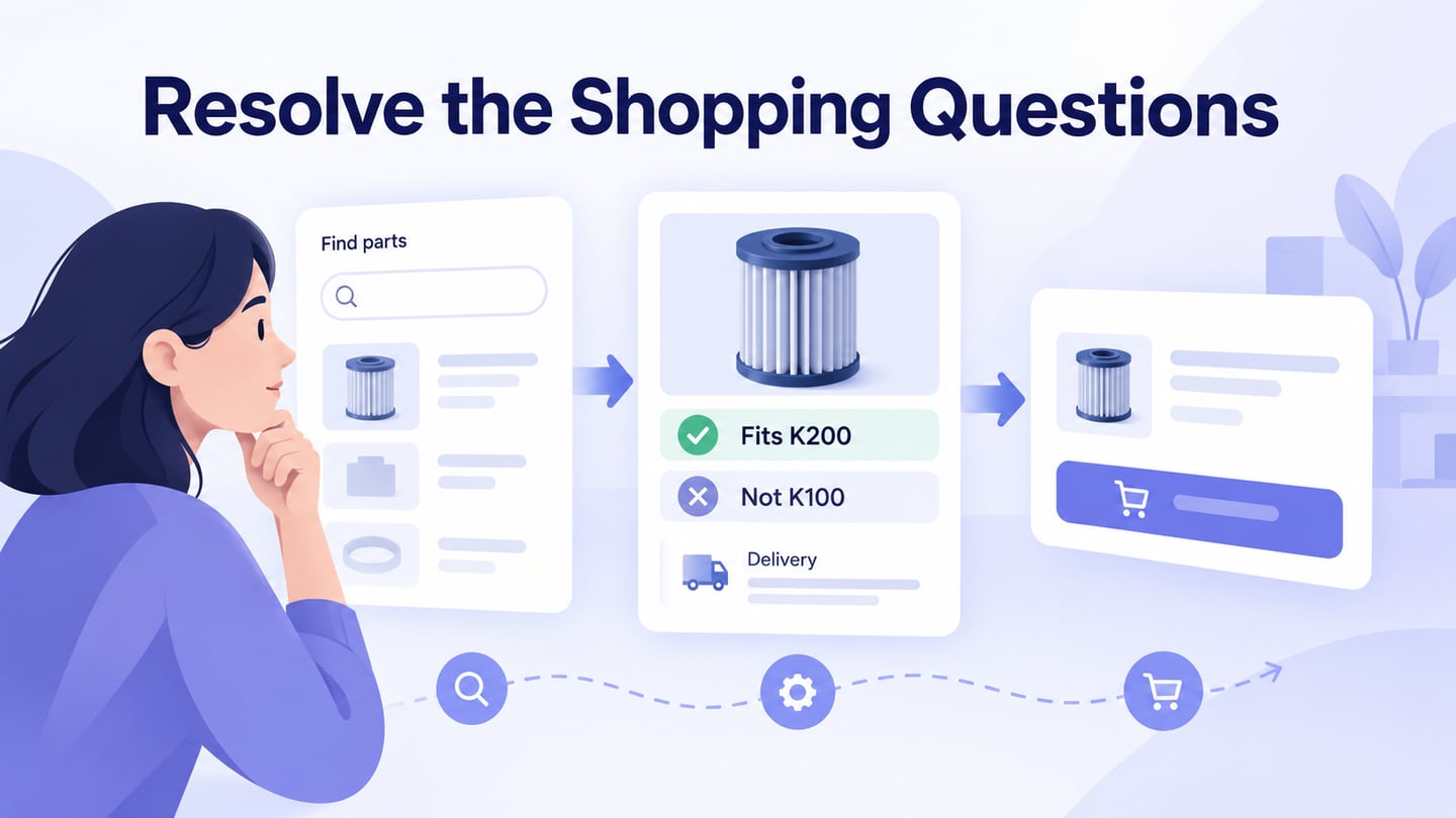
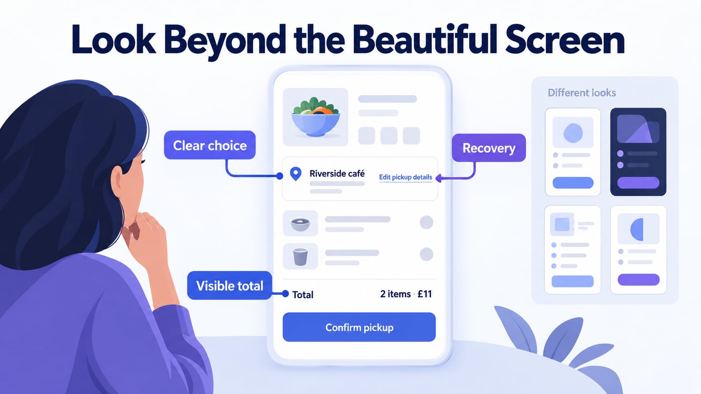
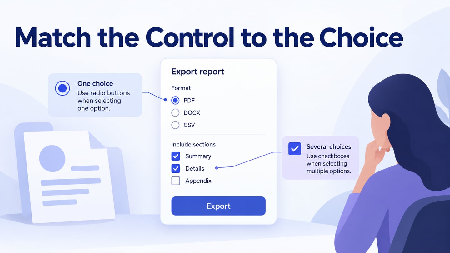
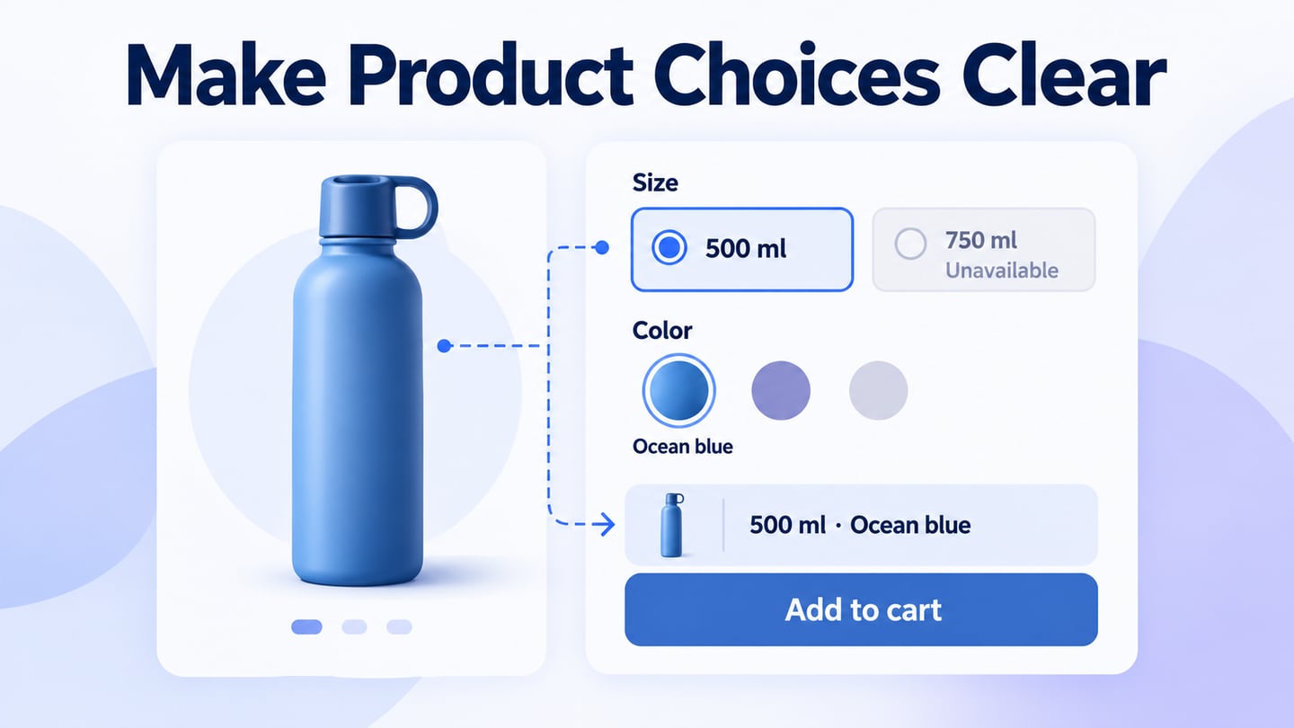
Design thinking begins with understanding the problem, not selecting a fashionable color scheme. Identify what the shopper must decide on the screen: whether a product is suitable, which option is available, or what happens after adding it to the cart. Put that decision into a concrete task and show the necessary information. For example, a capacity selector needs meaningful labels and an understandable selected state; decorative modules cannot compensate for an unclear choice. Review the initial design with representative people and revise the points where they hesitate or misunderstand the result.
2. Mobile responsive design
A responsive layout adapts to the available space. Mobile-first describes a design approach; it does not mean desktop support is automatic. On a narrow screen, keep the product name, relevant image, options, and primary action understandable without requiring horizontal scrolling. Check long variant names, an open selector, an error message, and the keyboard where inputs are present. On a wider screen, preserve the relationship between the selected option and the product summary. Test the resulting page on actual devices rather than assuming a resized mockup proves compatibility.
3. Use Motion for Feedback
Animation is useful when it explains a change, such as confirming that an item was added or revealing the result of a selection. Full-screen videos and looping GIFs are not necessary for every store and can compete with product information. Keep important text and controls available without waiting for an animation. Provide an appropriate reduced-motion experience and avoid interactions that depend solely on hover. In a prototype, show the before and after states clearly; during implementation, check loading, focus, and behaviour on slower devices. Choose media because it answers a product question, not simply because the interface can display it.
4. Keep Navigation Predictable
Simple navigation helps shoppers understand where they are and how to change their choice. Use recognizable category names, a clear route back to results, and a cart entry that remains understandable after an item is added. Avoid treating voice, swipe, or hidden gestures as substitutes for visible navigation. Search results, filters, and product pages should use consistent names for the same attributes. When a filter changes the results, show the applied condition and a way to clear it. A particular theme or framework cannot establish that the resulting navigation is usable; inspect the actual task flow.
5. Give Color a Purpose
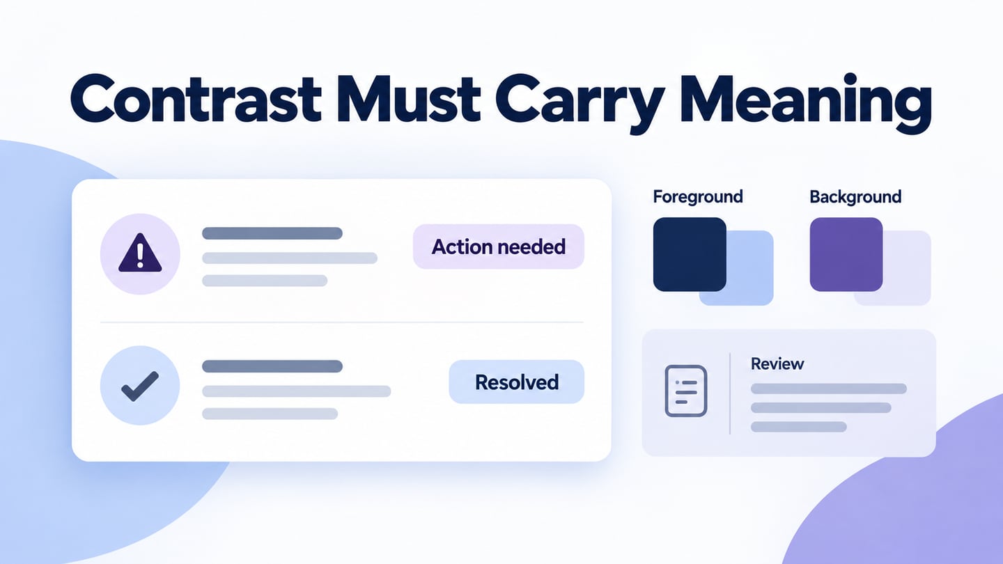
Use color to support hierarchy, selection, and feedback while preserving the store’s visual identity. A bold palette and a neutral palette can both work if the content remains readable and states are clear. Follow the principle that color must not carry meaning alone: mark an unavailable option with a label, and show selection with a border, icon, or text as appropriate. Check text and control contrast in each state. Do not assume a particular color scheme will cause more purchases, and do not change product photography merely to fit the interface palette.
Apply these practices to one product decision before expanding them across the catalog. A component should handle the ordinary selection and the exceptions, including unavailable combinations and long option labels.
Build a product-variant component with clear states
For an illustrative bottle store, show two capacity options: 500 ml and 750 ml. Mark 500 ml as selected and 750 ml as unavailable, then show the chosen color, Ocean blue. Repeat “500 ml · Ocean blue” above the cart action so the shopper can confirm the combination without inferring it from color alone.
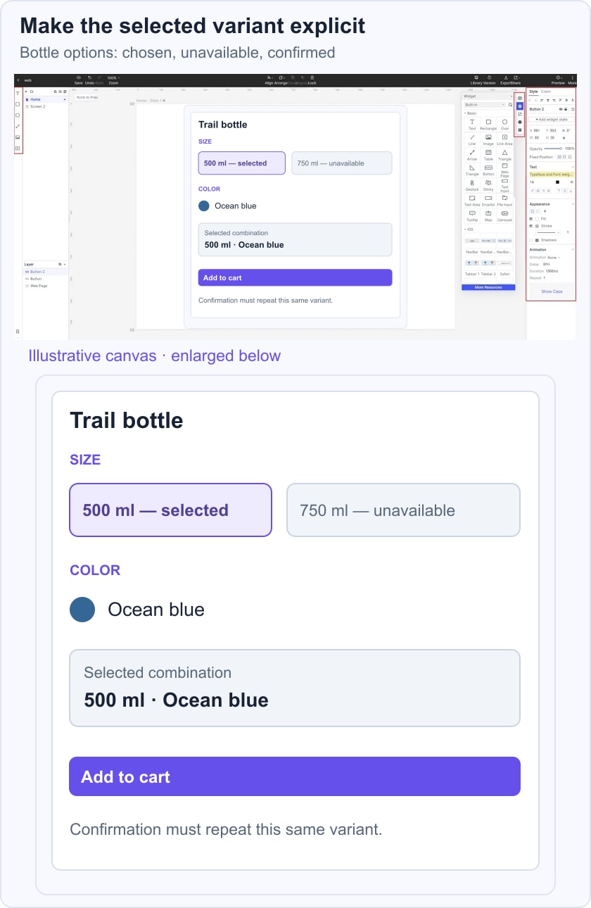
The Shopify variant documentation describes variants as combinations of product options. Use that distinction in the design: availability belongs to the selected combination, not just to the product name. If changing color invalidates the capacity choice, explain the change and require a valid selection rather than silently adding another item.
Ask a reviewer to identify the selected bottle and choose the unavailable size. The expected result is an understandable constraint, not a silent failure. After a valid cart action, the confirmation should repeat the same variant. This is a design-review scenario; inventory validation and actual cart contents must also be checked in the working store.
 Earlier Mockitt guide capture illustrating the workspace, not a finished ecommerce store.
Use Mockitt to Develop the Interface
Mockitt provides a workspace for arranging interface components and reviewing design alternatives. Use it to define the product card, option selectors, availability messages, and cart confirmation as a connected set. Keep the same example product throughout the review so differences in content do not hide inconsistent states. A visual design file communicates the intended experience; it does not connect a store to inventory, payment, or shipping services. The retained guide capture illustrates an earlier Mockitt workspace, while the article-specific example focuses on the ecommerce decision.
How to Create Ecommerce UI Design
The following workflow covers project creation, design, preview, and sharing. Current labels may differ from the earlier screenshots; concentrate on the screen states and the behaviour to review.
Step 1: Create a new project
Create a project for the relevant web or mobile layout and give it a name tied to the shopping task. Start with the product page, then add the option-selection and cart-confirmation states. Include a representative narrow and wide layout rather than treating one fixed frame as a complete responsive specification.
Step 2: Design the app
Build the product page with realistic names, images, availability, and option labels. Make shared components for repeated controls so a change can be reviewed consistently across the design.
- Add components and icons from the available libraries or create the elements the task needs. Give each product option a normal, selected, unavailable, and focus treatment where applicable. Keep icon meaning understandable through labels or context; avoid using an unlabeled symbol as the only explanation of availability.
- Connect the relevant states in an interactive shopping prototype. Selecting an option should lead to the matching summary, while a valid cart action should show a confirmation. Do not link every control to the same success screen, because that hides invalid or unavailable choices.
- Add design notes for constraints that are not fully represented by the prototype, such as inventory checks or a variant becoming unavailable. Keep those internal notes separate from the customer-facing message.
- Use state changes or transitions to explain selection and feedback. The important result is that reviewers can see which option changed and what remains selected. Avoid adding motion that makes comparison harder or obscures the primary action.
Step 3: Preview the Product Choices
- Preview the selected and unavailable states at relevant screen sizes. Ask someone to describe the exact item they expect to add, then compare that description with the confirmation. Check long labels, wrapping, visible focus, and whether the chosen combination remains visible near the action. Record the observations as design issues rather than claiming the prototype proves a conversion improvement.
Step 4: Share and Resolve the Review
- Share the prototype with the people responsible for design, product content, and implementation. Request feedback on specific decisions: whether the option is clear, the constraint is explained, and the confirmation matches the choice. Resolve those issues before duplicating the component across the catalog. In the working store, verify inventory, cart data, accessible controls, and performance separately.