A logo color scheme should help people recognize a mark in the places where it will appear: a website header, an app, a document or a printed item. Color is one part of that identity, alongside shape, lettering and spacing. The ten families below offer starting points for comparison, not universal predictions about what customers will feel. Use the principles of visual design to judge how the complete mark works in context.
Ten Logo Color Families and Their Practical Checks
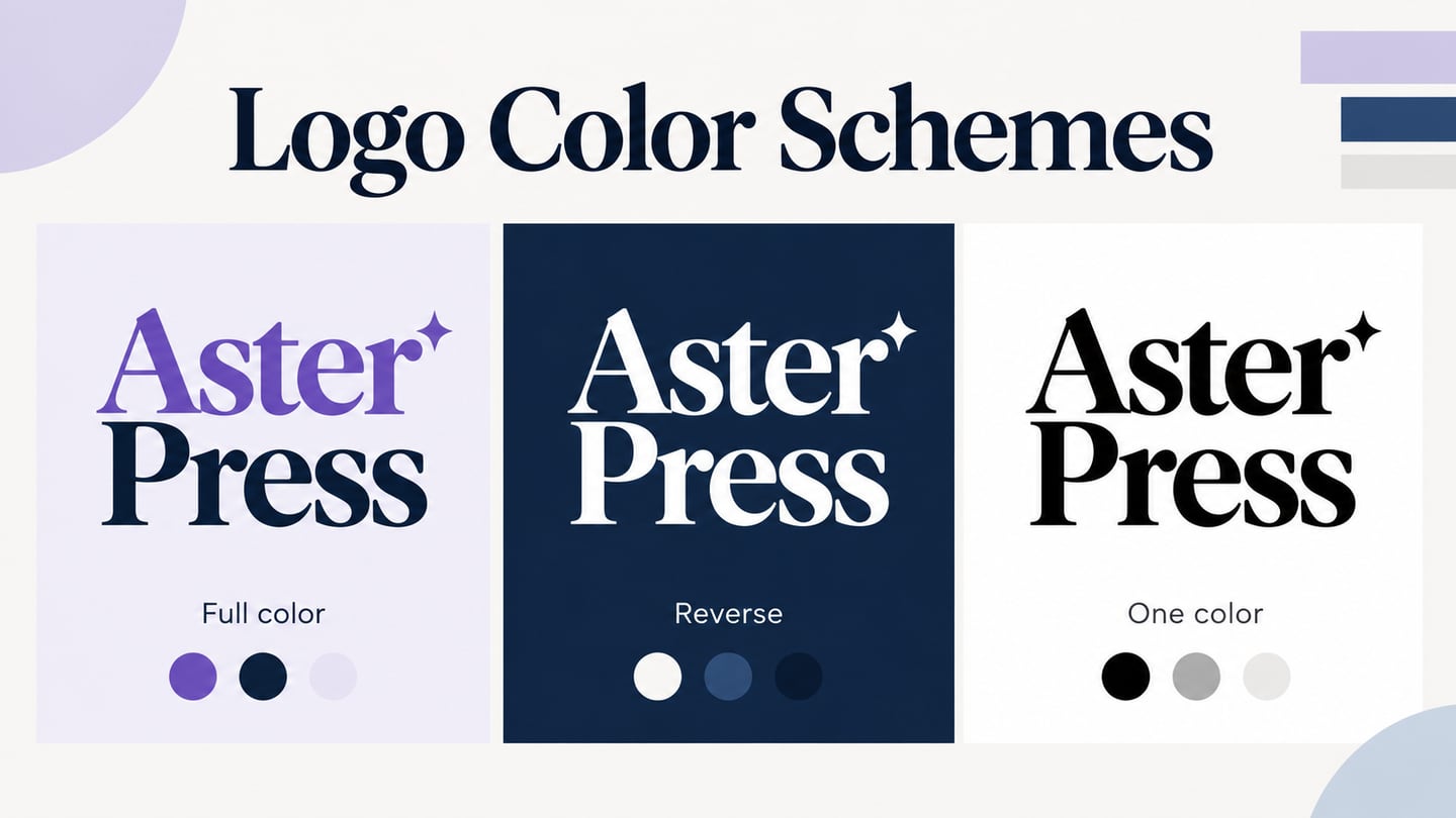
Start by listing the backgrounds, sizes and reproduction methods the identity needs to support. Then compare a full-color version, an approved reverse version for dark backgrounds and a single-color version where appropriate. Keep the shape and spacing consistent across them. A color name alone does not specify a usable scheme: a pale blue and a deep navy can behave very differently beside the same lettering and background.
1. Red Logo Color Schemes
A red mark can create a strong point of emphasis on a quiet background. Compare a bright red, a deeper red and a single-color fallback with the actual letterforms rather than selecting the hue in isolation. When combining red with yellow or white, check that small details remain distinct and that the mark is still identifiable at its smallest intended size. Avoid relying on claims that red necessarily creates hunger, trust or decisive action; the audience, context and existing identity all matter.
2. Blue Logo Color Schemes
Blue offers a wide range of light and dark treatments. A pale blue symbol may need a darker wordmark or a different background, while a navy mark can hold its outline on a light surface. Compare the complete combination at realistic sizes. If blue is also used for links or buttons on the website, keep the logo's identity role separate from the interface's action styling. A blue logo does not itself establish trust or make a product look professional; the surrounding experience must support those impressions.
3. Yellow Logo Color Schemes
Yellow needs particular attention against white and other light backgrounds, where fine strokes can become difficult to distinguish. Try the intended mark against a darker field, or use an approved dark wordmark beside a yellow symbol. Check the same design in one color to see whether its structure depends too heavily on a subtle color boundary. The aim is to preserve recognition, not to assume that a yellow palette will communicate happiness to every audience.
4. Orange Logo Color Schemes
Orange can provide a vivid accent, especially when the surrounding palette is restrained. Compare warm orange, muted terracotta and brighter variants with the actual background and typography. A large colored symbol and a small wordmark may need different proportions to feel balanced. Keep one chosen specification for each approved version so the mark does not drift between slightly different oranges across pages.
For a practical trial, place the same orange mark on a light header, a dark header and a small document heading. Record where a reverse or single-color version is needed. This gives you a concrete application test without attributing an unverified psychological motive to a familiar brand.
5. Green Logo Color Schemes
Green may connect with a particular subject or established identity, but it is not evidence of a product's environmental or health qualities. Choose the color because it fits the organization and its applications. Test dark green against light backgrounds and lighter green against darker ones, paying attention to fine lettering. If a website also uses green for a success state, keep that functional meaning distinct from the logo: the mark should not look like a status message or a confirmation control.
6. Violet Logo Color Schemes
Violet and purple can help distinguish an identity within a particular competitive set, but their effect depends on shade, saturation, lettering and context. A deep violet mark and a light lavender mark need different background treatments. Compare both with the same content before choosing. For a mark with several colored parts, also inspect a single-color version so the relationship between the parts remains understandable when color reproduction is limited.
7. Pink Logo Color Schemes
Pink ranges from pale tints to highly saturated magenta. Choose between them by considering the mark's visibility, the intended applications and the audience research available to you. Avoid treating a hue as belonging to one gender. A pale pink wordmark may lose definition on white, while a darker or more saturated version can create a stronger boundary. Compare the same lettering on light and dark surfaces and document which version belongs on each.
8. Black Logo Color Schemes
A black mark on a light background is a useful test of the underlying silhouette and letterforms. It removes differences between colored parts and can reveal whether gaps or strokes are too fine. Check the negative spaces inside the symbol and between letters at small sizes. A single-color version can be valuable for limited-color applications, but should be deliberately prepared; converting a complex multicolor mark to solid black without review may merge important details.
9. White Logo Color Schemes
A white or reverse mark can suit a dark background when its shapes and clear space remain intact. Use the approved reverse asset rather than filling every light-colored area indiscriminately. For a real example of defined variants, the official WordPress logo resources provide gray and white transparent versions and refer users to the trademark policy. The choice of variant and its permitted use are part of the identity guidance, not an invitation to recolor the brand freely.
10. Gray Logo Color Schemes
Gray can serve as a neutral mark or a secondary application, but a light gray version may become faint on a pale surface. Compare the exact value with the intended background and size. Do not treat a flat gray screen color as equivalent to metallic silver: a metallic print treatment requires separate production decisions. Keep the screen asset, any print specification and the single-color fallback clearly identified so the correct version reaches the correct application.
Review logo visibility separately from the surrounding interface. WCAG text contrast guidance includes an exception for text that forms a logo or brand name, but it does not exempt ordinary headings, navigation or button labels because they use brand colors. The guidance also recommends considering a sufficiently contrasting permitted variant when a logo acts as a control. Preserve the identity while making the rest of the page readable and operable.
Review Logo Variants in a Website Layout
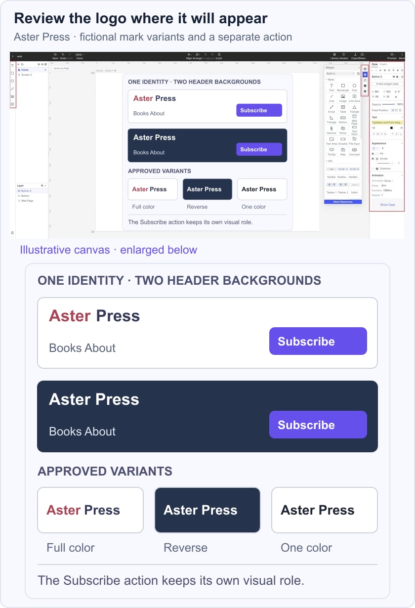
Use a Mockitt design canvas to compare the approved logo assets in their intended placements. Put the light and dark header applications beside each other, use the real navigation labels and keep the same spacing around the mark. The prototype helps reviewers see the application; it does not replace a brand asset specification or a production print check.
In the fictional Aster Press example, the full-color wordmark appears on a light header and a white variant appears on a dark header. A separate Subscribe control keeps the interface action distinct from the brand mark. Review the two website header layouts at their intended size, then confirm which asset belongs on each background. Also retain a single-color specimen for comparison so the identity remains recognizable without its full palette.
Before handing off the design, record the approved asset names, background uses, clear space and minimum sizes established for the identity. Test the exported files in the implementation rather than judging only a large canvas preview. A focused set of variants is easier to apply consistently than an open-ended collection of similar color combinations.