CSS controls a header’s visual layout: spacing, alignment, type, colors and how its content fits at different widths. HTML supplies the structure, including the site identity and navigation links. Treat those responsibilities separately so a visual choice does not obscure the meaning or behavior of the page.
Start with the content and destinations the header needs. The website header design guide covers navigation choices and mobile states; this article focuses on the HTML/CSS relationship and five preserved visual examples.
You can explore the appearance in a prototype before writing the code. The resulting website still needs implementation and browser checks. Below, a small header example demonstrates wrapping links, followed by observations from five historical site screenshots.
Plan a Header Before Writing Its CSS
In a Mockitt page design, arrange the site name, navigation labels and any essential action. A visual draft helps reviewers compare priorities before the layout is implemented. It does not replace HTML semantics, keyboard behavior or responsive browser testing.

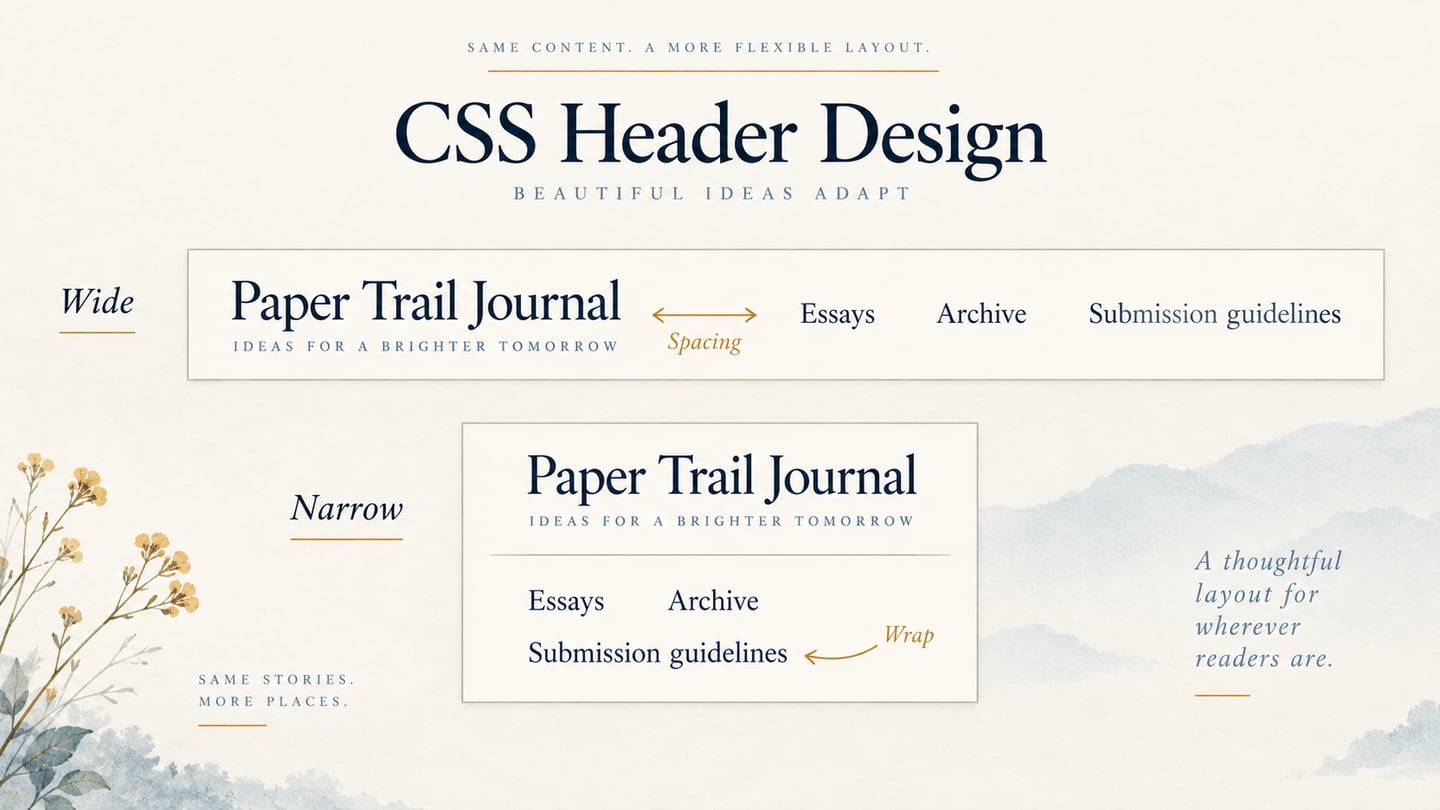
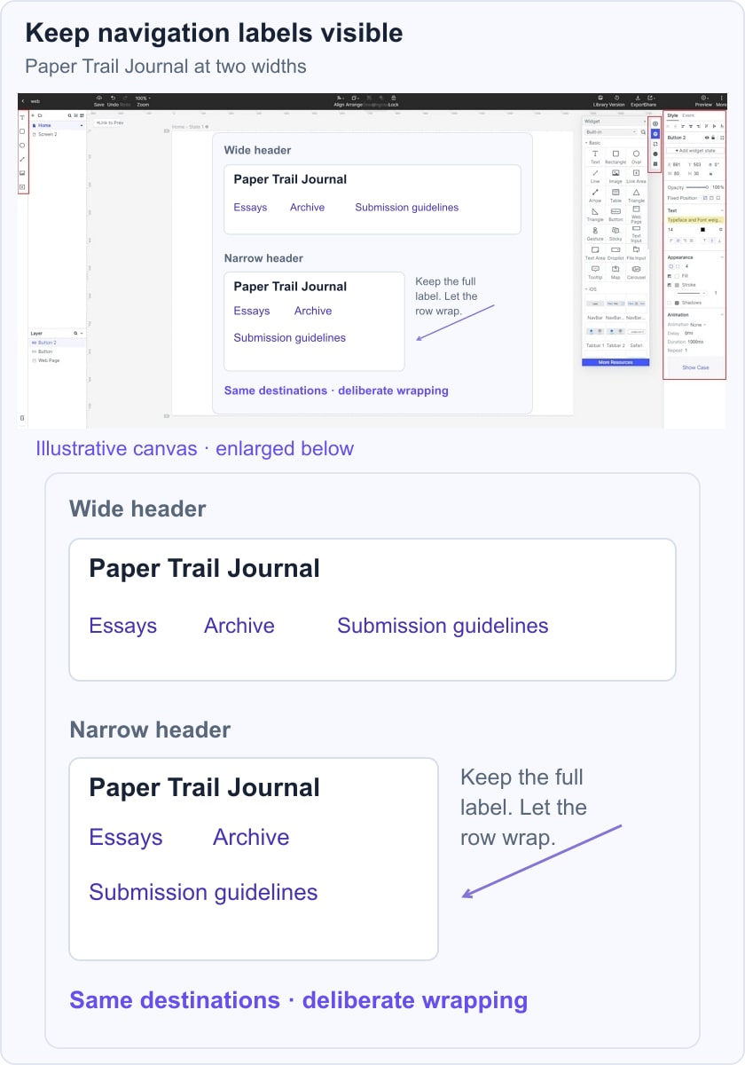
Use the actual labels early. “Submission guidelines” occupies more space than “More,” and that difference can change whether a header fits. Draw both a comfortable-width state and a narrow state instead of shrinking every element until it becomes difficult to read.
Adjust text, spacing and dimensions to explore the alternatives. A prototype can show where links should wrap or where a menu should appear, while the developer defines the real CSS and any required interaction.
What the Prototype Can Help You Review
Keep the review focused on the content and the intended route through the site. Useful tasks include:
- Arrange navigation labels and connect them to representative destinations.
- Demonstrate a menu’s open and closed states when that behavior needs review.
- Compare the site identity with the available navigation space.
- Record dimensions and spacing decisions alongside the design.
Share the draft with appropriate permissions and ask reviewers to find a specific section. Feedback should identify unclear labels or missing destinations, not merely which version looks more fashionable.
For a fictional Paper Trail Journal header, use “Essays,” “Archive” and “Submission guidelines.” Compare a wide arrangement with a narrow version in which the navigation wraps deliberately. Keep the long label fully visible and maintain its relationship to the other links.
Build the Header Structure and Layout
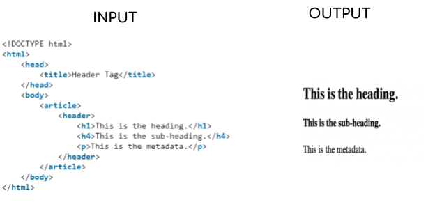
The HTML header element represents introductory or navigational content. It is different from <head>, which holds document information such as the title and metadata. A page can also contain a header within an article or section.
Use HTML elements according to their purpose. A navigation destination is normally a link with an href; an action such as opening a menu normally uses a button. Headings describe content hierarchy. CSS sets their visual size, so choosing an h1 or h4 is not a substitute for a font-size decision.
The original input/output image below illustrates an article-level header. Its visible paragraph labelled “metadata” is ordinary body text, not head metadata, and its h1-to-h4 jump is not a recommended heading sequence. Use a meaningful hierarchy in your own document.
When styling the header, make these decisions explicitly:
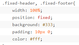
- Choose normal flow, sticky or fixed positioning according to the task. A header does not have to stay fixed. MDN’s positioning reference explains that fixed elements leave normal flow; they can cover content unless the layout accounts for them. The retained fixed-header snippet is only a partial example.
- Use animation only when it helps explain a state change. A basic header needs no animation to function. If motion is added, check its duration and respect relevant reduced-motion preferences.
- Define text size, spacing and wrapping in CSS while keeping navigation and heading semantics in HTML. Check focus visibility and link destinations in the implemented page.
This complete local example keeps the header in normal flow. Its flex layouts allow the navigation to wrap instead of clipping a long label. Save it as an HTML file, open it in a browser, and narrow the window to inspect the result. The fragment links point to real sections in this same document.
<!doctype html>
<html lang="en">
<head>
  <meta charset="utf-8">
  <meta name="viewport" content="width=device-width, initial-scale=1">
  <title>Paper Trail Journal</title>
  <style>
    * { box-sizing: border-box; }
    body { margin: 0; color: #183042; font: 1rem/1.5 system-ui, sans-serif; }
    .site-header { display: flex; flex-wrap: wrap; align-items: center;
      gap: 1rem 2rem; padding: 1rem; background: #eef3f5; }
    .brand { font-weight: 700; }
    nav ul { display: flex; flex-wrap: wrap; gap: .5rem 1rem;
      margin: 0; padding: 0; list-style: none; }
    a { color: #174a66; }
    a:focus-visible { outline: 3px solid #174a66; outline-offset: 3px; }
    main { max-width: 60rem; margin: auto; padding: 1rem; }
  </style>
</head>
<body>
  <header class="site-header">
    <span class="brand">Paper Trail Journal</span>
    <nav aria-label="Main">
      <ul>
        <li><a href="#essays">Essays</a></li>
        <li><a href="#archive">Archive</a></li>
        <li><a href="#submissions">Submission guidelines</a></li>
      </ul>
    </nav>
  </header>
  <main>
    <h1>Stories worth keeping</h1>
    <section id="essays"><h2>Essays</h2><p>Read the latest issue.</p></section>
    <section id="archive"><h2>Archive</h2><p>Explore past issues.</p></section>
    <section id="submissions"><h2>Submission guidelines</h2><p>Send one original essay.</p></section>
  </main>
</body>
</html>
Try a longer site name and use the keyboard to visit each link. Check that the focus indicator is visible and that the labels remain inside the viewport. More complex navigation may need additional behavior and testing; do not add a collapsed menu merely because the viewport is narrow.
Five Historical Header Examples
1. Ziggy Denim
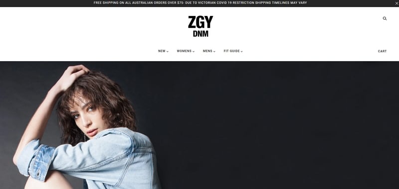
The retained Ziggy Denim screenshot places the ZGY DNM mark centrally above a compact row of clothing categories. A narrow delivery notice sits at the top, and a large editorial photograph starts beneath the navigation. The layers distinguish temporary information, identity and browsing choices.
Search and cart controls sit toward the right edge. When using a similarly wide composition, check whether these utilities remain discoverable after the layout narrows. The useful lesson is the relationship between the central brand and utility actions; the static image does not establish the site’s slider code or timing.
2. Orangina
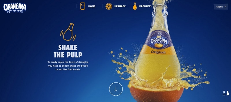
Orangina’s historical header uses the logo at the left and icon-supported Home, Heritage and Products labels across the top. Their yellow accents contrast with the blue background and connect visually with the product illustration.
The language choice is separated at the right. Keeping it distinct from the main product navigation helps explain its different purpose.
An icon can support a familiar label, but CSS does not itself supply a universal icon library. Choose an appropriate asset or component and retain understandable text where needed. Avoid assuming a particular implementation from this screenshot.
3. The Print Ink Co
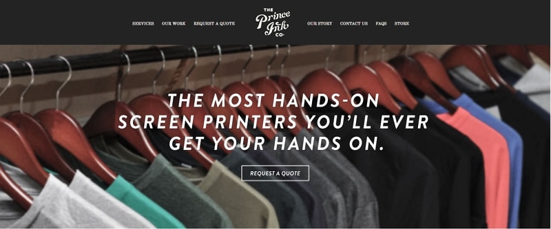
The Print Ink Co screenshot places a distinctive central logo among evenly styled navigation links. The surrounding labels are visually restrained, leaving the identity more expressive without changing every menu item’s typography.
Below the header, a clothing photograph supports a large screen-printing message. Its contrast and placement separate the hero statement from the smaller navigation above.
A Request a quote control gives the hero a clear next step. In an implemented website, use a link when it navigates to a quotation page or a button when it performs an action; CSS styles that control but does not create its destination by itself.
4. World in My Lens
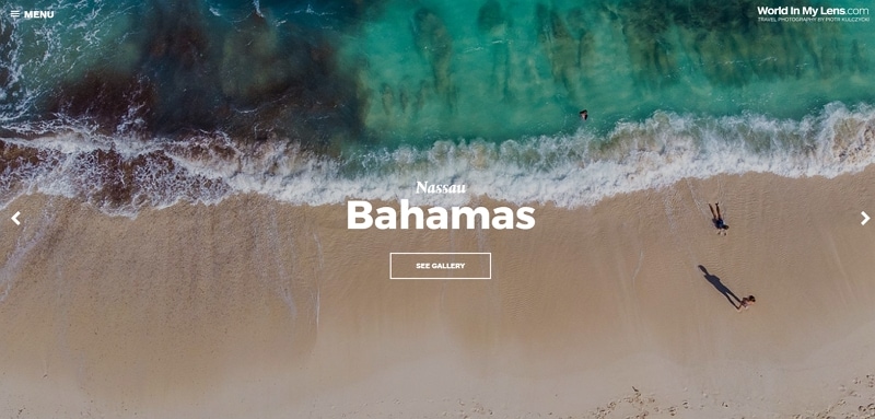
The World in My Lens screenshot keeps the site identity in the upper-right corner and a compact Menu label at the upper left. A large beach image carries the page, with the destination name and See gallery action centred over it.
Visible left and right arrows suggest a route between images, while the gallery action offers a different destination. A clear navigation structure should make those purposes distinct. Review menu-open and image-change states separately if adapting this pattern; the still image alone does not document their behavior.
5. Runrun.it
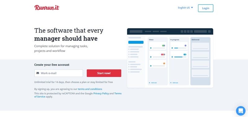
The retained Runrun.it page has a sparse top row: the brand at the left, with language and Login at the right. The larger headline, explanatory copy and product illustration belong to the hero beneath it. Separating those areas keeps the header from competing with the product message.
The visible email field and Start now action make the hero’s intended next step clear. Treat its historical offer text as part of the example, not a current pricing statement. The transferable decision is where to place existing-user access versus a new-user action.
From the Visual Plan to Working CSS
Use the examples to discuss hierarchy, spacing and navigation, then implement those decisions with suitable HTML and CSS. A screenshot can inspire a layout; the finished code must still make the content and destinations work at the required widths.
For the journal example, the important result is simple: the identity and all three labels stay readable, the links reach their sections, and keyboard focus remains visible. Review those outcomes in the browser as well as in the prototype.