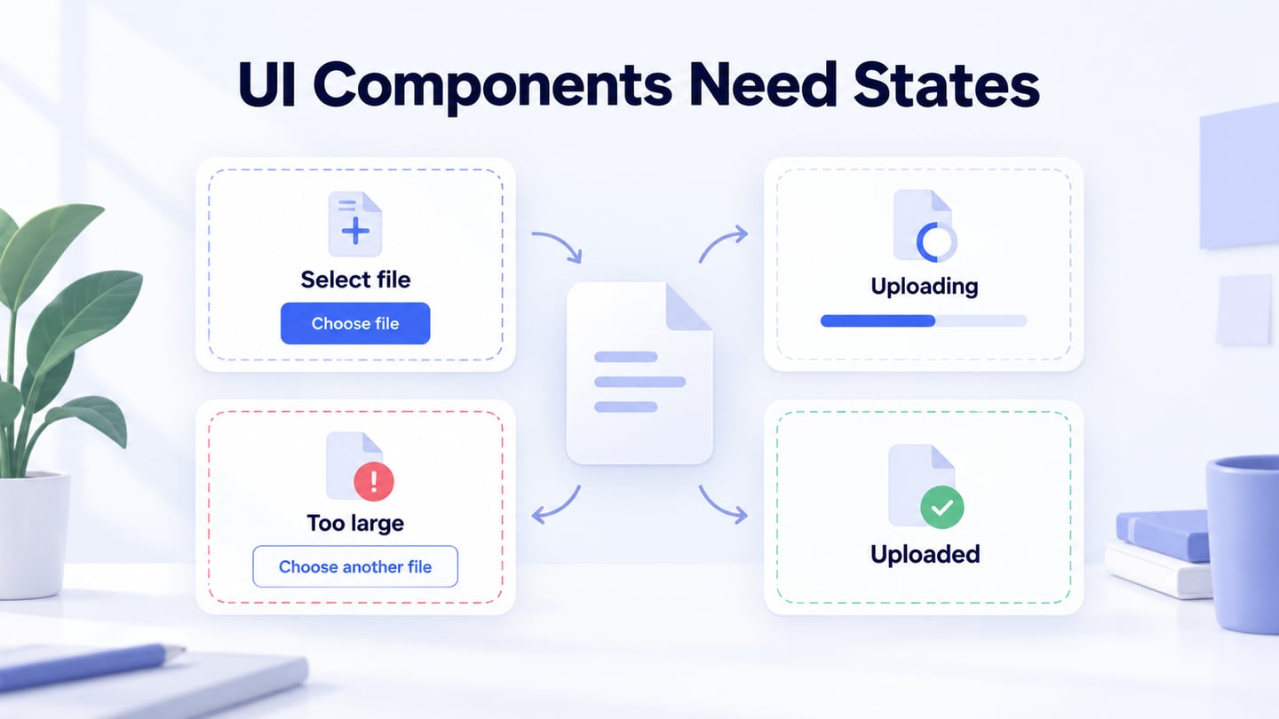
UI design components are reusable building blocks such as fields, buttons, cards and navigation elements. Their value comes from consistent meaning and behavior, not from choosing the tool with the largest library. Start with the user’s task, then select the components that support it.
Where to Find Design Components
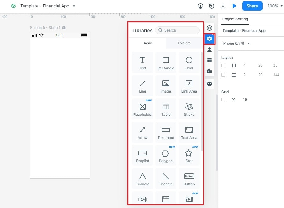
In Mockitt, use the available asset and widget libraries as a starting point for a screen. Check whether a component fits the intended content, states and interaction. The older screenshots below show library controls from an earlier interface; current labels and access may differ.
Share the design with colleagues to review how the components work together. A reusable element in a design file is not automatically a coded, accessible production component. Confirm current workspace and export options rather than assume an offline preview or integration exists for every project.
How to Use Design Components to Finish Your UI/UX Design
The four steps—from creating a project to sharing a review—work best when they focus on one concrete component. Here the example is a project-brief attachment upload with a visible recovery state.
Step 1: Create a New Project
Create a project for the relevant task and name the screens or states clearly. Include the target screen sizes and use synthetic file names rather than confidential documents.
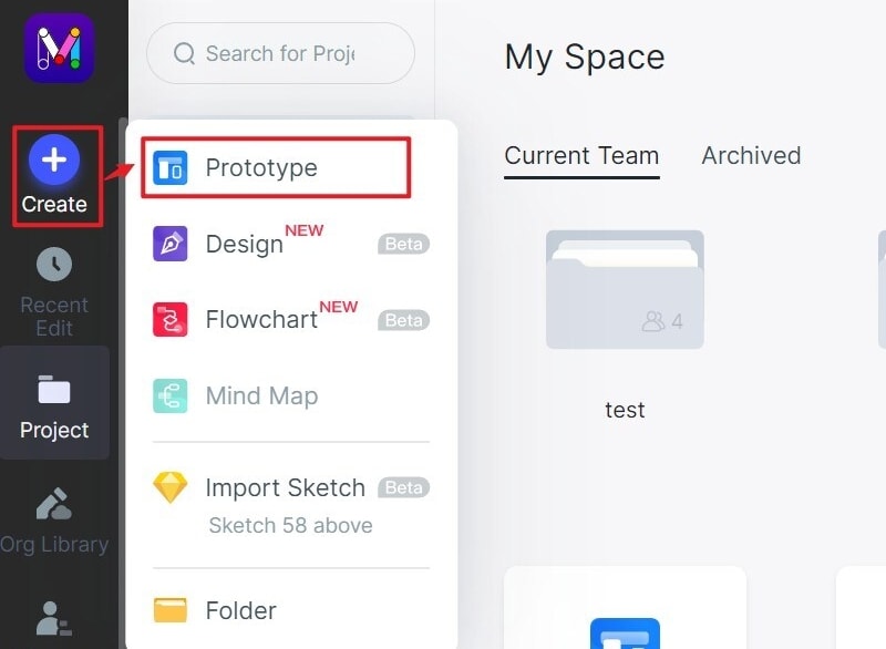
Step 2: Find the Design Components
Start with Available Widgets
Open the component or widget library and find the building blocks needed for the upload control: a label, action, file summary and feedback area. Add them to the canvas using the controls available in your workspace.
Evaluate Additional Components
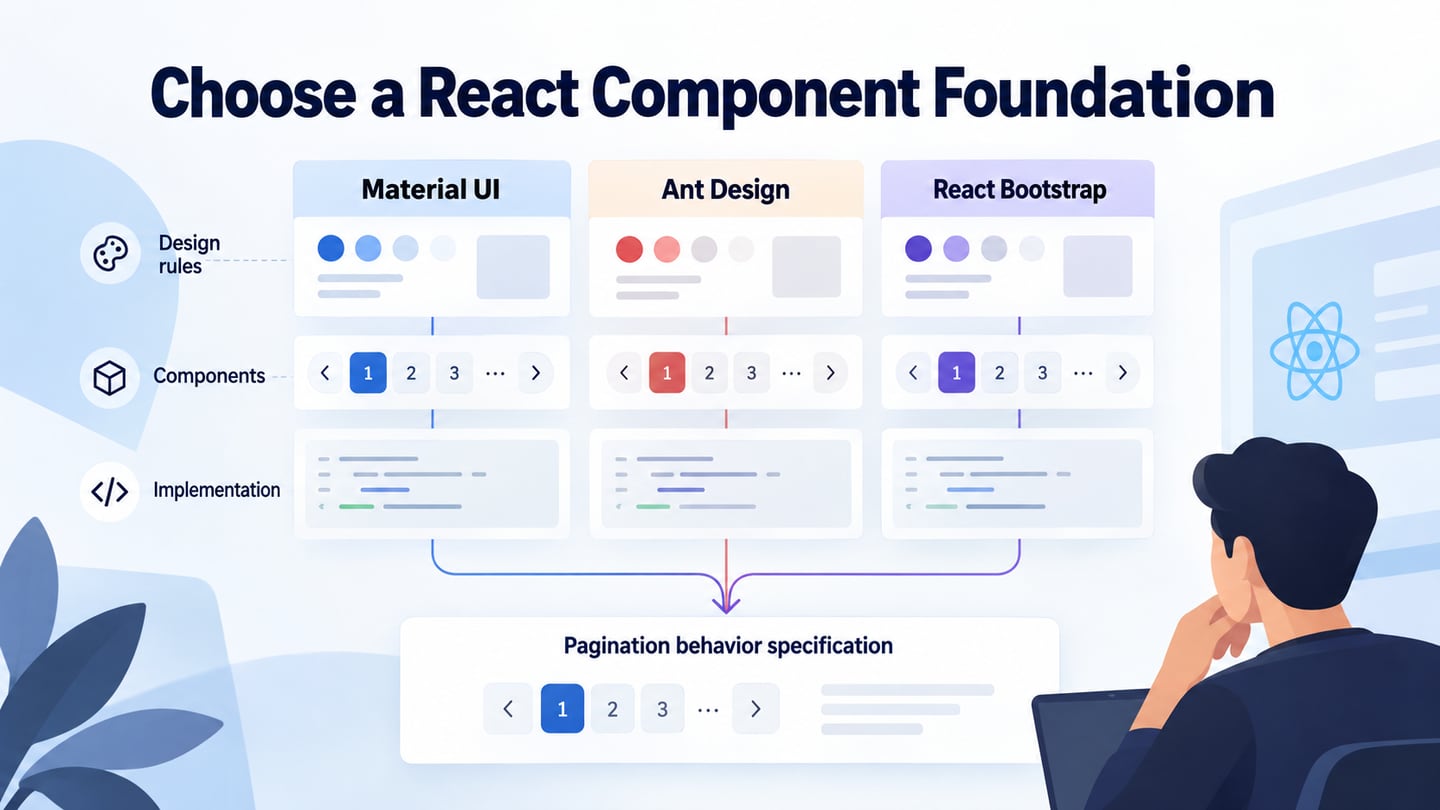
If the library has a suitable reusable pattern, inspect its variants before using it. Check which parts are configurable and which conventions should stay consistent. More assets are useful only when they solve an actual design need.
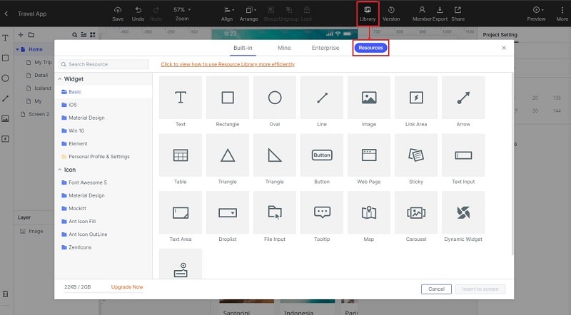
Combine basic elements when a ready-made component does not fit the task. An upload control may need a selected-file name, progress feedback and a retry action, not simply a rectangle with an icon. Record these requirements so a visually complete component is not mistaken for a behaviorally complete one.
Step 3: Adapt the Component and Its States
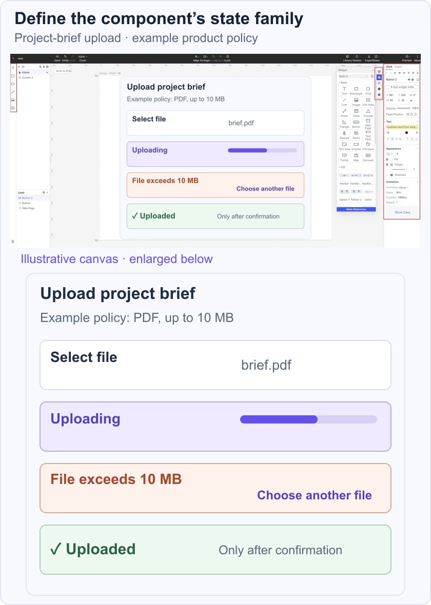
For a project-brief upload component, define the selected file, uploading, error and completed states. Use an example policy of PDF files up to 10 MB, clearly labeled as this fictional product’s rule—not a Mockitt limit. When a file is too large, explain the rule and offer Choose another file. Keep labels and action placement consistent across states, and avoid showing Uploaded before success is confirmed.
Step 4: Preview and Share your UI Component Design
Preview the component in its surrounding form and ask a reviewer to replace a rejected file. Can they tell why the file was rejected and what to do next? Share the state definitions with developers, including what happens if the upload is cancelled or the connection fails. The prototype represents these outcomes; it does not perform the upload service.
What is Component-Based Design
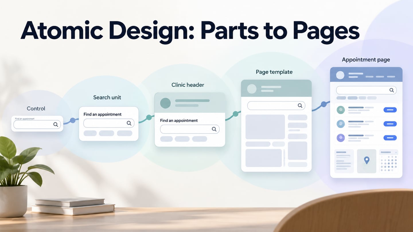
Component-based design builds an interface from reusable units with defined purposes, variants and behavior. A design component, a coded component and a complete design system are related but different artifacts. Reusing a visual element does not remove the need for engineering, accessibility checks or maintenance. A design system adds shared guidance and governance around reusable parts.
Useful tips about design components
1. Create the Components You Need
Start with repeated patterns in the real product. A one-off screen detail may not need a general component yet. If a pattern is reused, document the common structure and the differences that should be supported.
2. Understand the Component’s Purpose
Define what a component helps someone do. For the upload control, success means attaching an acceptable file with understandable feedback, not merely displaying a familiar icon. This purpose guides which states and instructions belong in the component.
3. Make Shape and Behavior Agree
The shape can suggest a role, but it cannot define interaction by itself. A control that looks like a button should have a clear action, while a status label should not appear clickable without a reason. Check keyboard and assistive-technology behavior against relevant W3C interaction patterns during implementation.
4. Use Spacing to Keep Relationships Clear
Keep the label, file summary and feedback close enough to read as one group. Leave room for a longer filename and a two-line error. Test narrow layouts before fixing the component’s height.
5. Customize Without Creating Unnecessary Variants
Change properties to meet the task, while preserving shared behavior. If a special case needs a new variant, explain why and review its effect on other uses. Keep a record of approved states and update both design and implementation when the rule changes, with a consumer migration plan if the component is being retired.