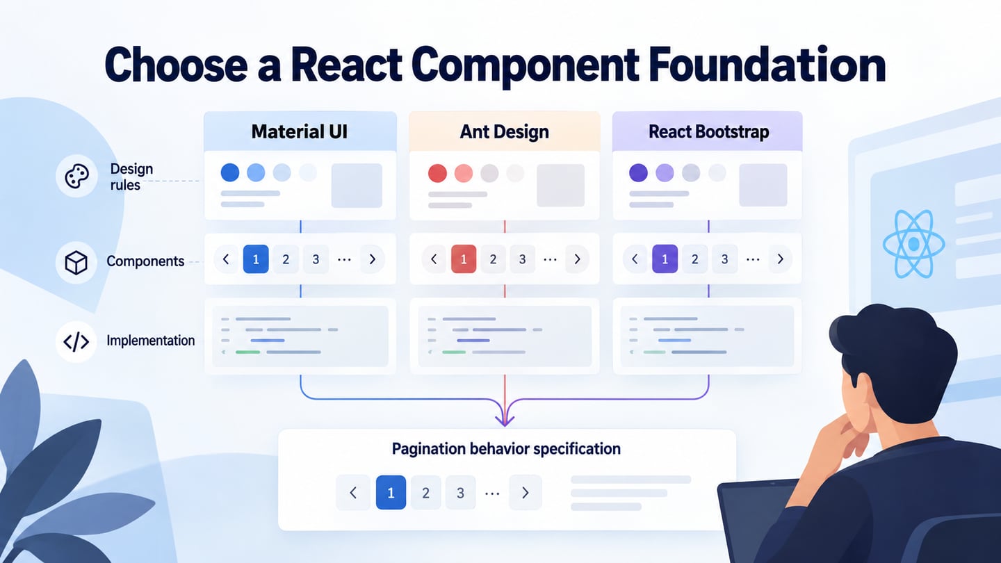
React component libraries can supply reusable controls for a web interface, but a library is only one part of a design system. A system also needs shared design decisions, usage guidance and a way to maintain them. This guide compares the original three choices—Material UI, Ant Design and React Bootstrap—by their roles and project fit rather than a popularity ranking.
React, Components and Design Systems
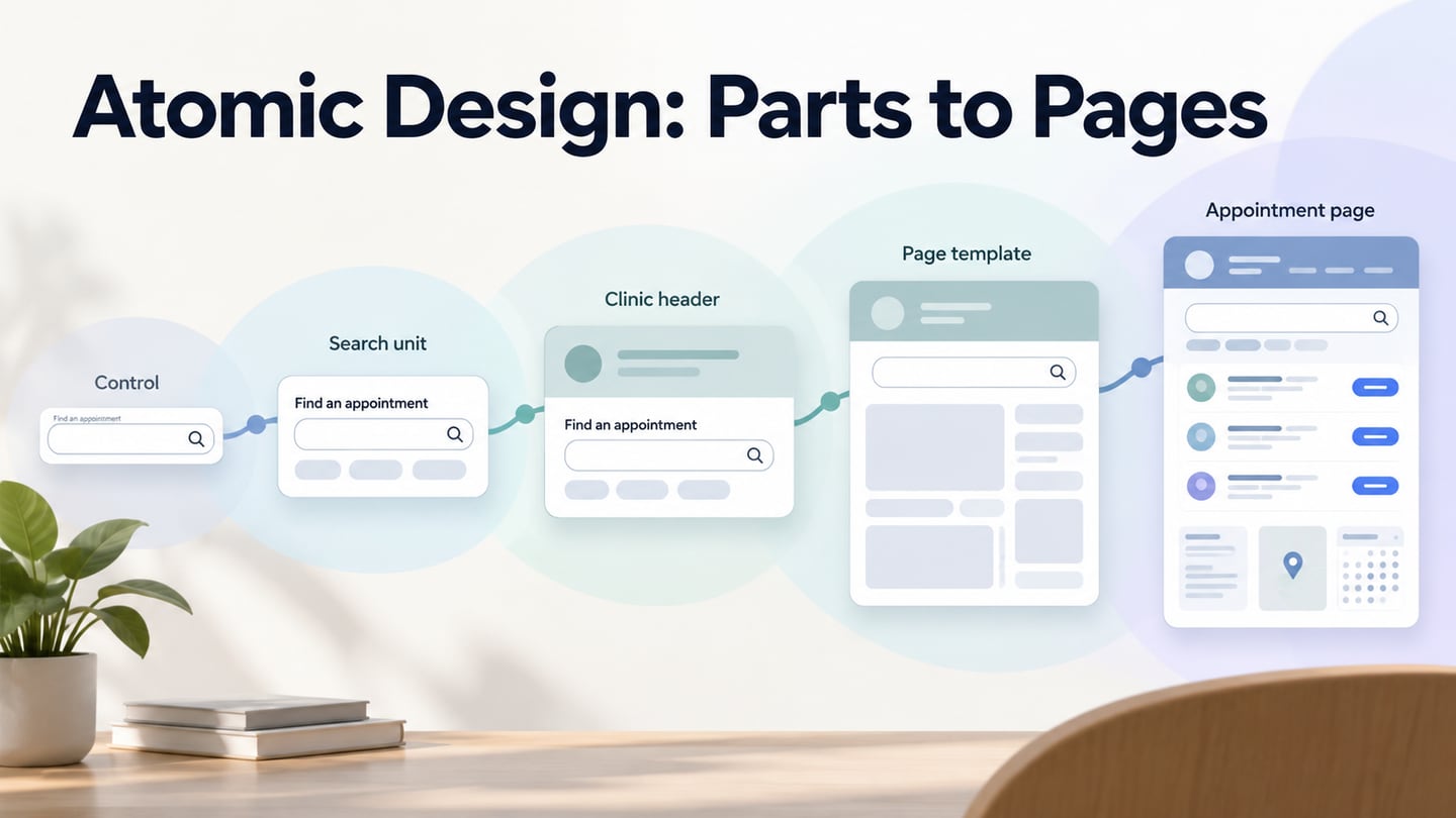
React is a library for building interfaces from components. A component describes part of the UI, and components can be combined into larger views. React is not itself a complete visual design system: it does not decide the brand palette, appropriate labels, spacing rules or which control best serves a task. A component library provides implementations that a team can evaluate and configure.
A React interface renders according to its data and state. Developers define how events update that state and how components receive the information they need. The approach can support reusable behavior, but it does not eliminate application logic or guarantee that a change requires no other code work. React can be used within different application architectures; React Native is a separate route for native interfaces, not proof that a web component library runs unchanged on a phone.
The retained screenshot below shows a historical class component with a render() method and this.props. It is useful for understanding how a component receives input and describes output, but it is not a current application setup to copy unchanged.
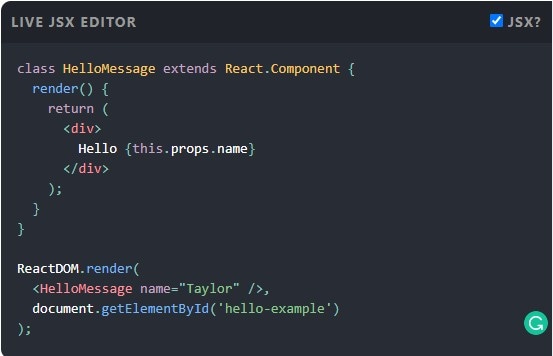 Historical class-component example. Use current React documentation for function components and root setup.
Current introductory React documentation teaches function components and JSX, the markup-like syntax used to describe UI. For a client-rendered browser root, the current createRoot API replaces the older root-rendering pattern shown in the screenshot. Frameworks may manage setup themselves. Follow the documentation for the project’s actual architecture and installed versions.
Three React Component Libraries
The following libraries provide different starting points. Compare the controls your application needs, styling approach, accessibility behavior, supported environment and maintenance implications. A GitHub star count or download total does not tell you whether the library fits a particular task. Build a small representative screen before committing to broad customization.
1. Material UI
Material UI is MUI’s open-source React component library. Its overview identifies Material Design 2 as the design basis and provides components, theming and customization options. It can be a useful starting point when that language suits the product, but setup, data handling and application-specific behavior still belong to the project. A component’s default appearance does not certify the accessibility or performance of the finished page. Review focus, labels, contrast and states in context. The separate Material UI guide explains its components, APIs, themes and styles in more detail.
For a representative pagination control, check how the library expresses the current page, unavailable Previous/Next actions and keyboard behavior. Then inspect whether a brand customization preserves those cues. Theme configuration is usually easier to maintain when shared decisions are explicit; many unrelated local overrides can obscure the rules the team thought it was adopting.
2. Ant Design
Ant Design of React is the antd library implementing Ant Design’s language for web applications. Its documentation describes React components, TypeScript support, internationalization and theme customization. The wider Ant Design system also provides values and guidance, which are different from a package of controls. It is often considered for information-rich application interfaces, but the choice still depends on the actual workflow. Check whether the necessary component states and localization behavior fit the product before using broad claims such as “enterprise-ready” as the whole decision.
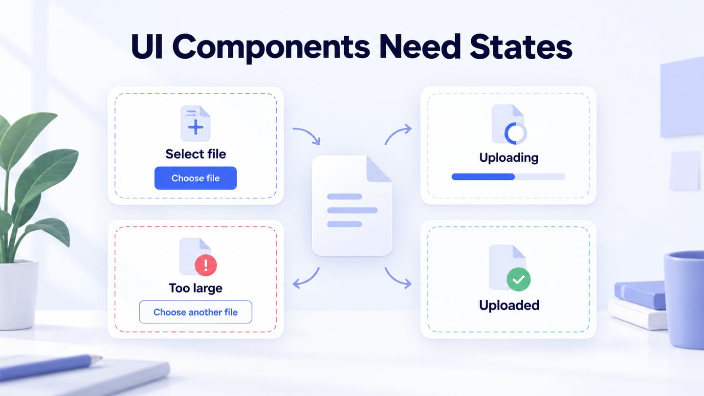
The Ant Design overview covers the system separately. In a library comparison, inspect concrete needs: can the team represent empty data, loading, errors and permissions clearly, and how much adaptation is required? Keep package scope and optional companion products distinct. A large catalog is helpful only when the selected controls solve the interface problem and remain understandable after customization.
3. React Bootstrap
React Bootstrap supplies React implementations of Bootstrap components. Its introduction explains component imports and the need to include styles; the package does not ship the required CSS automatically. It reimplements Bootstrap’s JavaScript behavior, so themes that extend Bootstrap’s original JavaScript are not automatically compatible. This can suit a project already using Bootstrap’s styling approach, but check the React, Bootstrap and React-Bootstrap versions together. It is not dependency-free or universally the fastest option simply because it does not rely on jQuery for its component behavior.
Use the same small task when evaluating all three choices, such as an equipment inventory with pagination. Compare implementation effort, visual fit and behavior under the same content and states. Record where a library provides a suitable default and where the team must add logic or guidance. This produces a decision the team can explain without treating a library as a complete organizational design system.
Plan the Design Before Implementation
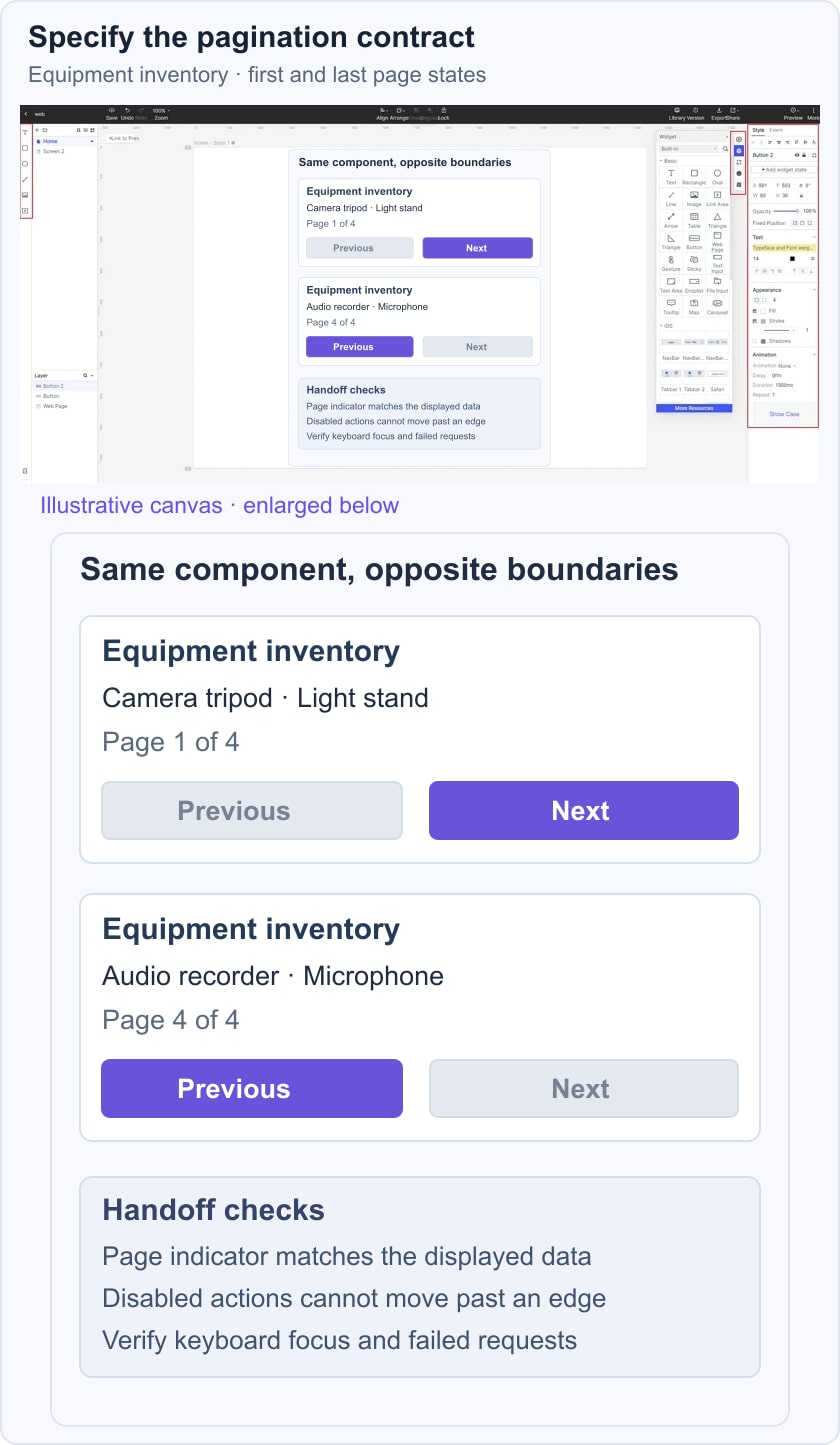
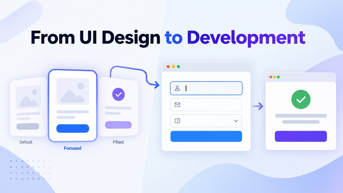
Mockitt can help a team agree on the intended interface before implementation. For an equipment inventory, show the first and last pages and define what Previous and Next do. A prototype communicates labels, layout and state transitions; it does not establish that the design has been exported as React code or that a particular component package is already integrated. The historical editor capture below illustrates this visual planning role.

Useful Design-to-Implementation Tasks
- Share a reviewed design version with the people responsible for implementation, using access settings appropriate to the project.
- Collect specific feedback about the task, missing states and unclear labels, then record the decision rather than leaving conflicting comments unresolved.
- Adapt visual assets and templates to the product’s content. Similar-looking design assets and coded components may behave differently.
- Connect the prototype actions that matter to the review. Document behavior that the visual demonstration does not reproduce.
- Hand off state rules, labels, assets and open questions together. Developers still need to implement data requests, component state and error handling.
- Review the design before handoff and test the implemented interface afterward. A successful prototype walkthrough is not a substitute for browser, keyboard or accessibility testing.
The illustrative inventory below shows page 1 of 4 with Previous unavailable and page 4 of 4 with Next unavailable. The handoff also needs to define what happens when data changes, a request fails or focus moves after a page change. These rules belong to the product, whichever React library supplies the controls.