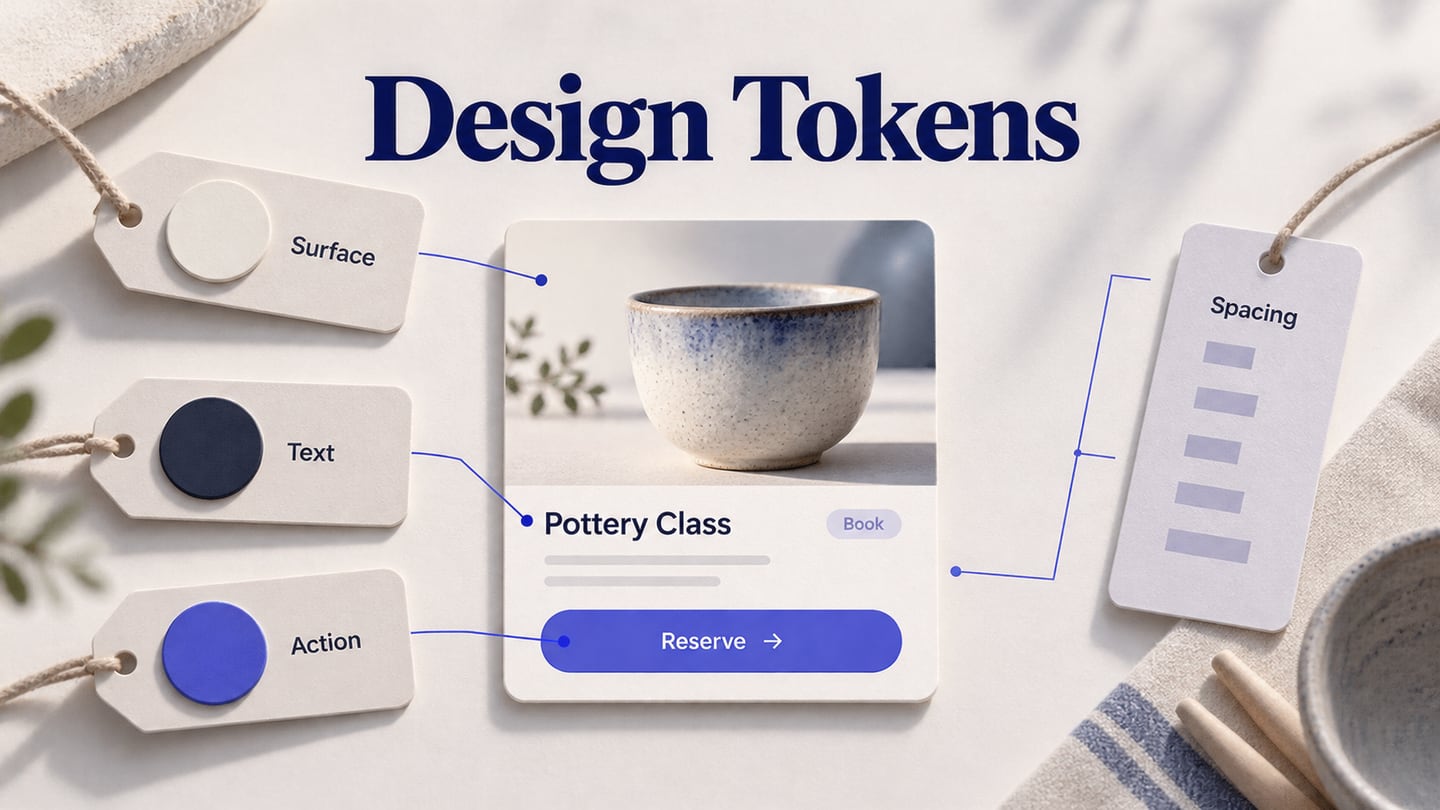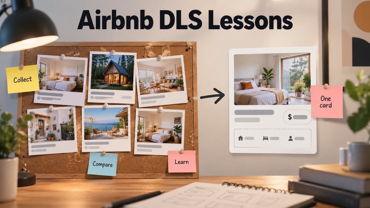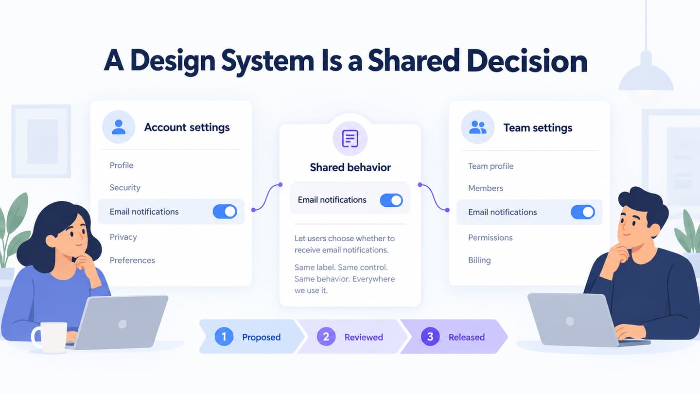
A design system helps a team reuse interface decisions consistently across products and releases. It can include components, design tokens, content guidance and implementation rules, with people responsible for maintaining them. It is more than a folder of assets, and its scope should fit the organization’s actual needs.
What Is a Design System?
A design system combines reusable parts with guidance about when and how to use them. Foundations may include color, type and spacing; components may include fields and menus; patterns describe how several parts work together. Design Systems 101 distinguishes a complete system from individual libraries or style guides.
Design and code representations need to agree, but they are not automatically synchronized just because both exist. A maintained system also needs ownership, documentation, accessibility expectations and a way to propose and release changes. The useful question is whether teams can make and implement a consistent decision.
A growing product can accumulate several versions of the same field, button or message. Shared rules reduce that drift and make exceptions easier to discuss. Reuse can save repeated work, but a system is not a solution to every product problem: a new task may still need research and a new pattern. Begin with recurring needs and invest in maintenance as well as creation.
What Makes the System Usable by a Team?
For each component, document its purpose, supported variants, interaction states, content rules and implementation reference. Identify an owner and a contribution path so a team knows where to raise a missing case. When behavior changes, explain the migration and review existing uses rather than silently replacing an asset. A design library is useful; shared decisions and maintenance make it a system.
Five Public Design References to Learn From
These references cover different scopes. Public access does not mean that all code, assets or brand elements can be reused without conditions. Check the relevant license and your platform requirements before adoption.
1. Google Material Design
Material Design 3 provides foundations and component guidance for building coherent interfaces. Use the current version’s documentation rather than mixing examples from different generations without checking the differences.
Study how the guidance connects a component’s anatomy, behavior and visual treatment. Adopting a color palette alone does not implement a system, and a platform-specific component still needs review in your own product.
2. Mailchimp’s Content Style Guide
The Mailchimp Content Style Guide is a public writing reference covering voice, terminology and content practices. It is useful as an example of content governance, but it is not a complete coded UI component library or access to Mailchimp’s marketing service. Its stated license includes conditions; do not treat “public” as unrestricted reuse.
3. Uber’s Base Web
Base Web provides a component-oriented reference associated with Uber. Distinguish this from a brand guide about logo use and photography: brand identity and reusable application controls solve related but different problems.
Review the component behavior, customization model and platform fit before adopting a library. A documented component can reduce repeated work, but it does not guarantee that every use in a product is accessible or appropriate.
4. Salesforce Lightning Design System
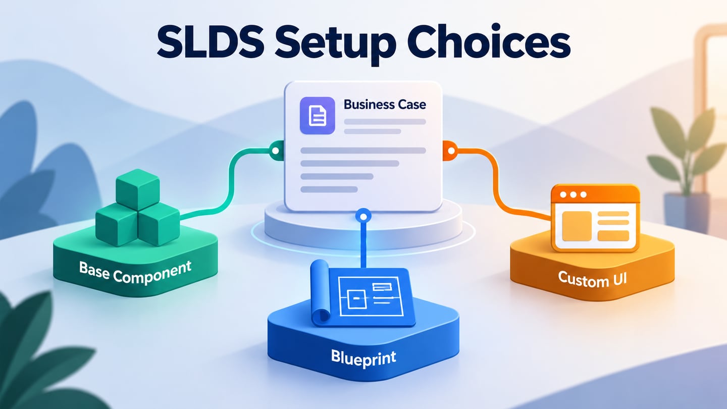
Salesforce’s Lightning Design System guidance explains how styling and components relate to its development platform. It is a useful example of design and implementation conventions working together.
Examine the appropriate version and integration guidance for your environment. Do not assume that a visual blueprint is equivalent to a fully working component in every framework, or that copying styles automatically supplies the required interactions.
5. Atlassian Design System
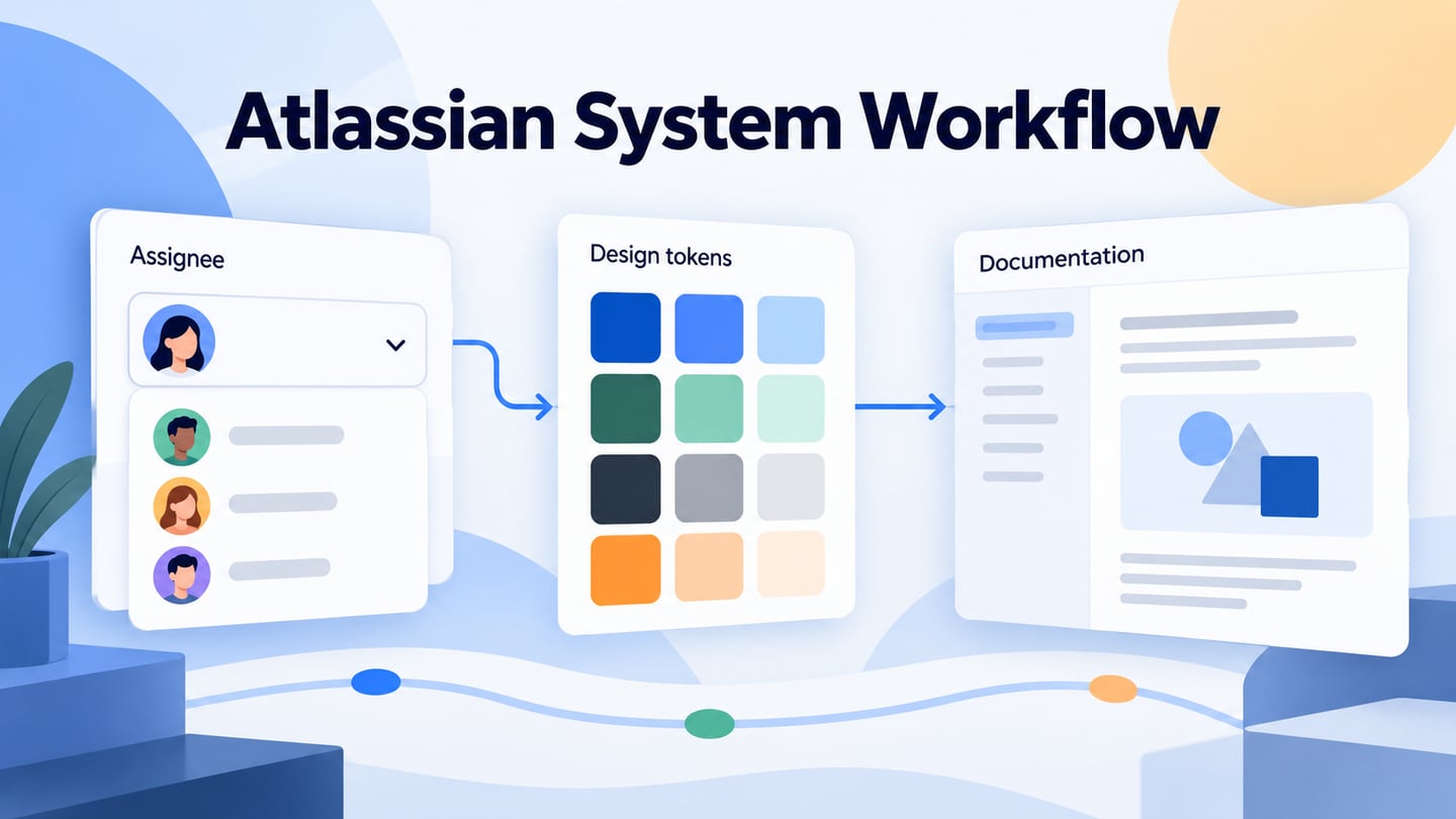
Atlassian’s current design site links foundations, components, accessibility and tokens. These references illustrate how an organization communicates shared decisions across a family of products.
Look at how semantic tokens describe roles and how component guidance supports their use. Older asset formats or playful color names should not be treated as a current implementation requirement. The transferable lesson is consistent meaning and documentation, not a universal ranking of design systems.
Review a System Decision in Mockitt
Use Mockitt to make a proposed shared pattern visible in context. For a shared notification preference, place its Account settings and Team settings uses side by side. Check whether the same label, helper text and state mean the same thing in both places before deciding they should share a component.
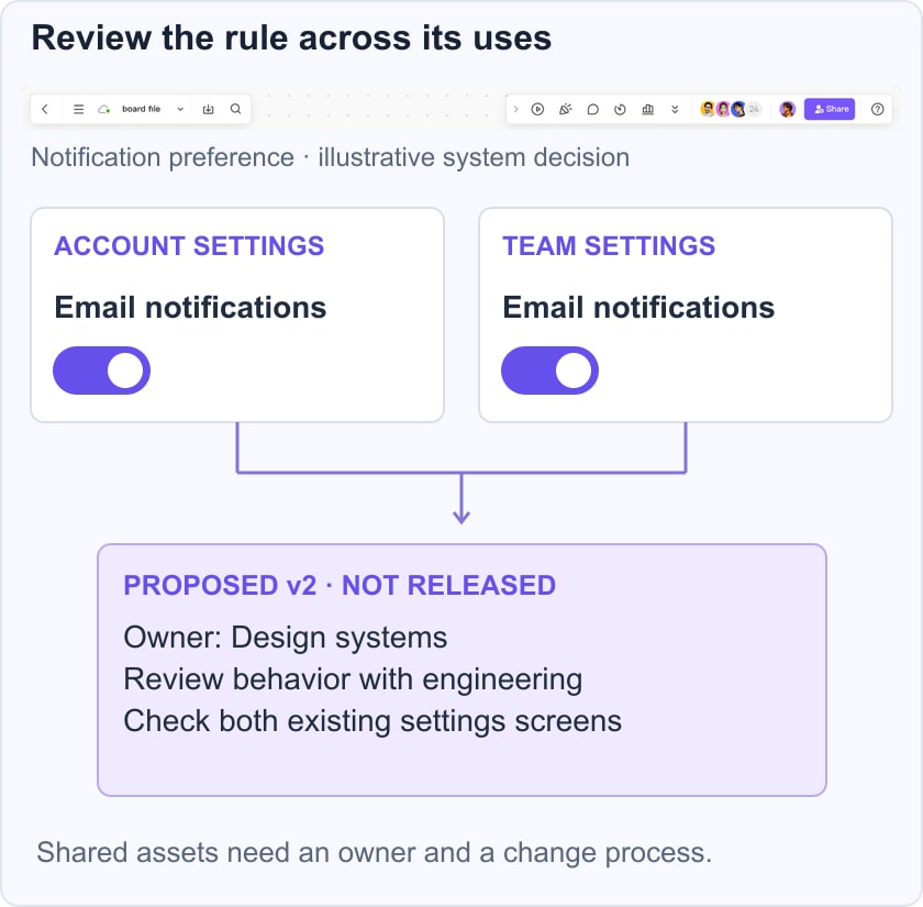
- Define the purpose: Record what turning Email notifications on or off means, including any messages that remain mandatory for the service. Use an explicit example policy rather than infer behavior from a toggle’s appearance.
- Review states and content: Compare default, pending, error and saved states. A shared component should not silently change meaning when moved to another screen.
- Record the proposed change: Name the owner, the reason for the revision and which existing uses need review. An example “Proposed v2” label is a design-review record, not a claim that the system has been released.
- Coordinate implementation: Hand off the approved behavior and visual decisions, then verify the coded component and affected screens. Reusable design assets support the discussion; they do not replace versioning, accessibility checks or a release process.