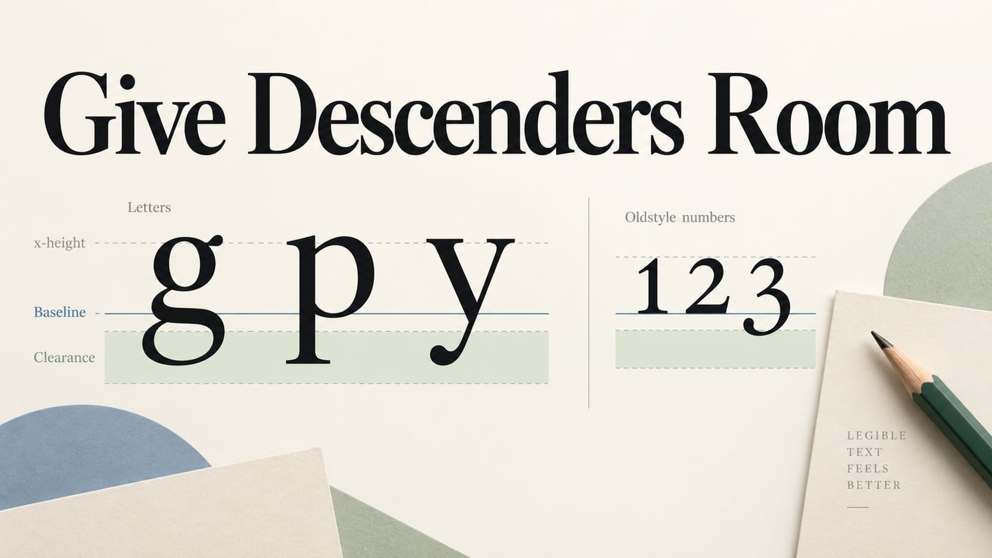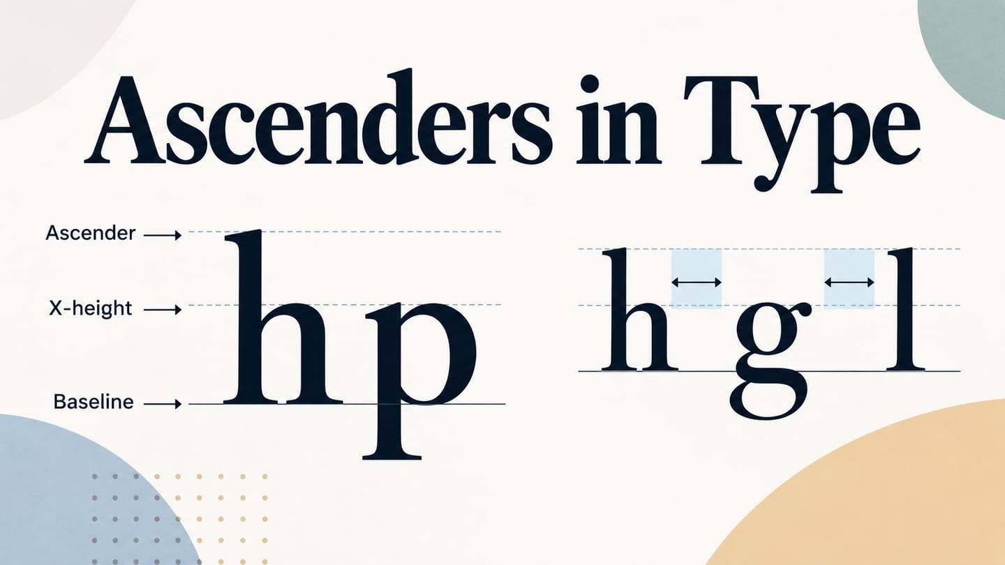
An ascender is the part of a lowercase letter that rises above the x-height, as in b, d, h or l. A descender extends in the opposite direction, below the baseline. This guide explains the difference with letter diagrams and nine font specimens, then shows how these shapes affect typography in a user interface.
What Is an Ascender?
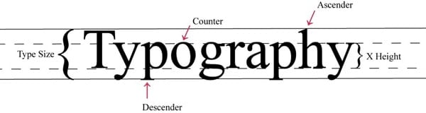
The baseline is the reference line on which most letters sit. X-height describes the height of the main lowercase body, commonly represented by x. The part of a lowercase stroke that rises above that height is an ascender. Cap height is a separate measurement: ascenders may extend to, above or below the capitals depending on the typeface. Monotype’s type glossary defines the term in relation to x-height, not the width of a baseline.
In “Typography,” the h has an ascender, while the p and y have descenders below the baseline. The capital T is not normally called an ascender. The diagram below puts these features together so you can distinguish a line’s baseline from the upper and lower extents of its actual letterforms.
Source: DesignModo
A Brief History of Ascenders
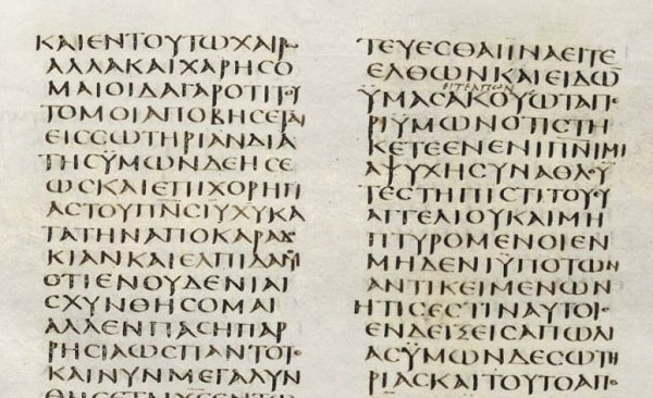
Ascenders belong to the development of lowercase letterforms and handwriting, long before digital type. Historical manuscripts are useful for observing how some strokes extend beyond a letter’s main body. Establishing a first-ever date is a separate historical question; a single manuscript image cannot substantiate one.
The Greek manuscript below provides a visual comparison with contemporary type anatomy. Look at the varying stroke heights and the relationship between neighboring letters. Historical writing styles should not be treated as interchangeable with the fixed metrics of a modern digital font.
Source: Found in Antiquity
Jock Kinneir and Margaret Calvert later made an influential contribution to British road-sign typography. Their work addressed legibility in a particular public setting; they did not invent ascenders. The Design Museum’s account of Calvert’s work provides the relevant road-sign context. The practical lesson is to judge a typeface in its intended reading conditions.
Avoid Colliding Strokes and Clipped Text
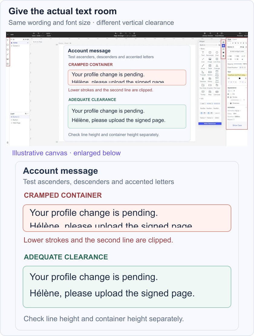
Text can collide when adjacent lines are too close, or be clipped when its container does not leave room for the actual glyphs. These are related but different problems: increasing line spacing does not fix every fixed-height container.
A descender such as g or p on one line can approach a tall stroke or accent on the next. The outcome depends on the typeface, font size, line height and exact words. Do not assume that a font described as compact will always fit, or that text containing only capital letters needs no additional vertical room.
Test a two-line account message containing h, d, g, p and accented characters. Compare a cramped version with one that has sufficient line spacing and container height, keeping the same font size and wording. Also test longer translations and user text-size settings. The handwriting image below highlights a tall stroke in a single line; it is not a demonstration of two lines colliding.
WCAG’s text-spacing criterion requires content to tolerate specified user spacing adjustments without losing content or functionality. Its line-height value is a test condition, not a universal default prescription for every design. Check the implemented component after prototyping.
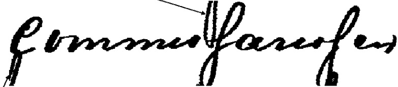 Single-line handwriting specimen highlighting a tall stroke.
Source: ResearchGate
Tall and Decorative Ascender Examples
The following specimens make vertical proportions visible. They are examples to inspect, not a ranking of which fonts always need more or less line spacing. Font versions, weights, accents and the chosen words can change the result; verify licensing and availability separately before using a typeface.
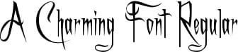
1. A Charming Font
A Charming Font uses decorative, extended strokes. The specimen suits a discussion of expressive display lettering, where flourishes can project beyond the ordinary letter body. Inspect complete words and neighboring lines rather than estimating their required space from one isolated letter.
Source: 1001 Fonts
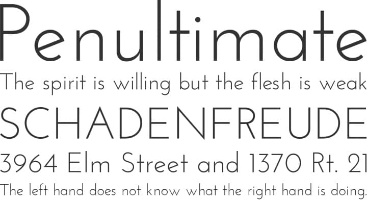
2. Josefin Sans
Josefin Sans offers a useful mixed-case comparison: observe the tall l and h against the x-height in the specimen. Do not group t with every full-height ascender automatically; its height can differ by typeface. Compare the font’s proportions at the actual size where the text will be read.
Source: Pinterest
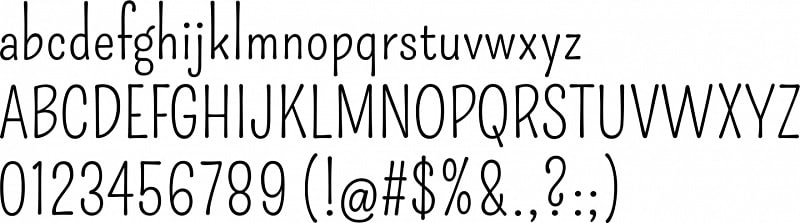
3. Pompiere
Pompiere’s specimen has narrow forms and visibly extended lowercase strokes. Its b, d, h and l rise above the main lowercase body. That makes their proportions easy to study, but does not mean the font inherently causes collisions; spacing and container dimensions remain part of the layout decision.
Source: Font Squirrel
Comparing Compact and Geometric Proportions
These three specimens show different relationships among width, weight and height. Evaluate the actual font metrics and text instead of treating the labels “low ascender” or “compact” as guarantees that a line will fit.
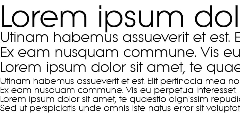
1. Litera
Litera’s mixed-case specimen has clearly visible ascenders and descenders. Compare b, d and h with nearby lowercase letters, then inspect the same characters in the words you intend to use. A clean appearance alone says little about the space required above and below a line.
Source: FontsGeek
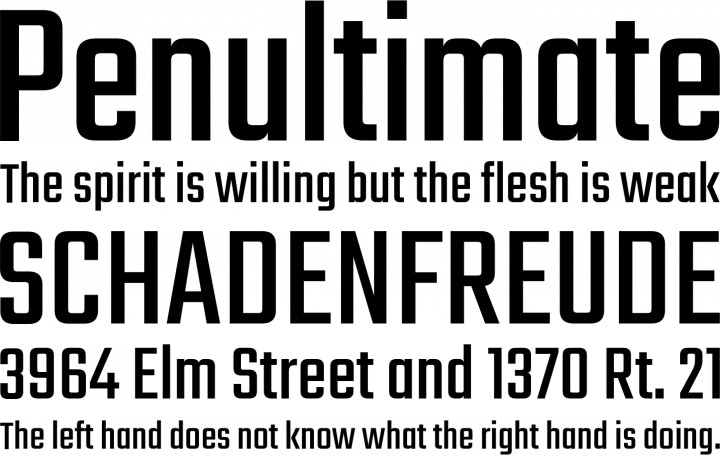
2. Teko
Teko’s bold, condensed specimen illustrates how narrow letter widths and strong weight affect display text. Its compact horizontal form is different from vertical clearance. A heading can fit within a narrow column and still need more line height or a taller container when it wraps.
Source: Font Squirrel
3. Futura
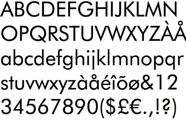
Futura’s geometric forms make another useful comparison. The specimen includes mixed-case letters and accents, so inspect both the regular ascenders and the marks above the capitals. A minimal visual style does not remove the need to accommodate those marks in a button, label or heading.
Source: Free Fonts Family
Display Fonts and the Limits of “No Ascenders”
A capital-only sample may appear to have a uniform top edge, but it cannot prove that every glyph in the typeface has the same height. The following display examples are valuable for comparing shapes, not for promising collision-free text.
1. Amazonas
Amazonas visibly includes lowercase ascenders in letters such as b, d, h and l. It therefore does not belong in a “no ascenders” category. Use the mixed-case specimen to compare those strokes with the lowercase body and with the descenders below it.
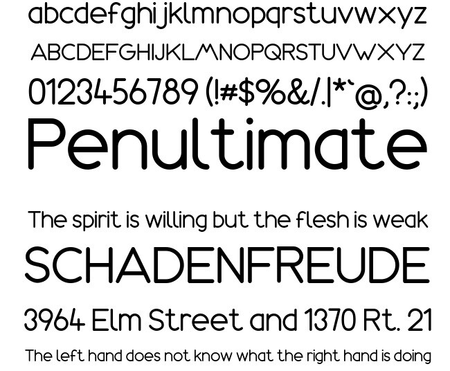 Amazonas includes visible lowercase ascenders; this is a shape comparison, not a no-ascender example.
Source: FontGet
2. Daggersquare
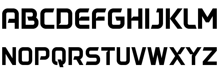
Daggersquare’s displayed sample is primarily capital lettering with squared forms. It can illustrate a distinctive display treatment, while the complete character set and font metrics still need checking. Test punctuation, accents and multiple lines before selecting it for a constrained interface area.
Source: FFonts
3. Monoton
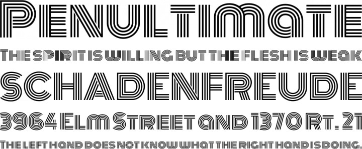
Monoton’s outlined capital forms create a strong display texture. Uniform-looking capitals do not guarantee that wrapped text cannot collide or be clipped. Check stroke detail at small sizes as well as vertical spacing; a face that works in a large title may be difficult to read in a compact control.
Source: Font Squirrel
In a Mockitt prototype, compare the account-message layouts before committing to a fixed-height component. Keep the same wording and font size, change spacing and container height deliberately, and record what needs validation in the browser. The nine specimens above help you notice letter anatomy; they are not a claim that those fonts are installed in Mockitt or licensed for your project.
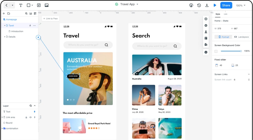 Historical Mockitt editor capture; interface details may differ from the current product.