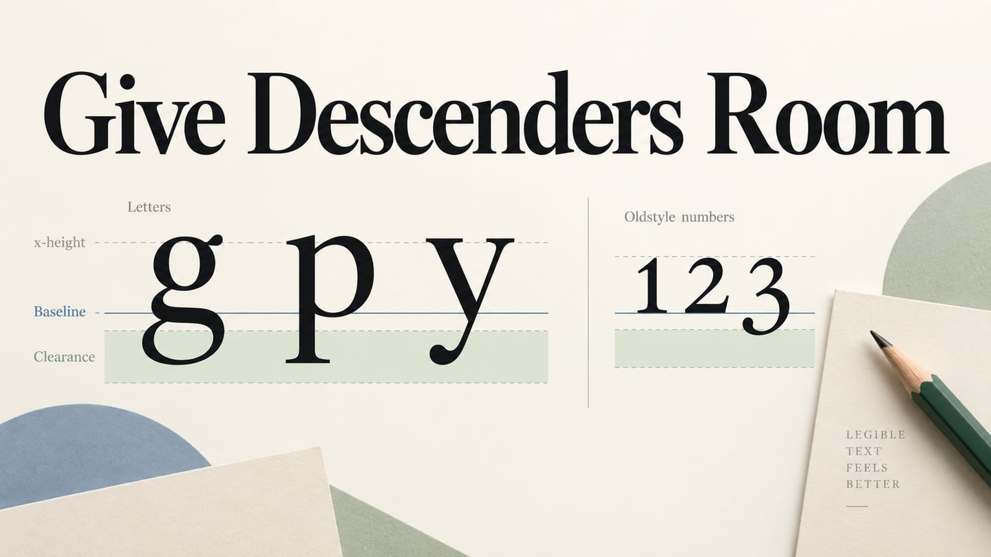
A descender is the part of a letter that extends below the baseline, such as the lower stroke of g, j, p, q or y. An ascender rises above the lowercase x-height instead. The diagrams and font examples below show how descenders affect typography in UI design, especially when tight line spacing or a small text box clips the lower strokes.
What Are Descenders?
The baseline is an imaginary line on which most letters sit. The x-height describes the height of the lowercase x above that line. These are vertical references, not a “baseline width” or “x-width.” They help you compare the parts of a typeface without assuming that every character occupies the same space.
The lower portions of g, j, p, q and y are common descender examples. An ascender instead rises above the x-height, as in h. Capitals, italic forms, numerals and characters from other writing systems can have their own extensions. Monotype’s typography glossary provides examples; inspect the specific font and glyphs you intend to use.
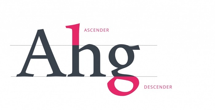
Source: UX Planet
Tips for Using Descenders in Your Designs
Check descenders in the finished context: the actual words, size, weight, text box and surrounding controls. A font specimen is a useful starting point, but a single sample does not establish how every label, language or numeral will fit.
Tip 1: Watch for Colliding Descenders
When two lines sit too close together, the descenders on the upper line can approach or collide with the ascenders on the line below. The relevant control is the distance between lines and the available text area, not the width of a baseline.
Try a phrase containing g, j, p, q and y above a line containing tall letters such as h and l. Inspect the closest strokes at the intended display size. Increase line spacing or adjust the layout if the forms become difficult to separate; do not simply shrink every label to make it fit.
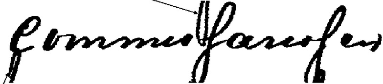
Source: Research Gate
In interface text, also check the bottom edge of the text box. A one-line button or badge can clip a descender even when there is no second line. Review the result with longer content and at enlarged text settings, then verify the implemented interface rather than relying on the mockup alone.
Tip 2: Inspect Capital Letters and Other Scripts
Descender checks are not limited to lowercase English letters. A capital Q can have a tail below the baseline, and the shape of J varies by typeface. Decorative swashes may extend farther than the basic letterform. Look at the actual font instead of assuming all capitals fit inside one rectangle.
The illustration below shows Cyrillic letterforms with extensions below their main bodies. It is a useful reminder to test the writing systems your interface supports. A Latin-only sample cannot establish the spacing needed by translated text or other character sets.
 This retained example uses Cyrillic letterforms; inspect the scripts required by your own interface.
Source: Wikipedia
Tip 3: Check Numeral Styles
Numerals may be lining figures, with more uniform heights, or oldstyle figures, whose shapes can rise and descend in relation to the baseline. Which digits extend, and by how much, depends on the typeface and style. Do not assume that 3, 6, 7 and 9 behave identically in every font.
For prices, dates and quantities, test a complete set of digits as well as punctuation and currency symbols. Leave enough vertical room for the chosen forms. If a layout requires aligned numeric columns, inspect numeral width and alignment too; descender length is only one part of the decision.
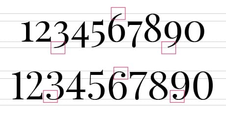
Source: Not User
Common Fonts with Long Descenders
The following retained specimens show expressive lettering with visible lower extensions. Use them to compare shapes, then test your actual words in the licensed font file. Display lettering that works for an invitation may be unsuitable for a small navigation label.
1. Aerotis Calligraphy
The Aerotis Calligraphy specimen has fine connecting strokes and long loops. It can suggest an expressive invitation or display treatment, but the surrounding space needs to accommodate those flourishes. Check both upper and lower extents of the specific words rather than assigning one descender length to the whole family.
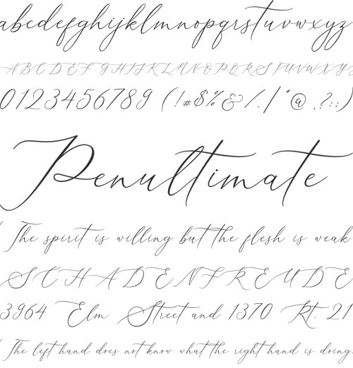
Source: CufonFont
2. Homemade Apple
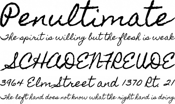
The Homemade Apple specimen has a rough handwritten character and extended strokes. Compare its smaller text with the large sample: a lively handwritten treatment still needs clear word shapes and separation between lines. Test readability before using it for instructions or other text people must scan quickly.
Source: Font Squirrel
3. GretchenHello
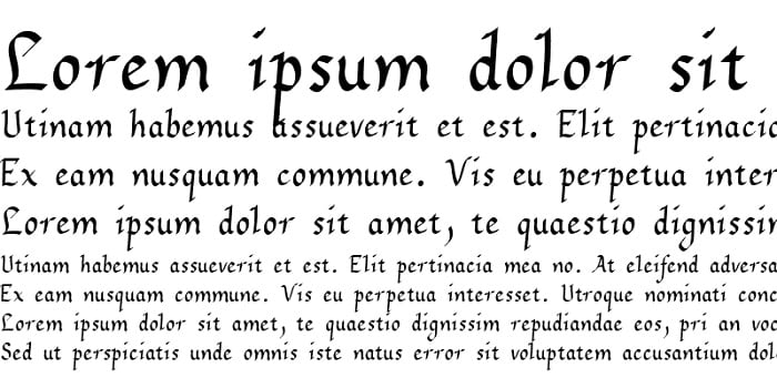
The retained GretchenHello example gives another opportunity to inspect lower extensions across several text sizes. Use the specimen as a visual reference, then verify the actual font and characters before choosing it. Suitability for headings does not automatically make a decorative face suitable for a paragraph or compact control.
Source: Fontsgeek
Common Fonts with Short Descenders
Shorter-looking descenders can help a compact composition, but they do not eliminate the need for spacing. Compare the lowercase letters at the same intended size, and remember that font metrics, accents and punctuation also affect the space the text needs.
1. Kaleko
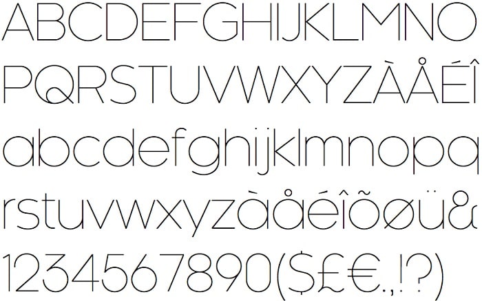
The Kaleko specimen uses thin geometric forms, with visible lower extensions on letters such as g, j, p, q and y. Its clean appearance is not a reason to reduce the text box to the height of the capitals. Check stroke visibility and clearance in the final label.
Source: Identify Font
2. Philosopher
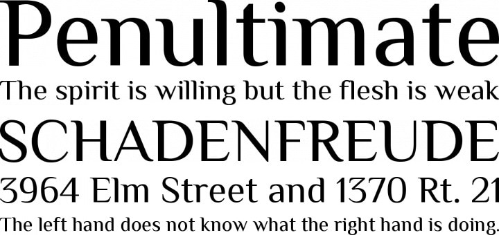
The Philosopher specimen combines distinctive letter shapes with mixed-case sample text. Examine the descenders in the smaller lines as well as the headline. Choose it for a particular reading context only after checking the actual size, spacing and content.
Source: Font Squirrel
3. Passion One
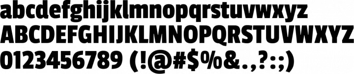
The Passion One specimen shows a heavy, condensed treatment. Its lowercase forms still include descenders. Compare the weight and counter shapes at the intended display size, and confirm the styles available in the font source rather than assuming that an italic or another weight exists.
Source: Font Squirrel
Display-Lettering Specimens to Inspect
Capital-like or tightly aligned display lettering can appear to have few lower extensions in a sample. That is not proof that the entire family has no descenders, and it does not justify removing all spacing. The next three examples are useful precisely because their displayed character sets need careful interpretation.
1. Crushed
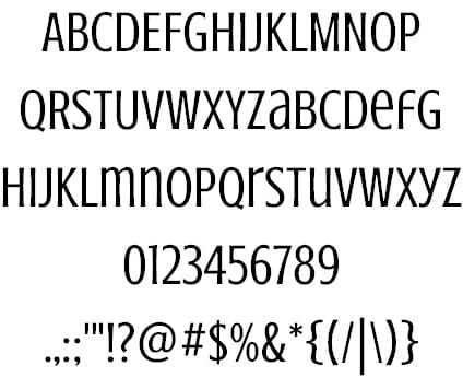
The Crushed specimen uses condensed, capital-like forms. Inspect the complete text you need, including punctuation and any alternate glyphs. Even when the main letters align neatly, a text box still needs breathing room and must accommodate the font’s metrics.
Source: Creative Booster
2. No Manners
The No Manners strip shown here contains capitals only. It demonstrates the shape and rhythm of those letters, but says nothing about lowercase letters that are absent from the image. Use the actual required character set to decide whether the face fits a label.
 A capitals-only strip cannot establish the spacing of lowercase glyphs that it does not show.
Source: WhatFonts
3. Unica One
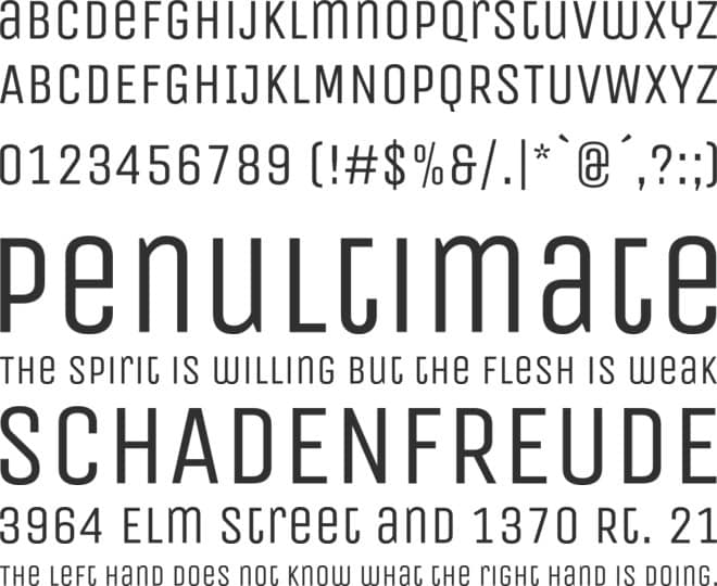
The Unica One specimen has a narrow display character. Compare its mixed sample lines and numerals before using it in a compact layout. A display treatment may be useful for a short heading, but long body text and small interactive labels need their own readability checks.
Source: Cufon Fonts
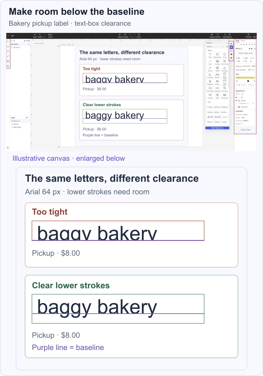
In Mockitt’s design workspace, place a realistic label such as “Baggy bakery pickup” in the proposed control and compare a tight text box with one that leaves the lower strokes intact. Keep the font, size and words constant while changing the available space. The example is a visual check, not an automatic font-metrics test. After handoff, verify the actual rendering, text resizing and supported languages in the implemented interface.