A ChatGPT app can mean several things: the official ChatGPT application, a third-party application that uses an AI service, or an integration that brings conversational assistance into another workflow. Those are different products with different accounts, features, and data terms. Identify which one you are evaluating before comparing it with another tool.
This guide focuses on using a conversational assistant well and carrying useful output into product design. It explains the underlying interaction, four ways to improve a prompt, and a Mockitt walkthrough that turns a broad website idea into material a designer can review.
Part 1: Understand the application around the model
A large language model generates text from its training and the context it receives. The app around it determines how you enter that context, which tools are available, and what you can do with the answer. The presence of a chat box does not tell you whether an application can search the web, inspect a file, or interact with your workspace.
A third-party app that mentions a well-known model is not automatically an official ChatGPT app. Check three things: who publishes it, which account you sign in with, and who bills for its service. A familiar model name is not enough to answer those questions. Use OpenAI's official ChatGPT learning resources for its own application, and the provider's documentation for an integration.
What a conversational workflow can do well
A conversation lets you develop a task over several turns. You can ask for a draft, identify the part that misses the brief, and request a specific revision. That can help with explanations, outlines, alternate wording, or summaries of material you supply.
For a product manager, the useful output may be a set of unresolved questions from a requirements note. For a designer, it may be alternative empty-state copy. For a support team, it may be a draft response grounded in an approved policy. These tasks need different instructions and different review criteria.
What the conversation does not establish
The same prompt in two apps may reach different models, tools, or context. Note which app and account produced the answer before treating the difference as a model comparison. For work material, check the actual service's permissions and data terms; an organization account's rules should not be assumed to apply to a separate personal or third-party account.
Part 2: Four ways to get a more useful answer
1. Make the prompt concrete
Specify what the answer is for and what it should contain. “Help me design a website” leaves the audience, task, structure, and constraints open. “Outline the browse and detail screens of a fan-information website for readers who want to find a character” gives the assistant a narrower job.
Add an output format when it helps you review the answer. Ask for a table with section, purpose, and open question, rather than an unstructured essay. If some facts must not be inferred, say so explicitly and supply the source material the answer should use.
2. Give feedback about the actual defect
“Try again” is less useful than identifying what failed. If a draft mixes confirmed requirements with suggestions, ask it to separate those categories. If it produces a long introduction before answering the question, ask it to lead with the answer and retain only the supporting points you need.
Keep the useful parts. For example, preserve a clear screen outline while requesting a different navigation label. This avoids replacing a good decision merely because another paragraph needs work. Review the changed output against the previous version so an unrelated requirement does not disappear.
3. Supply relevant context, not every available document
Include the facts and constraints necessary for the task. A UI-copy request may need the user's prior action, the next action, tone guidance, and a character limit. It probably does not need unrelated internal documents or sensitive customer information.
Separate source text from your instructions. Label a quotation or document excerpt as material to analyze, and make clear which instructions define the task. When sources conflict, ask the assistant to point out the conflict rather than silently choose one account.
4. Compare alternatives using a decision rule
Request a small number of meaningful alternatives. A formal, plain-language, and reassuring version of an error message can be compared against the same criteria: accuracy, actionability, and fit in the interface. Ten almost identical variants usually add review work without improving the decision.
Place promising copy in the actual layout. A label may satisfy a word limit and still wrap poorly. A friendly message may omit the recovery action. The test should concern the user's task, not how impressive the generated text sounds in isolation.
Use the output where it can be checked
Common uses include drafting an email from approved facts, summarizing a supplied research note, translating a candidate message, and explaining a technical concept. Each has its own review. A translation needs meaning and terminology checks; a research summary needs source traceability; a factual explanation needs verification where an error would matter.
For interface writing specifically, the online AI text workflow shows how generated labels can be evaluated inside real controls. The example below instead develops a content outline through several rounds of feedback. If your immediate need is choosing a service, the text-generator comparison distinguishes general assistants from specialist tools.
Part 3: Apply the conversation to a Mockitt project
A product-design tool is useful when the outline needs to become an interactive prototype. Mockitt gives the team a place to arrange the content and discuss which sections actually belong on the screen. Start with the outline decisions, rather than asking the assistant to predict user behavior from an unfinished design.
The walkthrough below uses a fan-information website concept, with sections for characters, places, and events. The screenshots are from the legacy Mockitt interface. They document a genuine brainstorming sequence, while current feature access and navigation should be checked in the product.
Step 1: Create a project around a defined user task
Start with a content goal: organize a fan-information site's characters, places, and events into a coherent outline. Use the project's name and brief to keep the scope visible. The first decision is what belongs in each category, not how many pages the assistant can generate.
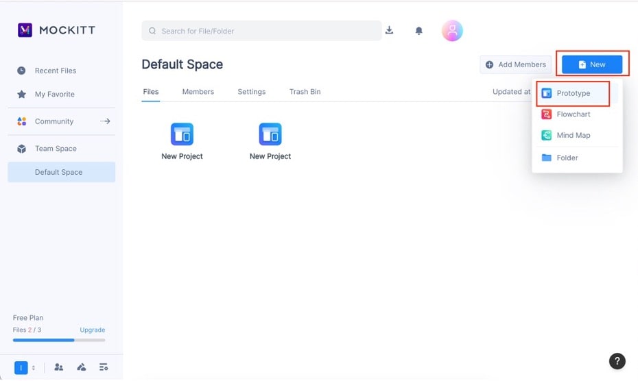
Step 2: Choose the target screen
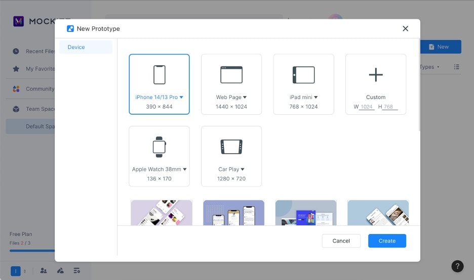
Select a device size that fits the likely use case. The example selects a phone-sized canvas. A narrow layout makes prioritization important: choose the first section a reader should see, then decide which details deserve a separate screen instead of treating every suggested heading as equally important.
Step 3: Ask for a reviewable content outline
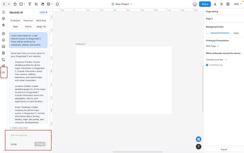
The example asks AI Chat for a Dragon Ball wiki concept. It suggests categories that can help organize a draft, but the factual entries and any licensed material still need a suitable source. Treat the example as a private design exercise unless you have the rights and evidence needed to publish it.
Develop the outline through three turns. First ask: “Propose sections for a fan-information website, using characters, places, and events as possible categories. Give each section a purpose; do not invent entries.” Then revise: “Keep the three categories, remove overlapping sections, and separate navigation labels from page headings.” Finally ask: “Compare this revised outline with the first version. List what changed and which decision still needs the team's input.”
This sequence gives you a stable part to preserve and a specific defect to correct. If the assistant removes a useful category while merging duplicate headings, restore it explicitly. Keep the accepted outline beside the design so later iterations do not accidentally undo that decision.
Step 4: Turn the accepted outline into a reviewable layout
Place the agreed section headings on the canvas and use realistic placeholder lengths. Ask a teammate to explain what they expect under each heading. If “Places” and “World” appear to mean the same thing, decide whether to merge them or clarify the distinction before adding more pages.
Carry the accepted labels and category decisions into the AI prototype workflow when you need a screen draft. The useful result of the conversation is a traceable sequence of decisions: initial outline, targeted revision, accepted structure, and the questions still open.