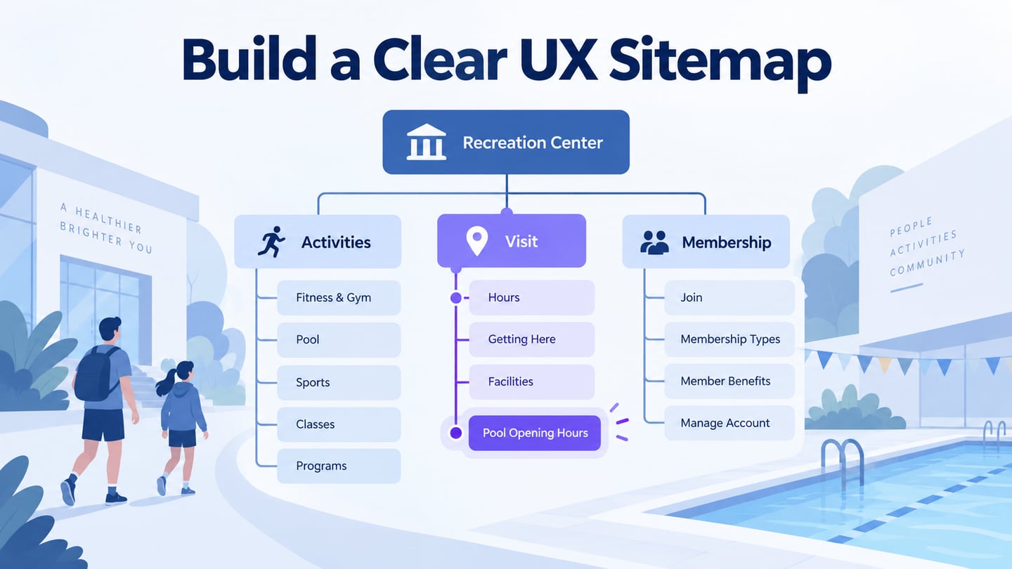
A UX sitemap is a visual map of a website’s pages and their parent–child relationships. It helps a team agree on what belongs together before designing individual screens. As part of information architecture, it answers “Where does this content live?” A user flow answers “How does someone complete a task?” An XML sitemap is a different file used by search engines. This guide keeps the focus on planning a usable content structure.
Part 1: Choose a tool for your UX sitemap
You can start a small sitemap with labeled boxes and connectors. Use a design workspace when the team also needs to connect page structure to screen ideas. Mockitt’s online prototyping workspace can help you develop those screens and review their interactions. Keep the structure diagram separate from the clickable prototype: a line showing that a page belongs under “Visit” is not automatically a working navigation link.
 Earlier Mockitt interface: page organization and screen design are shown together; current controls may differ.
Features to consider before you begin
- Access: Check that reviewers can open the chosen workspace or shared view on their actual devices. Editing and viewing are different tasks; do not assume every mobile browser provides the same editing experience.
- Collaboration: Use one agreed map for feedback so that content owners and designers discuss the same page names and hierarchy.
- Review output: Choose a readable export or shared view. A full map that becomes illegible when reduced to one image is not a useful handoff.
- Reusable elements: Standardize the shape for a page, section, external destination, and planned content item. Include a small legend rather than relying only on color.
- Change tracking: Record which structure is approved, what is still proposed, and who owns each unresolved decision. Do not treat autosave as approval or a separate backup.
- Project access: Confirm sharing permissions before sending the map outside the team, particularly when the diagram includes unpublished sections or private customer areas.
Part 2: Create a UX sitemap in six steps
Begin with a content inventory: list existing pages, proposed pages, duplicates, and pages that will be retired. Give each retained page a short identifier. Then use the following sequence to turn that list into a map. The original tutorial used an earlier Mockitt interface; the tasks remain useful even when control names or locations change.
Step 1: Set up the workspace and scope
Sign in to your workspace and decide which part of the site you are mapping. A public marketing site, a signed-in application, and a support center may need separate maps with clearly labeled connections. Write a one-sentence scope, such as “Public pages for a local recreation center.” This prevents account states and marketing pages from becoming one unmanageable tree.
Step 2: Create a project for the structure
Create a project or a blank working area and reserve space for the page inventory, the sitemap, and open questions. If you start from a template, replace its labels before judging whether the structure fits. A template’s categories are suggestions, not evidence of how your audience looks for information.
Step 3: Name the map and choose a readable scale
Use a descriptive project name and a review version, for example “Recreation center: public sitemap, proposal B.” Choose a canvas size that makes page labels readable during discussion. Unlike a mobile screen, the map itself does not need a device viewport. If you include screen previews, keep them separate from the hierarchy so their dimensions do not determine the structure.
Step 4: Add pages and organize the hierarchy
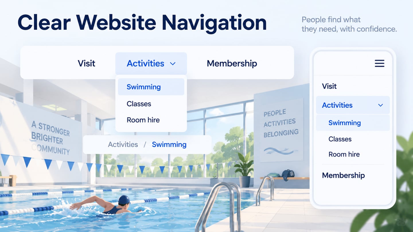
Create a box for each page or clearly defined page type, then group related content under plain-language section names. For a recreation-center website, start with Activities, Visit, and Membership. Put Swimming under Activities, and Pool hours and Getting here under Visit. Mark Pool hours as page V-02. If Swimming also needs a link to those hours, show a cross-link to V-02 rather than inventing a second copy of the page.
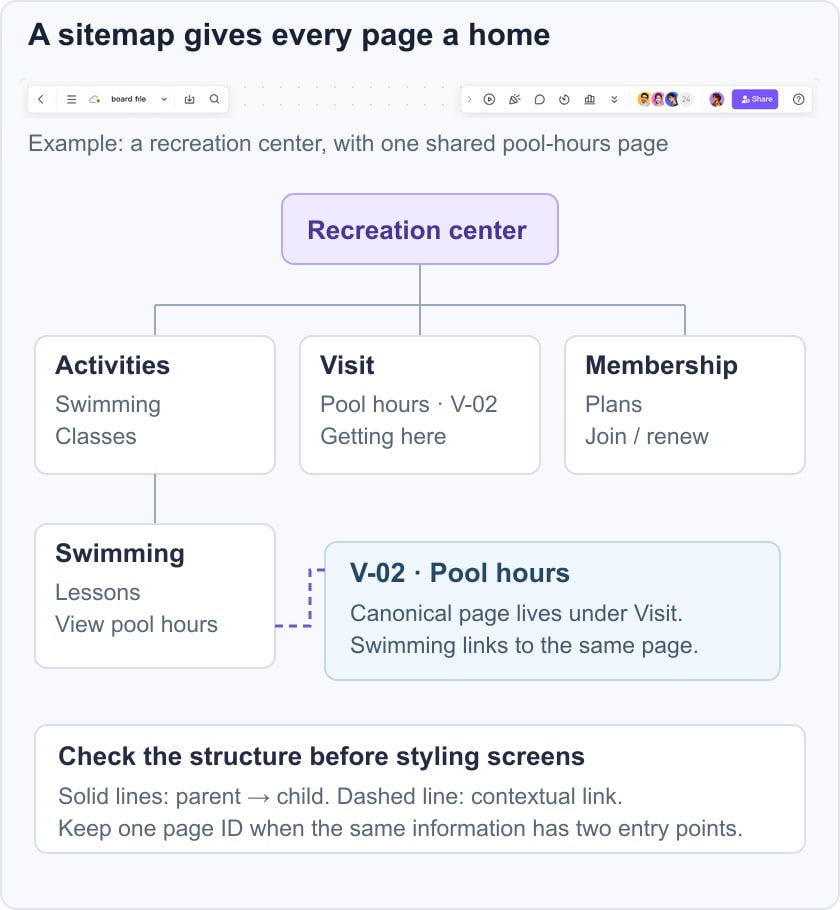
Use a consistent reading direction and explain connector meanings in a legend. Solid lines can represent parent–child relationships; a labeled dotted line can show a cross-link. When people disagree about a category, capture their alternatives and test the wording with users. A tidy diagram does not prove that the labels make sense outside the project team.
Step 5: Check routes before linking screens
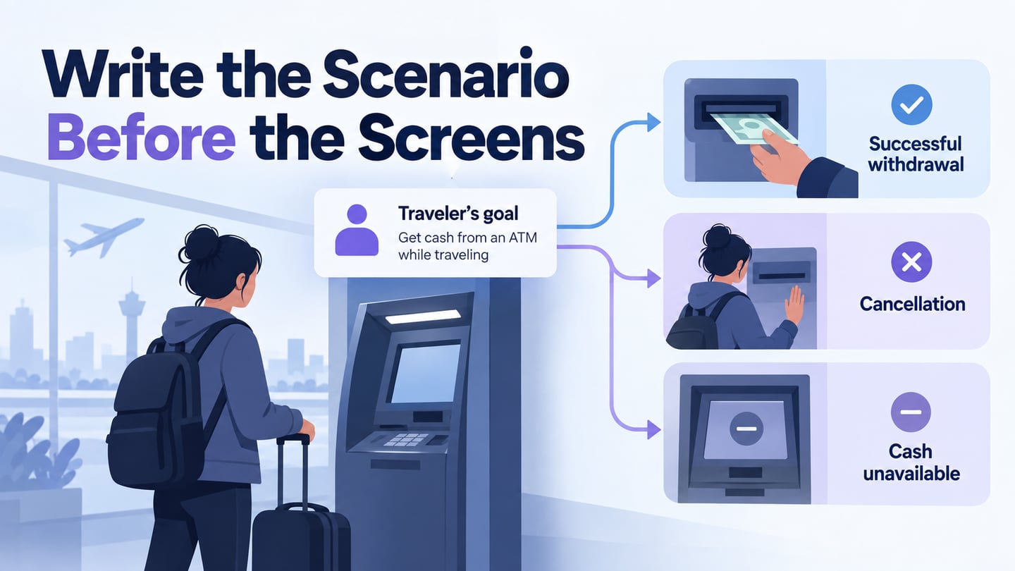
Review important tasks against the structure. Ask where someone would go to find pool opening hours, compare membership options, or check accessible entrances. If a task depends on several screens and decisions, develop a separate user flow. Then add the relevant interactions in the prototype and preview them. Do not turn every hierarchy connector into an interaction; structure and behavior communicate different things.
Step 6: Add annotations and validate the map
Annotate unclear labels, missing content, and decisions that require an owner. For page V-02, a useful note is “Visitor services must confirm weekday and holiday opening hours”; “Improve this page” is too vague. Review the structure with realistic findability tasks, revise confusing groups, and update the inventory when the team approves a move or merge.
A review question that exposes a structural problem
In the recreation-center example, ask a participant: “You want to swim after work on Friday. Where would you look for opening times?” Do not mention the Visit category in the task. Record the first section they choose, whether they backtrack, and where they expect the answer. If several participants start under Activities, consider a clear cross-link from Swimming or a better category label. The map is a proposal to test, not a promise that all visitors take one route.
Part 3: Five UX sitemap examples and what to learn from them
1.Online Bookstore
An online bookstore can group browsing pages by category while keeping product pages, search results, account pages, and checkout distinct. Do not draw every book as a separate box when a single “Book detail” page type is sufficient. A checkout journey belongs in a companion flow; the sitemap should make the content structure and shared destinations understandable.
2.Task Management
A task-management product needs clear boundaries between public information and the signed-in workspace. Group projects, tasks, team settings, and account settings by their purpose. Mark permission-dependent destinations so reviewers do not mistake an administrator-only page for something every member can access. Keep temporary states, such as a failed save, in the screen specification rather than treating them as top-level site sections.
3.Apple Visual Sitemap
Apple’s public site index shows how a large website groups destinations by product and service areas. It is a useful reference for labels and coverage, but it is a text index, not a diagram of every interaction. When learning from it, ask how a visitor distinguishes shopping, support, and account tasks instead of copying the categories into an unrelated product.
4.Library Sitemap
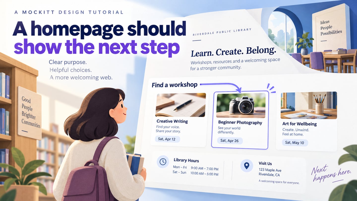
A library website may separate finding materials, borrowing, using facilities, and getting help. Keep the catalogue and individual item records distinguishable from information pages such as membership requirements. A “Renew a loan” task might enter an external account service; label that boundary. Useful grouping reflects patrons’ tasks and vocabulary, not simply the library’s internal departments.
5.Website Wireframe Sitemaps
A wireframe sitemap combines small screen sketches with a page hierarchy. Use it when reviewers need to see how major content groups appear on a page, but keep previews simple enough to scan. Detailed visual design can obscure structural questions. Once the structure is agreed, develop the individual website wireframes and keep their page IDs aligned with the map.
Before handing off the sitemap, confirm that every in-scope page has a place, each connector has a defined meaning, duplicate content has an owner, and unresolved labels are recorded. Include the review version and link the page inventory. That gives the next designer a structure they can use without guessing which boxes represent real pages.