Map a beginner-friendly user flow with goals, decisions, calls to action, recovery paths, and a travel booking example.
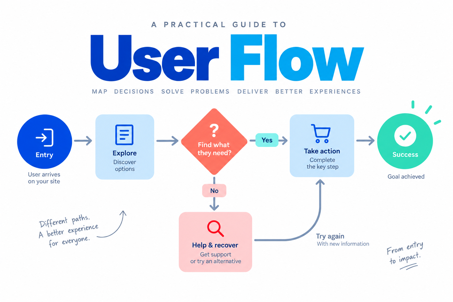
One of the most common mistakes when a new product idea appears is jumping straight to screens. A user flow gives the team a smaller question first: what does a person need to do, in what order, and what should happen when the expected path is interrupted? It is a map of actions and decisions, not a finished interface.
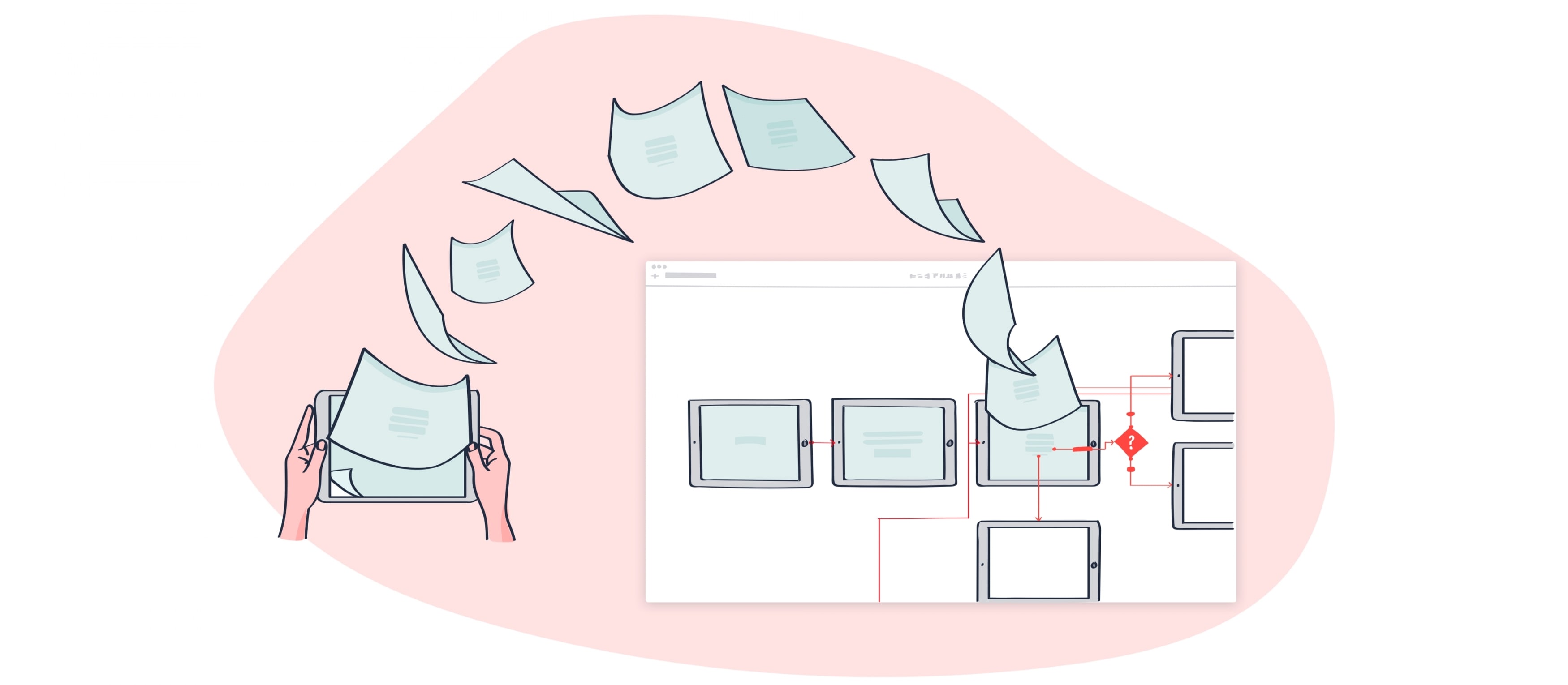
After the path is clear, Mockitt’s interactive prototyping workspace can help the team turn selected steps into screens and test the transitions before development. Keep the map and prototype connected, but do not treat either one as proof that users will behave exactly as predicted.
What is a user flow in UX?
A user flow is a diagram of the route a person takes through a product to achieve one goal. It starts with an entry point, such as a landing page, notification, or deep link, and ends with an outcome, such as a confirmed booking or a saved change. The route may include decisions, alternate paths, errors, and a way to return.
The simplest useful flow answers three questions:
- Who is taking the path and what context do they bring?
- What goal are they trying to complete now?
- Which steps and decisions are necessary to reach that goal?
Keeping one goal per flow makes the diagram easier to review. A broad product map can link several task flows, but a single page should not try to explain every possible job at once.
Why map the flow before the interface?
The diagram exposes unnecessary steps before the team spends time on visual detail. It also gives product, design, engineering, and research a shared object to discuss. A useful map makes assumptions visible: the entry point, the information required, the decision criteria, the success state, and the recovery path.
It is not a conversion guarantee. Analytics can show where people leave or repeat a step, but it cannot explain the reason by itself. Pair behavioural data with interviews, support conversations, usability sessions, or a short task test before changing the flow.
Ten practical tips for creating a user flow
1. Define the objective
Write the user’s immediate goal and the business outcome separately. “Find an available class and reserve a seat” is a user goal; “reduce incomplete reservations” is a business outcome. The flow should make the user’s next action clear while giving the business a measurable point to observe.
2. Name the entry point
Record how the person arrives: search, email, dashboard, notification, or a shared link. The same task may need a different first screen depending on context. A returning user should not be forced through an introduction meant for a first-time visitor.
3. Use guidance where a decision is unfamiliar
Use short labels, examples, and progressive disclosure to explain a choice. Guidance should answer the current question rather than push a person toward an unrelated section. Make the next step visible, but let the user review or go back.
4. Identify the audience and evidence
Describe the audience in terms that change the path: role, permission, device, urgency, or prior knowledge. Use analytics to understand aggregate paths and combine it with qualitative evidence to understand intent. Avoid designing for a fictional “average user.”
5. Research the need behind the task
Ask what people are trying to accomplish, what blocks them, and what information they need before committing. Questions such as “What would make you stop here?” and “What would you expect after submitting?” reveal missing states better than a preference question alone.
6. Give the primary action a clear label
The call to action should describe the result—“Reserve a seat,” “Save draft,” or “Send request”—rather than a vague “Continue.” Place it near the relevant information and show what happens next. Do not add several competing primary actions to one step.
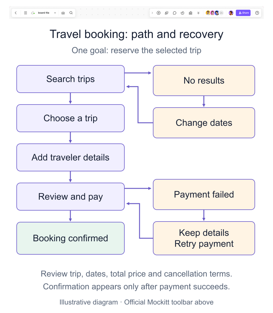
Before asking someone to book, show the details needed to make that choice: the selected trip, travel dates, total price, and cancellation terms. Keep those details available at the confirmation step so the person can check what they are agreeing to.
7. Keep the decision load small
Remove choices that are not needed for the current goal. If a long list cannot be avoided, group it, provide search or filters, and preserve selections when the person goes back. Simplicity means reducing unnecessary work, not hiding important detail.
8. Keep interfaces consistent
Use the same label, position, and state treatment for the same action. A selected item should look selected; a disabled action should explain what is missing. Consistency lets a person transfer learning from one step to the next.
9. Include error, empty, and recovery states
Draw the path for missing information, unavailable inventory, a failed request, and a cancelled action. State what was saved, what can be retried, and how to return without losing work. These branches are part of the user flow, not implementation details to add later.
10. Test and iterate with evidence
Walk through the flow with a realistic task and ask someone unfamiliar with the design to narrate what they expect. Record pauses, wrong turns, and questions. Update the smallest part that resolves the observed issue, then test the changed branch again.
A short worked example
For a travel booking, the main path is Search trips → Choose a trip → Add traveler details → Review and pay → Booking confirmed. If there are no results, return to the search with the destination and traveler count preserved so the person can change the dates. If payment fails, keep the trip and entered details, explain the failure, and offer a retry. Show a confirmed booking only after payment succeeds.
Conclusion
A user flow is a planning tool for one user goal. Define the entry point, separate user and business objectives, keep choices understandable, and draw the states where the expected path breaks. Use evidence to refine the map, then prototype only the parts that need discussion or testing. This keeps the interface work focused while giving the team a shared, reviewable model.