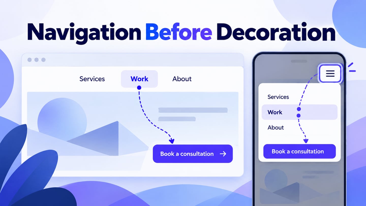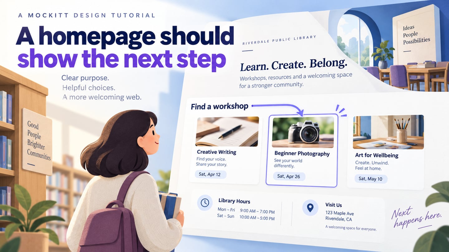
A homepage helps visitors understand where they are, what the site offers and which route fits their task. It may be the first page someone sees, but search, shared links and campaigns can also bring people directly to deeper pages. Design it as a clear starting point rather than a compulsory gateway. An attractive first impression is useful when it supports readable content and meaningful actions; decoration alone does not explain the service.
Plan the Homepage in a Design Workspace
Use Mockitt’s UI design tools to arrange the homepage’s content, navigation and actions at the intended screen sizes. Start with the information people need to make a decision, then choose widgets and imagery that support it. Reusable cards and controls can keep the design consistent, but a template is only a starting point. Remove sections that do not answer a real visitor question instead of filling every available area.
Connect the homepage’s main actions to the relevant destination screens so a review covers the route, not just the opening view. If importing existing artwork, inspect the supported workflow and the imported result. The design shown in a prototype still needs implementation, content management and performance testing before it becomes a working website; an export option does not by itself complete that process.
Share the current design with appropriate access and ask reviewers to follow a specific task. Their comments should identify the label or section that caused uncertainty. Record the approved route and content decisions with the design rather than relying on a general impression that the page looks good.
How to Create Home Page UI and UX Design
Step 1: Create the Project and Define the Main Task
- Sign in to the workspace and create a blank project or choose a relevant template. Write down the audience and the main task the homepage should help them begin, such as finding a suitable workshop.
- Name the project and prepare a desktop and narrow viewport. Keep the same essential information in both, even when its arrangement changes.
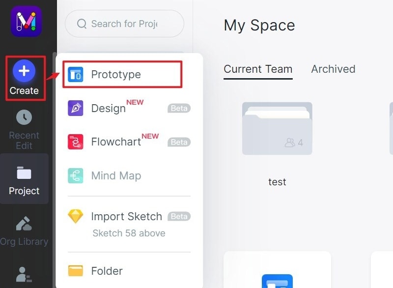
Step 2: Design the Homepage Content and Actions
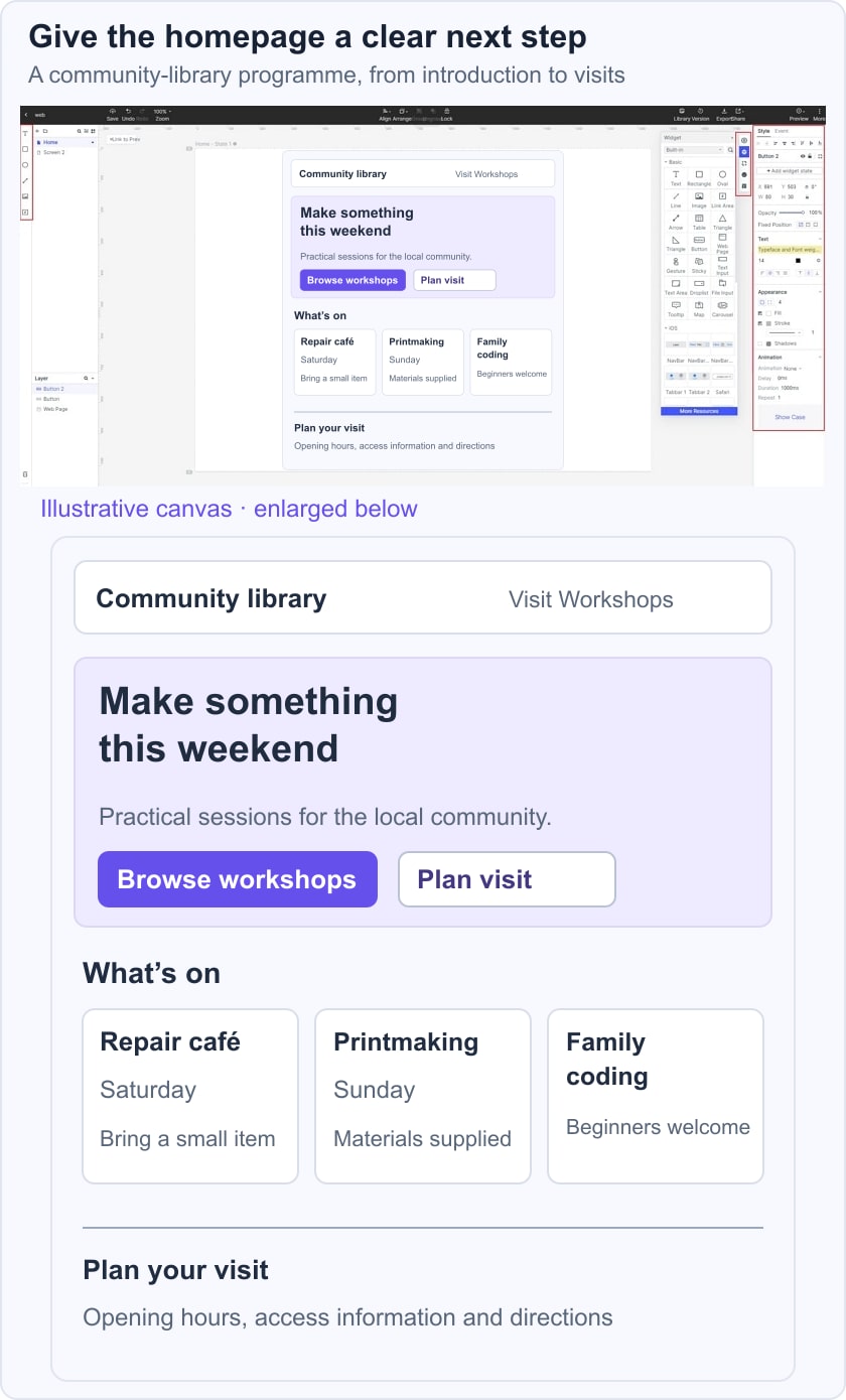
- Add the purpose statement, main action, navigation and the content needed to support the choice. Use realistic labels and sample titles before deciding how wide each card or section should be.
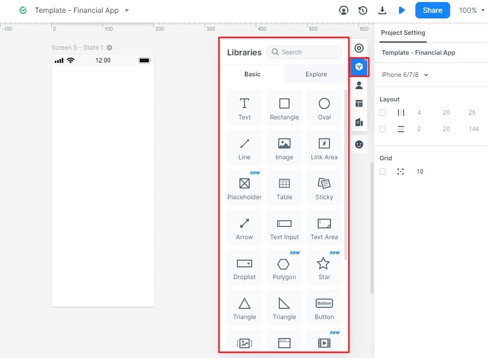
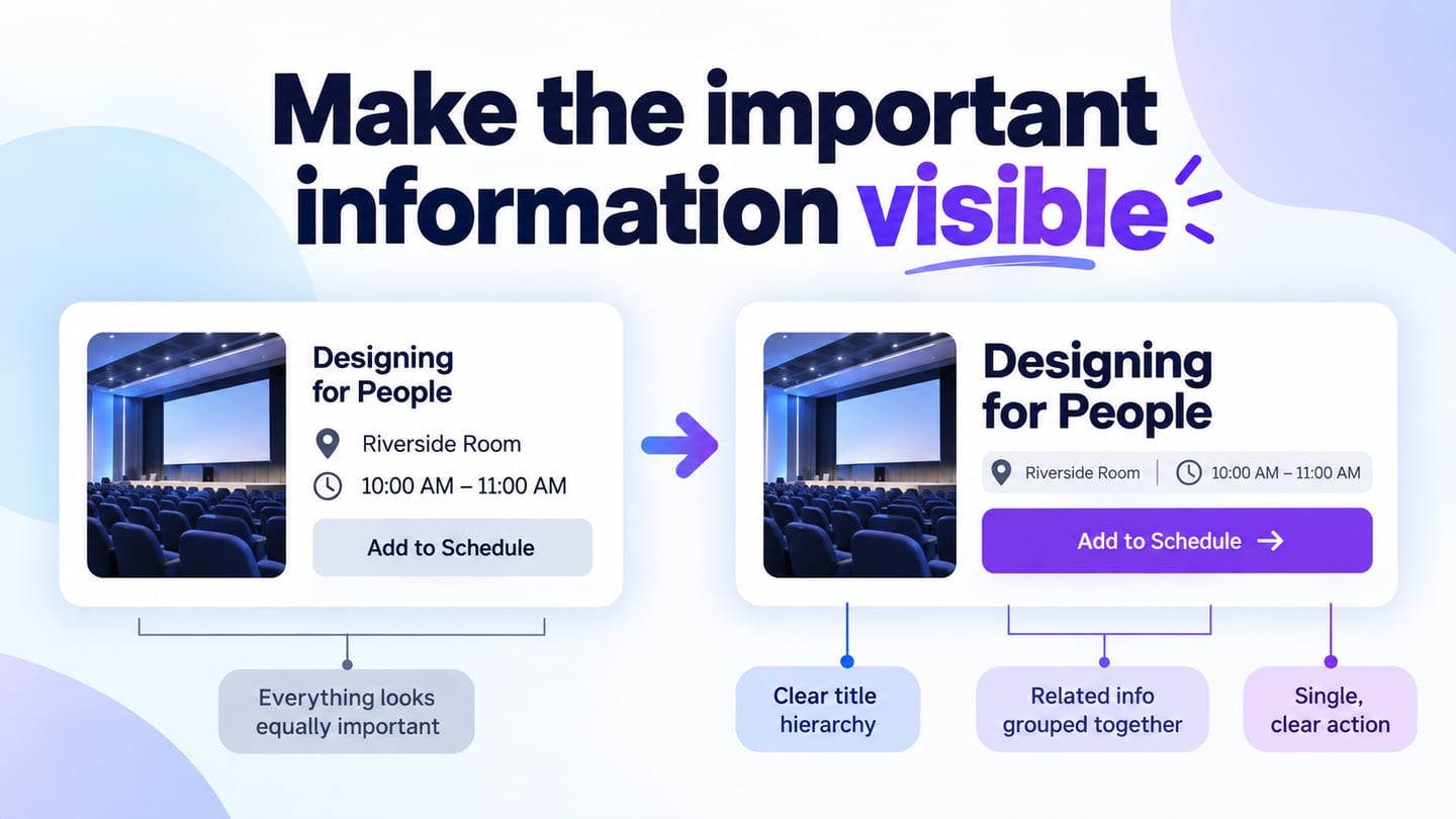
- Reuse the card and control structure where it repeats. The card design should expose the information needed to choose, such as date and audience, rather than requiring a visitor to open every item.
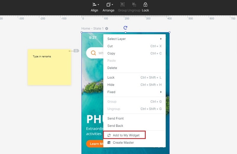
- Connect the main action to the correct listing or task screen. A button labeled Browse workshops should open the workshops, not a generic sign-up form unless signing up is clearly required first.
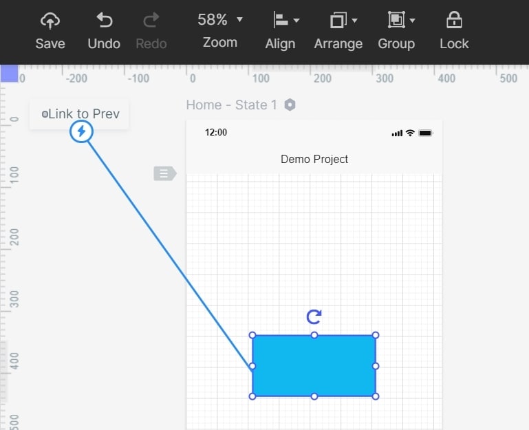
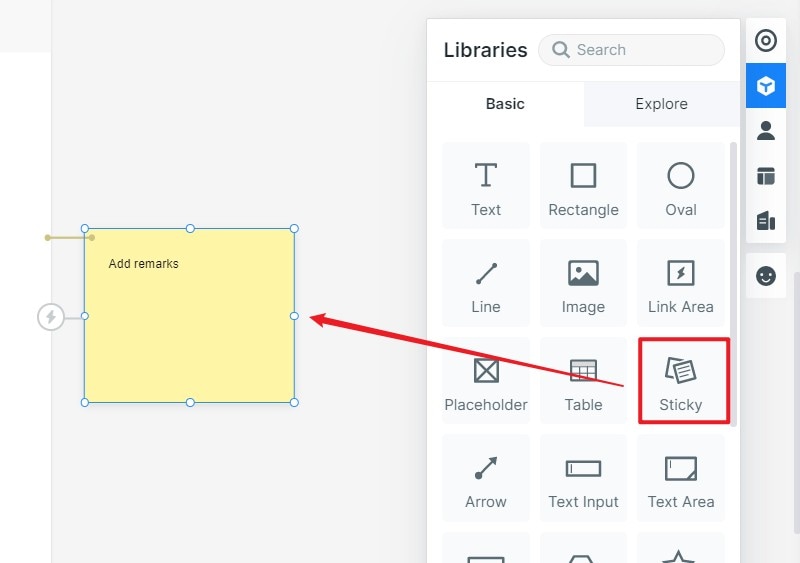
- Use notes to record content priority, link destinations and behaviors that are not visible in the static design. Distinguish editorial placeholders from approved copy and identify who must supply the actual opening hours or event details.
For a community library homepage, use the heading Make something this weekend, followed by Browse workshops and a secondary Plan your visit link. Show three example workshops with their dates and intended audiences. Keep opening hours and location easy to find without giving them the same emphasis as every promotional card. A visitor choosing an activity should understand the next step without reading the entire page.
Step 3: Preview the homepage UX
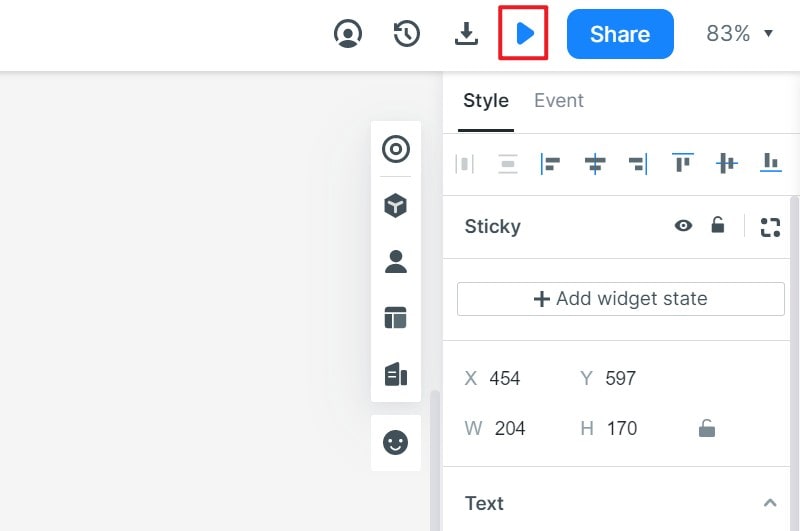
- Preview both a full-width layout and the responsive UI arrangement. Use long workshop titles and enlarged text to check for overlap. Ensure the main action remains meaningful when images load late or are unavailable. Resizing a static canvas helps compare layouts but does not test the finished website’s CSS or network performance.
Step 4: Share the design
- Share the flow with people representative of the audience and ask them to find a suitable workshop and check the opening hours. Observe where they look first, which label they select and what they expect to happen. Feedback from the team is useful, but it does not replace observing the intended task with users.
Step 5: Prepare the Design for Implementation
- Hand off the approved content hierarchy, linked destinations and responsive decisions. Verify the implemented page with actual content, keyboard navigation and performance checks before release. A successful prototype review is one input to launch readiness, not proof that the site is complete.
Useful Tips for Home Page UI/UX Design
1. Understand your end-users
Learn which questions visitors bring to the homepage using user research, existing support questions and task evidence. For a library, a new visitor may need location and access information while a returning visitor wants the next workshop date. Avoid assuming that every audience needs the same promotional introduction.
2. Define how the interface is used
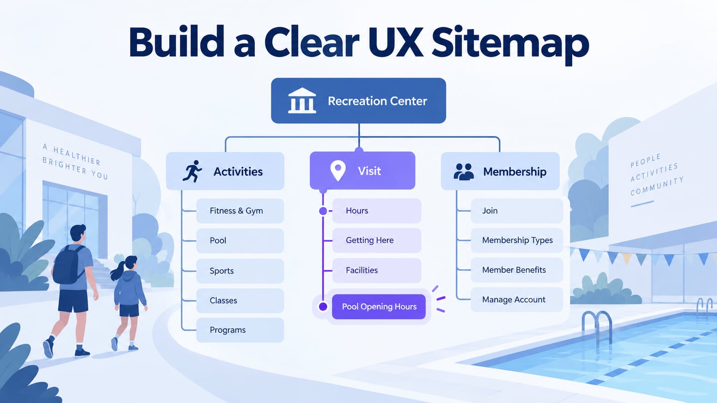
Determine how visitors enter and use the site. Include touch, keyboard and pointer interaction, and check the tasks on small screens. A search function may be helpful for a large catalog, while a small service site may be better served by a few clear navigation choices. Choose according to the actual content and audience.
3. Set Clear Expectations
Use action labels and link text that describe the destination or consequence. Reserve the strongest emphasis for the main next step, and keep secondary paths discoverable. Do not rely on color alone to distinguish a warning or availability state. The W3C link-purpose guidance supports labels that can be understood in their context.
4. Expect mistakes
Anticipate empty, unavailable and mistaken states. A workshop can be sold out, a search can return no results and an old campaign can end. Give visitors a useful next route without implying that every item is available. Check that the homepage still works when one optional image or promotional block is missing.
5. Allow others to give feedback
Use review feedback to revise the route and content priority, not simply to collect color preferences. Keep the task the same when comparing alternatives so observations are meaningful. For the library example, a clearer workshop route and visible visiting information are more useful outcomes than making every section compete for attention.