Settings let people change how an app behaves, how their account is used and what information they receive. Use Mockitt’s online prototype editor to test those choices and their consequences. A settings page needs more than a tidy list: the person should understand what will change, when it takes effect and how to recover if saving fails.
Plan a settings prototype
Start by separating account-wide preferences from settings for the current device, workspace or individual project. Group related choices under plain headings, and keep destructive actions distinct from everyday preferences.
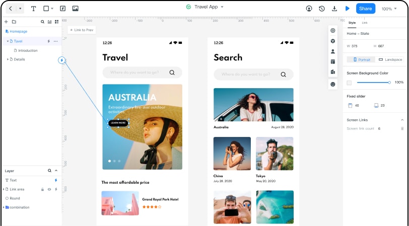
Elements to prepare
- Reusable rows and controls for choices that behave consistently.
- Realistic labels, current values, helper text and disabled states where appropriate.
- Explicit save behavior: immediate changes, a Save action or a clearly explained mixed model.
- Team review of permissions and scope, especially where a setting affects other people.
- Feedback and recovery states for a change that is pending, saved or unsuccessful.
Build the settings flow
Step 1: Define the scope and states
Choose one concrete preference and record who can change it, what it affects and where it is stored. Use a test account and fictional data for the prototype; do not place personal credentials in the design.
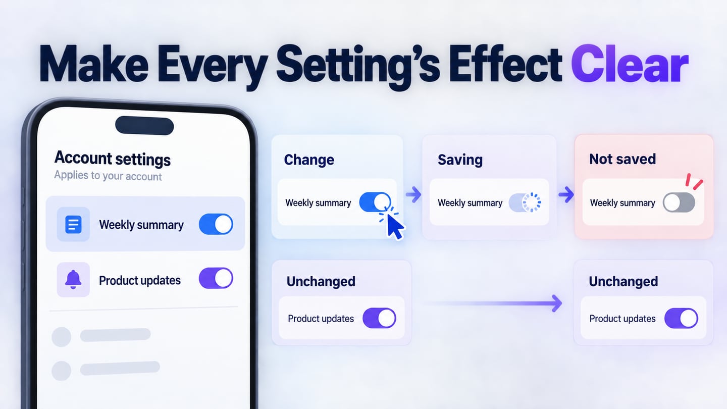
Create an initial screen and the necessary changed, saving, saved and error states. The retained editor images show an earlier workflow and are not exact instructions for the current toolbar.
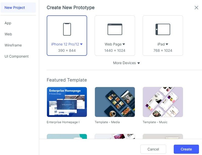
Step 2: Arrange the controls
Use labels that describe the effect of a control, not just “Enable” or “Disable.” For example, “Send a weekly summary” explains the choice. Follow W3C form-label guidance so the relationship remains clear in implementation.
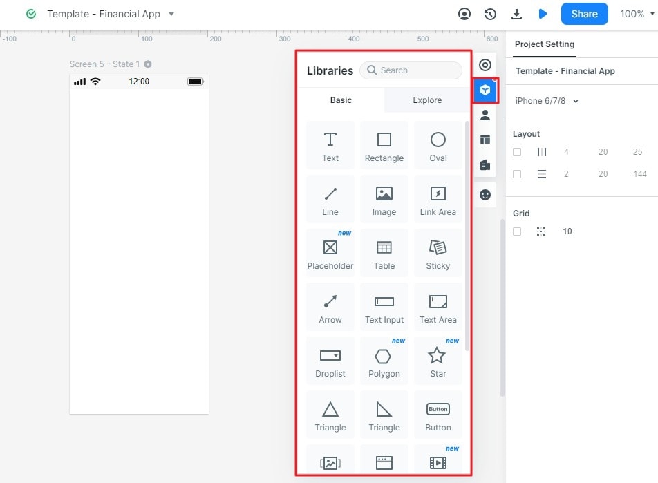
Step 3: Show context and dependencies
Place a short explanation beside a preference when scope or consequences are not obvious. If changing one option disables another, show and explain that relationship. The historical template image illustrates a settings layout, not a maintained account-policy specification.
Step 4: Test a change and a failure
Connect the control to the expected result, then test a failed update. Do not leave a switch visually on while the system has rejected the change without an explanation.
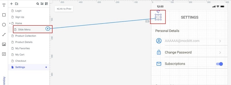
For an illustrative workspace account, the Notifications page has “Weekly summary” and “Product updates” preferences. Switching Weekly summary on starts a save request. If it fails, restore the previous off state and show “Could not save this preference. Try again.” Keep the other preference unchanged so the person can identify exactly what happened.
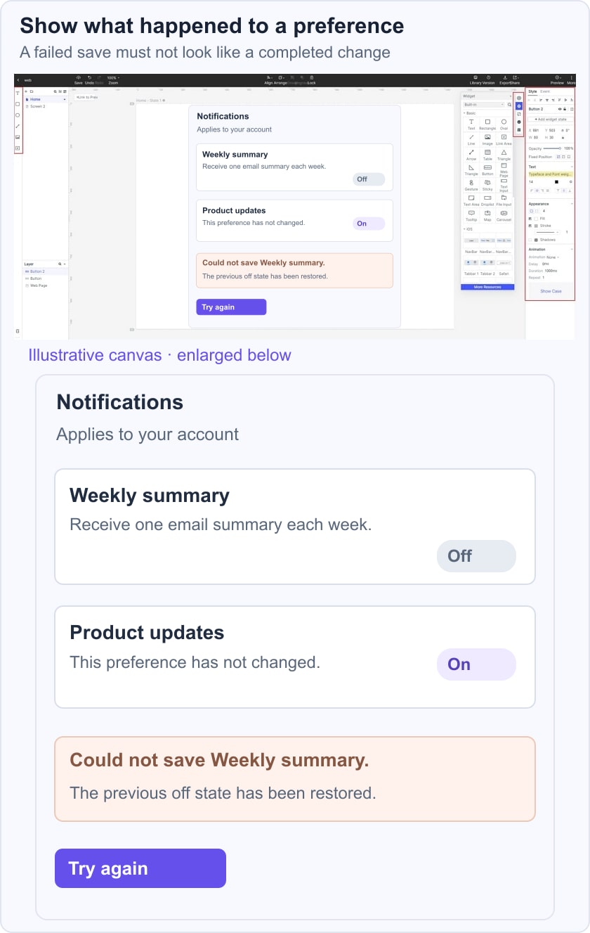
Compare that immediate-save model with an explicit Save button. In the second version, changing the switch creates unsaved edits; leaving the page needs a defined outcome. The prototype should make the distinction visible rather than mixing both models accidentally. Review the W3C notification guidance when specifying how status messages will be announced.
Test the same task with a narrow viewport and keyboard-only navigation. Check long translated labels, a disabled preference controlled by an administrator and a repeated save attempt. Account deletion belongs in a separate, clearly explained flow, with its scope and consequences confirmed before the action.
Five historical iOS settings examples
The following captures are preserved to study grouping, labels and control choices. They show earlier app interfaces and do not establish current features, subscriptions or health outcomes.
1: Tripadvisor
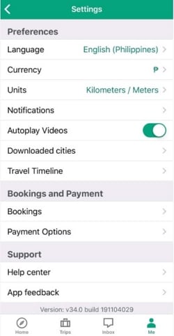
The Tripadvisor capture groups preferences such as language, currency and units separately from booking and support routes. This makes the scope of each group easier to scan.
Features
The settings entry sits within the account area in the retained capture. Keep the route discoverable without placing every preference in the main navigation.
Show current values beside choices such as language or units, so people can inspect the configuration without opening every row.
Bookings and payment options are a separate group. Group names should distinguish a preference from a transaction-related destination.
Advantages
A currency preference changes the way amounts are presented or selected according to the app’s defined behavior; it should not be described as calculating a traveler’s total expenses.
The Units row concerns measurement units. It is different from currency, and the label should communicate that distinction.
2: NBA
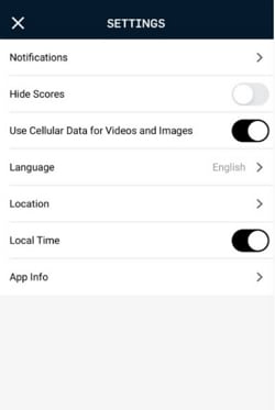
The NBA capture shows a compact list of notification, score, media and language preferences. The useful pattern is that each row describes a particular behavior.
Features
Switches suit choices with a clear on/off meaning when their effect is sufficiently explained.
“Hide Scores” communicates an outcome rather than an internal technical setting. Test whether a person can predict its effect without changing it first.
Language and location use rows that lead to a further choice; do not give every kind of preference the same control.
Advantages
Notification settings should explain what messages are affected and whether system-level permission is also required.
The Local Time switch is separate from location. Explain differences like this when the effect is not obvious to the intended audience.
3: Pillow
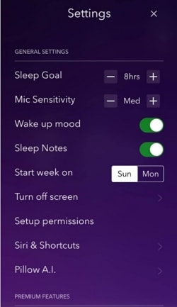
The Pillow capture provides examples of a numeric goal, switches and links to more detailed settings. It is useful for control selection; it does not validate sleep measurement accuracy or provide medical guidance.
Features
The Sleep Goal row uses minus and plus controls with a visible value. Define sensible boundaries and ensure the value is understandable without relying on the buttons alone.
Wake-up mood and sleep notes are separate switches. Labels should distinguish enabling a recording feature from the data that will later be entered.
Permissions are a separate destination. Explain why a permission is needed and what remains available if it is declined.
Advantages
The capture separates general settings from a premium section. If a preference depends on a plan, state that dependency without hiding an already saved value.
Short labels work when their meaning is familiar; add a concise explanation when a control affects data collection or a background behavior.
4: Workout Women
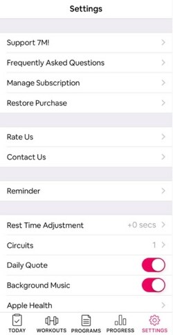
The Workout for Women capture groups subscription support, reminders and workout preferences. The design lesson concerns organization and current-value display, not a claim about health outcomes.
Features
A consistent Settings entry in the bottom navigation can make return visits predictable. The name and location should remain stable across related screens.
The colored switches identify binary choices, but color alone must not communicate whether a setting is on or off.
Readable type and row spacing matter when labels wrap or the user enlarges text. Do not force every row to remain one line.
Advantages
Manage Subscription and Restore Purchase are distinct tasks. Their labels should lead to the corresponding action rather than the same generic help page.
The Reminder row leads to a further choice, while other preferences are immediate switches. Make these different behaviors recognizable.
5: IMDB
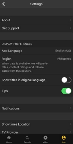
The IMDb capture groups display preferences and other account-related routes. It demonstrates the value of showing current language and region values beside their labels.
Features
A dark background is a visual choice, not proof of readability. Check text and control contrast, including inactive or explanatory text.
Language and region affect different aspects of the experience. The helper text in the capture explains the region’s relationship to titles, ratings and release information.
The Tips switch names the feature it changes. Keep optional guidance separate from essential explanations needed to use a control.
Advantages
About and Get Support are placed together near the top. Supporting destinations should remain easy to find without overwhelming the everyday preference list.
Notification and location-related entries appear as separate routes. Avoid combining unrelated permissions under one vague label.
Five historical Android settings examples
6: Twitch
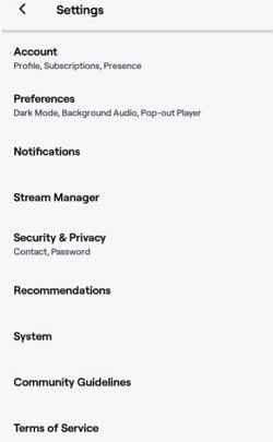
The Twitch capture uses grouped destinations for account, preferences, notifications, security and system information. The organization is more informative than a long alphabetical list of every setting.
Features
The Account summary names profile, subscriptions and presence. A short secondary description can help a visitor choose a category without opening it.
The Preferences summary includes appearance and playback choices. Describe the actual behavior rather than calling all audio controls “background music.”
Security and Privacy is a dedicated destination. Sensitive account actions need clear scope and appropriate implementation beyond what a visual prototype can provide.
Advantages
Keep sign-out and account removal distinct. A person should not need to infer whether leaving a session also deletes data.
System information and app-version details support troubleshooting. Do not confuse them with date and time preferences unless that is what the screen actually provides.
7: Blackboard
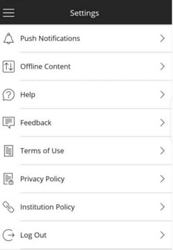
The Blackboard capture combines notification and offline-content options with help, policy and sign-out routes. The visible groups support both everyday preferences and support tasks.
Features
Feedback is an app-feedback destination in this capture; it should not be described as a direct message to an instructor without evidence.
Help should explain where the person will go and remain available when a preference is confusing or unavailable.
Log Out is clearly labeled and separate from policy links. It should not be visually confused with account deletion.
Advantages
Offline Content is a distinct choice with storage and availability implications. Explain those implications where the person makes the decision.
Terms and privacy information provide context for account use, but their presence is not proof that every setting is secure or compliant.
8: Discord
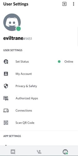
The Discord capture separates user settings from app settings. This distinction can help clarify whether a change concerns identity, connected services or the device experience.
Features
Set Status shows a current value, which makes the effect of the destination more predictable.
My Account is distinct from Privacy and Safety. Grouping should reflect the tasks and consequences, not merely the order in which features were built.
Authorized Apps and Connections are separate entries. The person needs to understand what access or relationship each route manages.
Advantages
The account identity at the top confirms which account is being edited. This is especially useful when people use more than one account.
Group headings provide useful landmarks in a long settings list. Do not make every row visually equal when the categories are different.
9: Tumblr
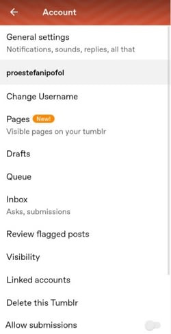
The Tumblr capture distinguishes general settings from actions for a particular blog. This makes scope a central design issue.
Features
The general-settings summary describes broad preferences, while the named blog section contains its own pages, drafts, queue and visibility controls.
“Delete this Tumblr” appears in the blog-specific section. Do not relabel it as deleting the person’s entire account; destructive actions must identify exactly what will be removed.
Change Username belongs to the relevant identity or blog scope. Show the existing value and any consequences before confirming a change.
Advantages
Visibility settings need to explain who can find or access the content. A vague “Private” label may not answer that question.
Linked Accounts should distinguish viewing a connection from granting or revoking access. Use clear confirmation and feedback for consequential changes.
10: Calm
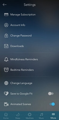
The Calm capture offers examples of account, reminder and playback-related settings. The interface does not establish that the product cures anxiety or guarantees a particular health result.
Features
Manage Subscription and Account Info are separate destinations. Keep commercial terms and personal details understandable within their own flows.
Change Password and Change Language are different tasks with different validation needs. A uniform row style should not conceal those differences.
Mindfulness and bedtime reminders are listed separately. Explain what each reminder does and how to change its schedule.
Advantages
Animated Scenes is a binary preference in the capture. Motion preferences should remain understandable and should not make essential content dependent on animation.
The bottom navigation provides a route back to the wider app. The settings page should preserve predictable navigation while a change is being saved.
Conclusion
Review a settings page by asking a person to explain the scope, current value and result of one change. Then test a save failure and an action that requires a separate confirmation. Keep account-entry behavior consistent with the login flow.
Settings often lead to supporting information. A relevant FAQ answer can explain a complex preference, and a support route can help when a change cannot be completed. Those routes should supplement clear labels and status messages, not replace them.