A login page helps a returning user regain access to the right account. Prototype its fields, errors and recovery paths in Mockitt’s online prototyping workspace before implementation. Visual design can clarify the experience, but it does not provide authentication, password storage or attack protection.
Keep login separate from account creation. A returning user should recognize the required identifier and method, while a new user needs a clearly labeled route to register. Do not make either task depend on interpreting a decorative illustration.
The ten images below are interface concepts and historical design references. Several names in the old article were labels inside those mockups, not verified software products. The examples are now evaluated for their visible layout rather than invented capabilities.
Prototype the complete login flow
Decide what the user already has: an account, an invitation or a particular organization’s sign-in method. The signup flow is a different task and should not be silently mixed into the login form.
Agree on the authentication method with the engineering team. The choice of a content-management system does not by itself determine whether the experience uses a password, a federated provider or another supported method.
Create the initial screen, incomplete-input state, unsuccessful sign-in state and recovery route. Use fictional account data only. A prototype’s input field should never be used to collect a participant’s real password.

Use visible labels and a deliberate reading order. Provide sufficient contrast and test increased text size. Do not choose credential behavior based on assumptions about ethnicity or age; review the actual audience’s access needs and supported devices.
The OWASP authentication guidance covers implementation concerns such as password handling, error responses and automated-attack protection. These require engineering and security review. A padlock icon, exported HTML or a branded template is not evidence that those controls exist.
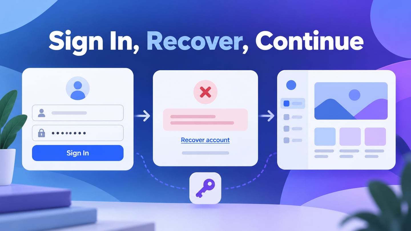
For an illustrative Fieldwork account, the user enters an email and password, then selects “Sign in.” If authentication fails, the screen says “We couldn’t sign you in. Check your details or reset your password.” The email remains available for correction, and “Reset password” leads to a separate recovery state with an appropriate generic response. For the screens after that handoff, see how to design a complete password recovery flow, including an expired link and the final return to sign-in.
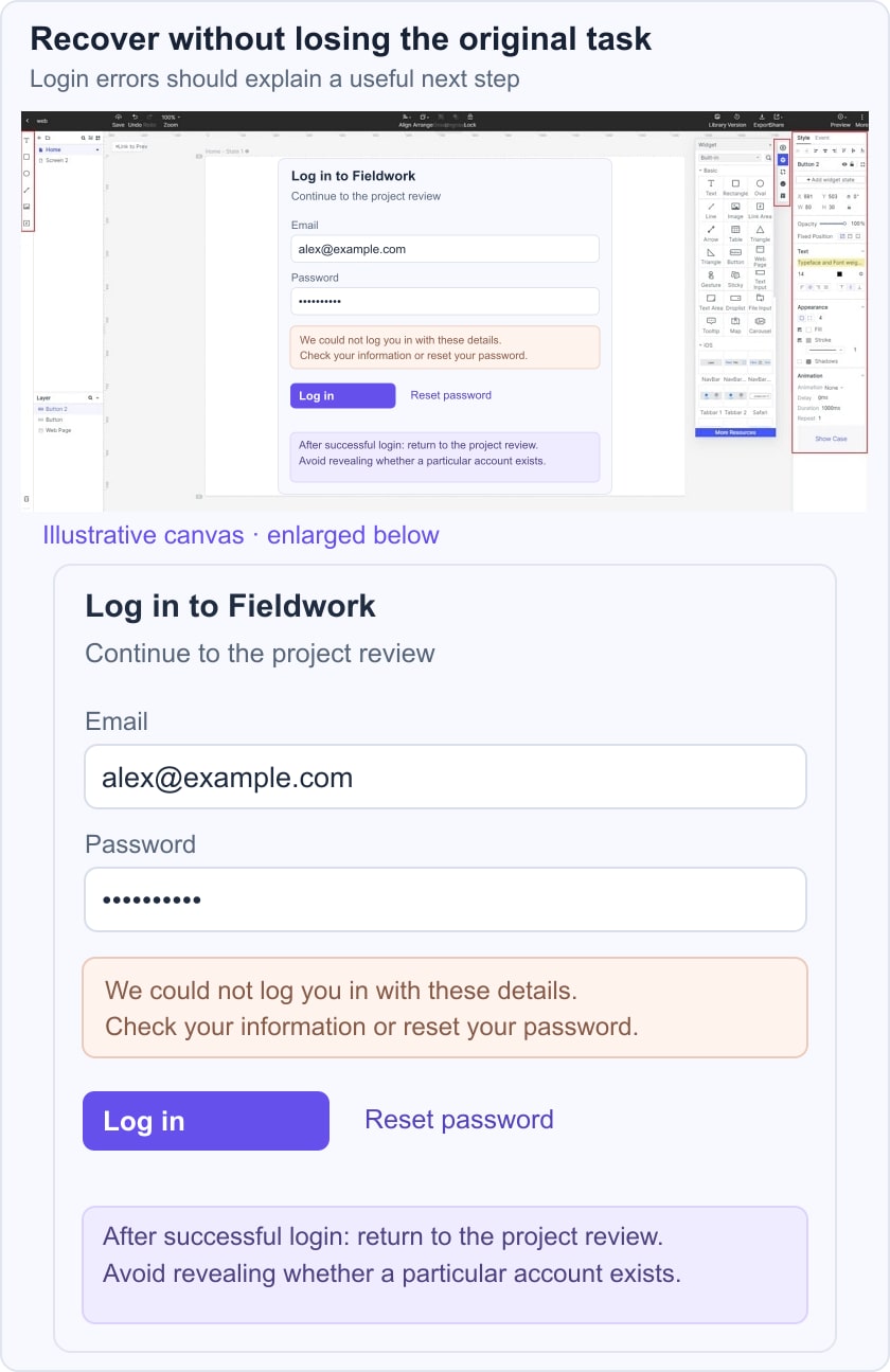
Test a user returning from a password manager, one using the wrong method and one who cannot receive the recovery message. Record what happens after success: the person should return to the intended destination when it is permitted, rather than always being sent to a generic start page. Keep the prototype’s simulated outcome clearly separate from a live authentication test.
Use the W3C guidance on form labels and review keyboard focus, password visibility controls and autofill with development. A functional review must cover the implemented form, not only the prototype.
Ten login and registration concepts: what to inspect
The retained images can inspire layout choices. They do not establish current services, downloadable templates, supported platforms or security guarantees.
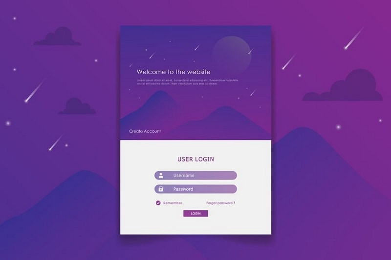
1. A compact illustrated login card
The first concept places a small login card over a purple illustrated background. The contrast between the card and its surroundings helps define the task area.
Its small labels and controls need careful review at the final rendered size. A decorative setting should not make recovery or account creation harder to find.
Keep the visible label above or beside each field rather than relying on a placeholder that disappears. Nothing in the image demonstrates encryption or a cookie-management service.
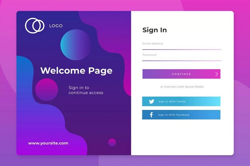
2. A split-layout sign-in concept
The second concept uses a welcome panel beside credential fields and social sign-in choices. The visible “yoursite.com” text is a placeholder, not evidence of a login-building product.
A split layout can introduce the brand while keeping the form in a stable area. On mobile, remove or reduce the decorative panel before shrinking the fields.
Only display identity-provider buttons that the implemented service actually supports. Make the consequence of selecting one clear, especially when it may lead to an external sign-in page.
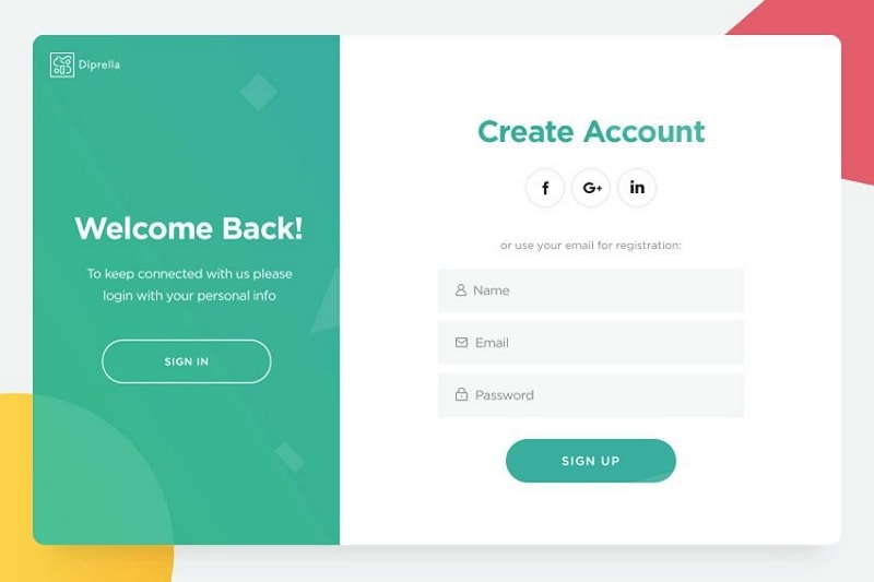
3. Diprella: separate returning and new users
The Diprella-labeled concept combines a returning-user invitation with a Create Account form. It illustrates the need to distinguish two related but different tasks.
If the page switches modes, keep the active mode obvious and preserve only appropriate information. Do not claim that a still mockup can build the flow or run on every operating system.
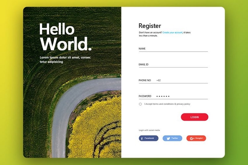
4. Hello World: align the action with the form
The Hello World concept shows a Register heading above fields, but its main button says Login. That mismatch is a useful defect to catch during review: the action label should describe the task the form actually performs.
Ask whether the phone number is necessary at this stage. A registration form should not collect extra information solely because the template has space.
Treat its provider icons as design placeholders until the real authentication choices are confirmed. Review the terms agreement separately from optional marketing consent.
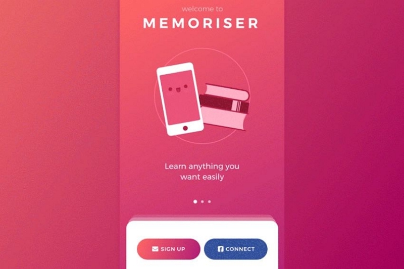
5. Memoriser: explain the first choice
The mobile Memoriser concept presents signup and connection actions below a brief introduction. A compact first screen can work when the alternatives are understandable.
A generic “Connect” label may be unclear without a provider or method. State what account the user will connect and what happens next. The image provides no evidence about data storage or transport security.
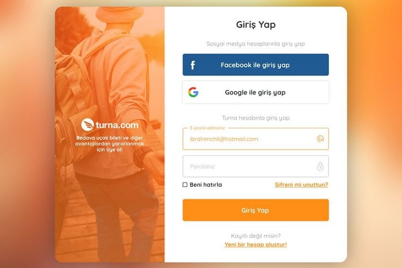
6. Turna: multiple sign-in methods
The Turna capture shows provider choices above email and password fields. It is a useful arrangement to inspect when a service supports several authentication methods.
Keep the provider names, divider and credential labels readable. Test how the page explains an account that was created with a different method, without exposing sensitive account information.
The retained non-English interface is a historical reference. For a localized implementation, translate visible controls consistently and check that longer labels fit without reducing accessibility.
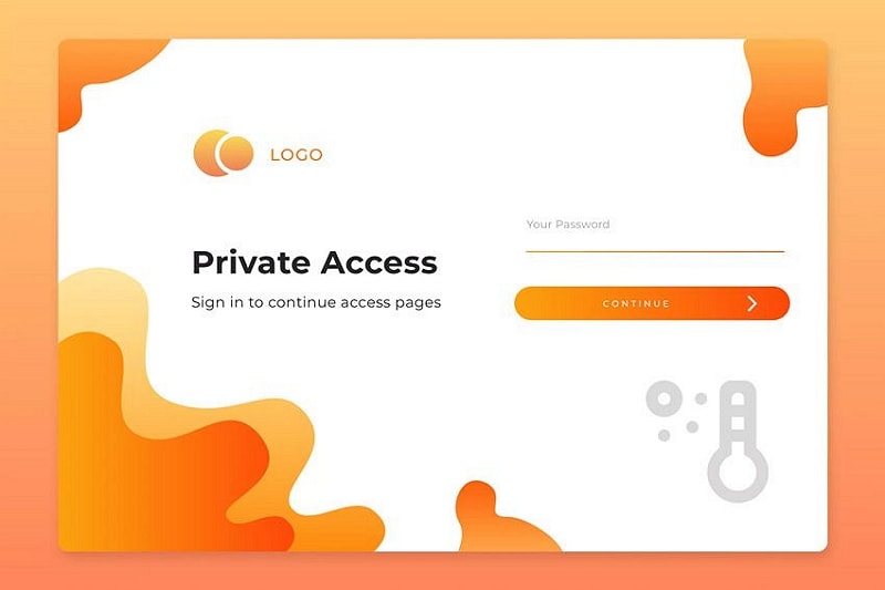
7. Private Access: clarify a password-only gate
The Private Access concept shows a single password field. That may represent a shared-content gate rather than a personal account login; those purposes should not be confused.
Explain which resource is being opened and provide an appropriate way to obtain access. A shared password gate is not a substitute for individually managed permissions where accountability matters.
Do not infer a particular audience, licensing model or security level from the playful background.
8. Brickshare: keep recovery visible
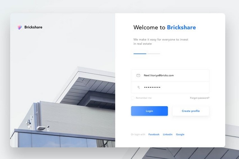
The Brickshare concept presents credentials, a password-recovery link and a separate Create profile action. The distinct actions make it possible to discuss the boundary between returning and new users.
Review the relative emphasis: the main sign-in action should remain clear, while recovery must still be discoverable. Check the layout with a longer email address and an error message.
The appearance does not establish how personal information is protected; document that requirement with the implementation team.
9. A registration concept with detailed fields
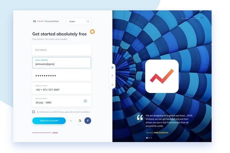
The ninth concept requests several personal details alongside a promotional visual. It is a registration example, not evidence of an application named Vendimation that creates login pages.
Question every field. Date of birth or phone information may require a specific purpose; do not collect it merely to complete a visually balanced form. Keep the privacy explanation understandable.
Remove unsupported claims about the product’s founding year, encryption strength or immunity to attacks. The useful design lesson is the tension between a welcoming page and unnecessary form complexity.
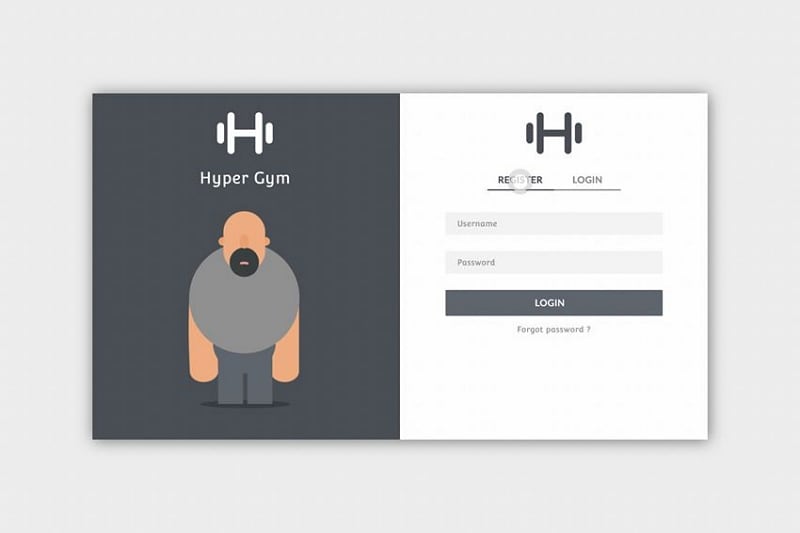
10. Hyper Gym: visible registration and login modes
The gym-themed concept presents Register and Login as separate tabs above credentials. This makes the task switch visible, but its active state must remain clear beyond color alone.
Test keyboard operation, focus order and the content shown after changing modes. A user should not accidentally create an account when trying to sign in.
Provide an appropriate recovery route and avoid implying that a template guarantees privacy or compatibility with every website platform.
Keep the illustration secondary so the form remains usable when imagery is unavailable or the viewport is narrow.
Choose a layout that makes access understandable, then review the full flow with engineering. A login prototype is a communication and usability tool, not an authentication provider.
Test the initial state, validation, unsuccessful sign-in, recovery and return destination. Coordinate account preferences with the settings page and provide a relevant support route for unresolved access problems. Preserve the distinction between helpful error guidance and information that could reveal private account status.