A team page helps visitors understand who does the work and how responsibilities fit together. Use Mockitt’s online prototyping workspace to review the profile layout, detail states and contact routes. The page should establish useful context through accurate information, not assume that a friendly photo alone creates trust.
Plan the team information
Begin with the questions visitors need answered: which roles are represented, what experience is relevant and how to reach the right function. The level of detail should fit the organization and the people’s consent.
What a useful team page includes
- A consistent introduction that explains how the group works, rather than a collection of unrelated slogans.
- Approved images or another appropriate visual treatment. Use current, accurately attributed portraits when available; do not invent employees or present generated portraits as real staff.
- Professional contact routes appropriate to each role. Personal email addresses and social profiles should appear only when their publication is intended and approved; a team inquiry route may be more suitable.
- Brief, relevant descriptions of responsibilities and experience. Distinguish a person’s role from an unsupported claim about expertise, awards or results.
Prototype the team presentation in Mockitt
- Create a reusable profile card with space for a name, role and short summary. Test long names and role titles instead of designing only for the shortest example.
- Add a profile-detail route only when there is useful approved information to show. Social links are optional and should have descriptive labels and verified destinations.
- Motion may add personality, but it should not be required to read a name, role or contact option. Include a usable static state and avoid interactions that depend only on hovering.
- If a profile opens in an overlay, specify the close action, keyboard behavior and return focus. A dedicated profile page may be clearer when the content is substantial or needs a stable link.
Review the page as a team-information task.

- Visual hierarchy: make names and responsibilities easy to distinguish without making every card compete for attention.
- Content consistency: use comparable information where appropriate, while allowing an individual’s relevant work to remain specific.
- Feedback: have each profile owner and the responsible editor check the text and image before release.
- Implementation notes: document card behavior, detail navigation and the narrow-screen layout. A prototype is a review artifact, not an automatically maintained personnel directory.
- Maintenance: identify who updates profiles when responsibilities change. Remove stale contact routes and avoid presenting former staff as current team members.
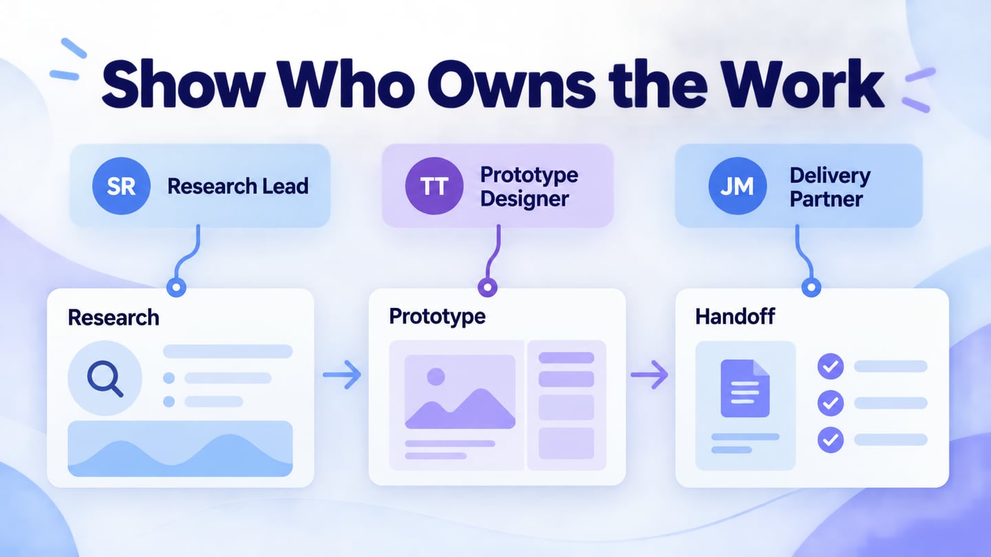
For an illustrative project team, show three roles: Research Lead, Prototype Designer and Delivery Partner. Each card explains the work owned by that role and links to a shared project inquiry route. Use clearly labeled example initials rather than invented employee portraits; a real site would replace them with approved people and information.
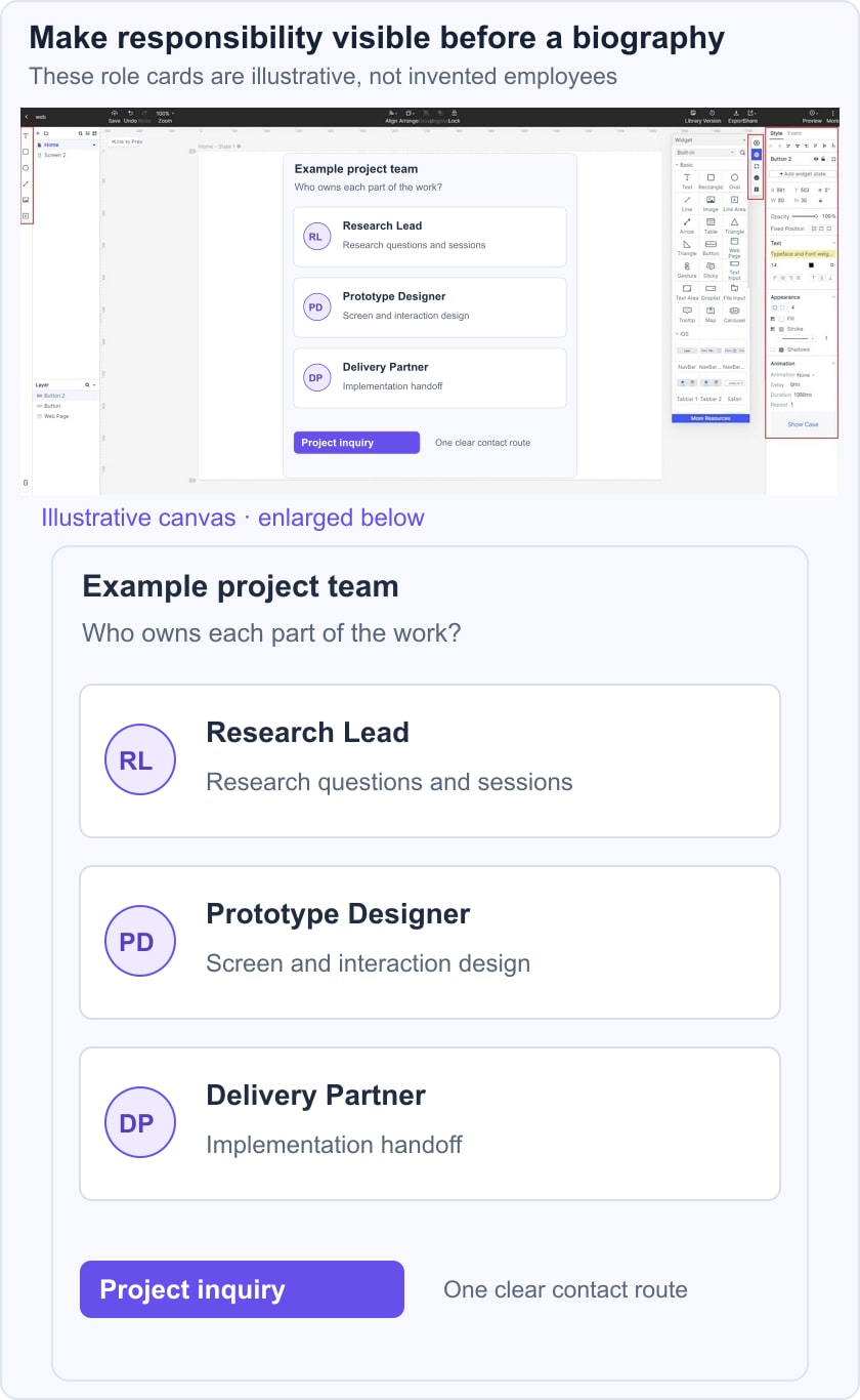
Ask a reviewer who has a research question to identify the relevant role and the next action. Then ask who coordinates implementation handoff. If every description says only “Passionate about design,” the page is not explaining responsibility. Connect the team’s work to the relevant service scope without turning each profile into a duplicate sales pitch.
On mobile, keep the role and summary visible with the name. Do not make a visitor tap every portrait simply to discover who does what. A longer biography can be optional, while essential responsibility and contact context stay in the card.
Eight historical team-page patterns
#1:Humaan
The Humaan reference emphasizes personality through expressive team presentation. The useful question is whether that personality coexists with readable names, roles and a predictable way to obtain more detail. The original reference is historical and does not establish the site’s current animation or layout.
#2:Lateral
The Lateral reference uses playful portrait interaction. Treat motion as optional decoration around the information, not as the only way to reveal it. Check touch input, keyboard navigation and a reduced-motion experience before using a similar approach.
#3: 6tematik
The 6tematik reference uses a strong visual identity to distinguish the team section. The design lesson is consistency between imagery, type and profile information. Avoid inferring someone’s role, interests or identity from the color used behind a portrait.
#4:Globule Bleu
The Globule Bleu reference uses an unusual card arrangement. A distinctive grid can work when reading order remains clear and every profile has enough room for a name and role. Essential information should not appear only on hover, and a simpler stacked layout may be preferable on a narrow screen.
#5:Advantix Digital
The Advantix Digital reference emphasizes detailed profiles. Longer biographies are useful when they explain relevant responsibilities, experience or work. Personal interests can be optional, but they should not crowd out the information a visitor needs to assess the team or choose a contact route.
#6:Luminary
The Luminary reference connects short cards with fuller profiles. A short summary can support scanning while a detail page provides context. Keep the link descriptive and avoid using unverified awards, company-size claims or tenure figures as filler.
#7:Major Tom
The Major Tom reference presents team identity alongside organizational context. If location or office information matters to the visitor, publish accurate current details. Do not assume a visually rich or parallax presentation makes responsibility clearer; test the actual information task.
#8: Kota
The Kota reference places people within a broader organization story. That can work when the about page explains the purpose and the team section explains who performs the work. Avoid repeating the same generic introduction in both places.
A useful team page combines accurate people information with a clear understanding of responsibility. Review profile permission, image accuracy, current roles and the professional contact route before release.
Then test the page with a concrete question: who handles research, who develops the prototype and who coordinates delivery? Check long text, absent portraits, keyboard focus and the mobile reading order. Keep claims tied to approved evidence and establish an owner for future updates so the page remains dependable after publication.